Immoweb
Unlock everyone's perfect place
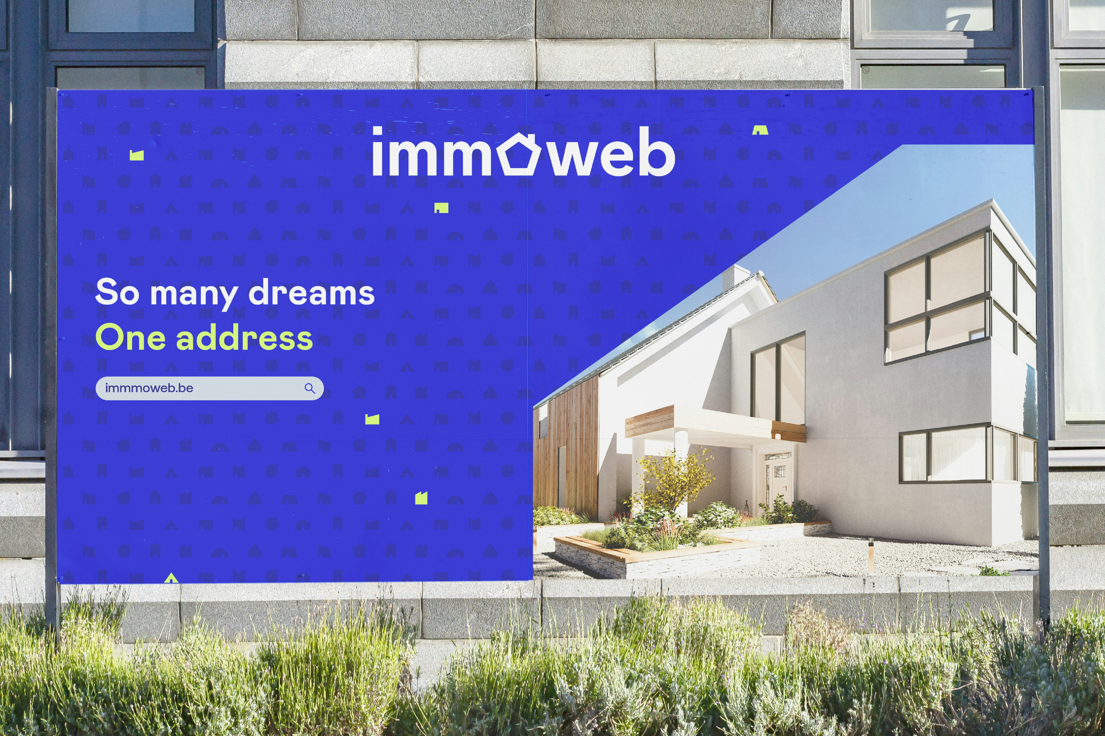
For over 25 years, Immoweb has been blazing a trail in the Belgian real estate market. And its quest for innovation continues today as it expands its range of services. The platform is no longer content to simply play the role of "marketplace"; instead, it is transforming itself into a veritable ecosystem for real estate. To achieve this new ambition, Immoweb has decided to strengthen its branding by adopting a powerful and dynamic visual identity.
Industries
- Real Estate,
- Services.
Skills
- Strategy,
- Brand Design,
- Brand Architecture,
- Digital.
Challenge
The challenge involves transforming and reinvigorating a brand that is firmly rooted in Belgium's collective conscious, while capitalising on the strengths that have kept Immoweb at the forefront of the industry for over 25 years. The aim is to build on this history to shape the brand's future and position it as the cornerstone of Belgium's real estate sector.
Solution
Capitalising on a brand as powerful and widely recognised brand as Immoweb, while updating its historic logo. Consolidating and reaffirming its leading position by defining robust and forward-looking values. Building on this impressive foundation to shape the new Immoweb, a leading brand that is growing and evolving in line with the changing needs of its users.

Unlock everyone's perfect place
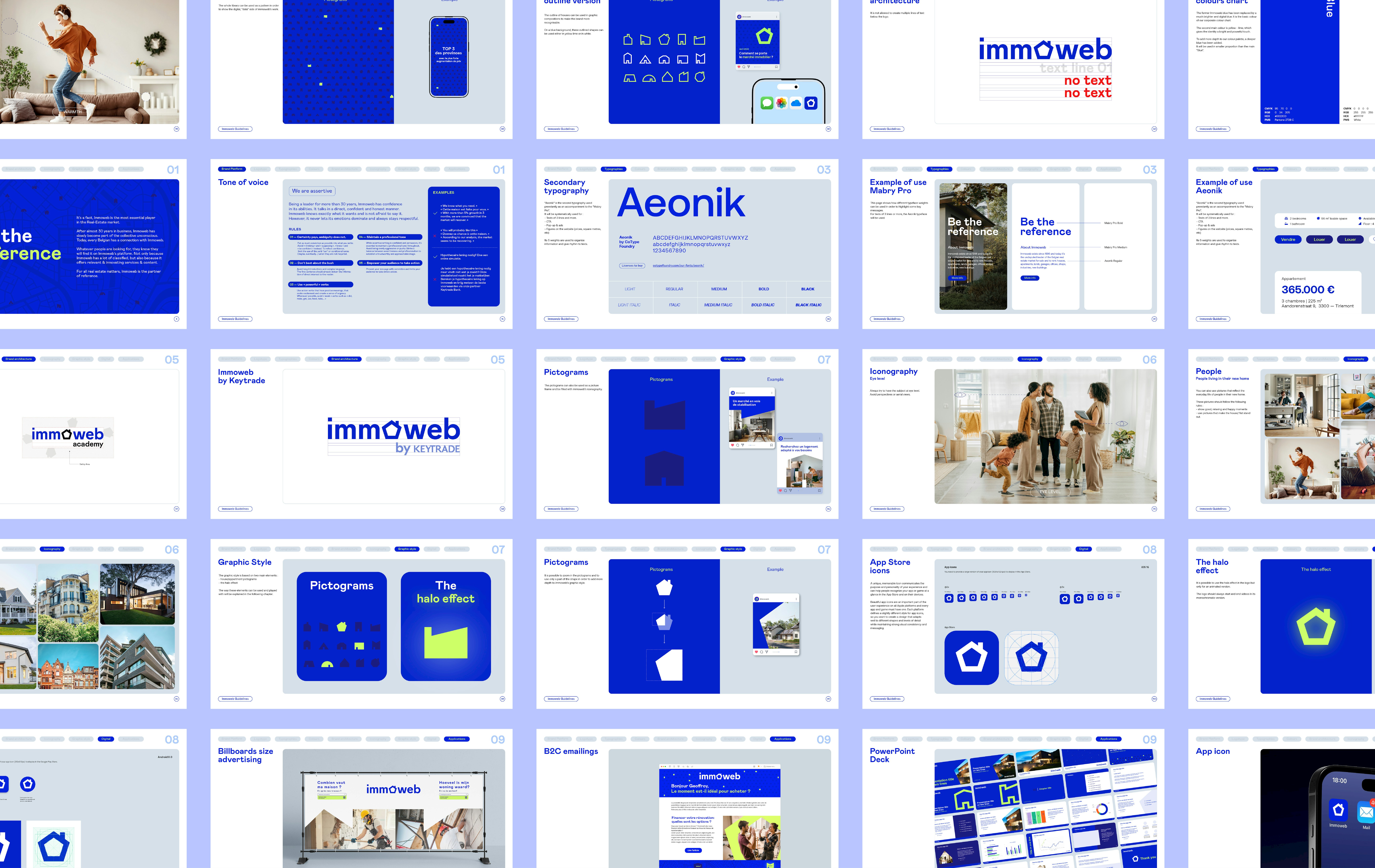
"Unlock everyone's perfect place" - this is the defining concept that guided the entire rebranding process, influencing every aspect of Immoweb's visual identity, from logo to iconography to graphic style.
In addition to this overriding idea, immoweb also upholds four source values:
- Think data
- Be the reference
- Value people
- Give smart solutions


Making the solution the focus... of the logo
The immoweb logo has always been based on the company's universal emblem. We had no intention of casting aside such an important symbol, but wanted to give it new meaning and make it more powerful. We began by shifting it back to the centre of the logo, before modernising the emblem and giving it more character. The symbol and name, previously very separate components, are now one.
On - Off
In its digital format, the logo comes to life by switching on and off like a light bulb, the universal symbol of creativity and bright ideas. This on/off effect is complemented by a halo that takes inspiration from the warmth emitted by a domestic light. The result is a brand that's both welcoming and dynamic, and that accompanies users throughout their property search.


A vast array of needs.
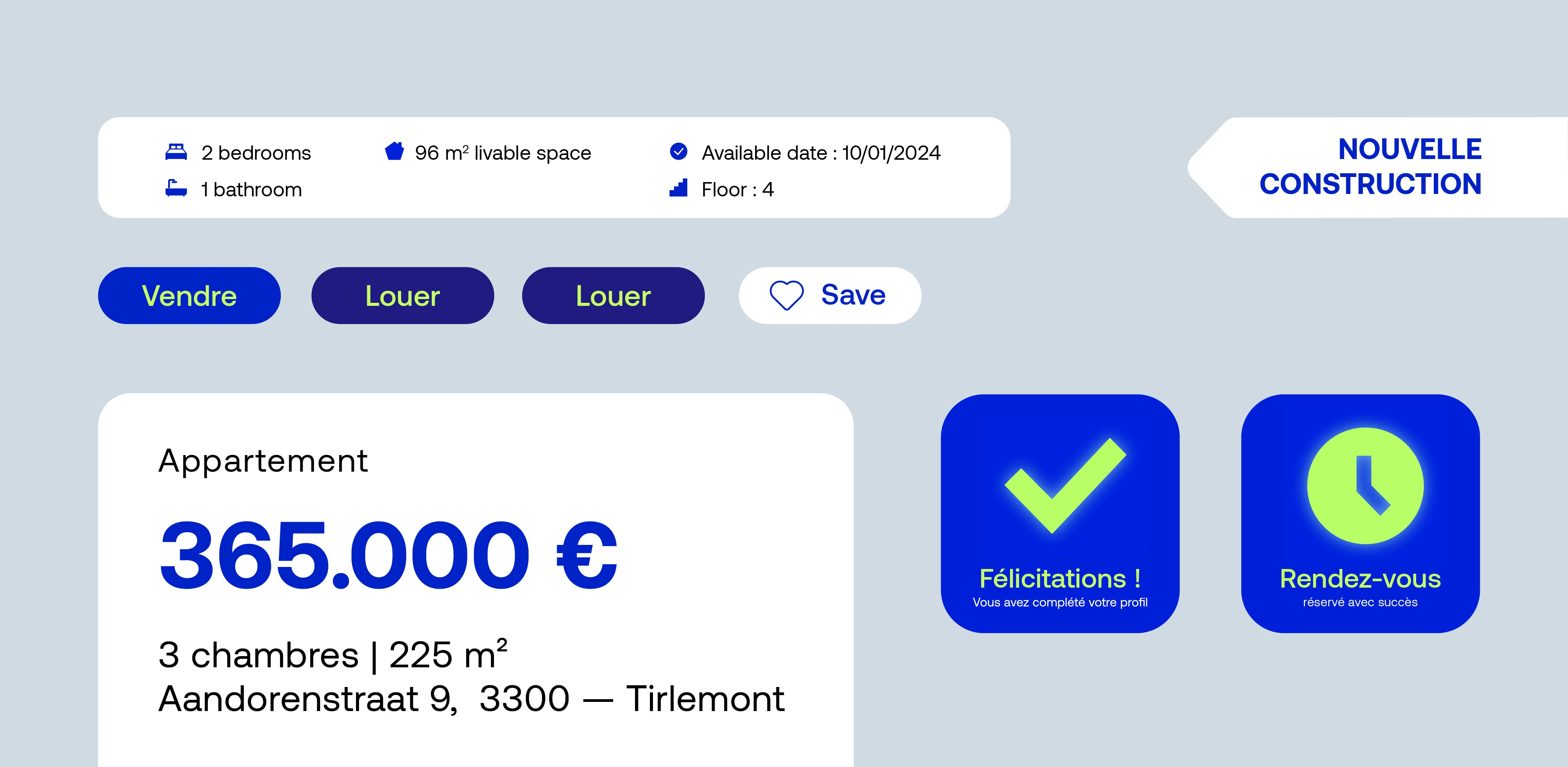
Immoweb's graphic identity is as rich and varied as the solutions offered by the platform. Its new graphic style is based on a wide range of shapes and pictograms, illustrating the wide variety of user needs.


A more human identity
Another challenge we faced was how to rehumanise the brand, which had become very functional in its approach. To do this, we introduced new typography, reworked the iconography and adopted brighter, more digital and contemporary colours. All of these things bring a much-needed human dimension to the Immoweb brand and refocus it on its core business.


