STIB MIVB
Public transport, made legible.
All cities face the same problem, reduce trafic and pollution by providing a safe, efficient public transport system that users will prefer. The signage system is the user’s manual and plays an essential role to achieving this. After commissioning a behavioural study in order to get a thorough knowledge of how the system is used and setting up a committee across the three modes of transport (metro, tram and bus), we designed a new way finding system that is coherent, contemporary and adaptable as new needs develop.
Industries
- Transport,
- Public Services.
Skills
- Strategy,
- Naming,
- Brand Design,
- Retail Design.


Challenge
Making public transport the public’s favoured mode for getting around Brussels.
Solution
Understanding the system, evaluating the flaws, designing a clear and contemporary system that would stand the test of time and adapt to new needs.


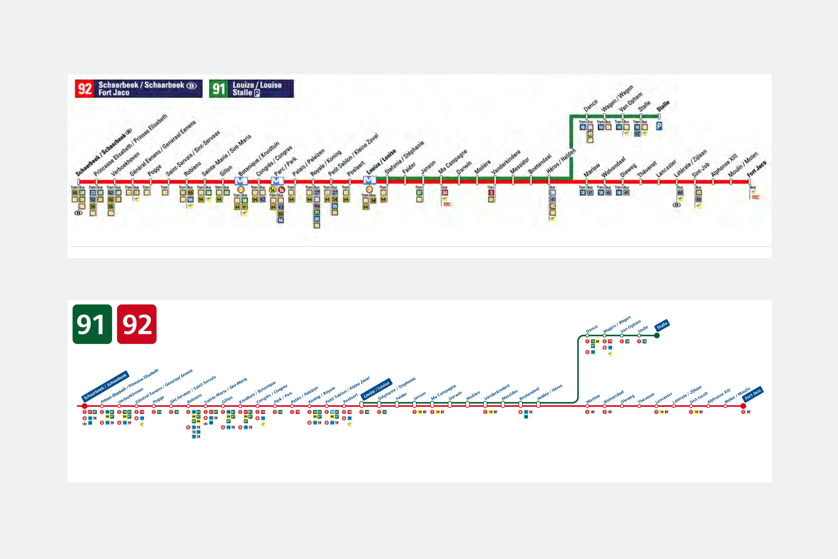
A coherent and complete design solution
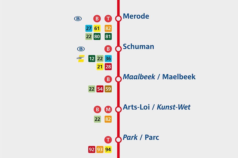
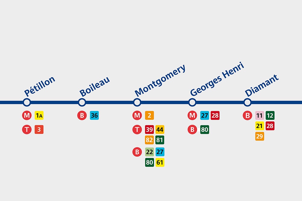
Minale Design Strategy developed a coherent and complete design solution for way finding throughout the Brussels system. This included a specific font designed to be legible for all uses, a complete set of pictogrammes, a coherent colour code and rules for hierarchy of information. It was just as important to develop rules for where signage is placed in order to make navigation the most efficient possible.


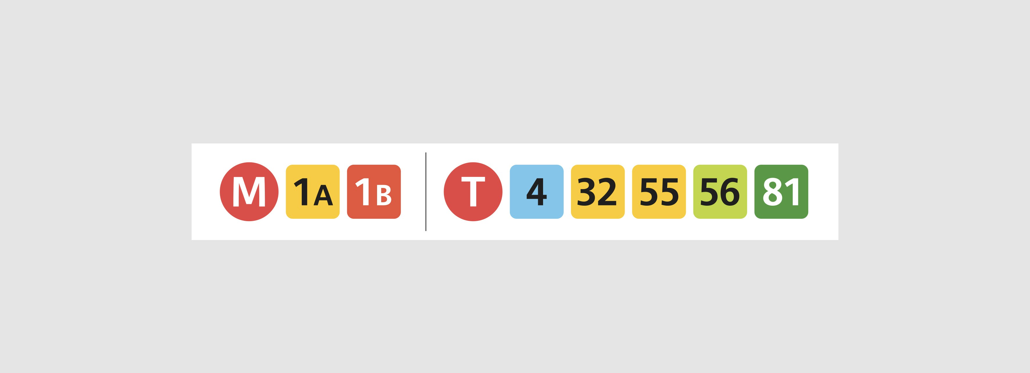


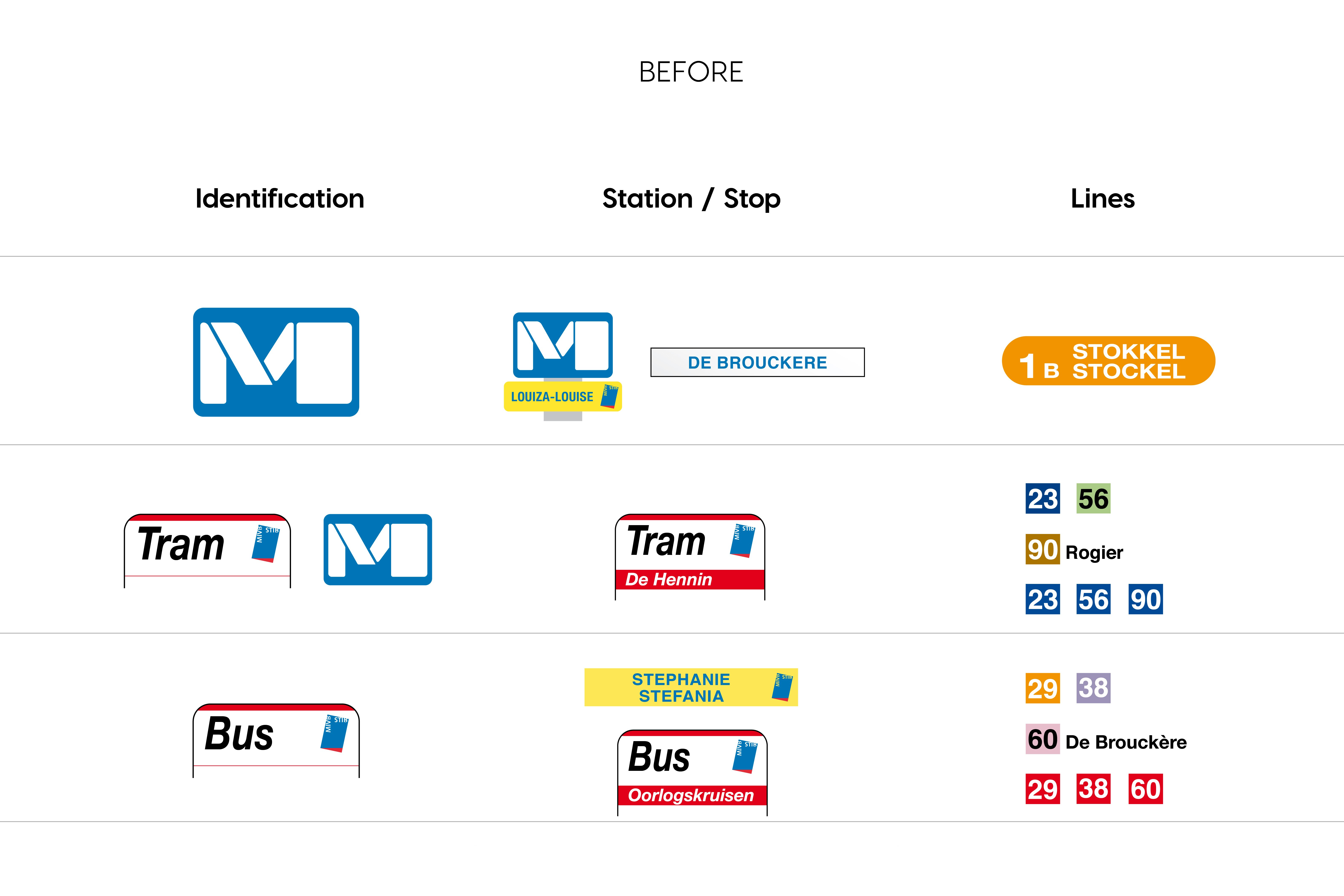
By simplifying the graphic language,
the user can more easily identify
the modes and lines.


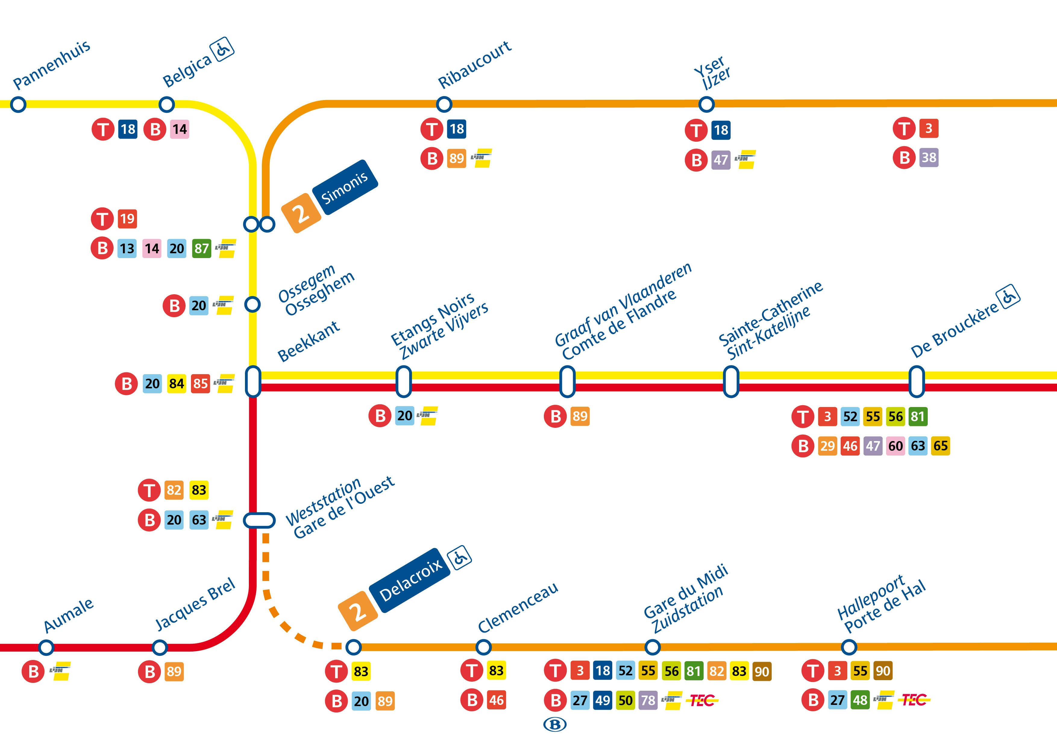
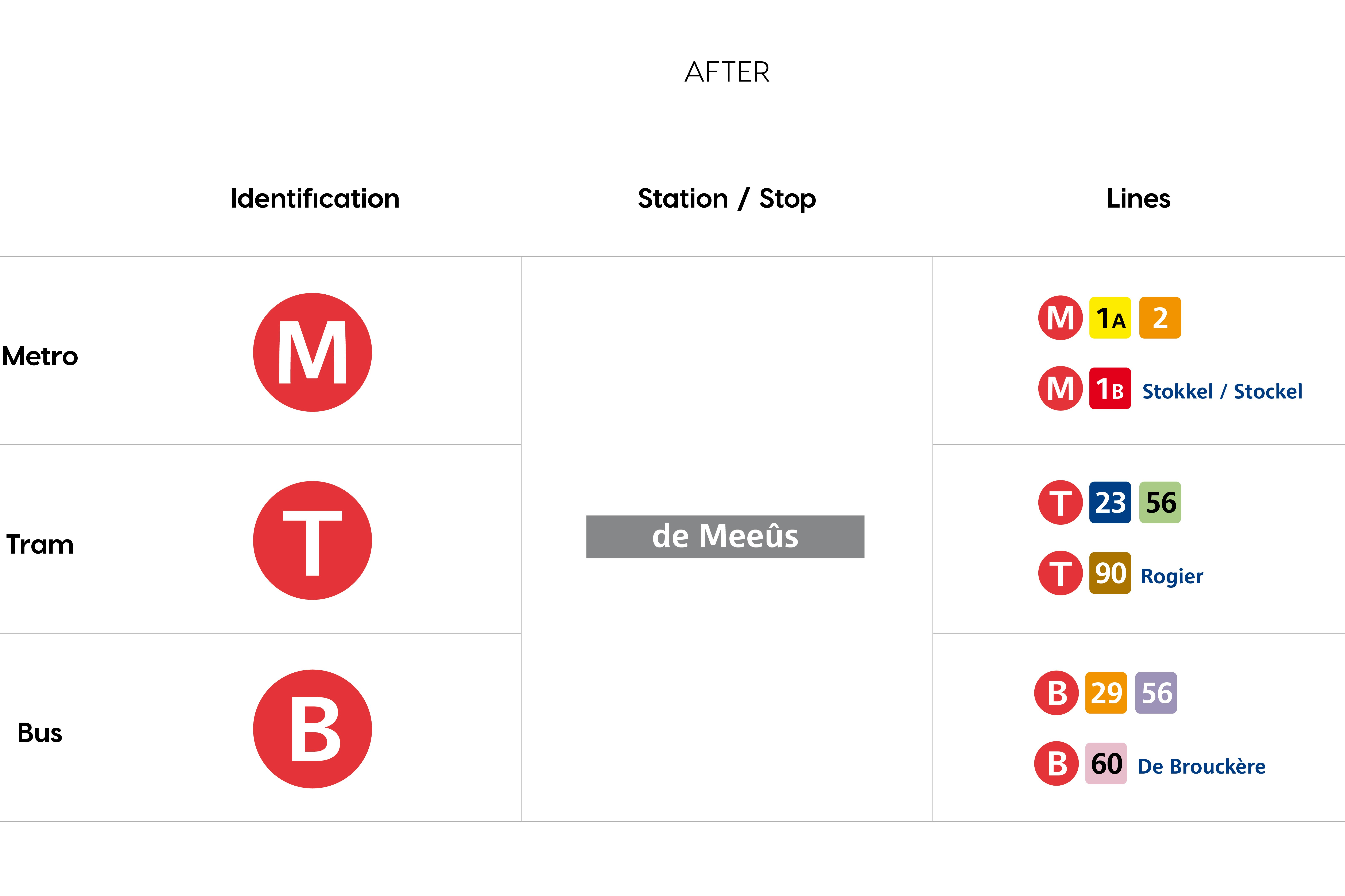
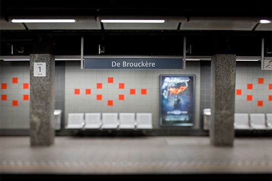
Establishing a hierarchy for the information and using crisper colours makes for a more readable and contemporary system.


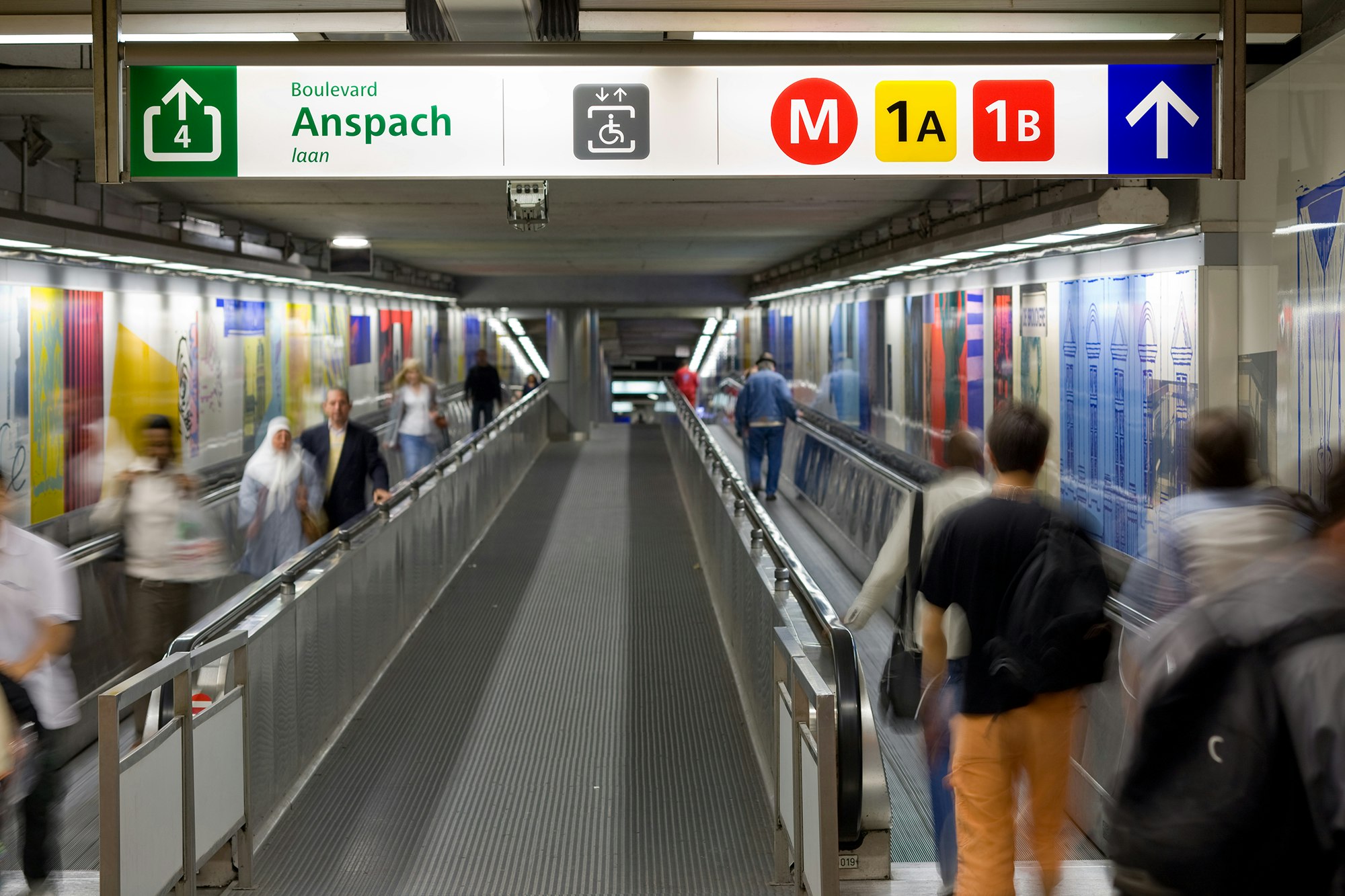


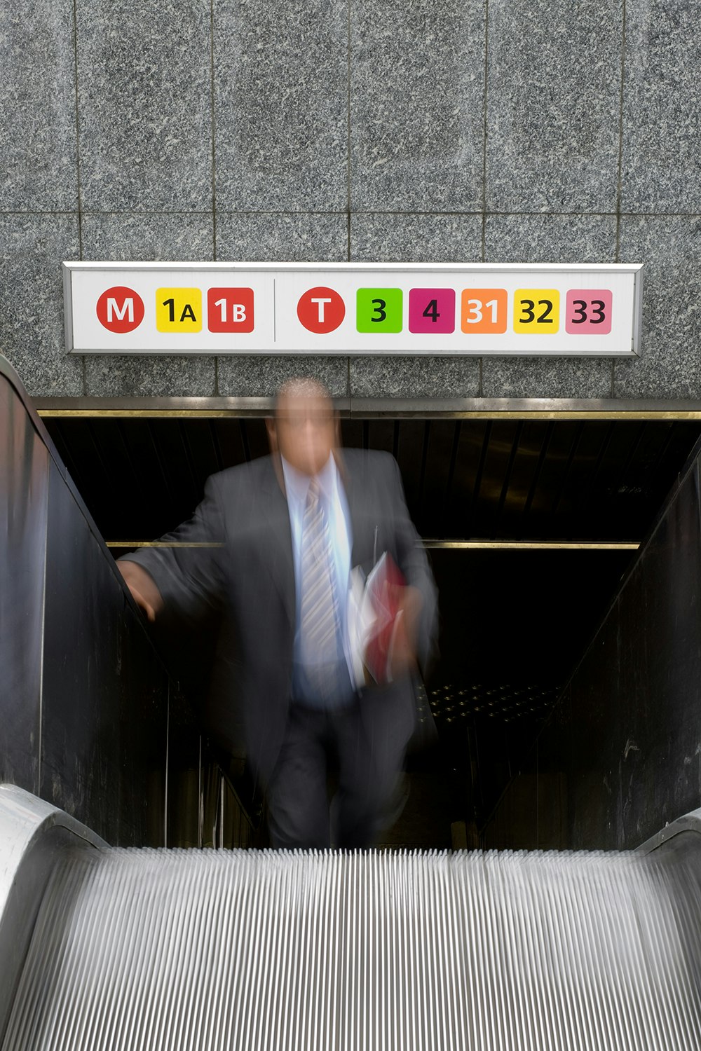


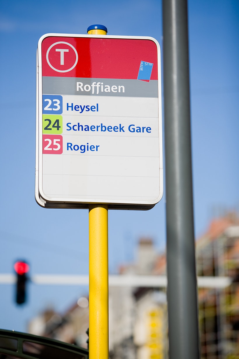
Any given panel gives only the relevant information in order to declutter and make understanding the information more immediate. Colour codes are coherent with those used on the map of the system.
The colour red is used to identify the panel and the mode of transport from a distance, which is the first information a user is interested in understanding. Then comes the line number and destination followed by the actual stop at which the panel is situated.


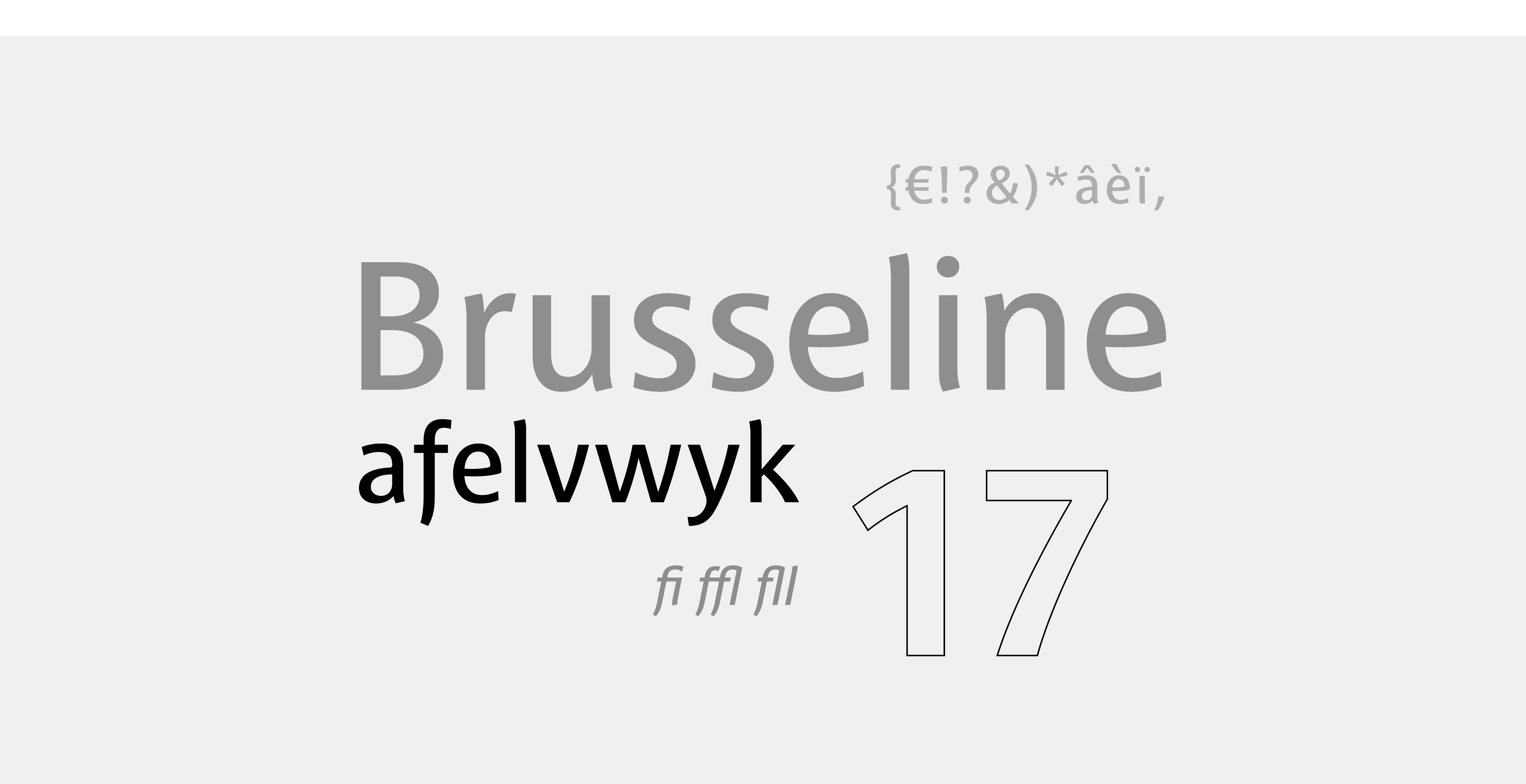
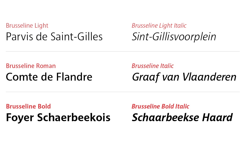
The Brusseline font was developed especially for the STIB, it is an efficient, clean typeface with an ever so subtle reference to the Art Nouveau style for which Brussels was one of the main capitals.


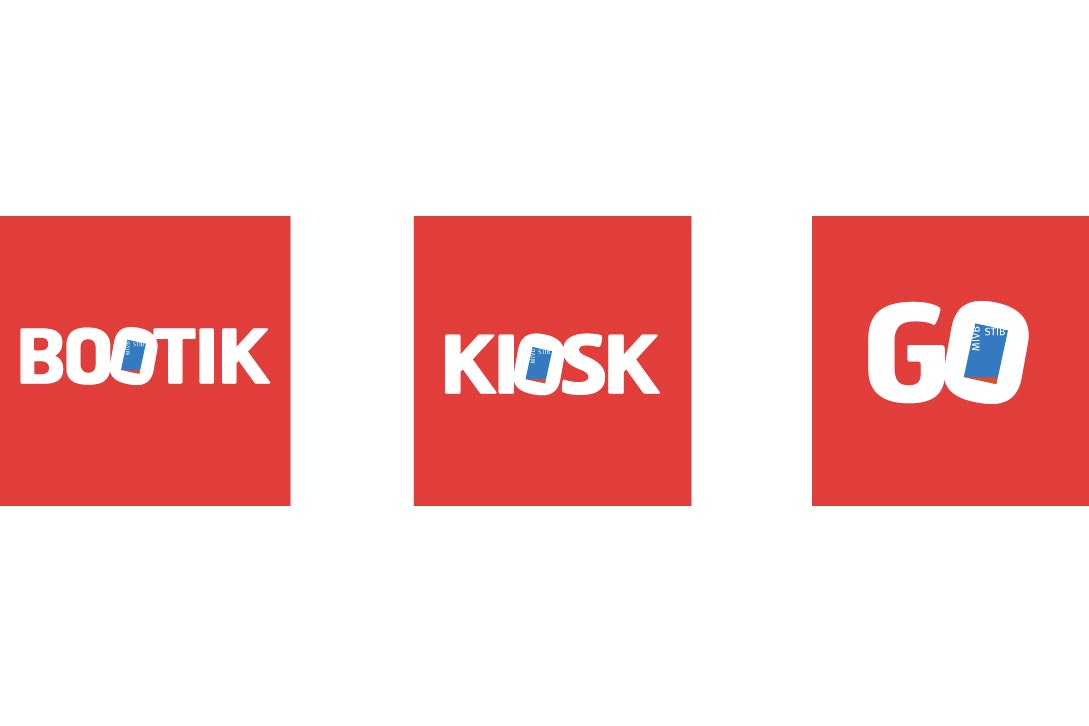
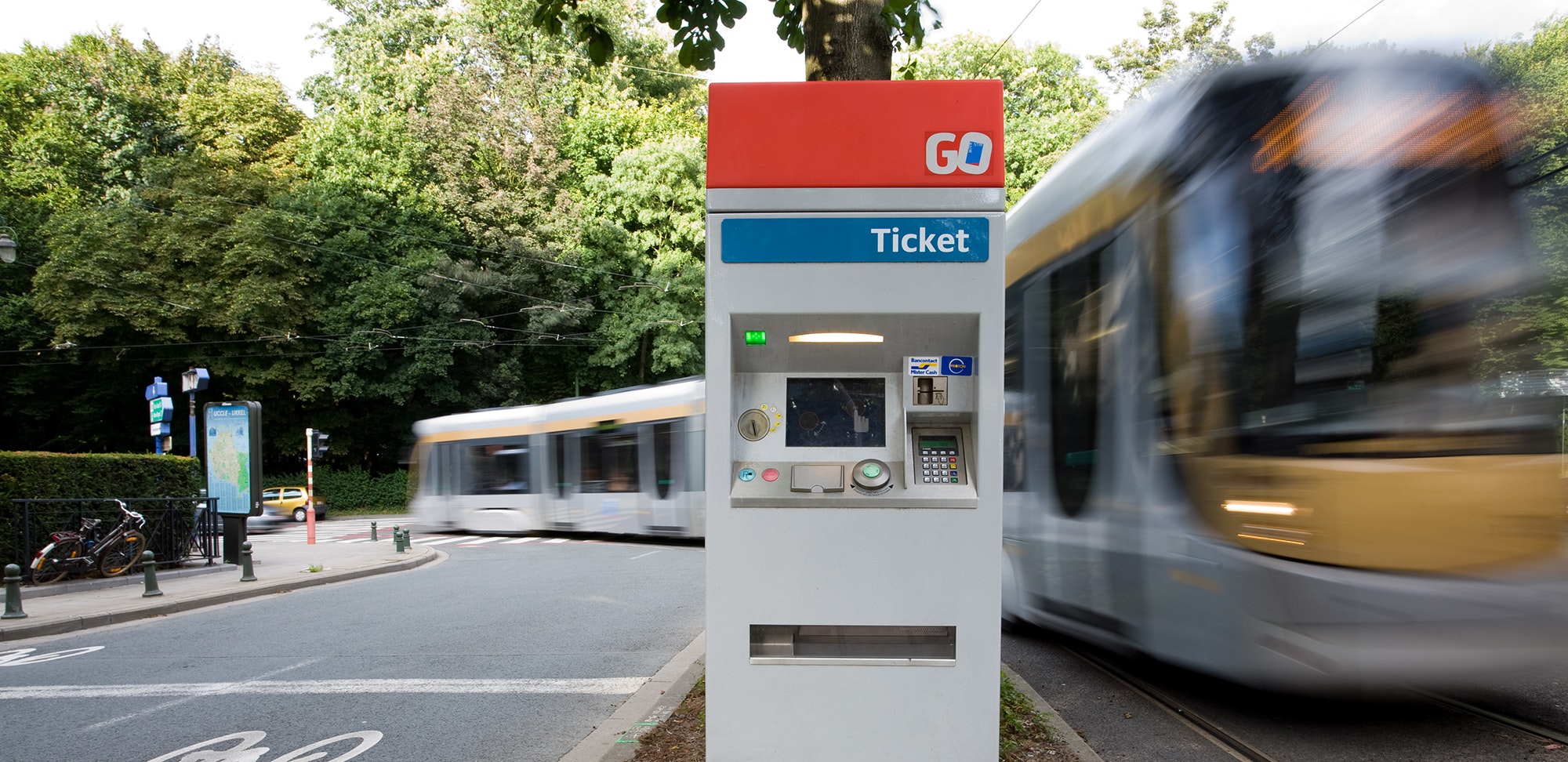
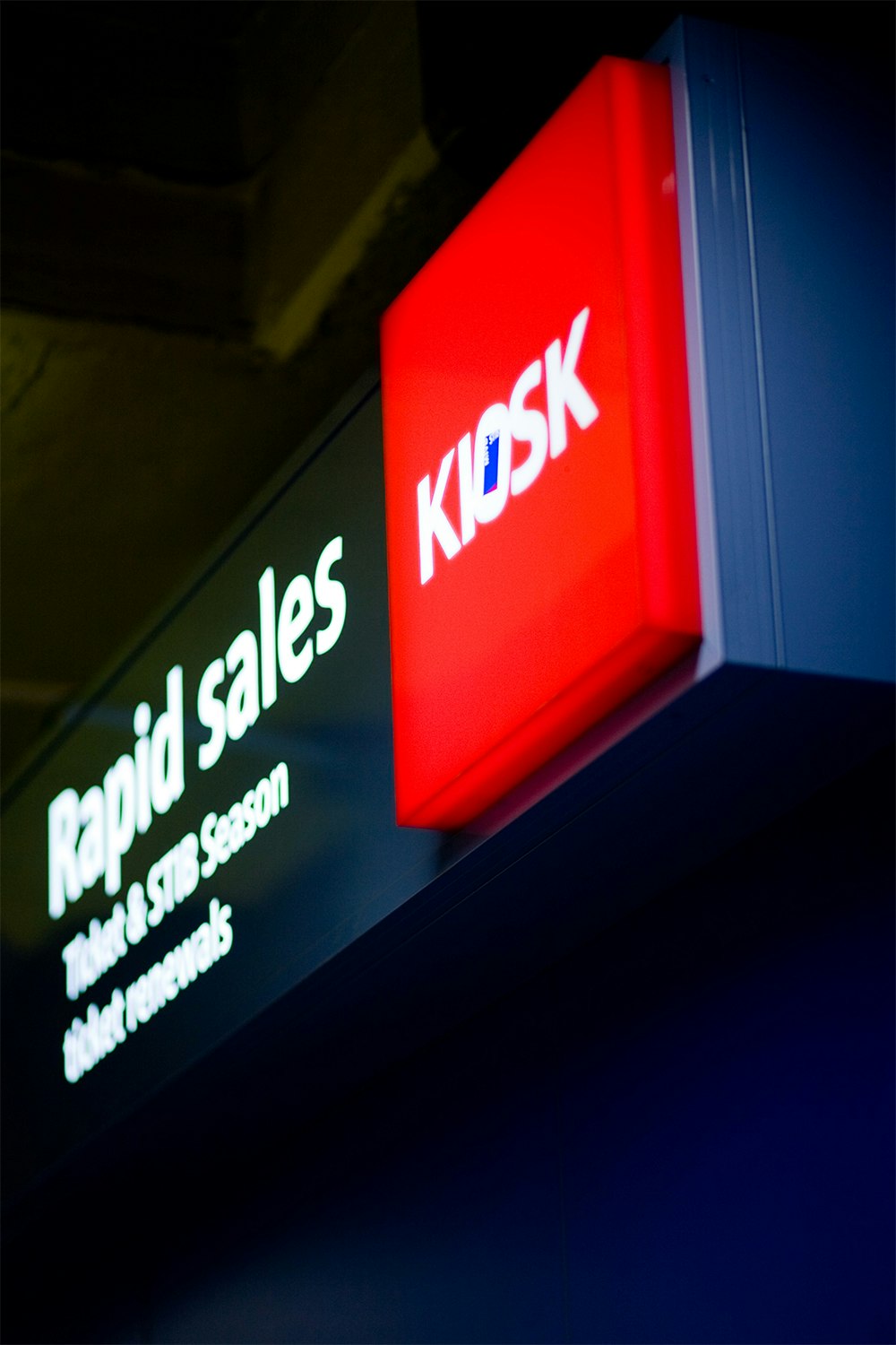
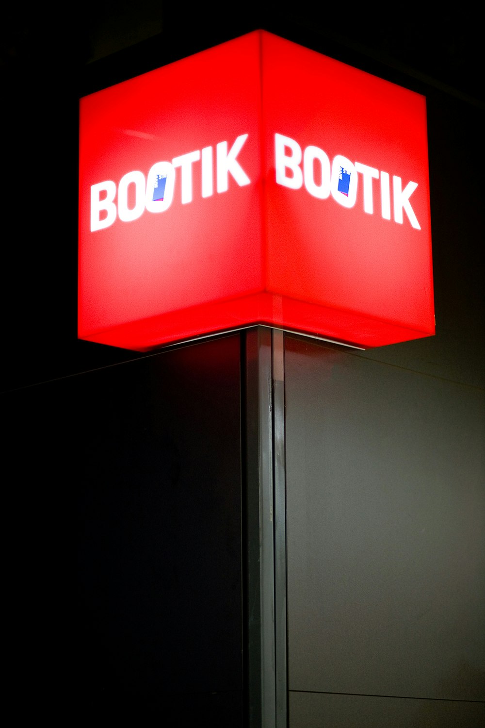
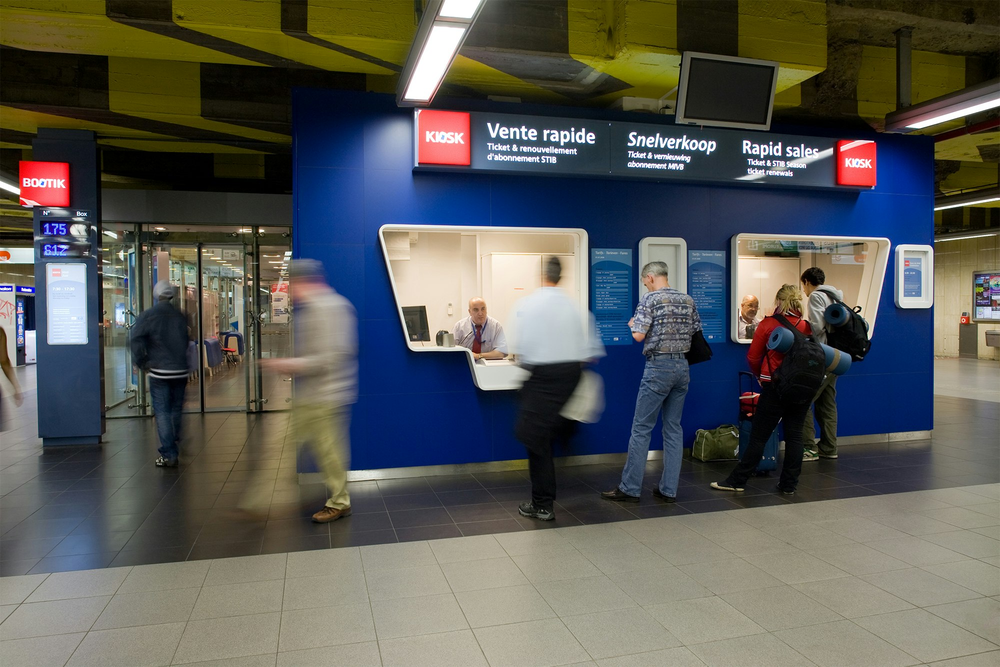
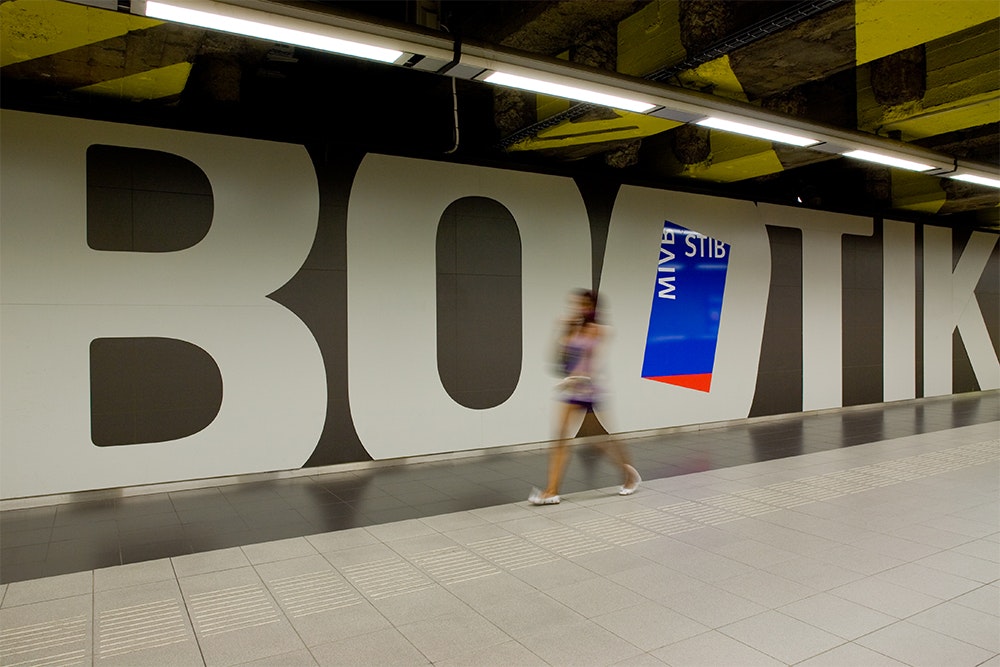
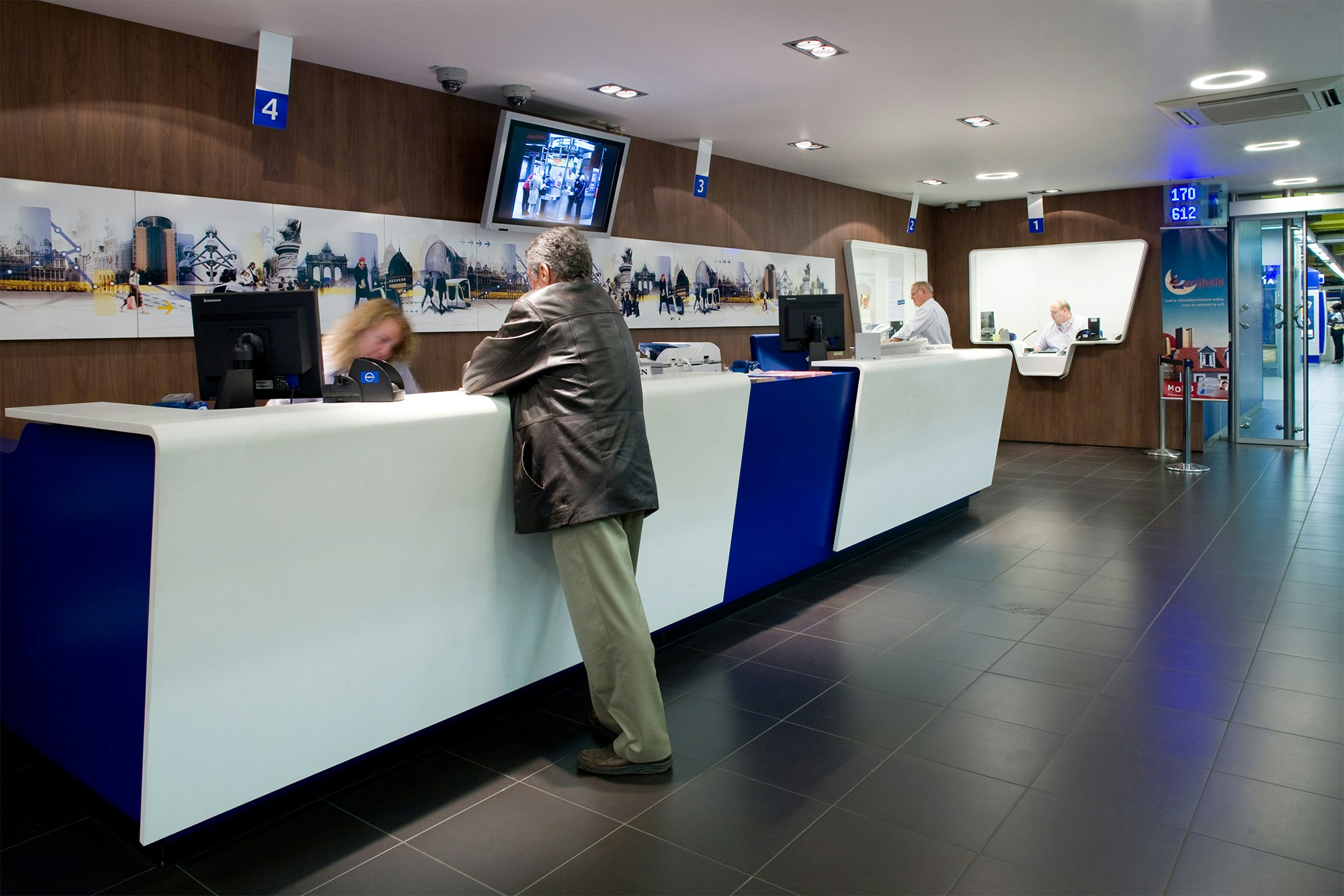
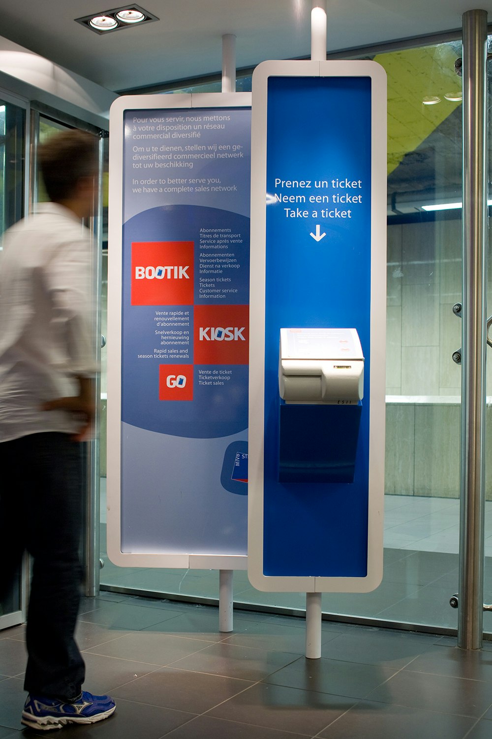
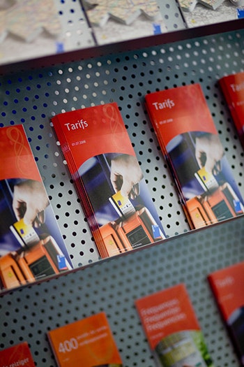
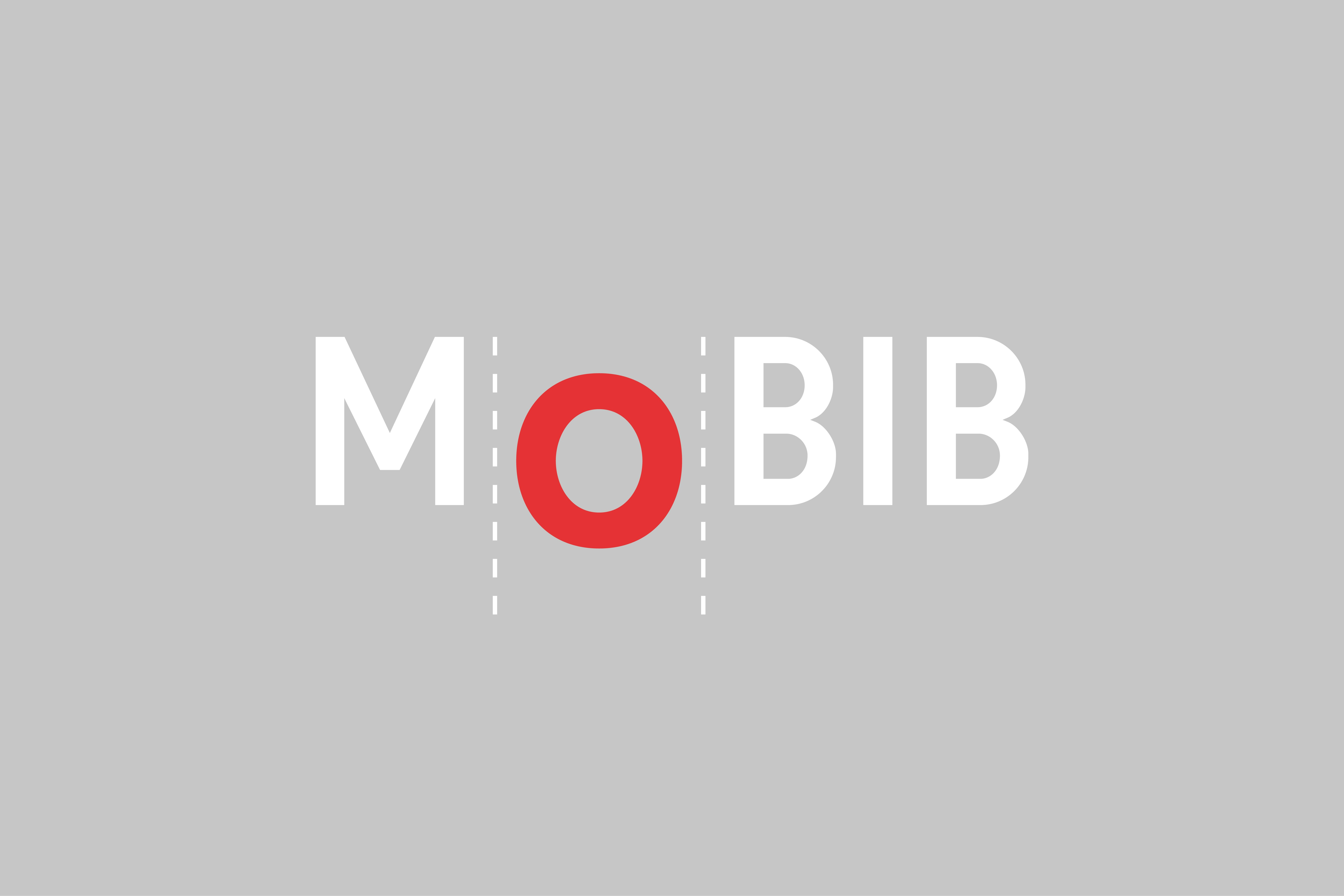
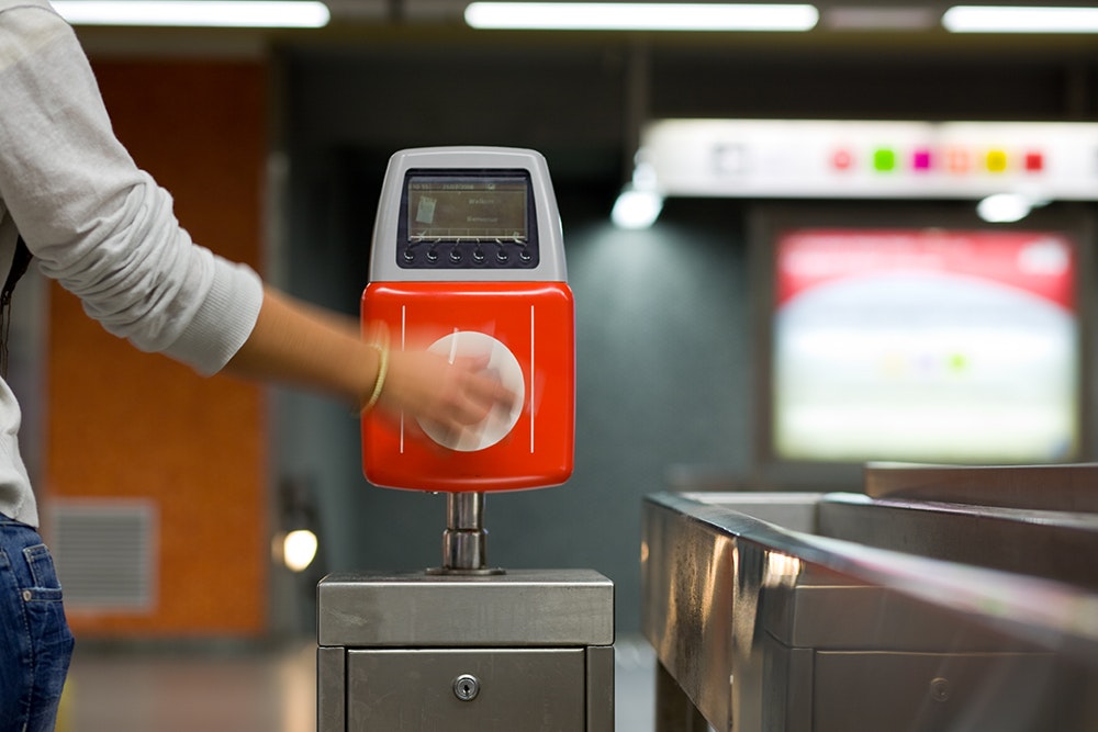
Besides tackling the major way finding project, Minale Design Strategy has also helped the STIB to enhance the customer journey by naming and designing the points of contact such as Bootik, Kiosk and Go points and other services such as night services or the Mobib travel card.