Delhaize
The country's local grocer.
For the past 10 years now we have been developping the retail concepts for Delhaize who is one of Belgium's prime supermarket players. How? Through close and constant collaboration based on respect and knowledge sharing. From supermarkets to local convenience stores and "food to go". Every format has its own unique concept and customer esperience.
Industries
- Supermarkets.
Skills
- Strategy,
- Brand Design,
- Naming,
- Retail Design,
- Packaging.

Challenge
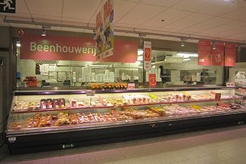
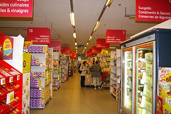
How to position each Delhaize format in a crowded and competitive environment? How to match the best strategy in ordr to meet the needs of todays' consumer? How to deliver the appropirate customer experience for each format, while serving the Delhaize brand? The starting point for our thinking was the history of Delhaize and its value proposition: "Standing by real life"
Solution
Organize and design different kind of shops: Inhouse Supermarket (DLL), affiliated supermarket (AD DLL), proximity (Proxy DLL), on the go (Shop&Go DLL). Convinced that eating better is at the heart of a better life, Delhaize is adopting an advisory approach, far from the cliché of a moralising brand.. to illustrate this, the stores are easy and comfortable to roam. Named and designed by Minale Design Strategy, each format serves the brands' mission strategy - health, taste and the notions of comfort and accessibility.

Brand architecture
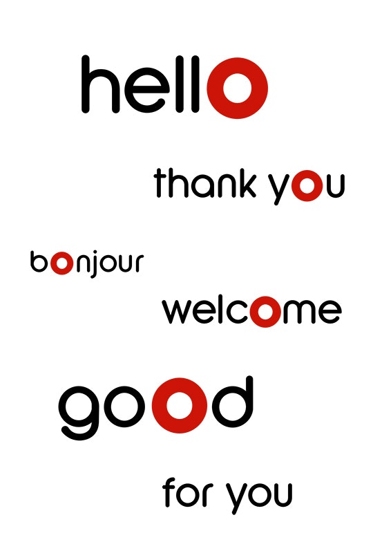
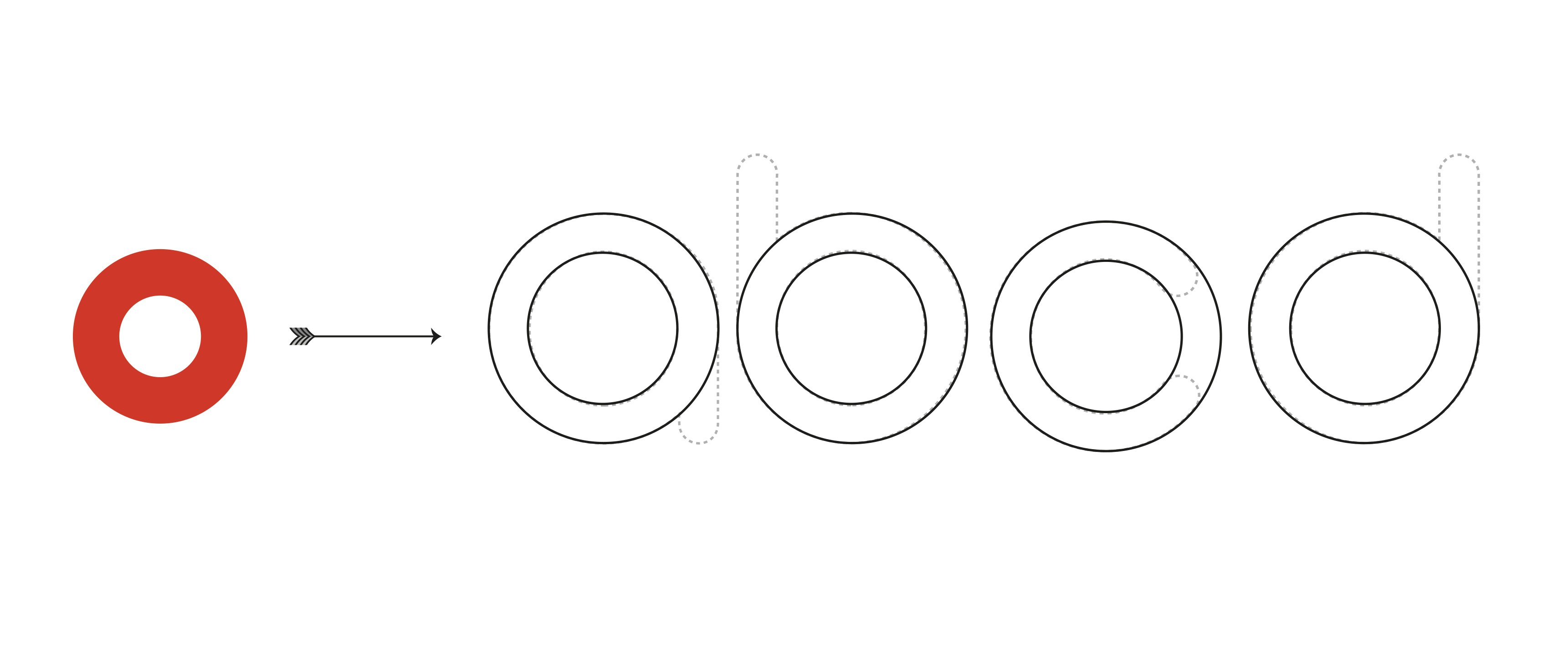
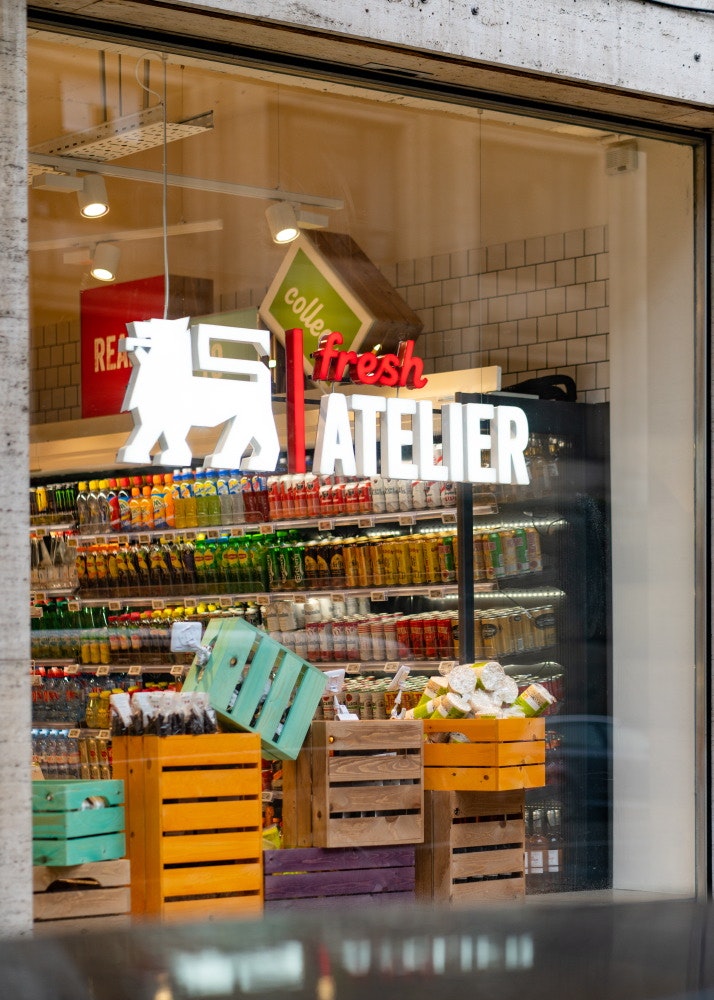
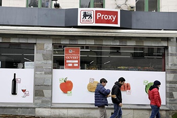
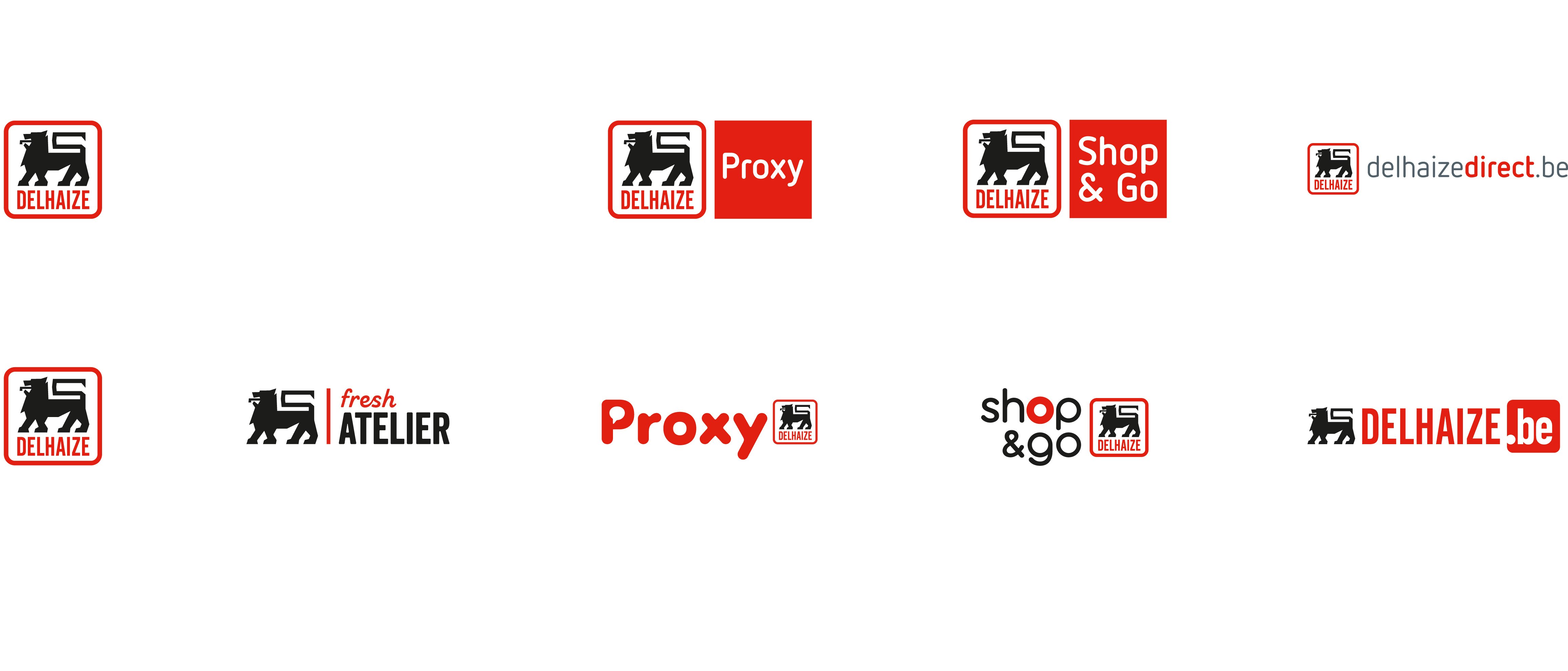
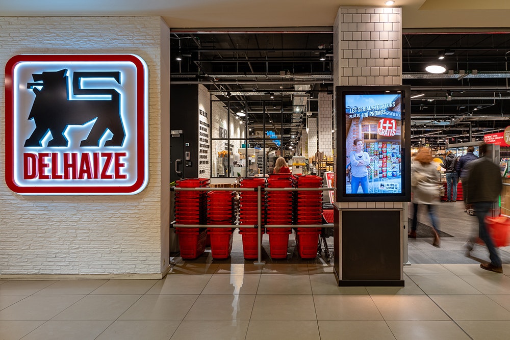
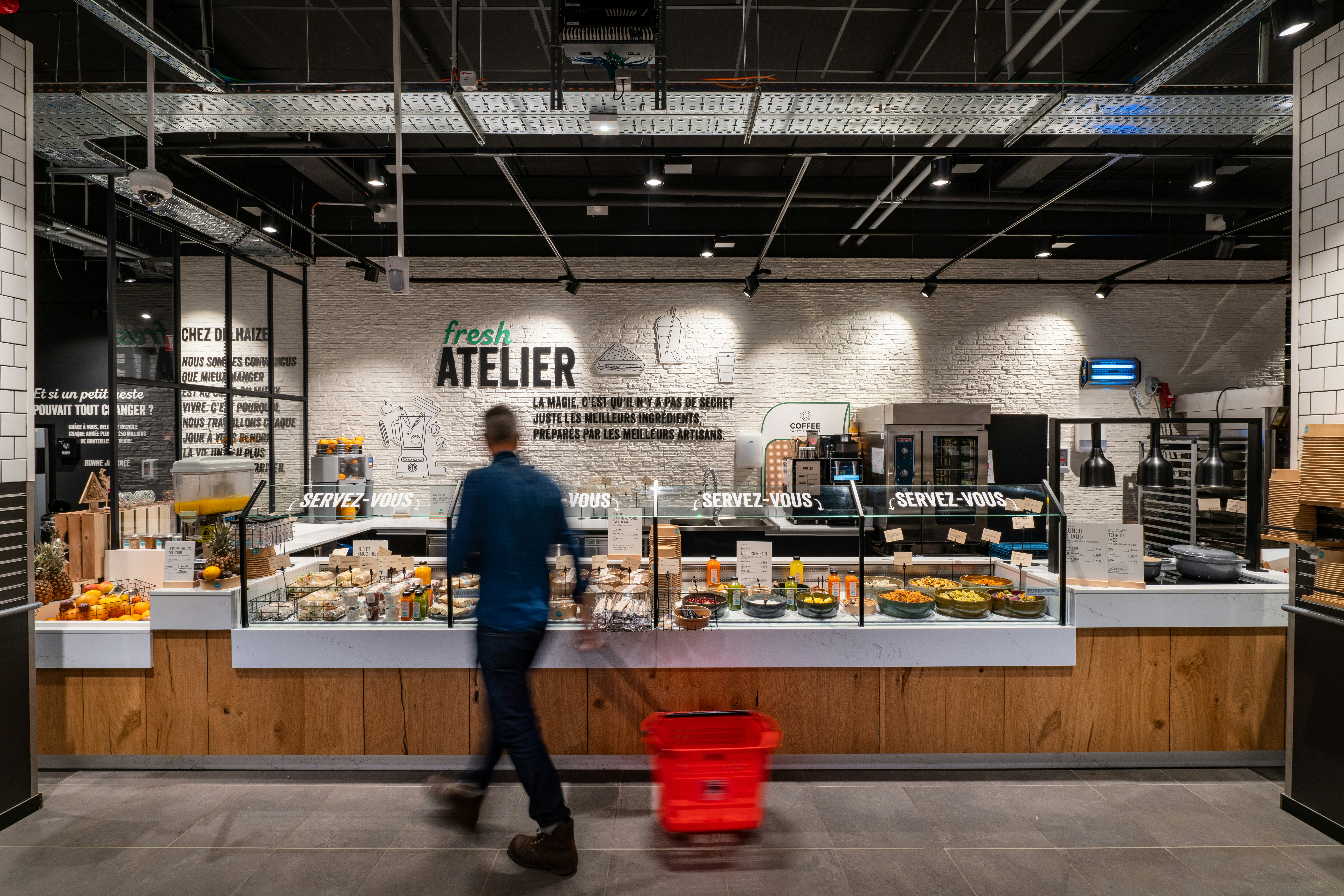
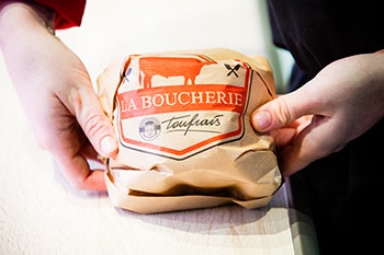
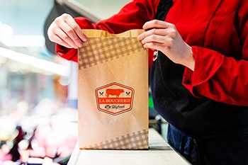
Our retail expertise helped Delhaize to adopt contemporary and pertinent concepts. Brand strategy takes on a real meaning in such details as allowing the new brand for Proxy Delhaize to stand out and work to seve the concept. To help this, Delhaize Proxy becom Proxy Delhaize. Delhaize Shop&Go become Shop&Go Delhaize, Fresh Atelier has been created as a new urban format on the go and, Delhaize Direct become Delhaize.be. The logos are at the service of the subject, the visual identity stands out and makes sense in our daily lives.
Supermarket, the latest format
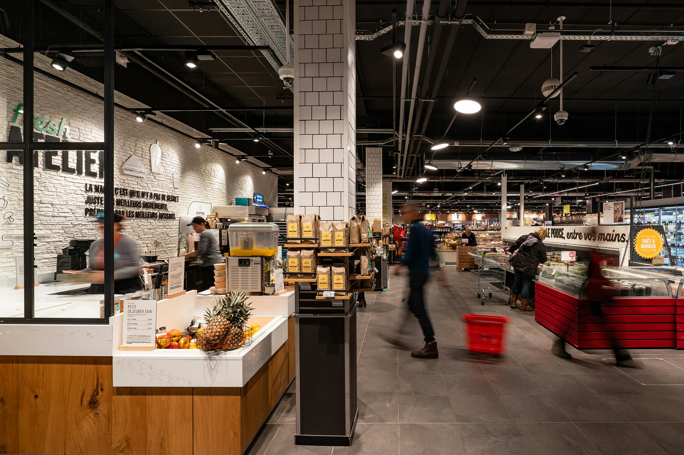
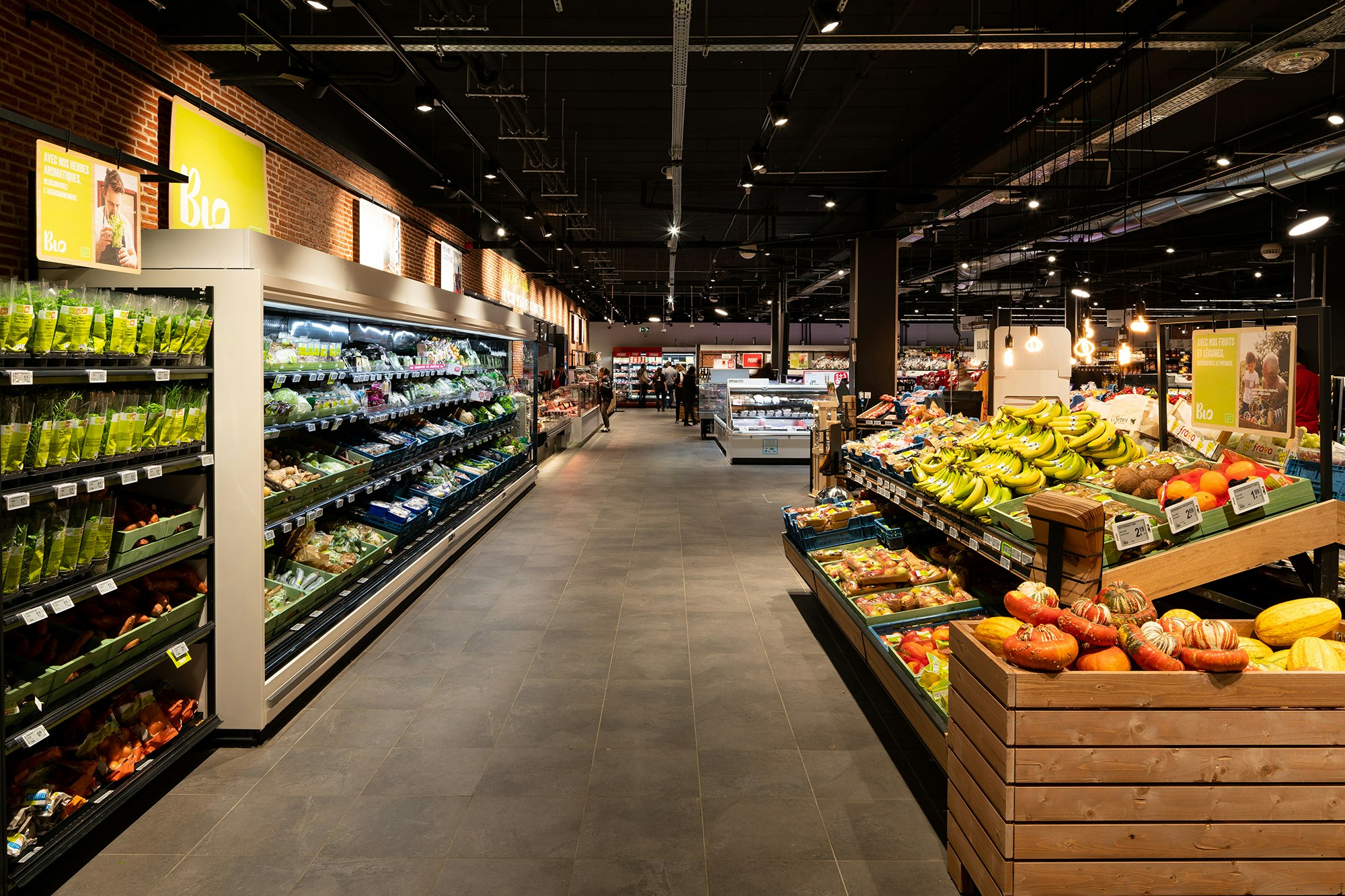
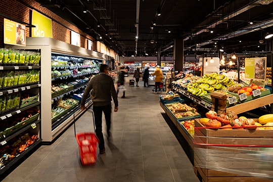
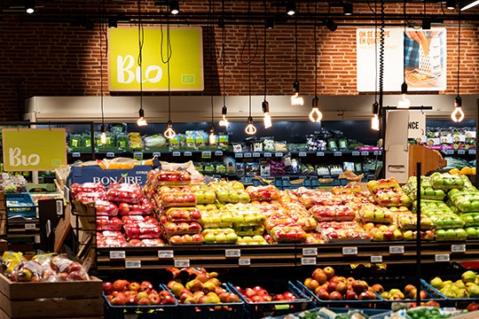
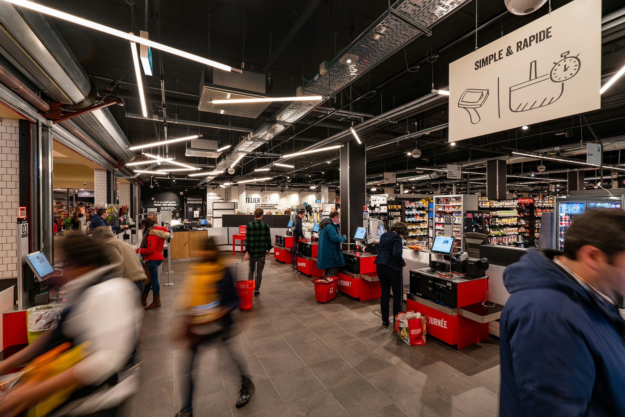
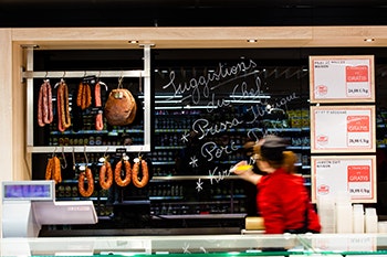
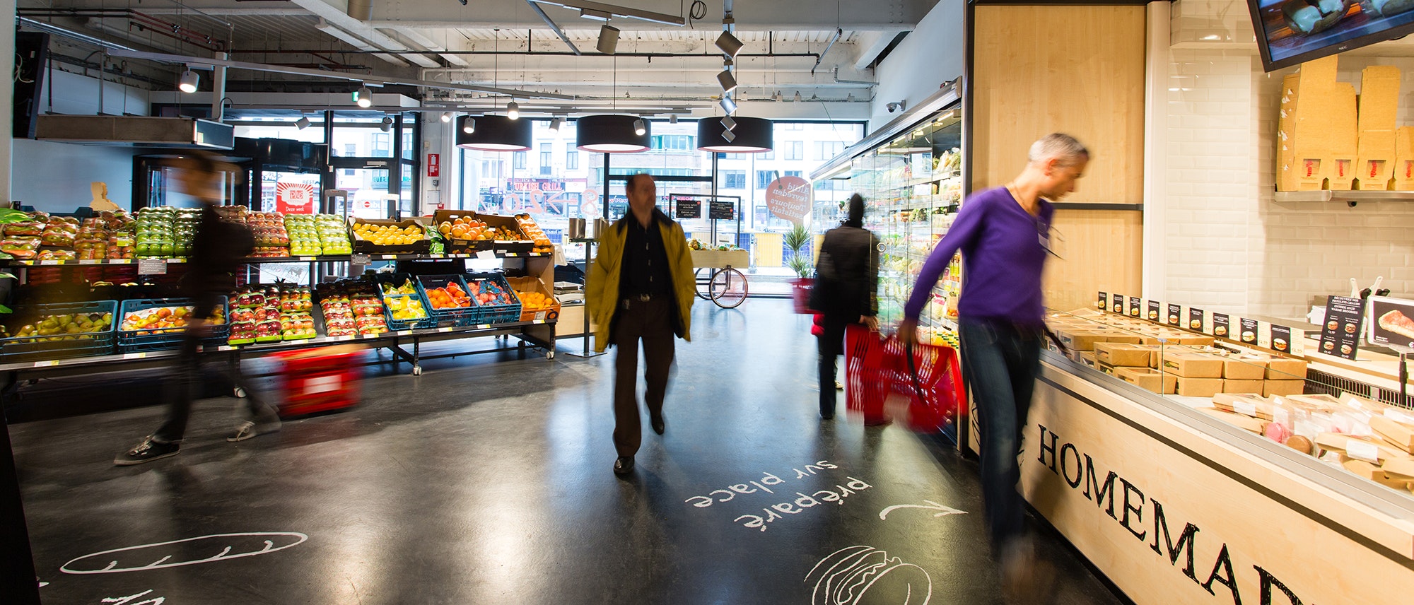
From the entrance to the store, a fresh produce department attracts attention with the open "Fresh Atelier". Fresh produce modules inspire with an "on the go" approach, just like a visit to the market. The overall organisation makes the store completely readable, enhancing the fruit and vegetable zone as well as the workshops in the back of the store, creating a uniform, inspiring and comfortable atmosphere. The "triangle frais" is the center of the shop, far from classical presentation.

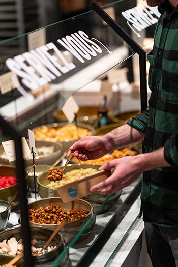
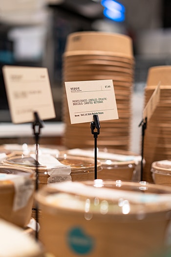
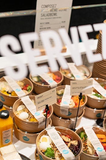
A graphic, informal and spontaneous style
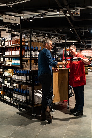
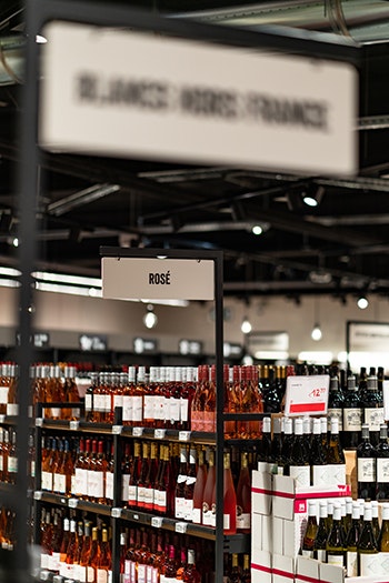
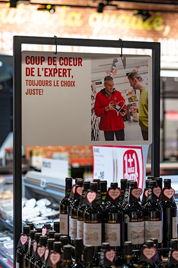
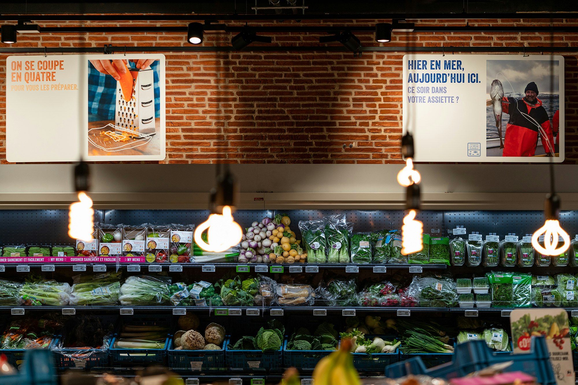
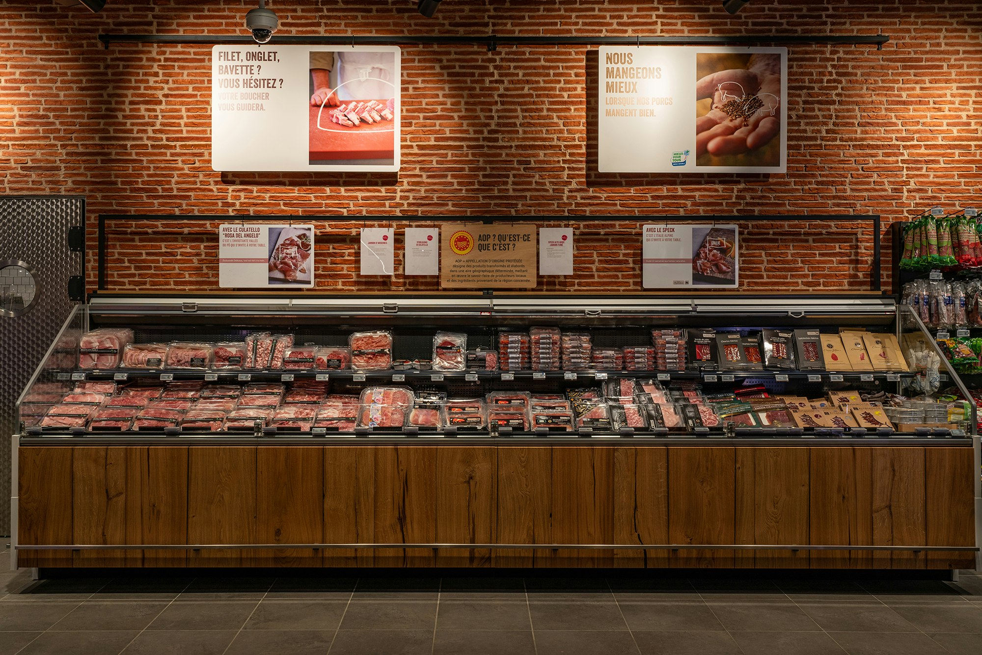
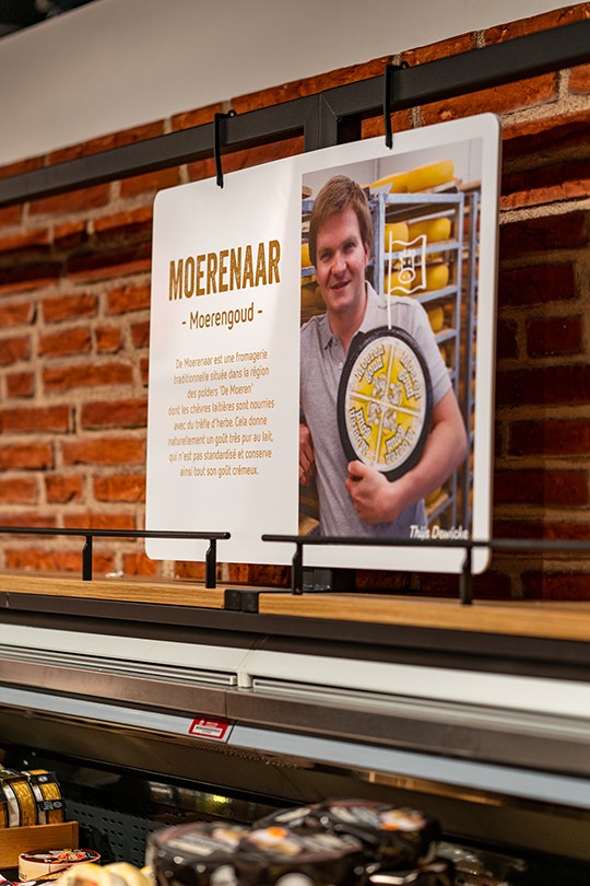
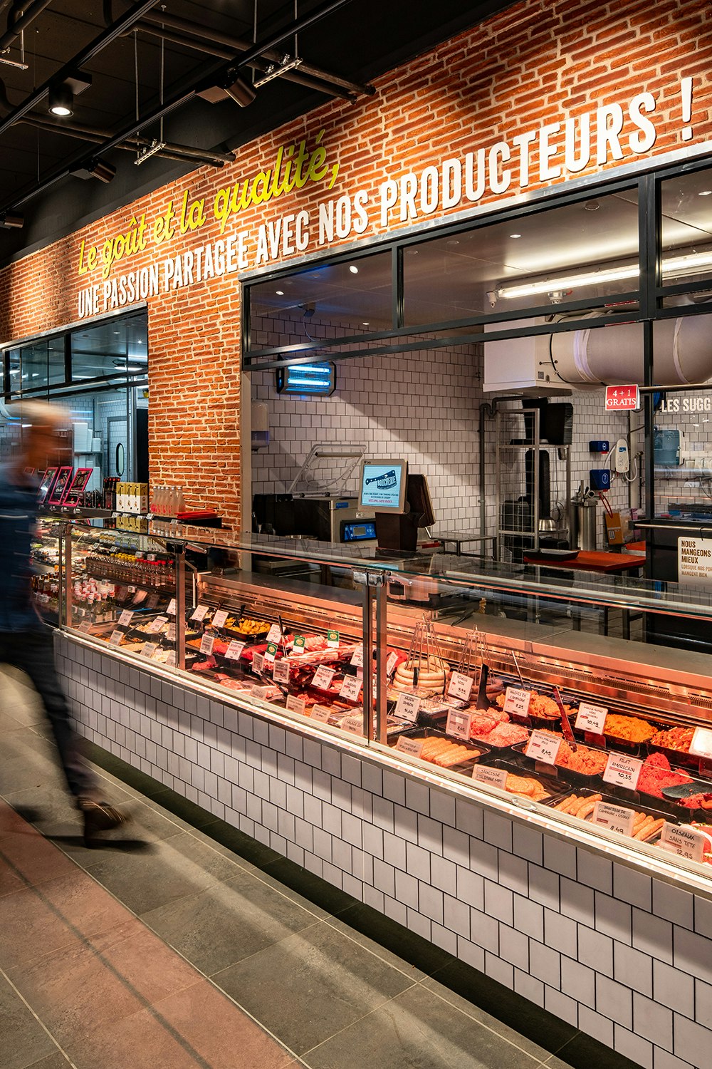
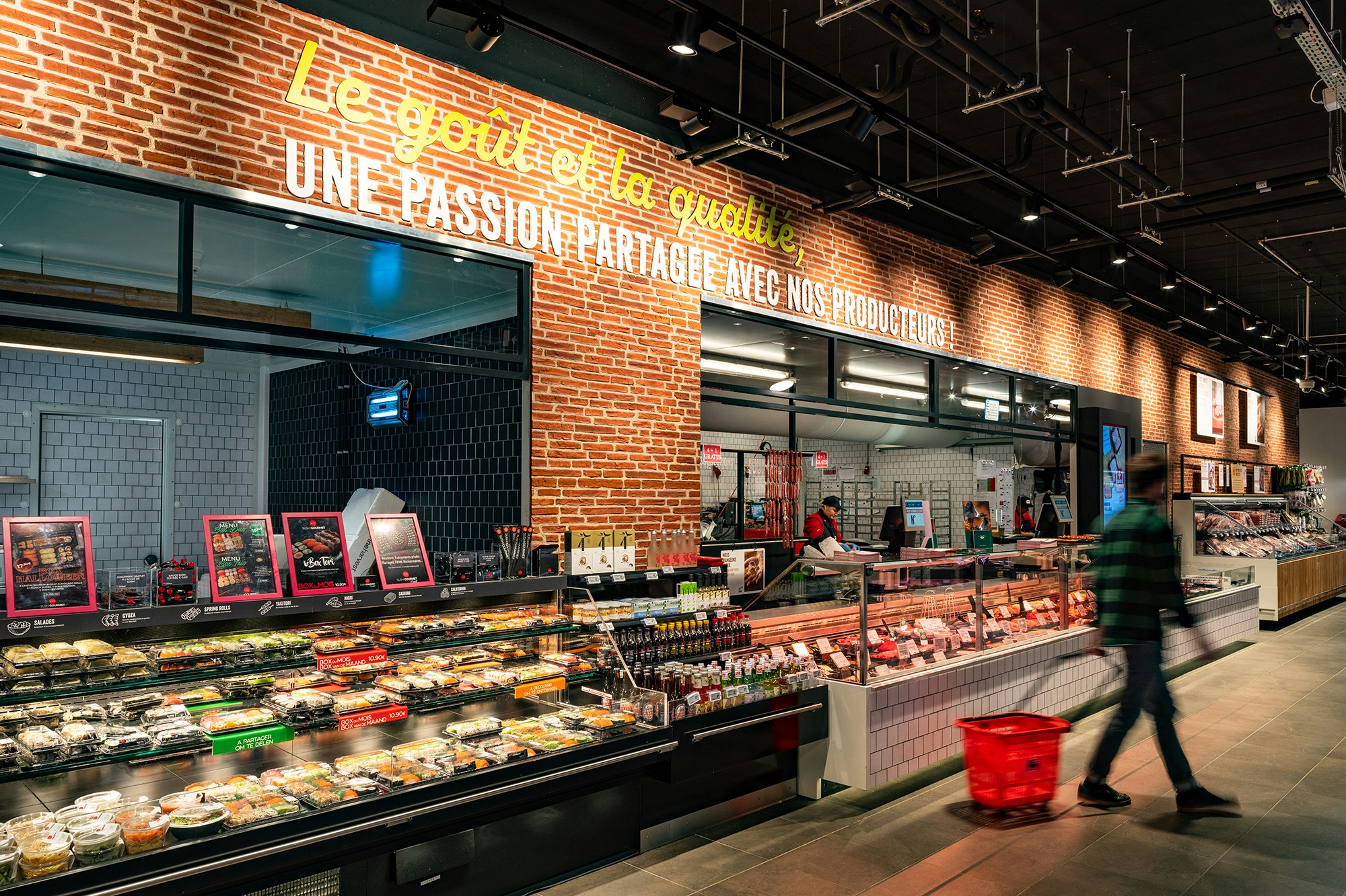
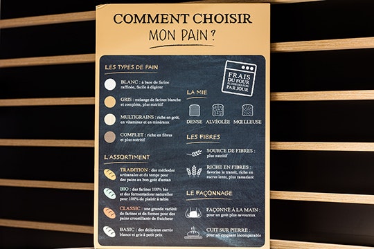
Designed as an authentic store, the graphic elements have been developed in order to increase legibility and clear pricing. The wood finish, the red and white brick walls delineate the workshop spaces, the dark ceiling enhances the warm colour of the floor and adds to the atmosphere.

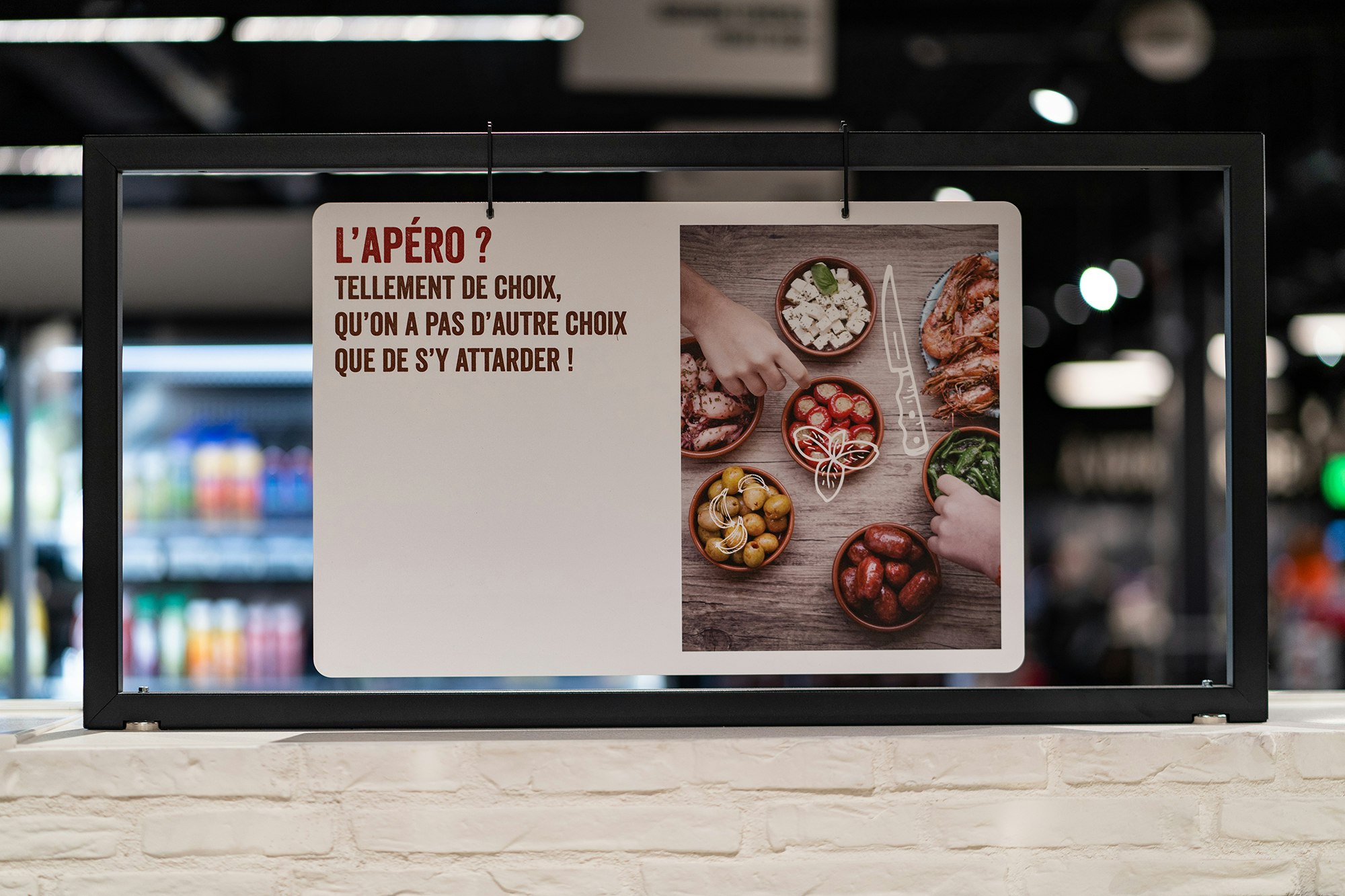





Less codes, more efficiency
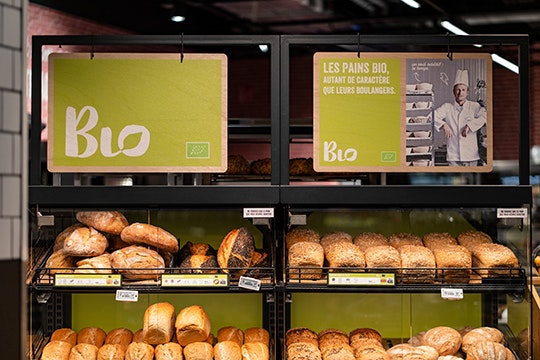
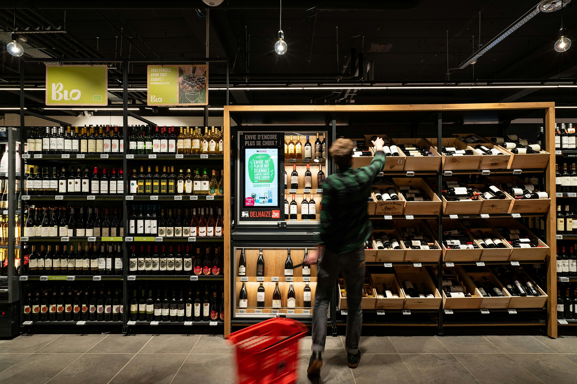
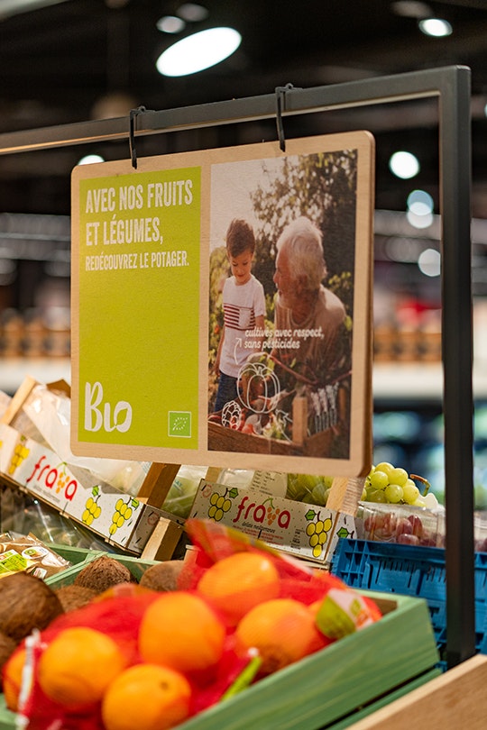
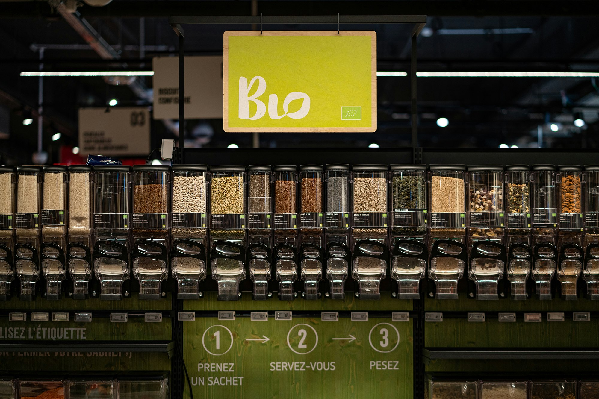
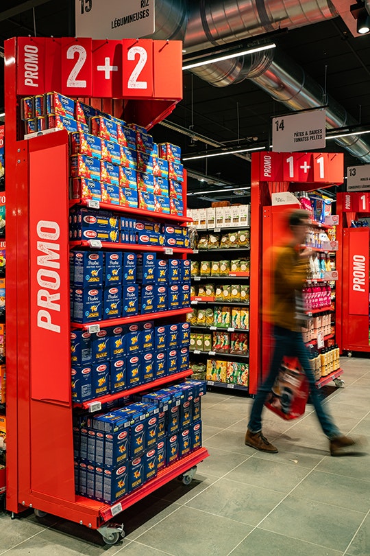
Minale Design Strategy has used elements of the brand as markers in the store. Green stained wood for the organic section, red stained wood for promotions. The identity clearly comes through without affecting the aesthetics, readability and accessibility of the product.

AD Delhaize




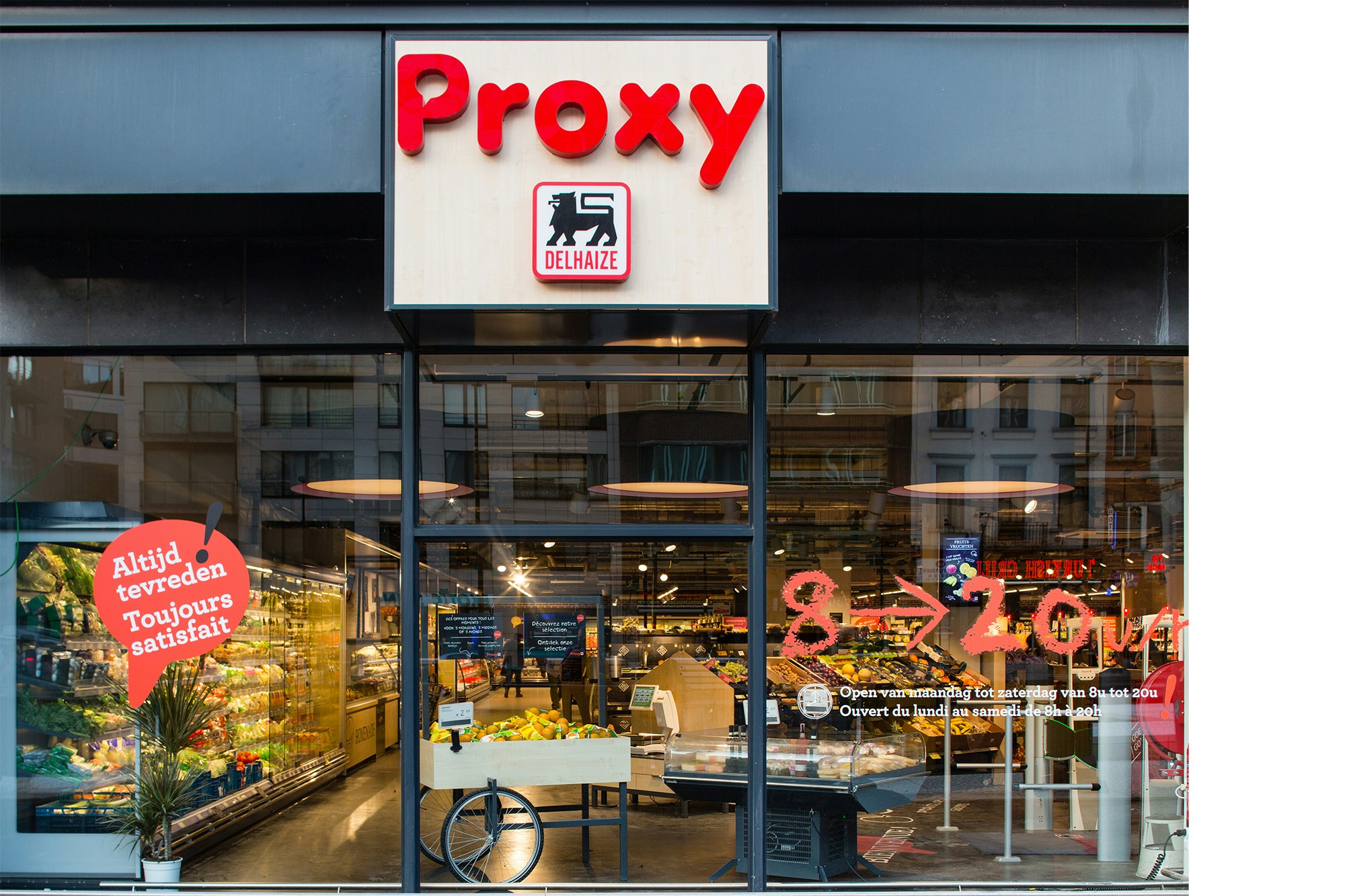
Proxy Delhaize
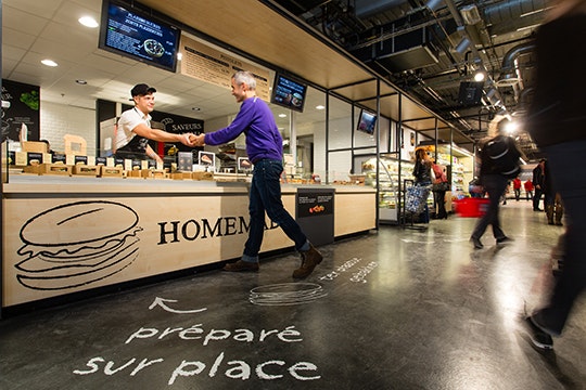
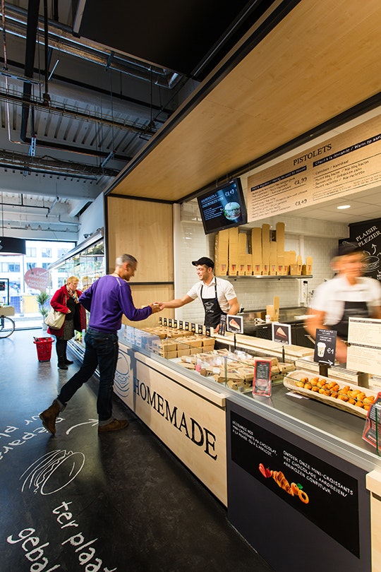
Based on the original ambitions of Delhaize to create a basic supermarket in a format caering to local residents, the idea of proximity is communicated through in-store communication and a warm atmosphere.




Shop&Go
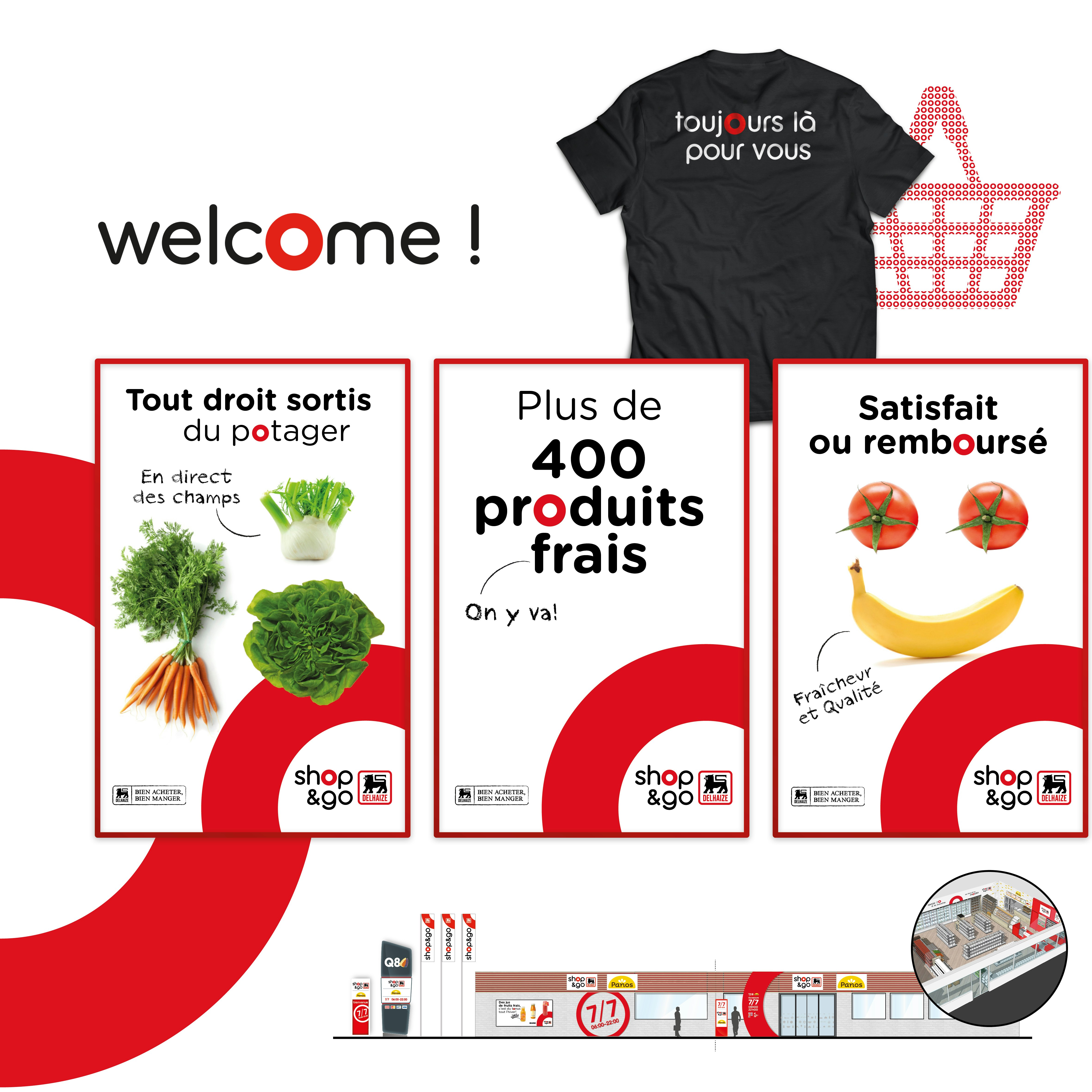
From a standard supermarket format, we developped a new concept for specific locations, an added-value permited by our wide-ranging expertise. The new Shop&Go fits in the mobility setting and highlights on-the-go food and ready-to-eat solutions.

