Andy
Easy peasy drink delivery.
Contaynor becomes "Andy". With a fresh new name and visual identity, this up-and-coming drinks delivery brand is ready to make its mark in a booming market. A brand built for both a physical and fully online approach.
Industries
- Food & Drink,
- Specialised Retail.
Skills
- Strategy,
- Naming,
- Brand Design,
- Digital.
Challenge
Contaynor, a young drinks delivery company created in 2019, is a 100% digital brand that's beginning to thrive. Having initially launched its visual identity on its own, Contaynor has now realised the importance of specialist support. Clearly, in a fast-growing market like this, packed with new, ultra-fast delivery services, it is important to stand out. For Contaynor, one thing quickly became clear: They needed a less industrial, more revealing name, with a more playful visual identity reflecting their corporate values, and a website offering an optimised UX and UI.
Solution
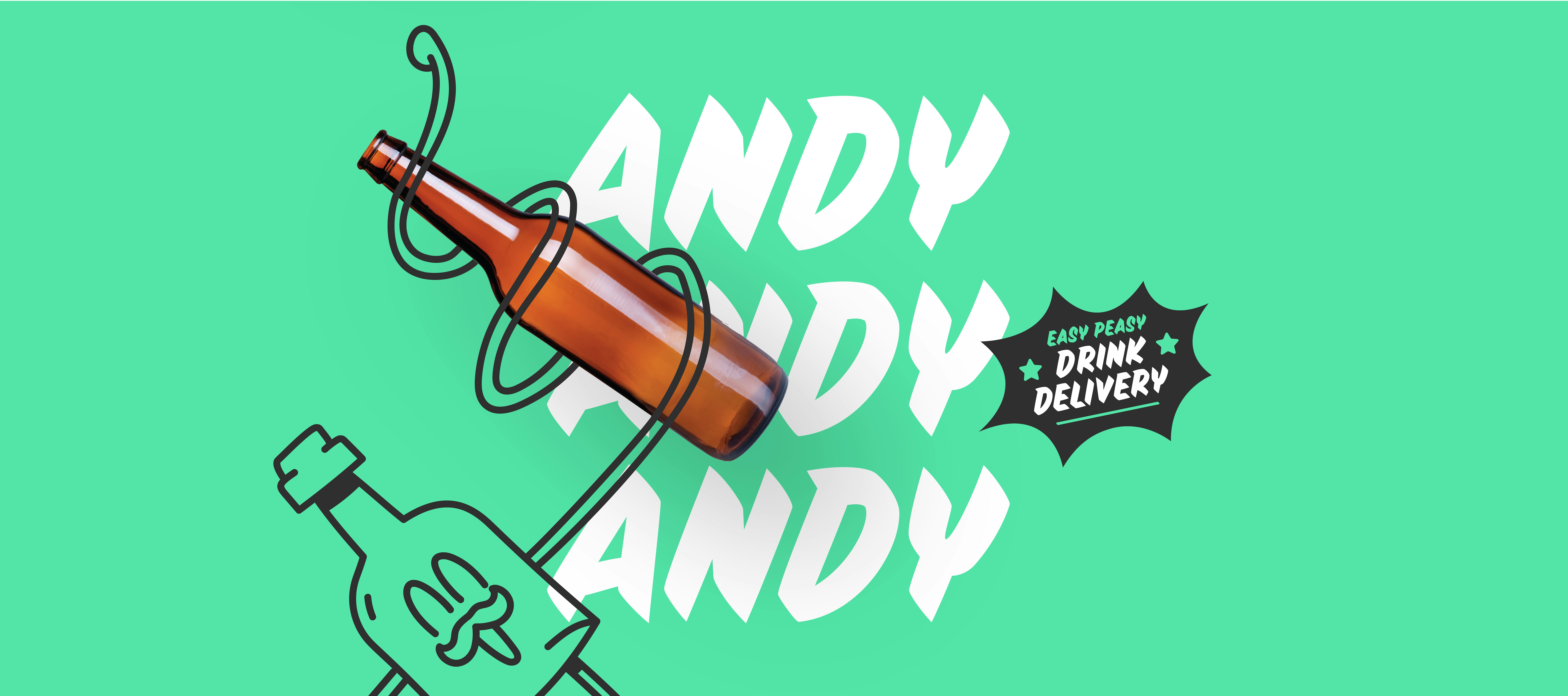
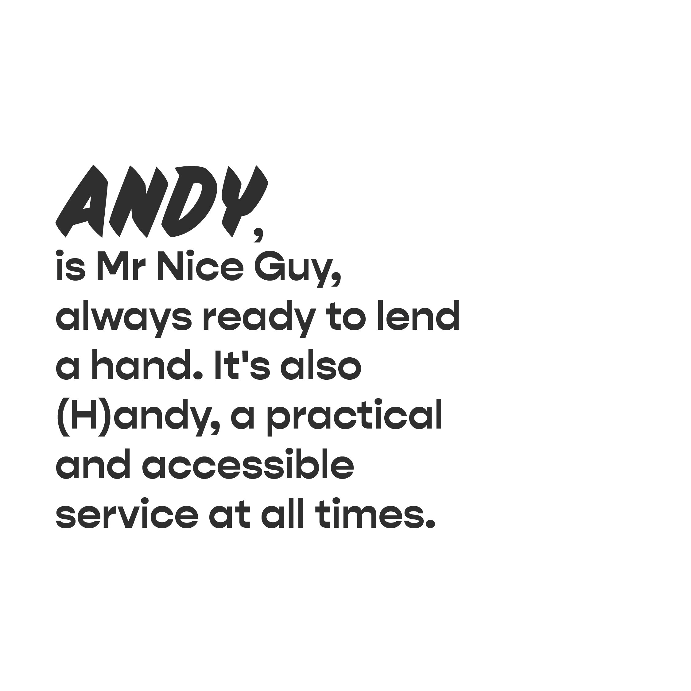
Reinforcing the brand's foundations by defining its positioning, its values and its purpose. This work then served as the basis for the creation of a new name that is more evocative and above all, more human... Andy. Creating a strong visual identity, enriched by various graphic design components such as brand colours, a mascot and a sticker system. Using all of these aspects combined, the website was given a makeover to make it more fun, attractive and ergonomic.

The modern milkman
Andy's ideal positioning quickly emerged: The Modern Milkman. That's right, that age-old profession that Andy is ready to bring bang up-to-date. Beyond its positioning, the Andy brand is built around four key values: convenient, fresh, neighbourly & inherently sustainable.
No logo & bold typography
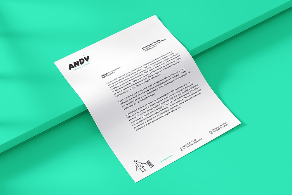
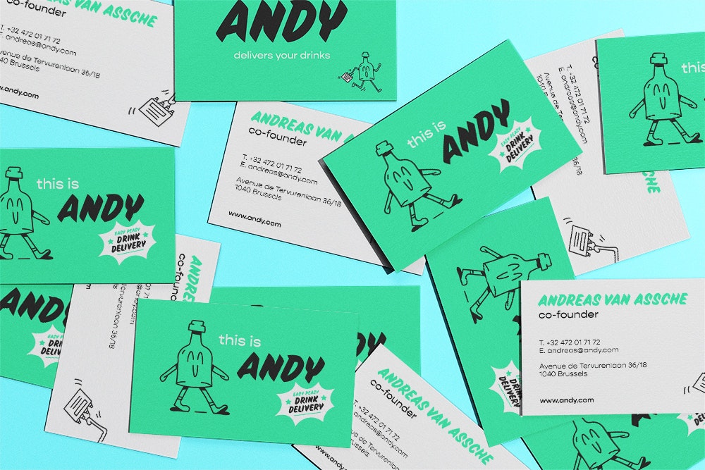
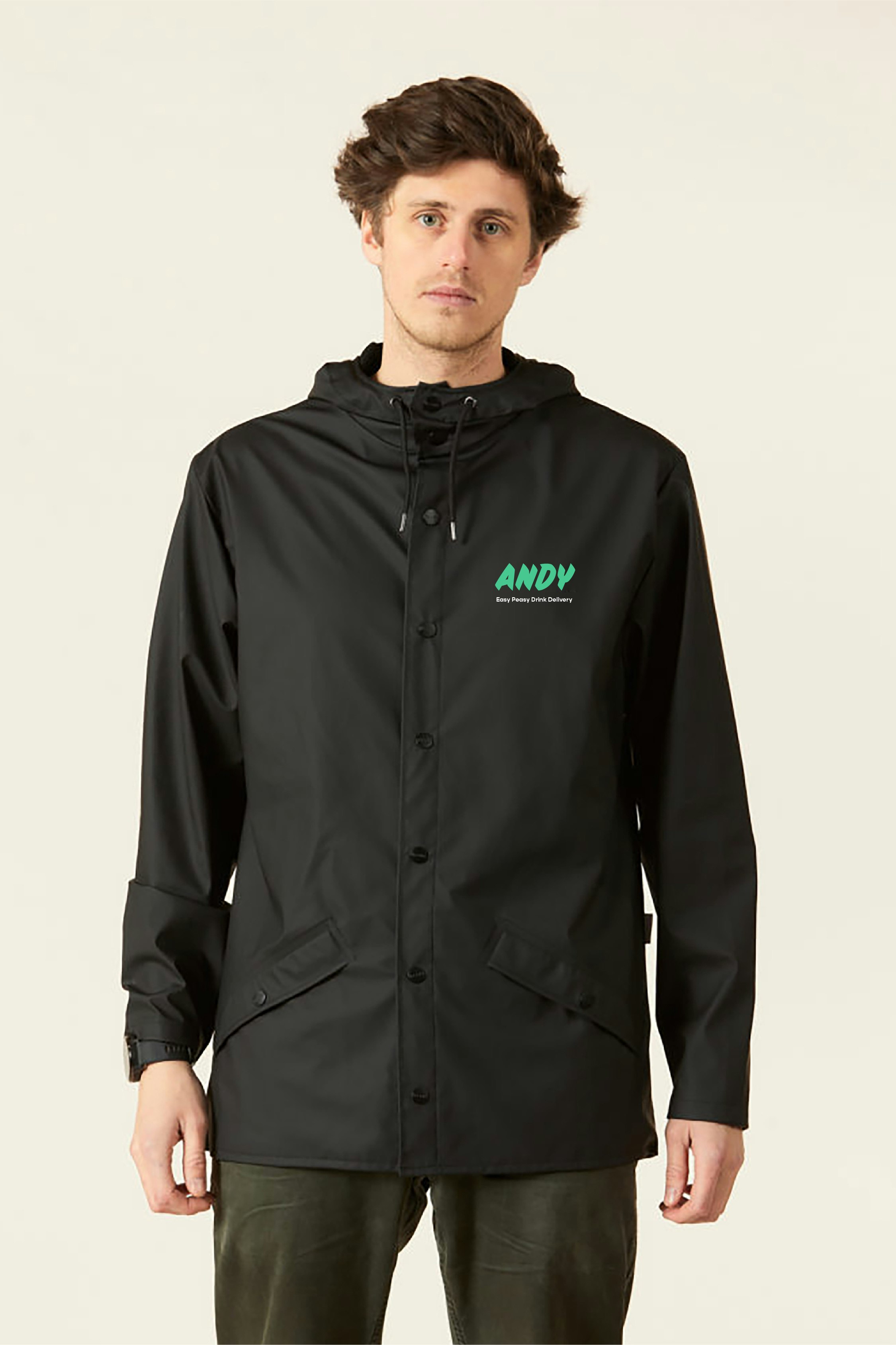
A "no logo" strategy, based on the Sideshow typeface, a very expressive and personal font. It's a font found in certain publications to give them personality. The Gopher typeface accompanies the Sideshow for balance and readability.



A "Green & Playful" visual identity
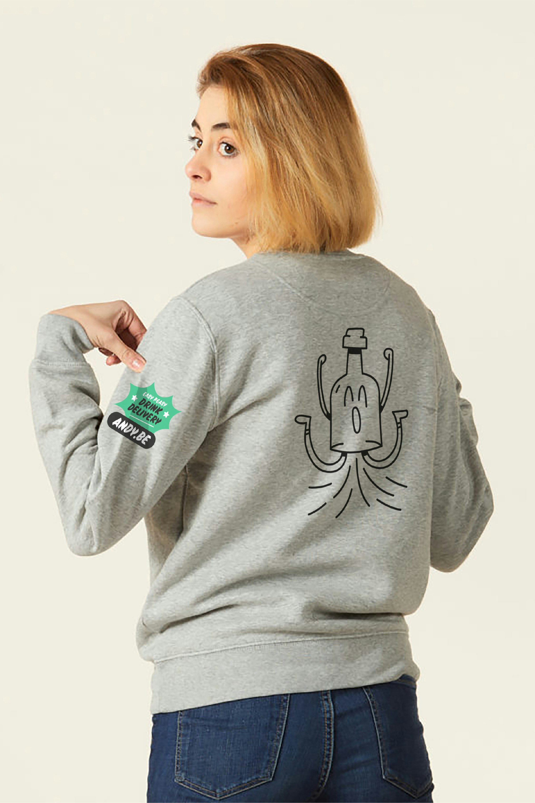
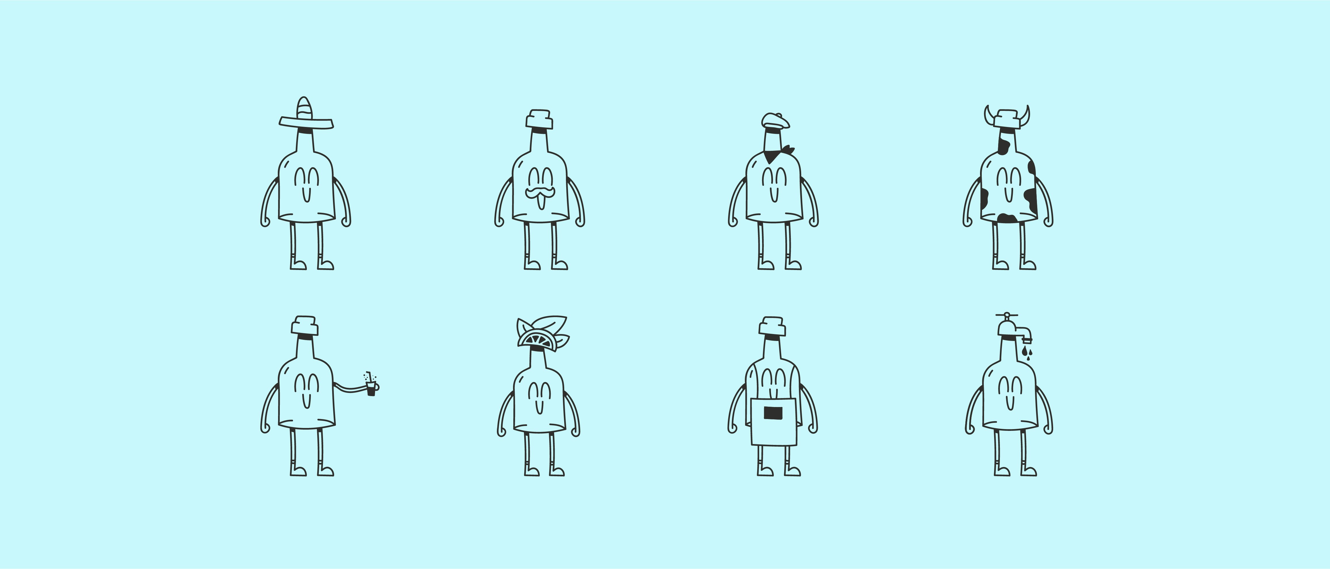
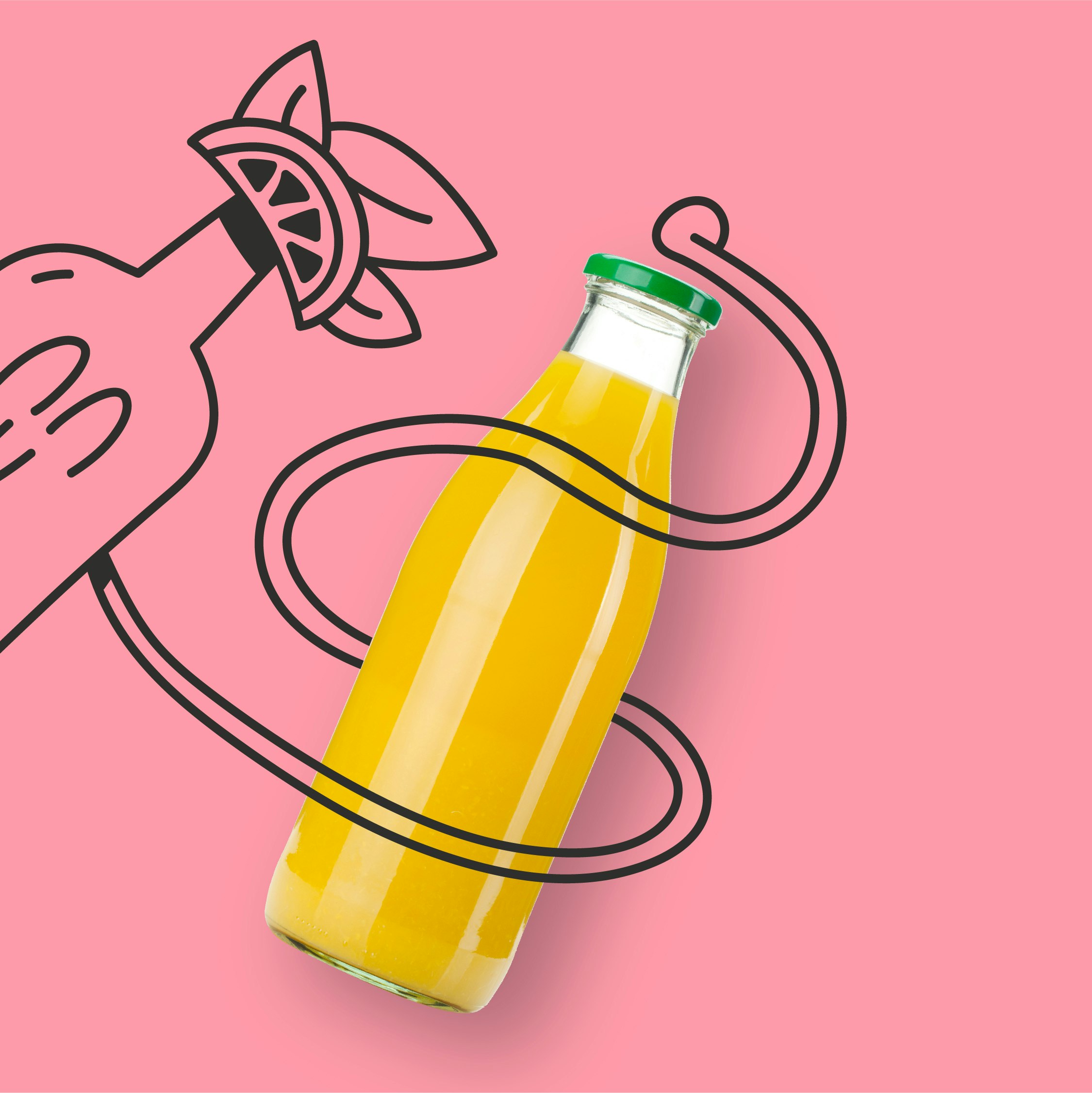
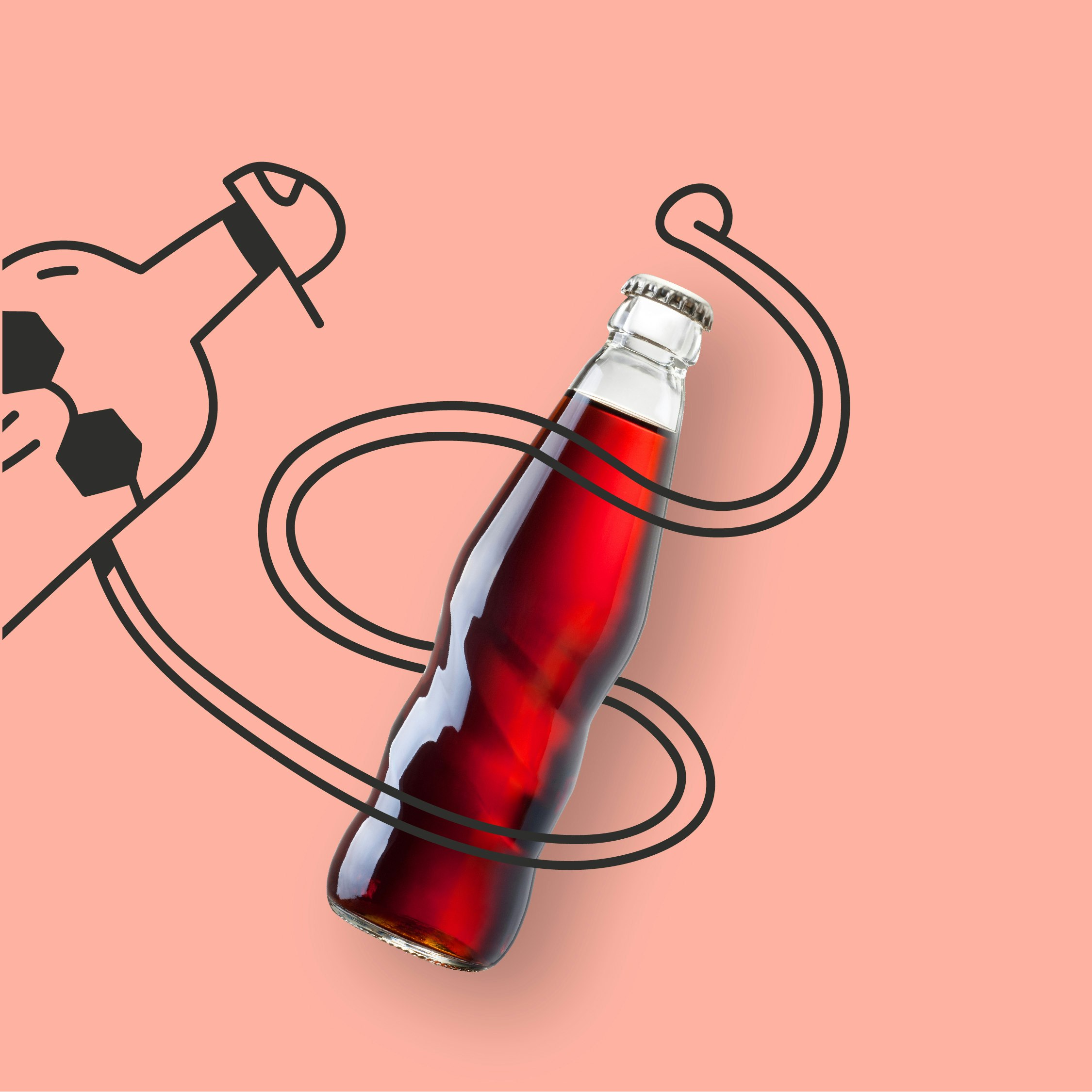
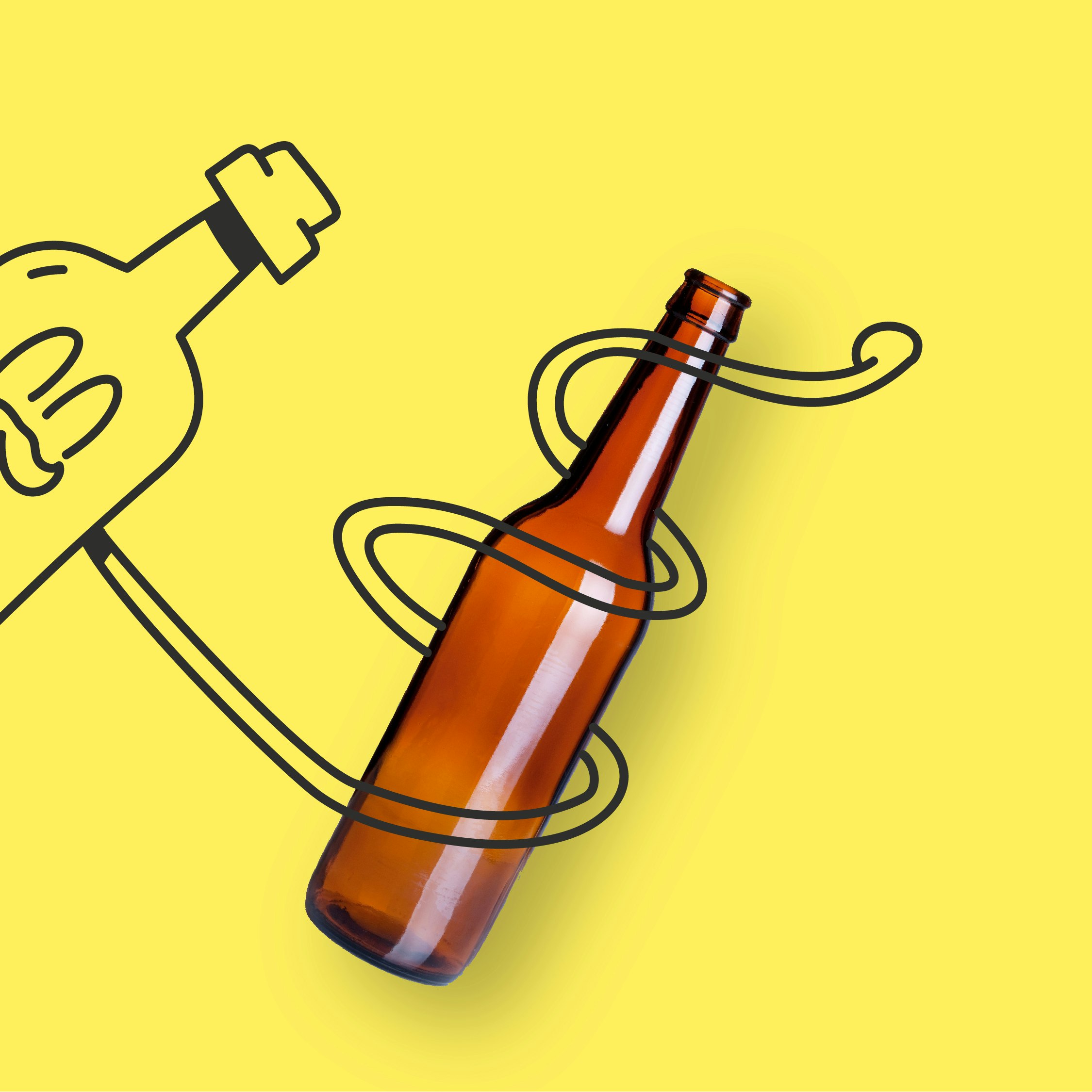
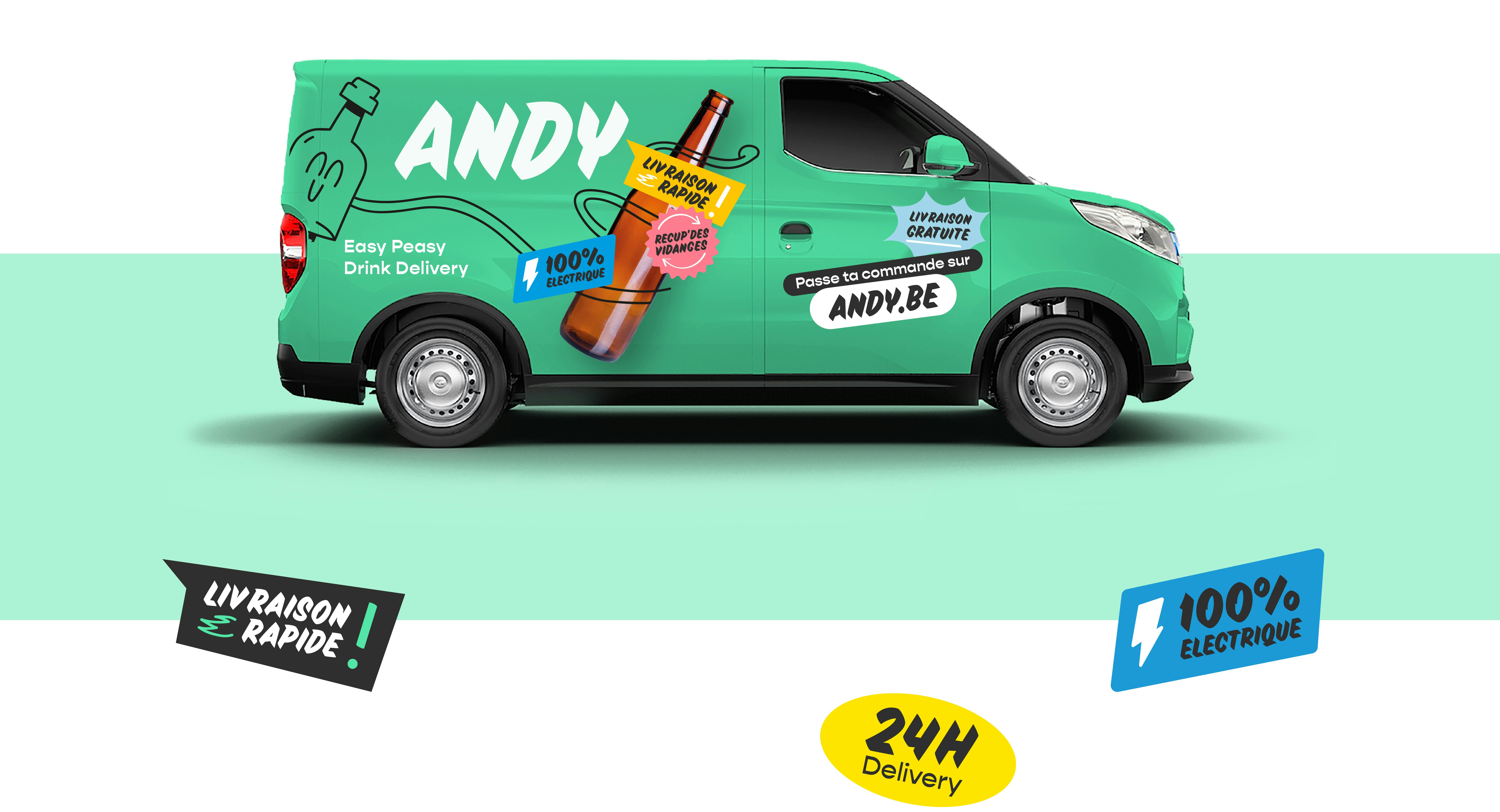
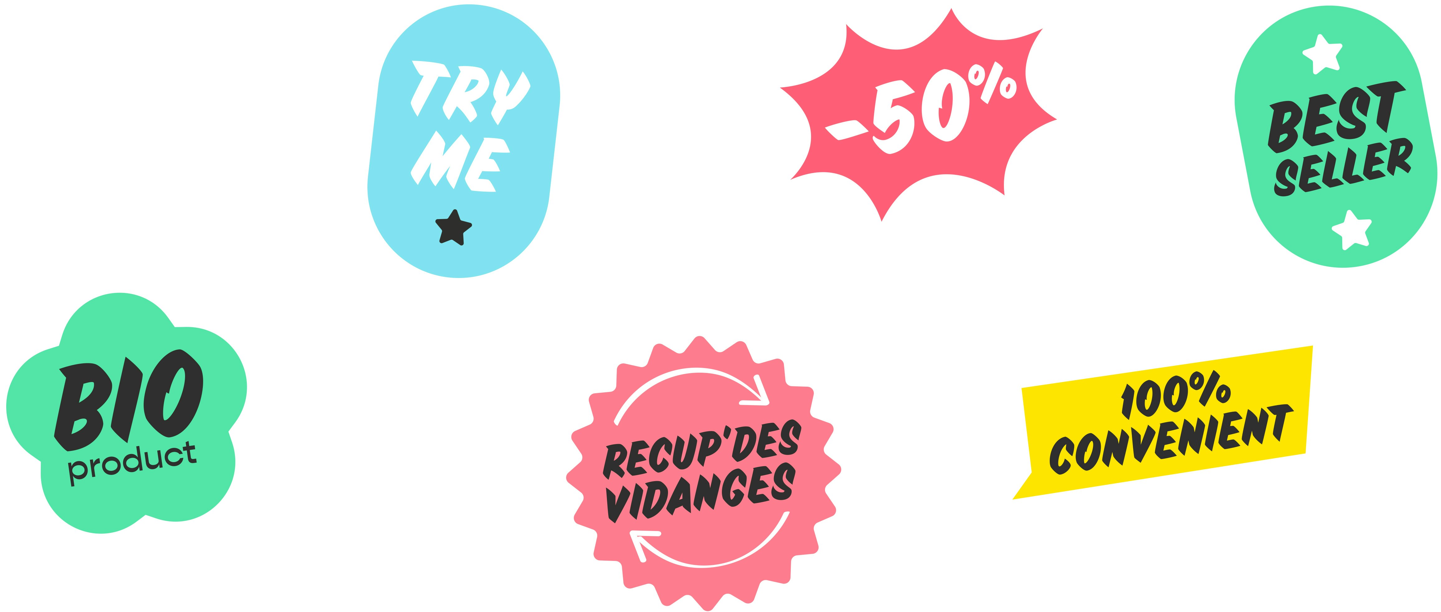
To exist, you have to be seen. Andy has understood this, adopting a colourful visual identity based on strong green branding, to emphasise the brand's sustainable approach. This green serves as a backdrop for the Andy mascot. Then come stickers and illustrations, expressing the USPs and spontaneous side of the brand.
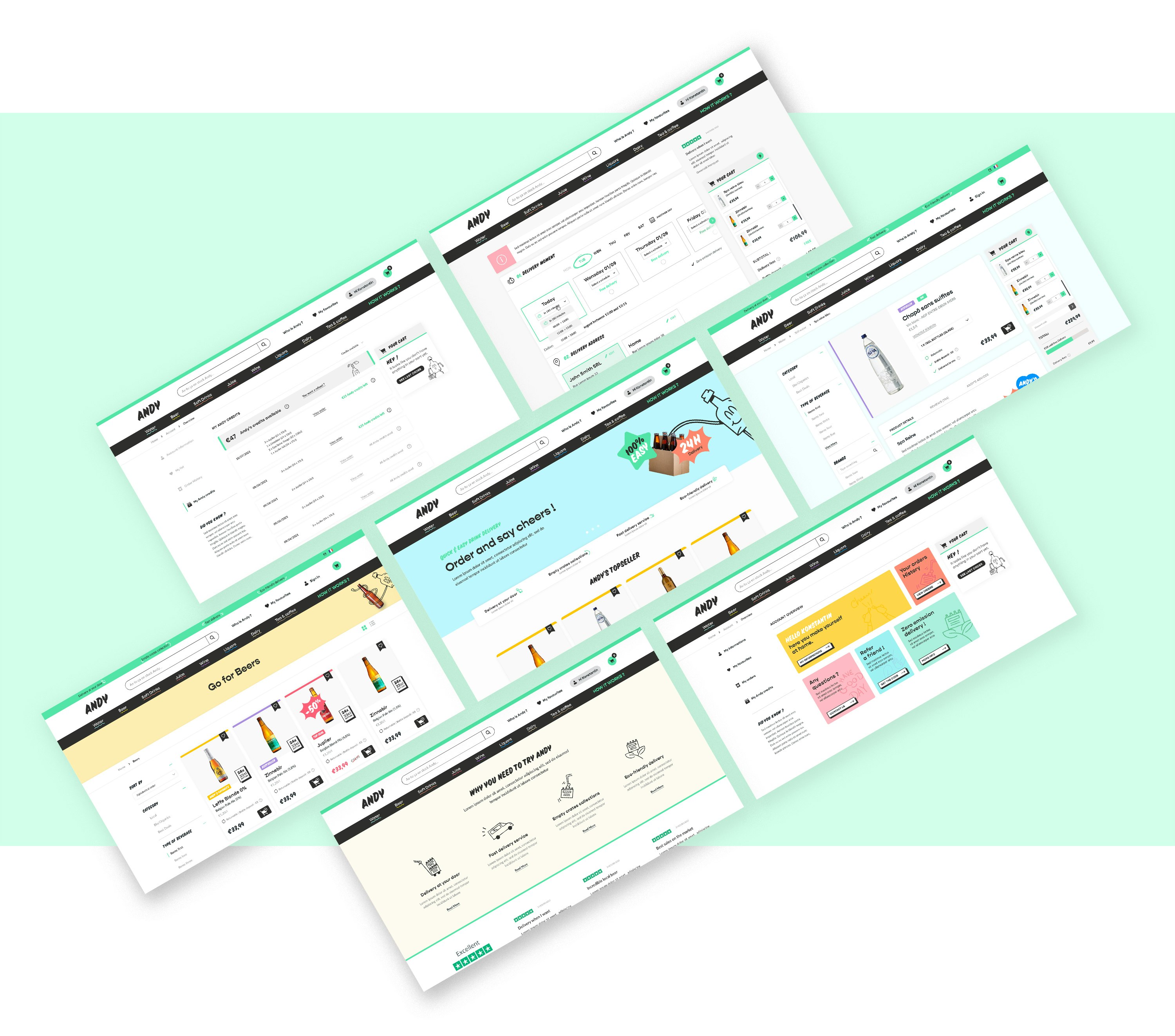
A (h)Andy Website
The main goal of the new site was to streamline the customer journey, from browsing to ordering. Add to that a hefty dose of fun and emotion and you get a site that is as functional as it is aesthetic.
