Camille
Parents to be, please meet Camille!
Family Allowance rules and regulations have recently changed in Belgium. One of the most substantial changes is that today, families are free to choose their Family Allowance Fund. This has pushed operators, such as UCM, to completely review their customer approach, moving from a B2B relationship with employers to a B2C relationship with families.
Industries
- Healthcare.
Skills
- Strategy,
- Naming,
- Brand Design,
- Retail Design.


Challenge
We saw this as an incredible opportunity to move away from a functional and descriptive approach to an inspirational strategy. Indeed, what life project can be more inspiring and important than bringing up children? We needed to create a brand that would be part of family's lives, that would create dialogue, a brand that would be loyal.
Solution
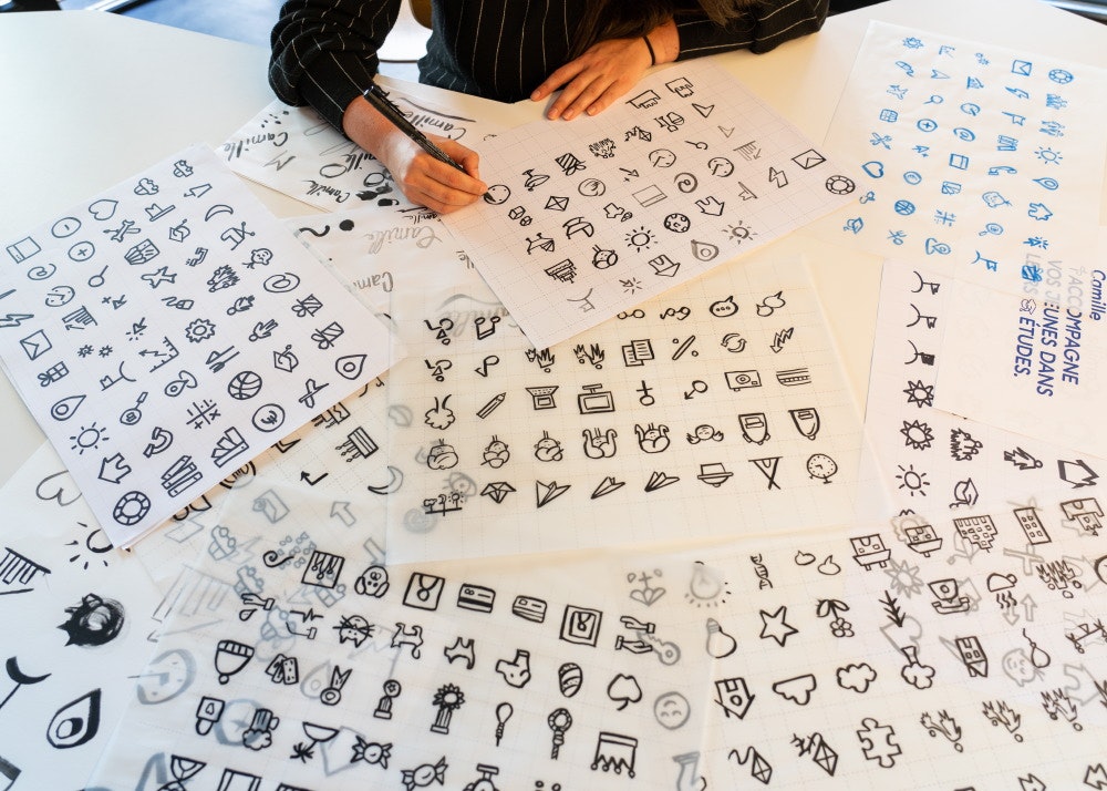
Using our proven Design Thinking methodology we returned to the basics of what Family Allowances do: "allow families to grow happily". Our whole approach, from naming to identity development and architectural proposals for Camille's offices was therefor built on this notion of "growing happily". And since families grow, and are places of constant change, we needed a moving visual/graphic system rather than a plain identity.


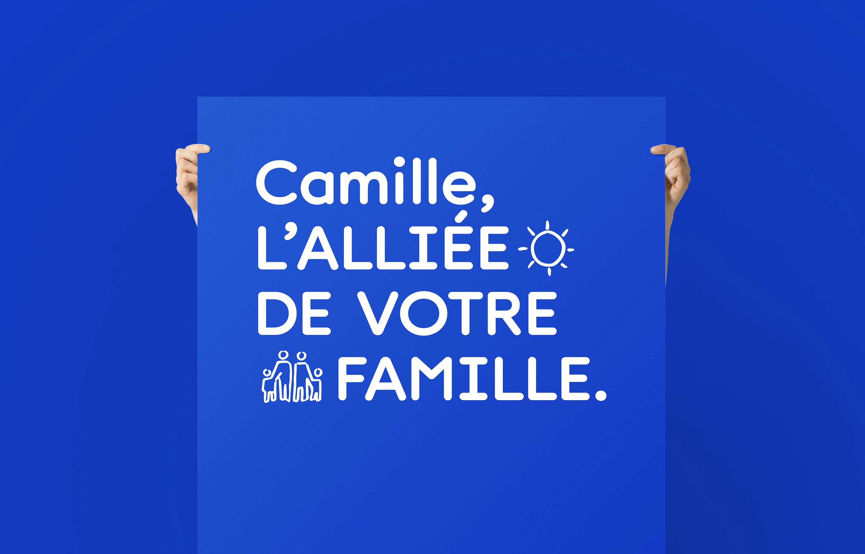
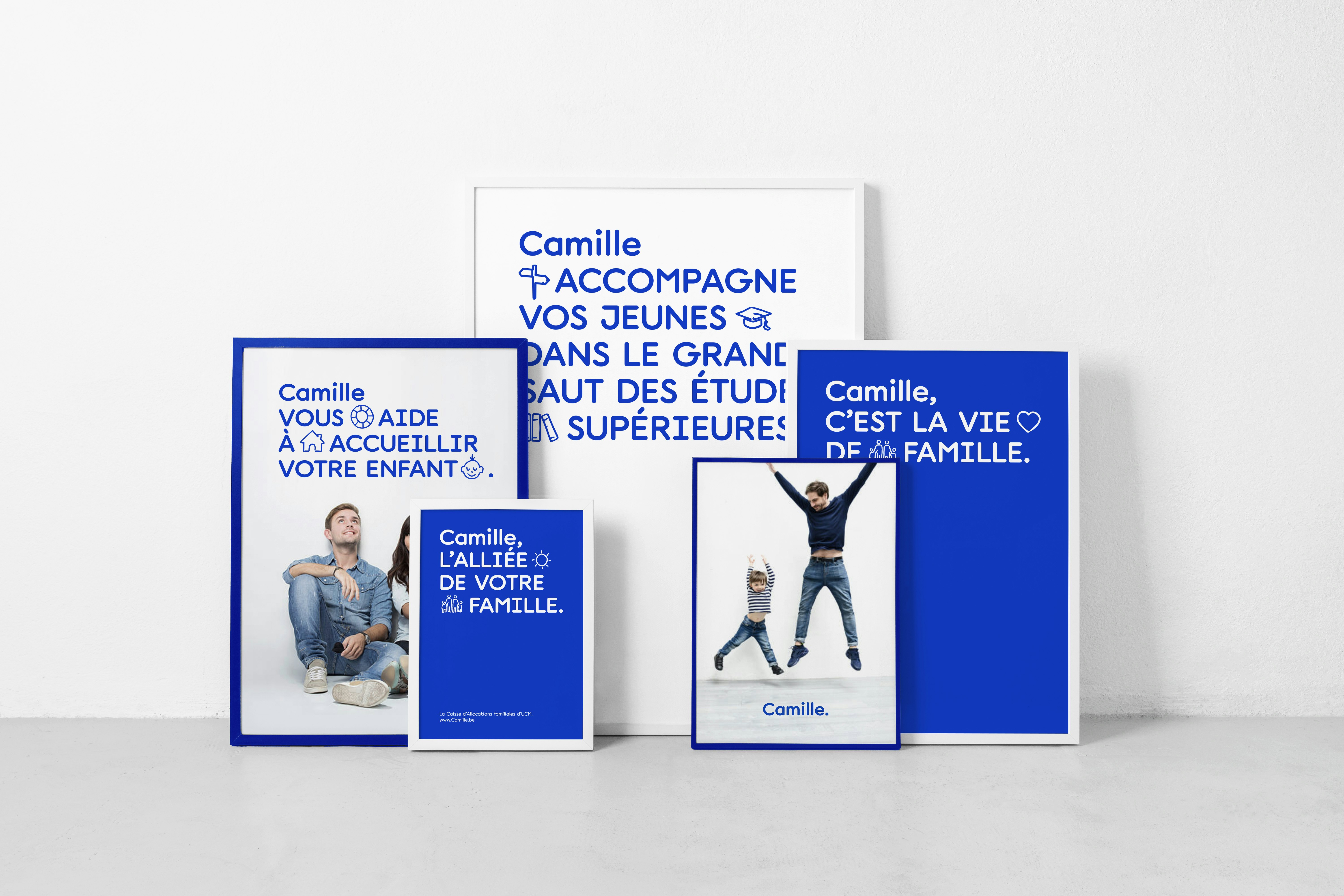
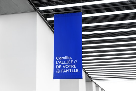
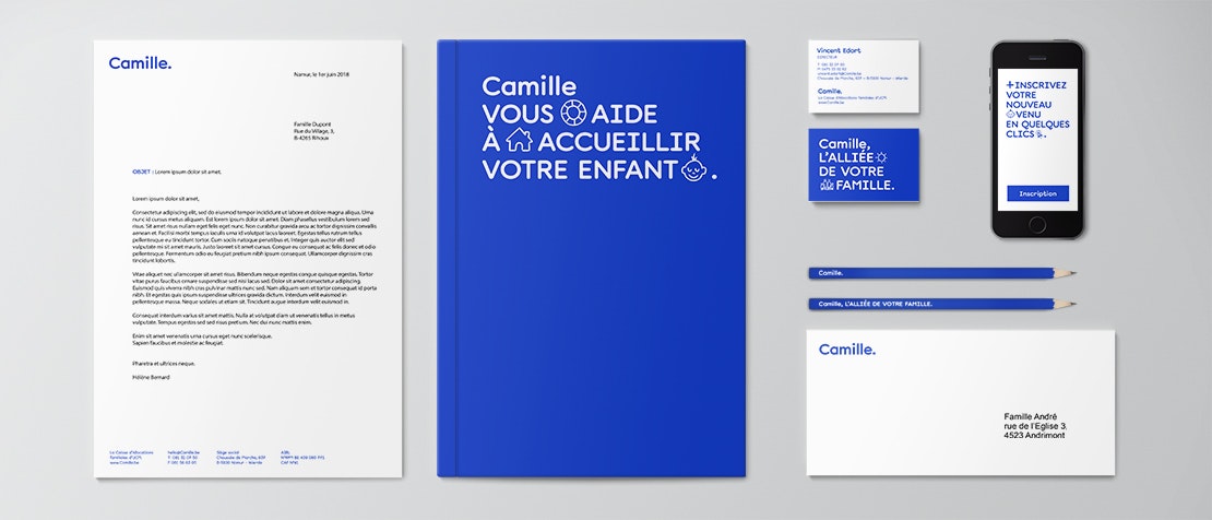
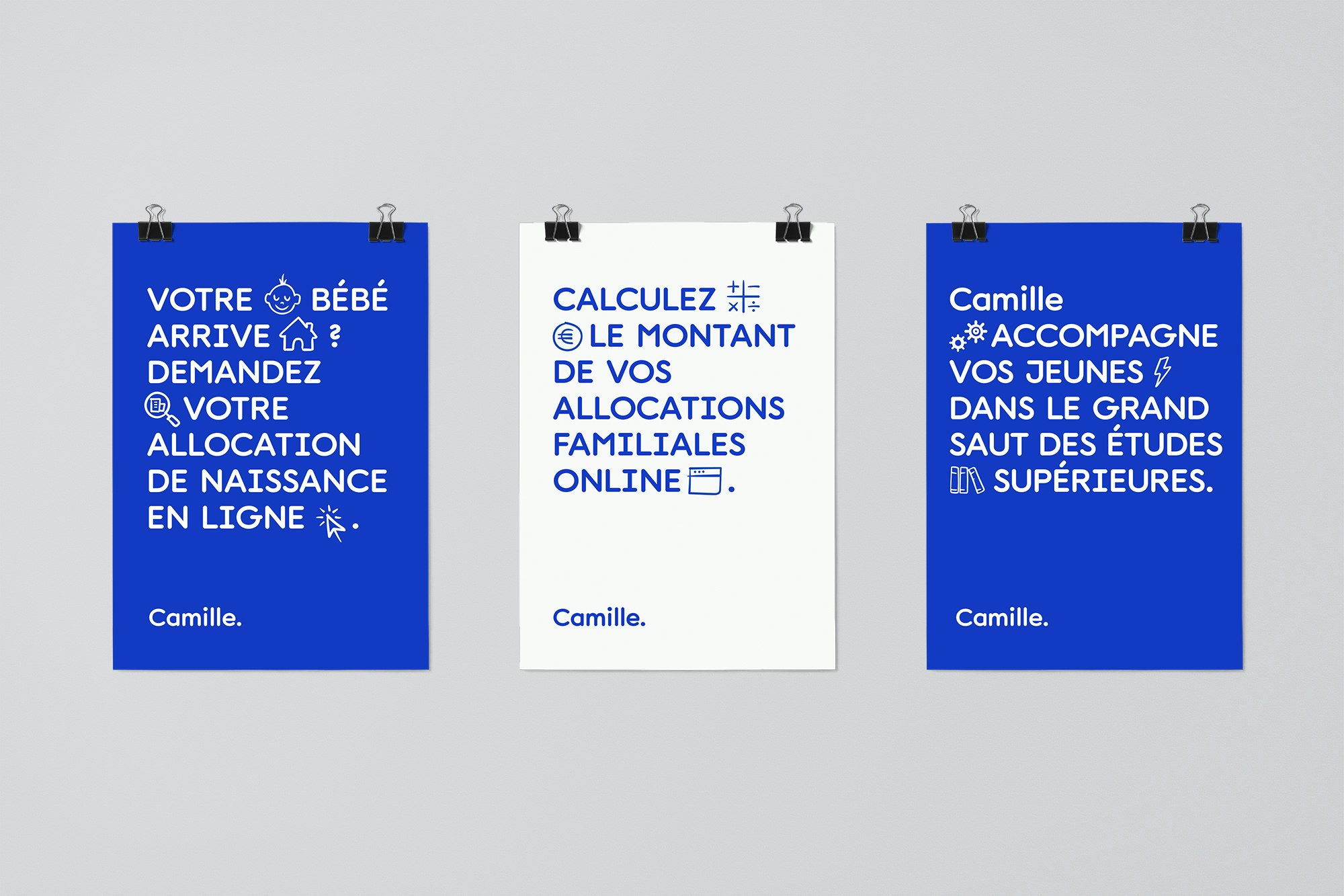
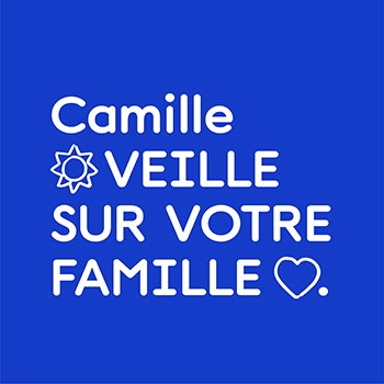
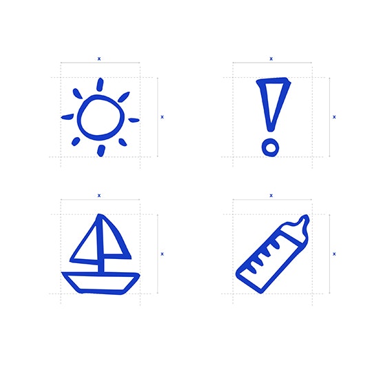
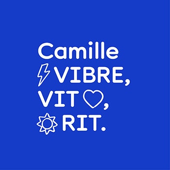
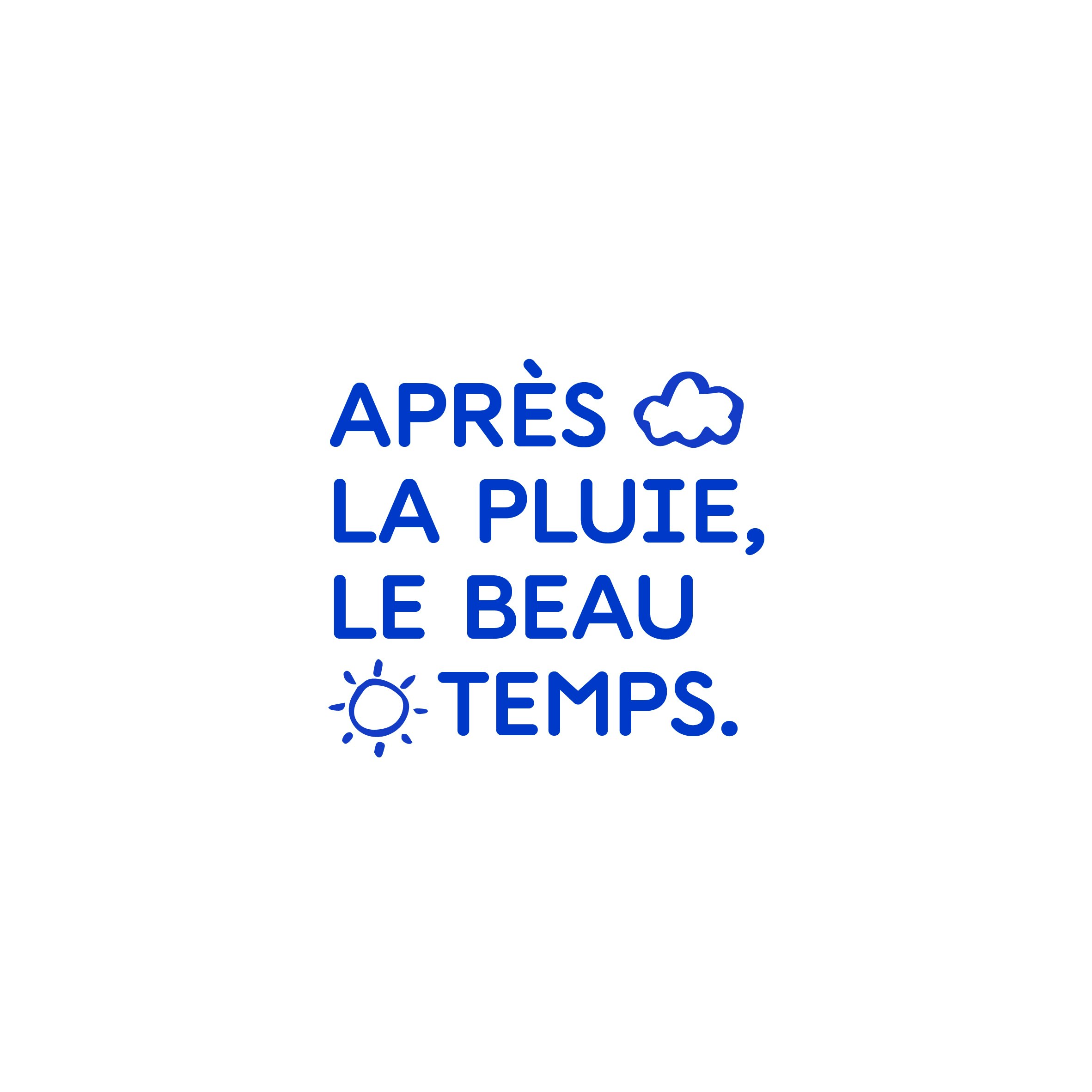
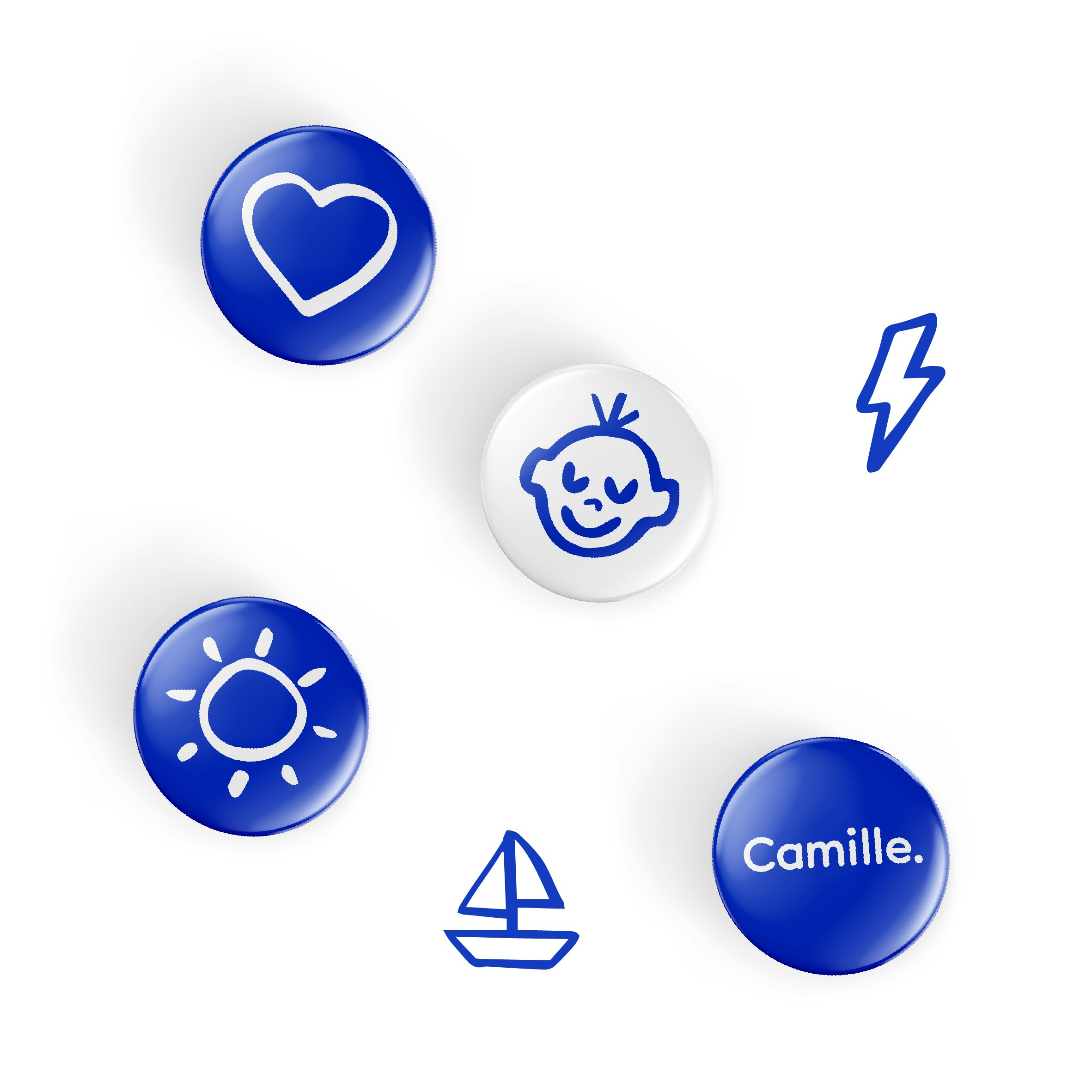
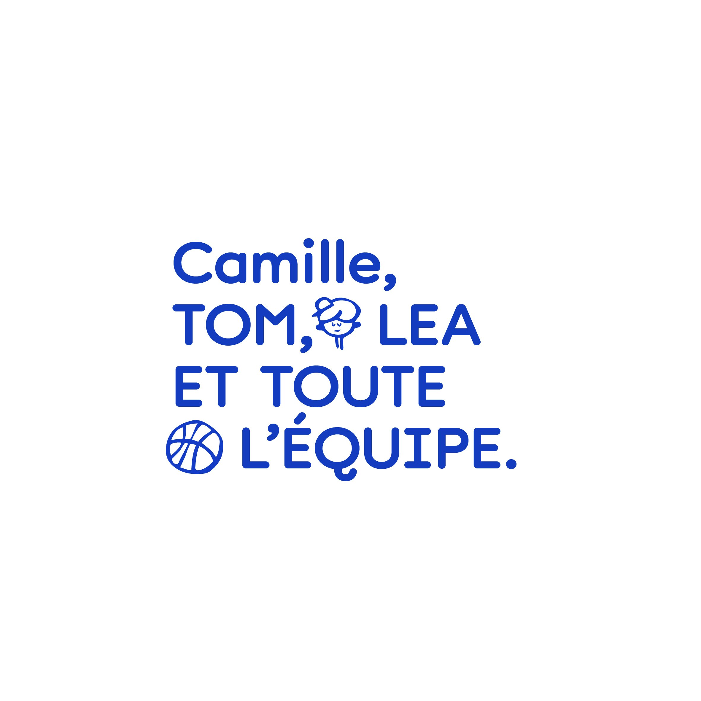
In addition to coming up with CAMILLE, a modern & time-proof first name (that works for both genders), contraction of "CAisse d'allocations" and "faMILLE", the system we developed includes a series of emoji's and pictograms considered as typographic elements, allowing texts to be highlighted, turning quite a dry matter into exciting copy.


One colour
We deliberately chose to stick to one colour, to maintain identity consistency in these early days, and chose blue, a reassuring yet intense & lively colour.


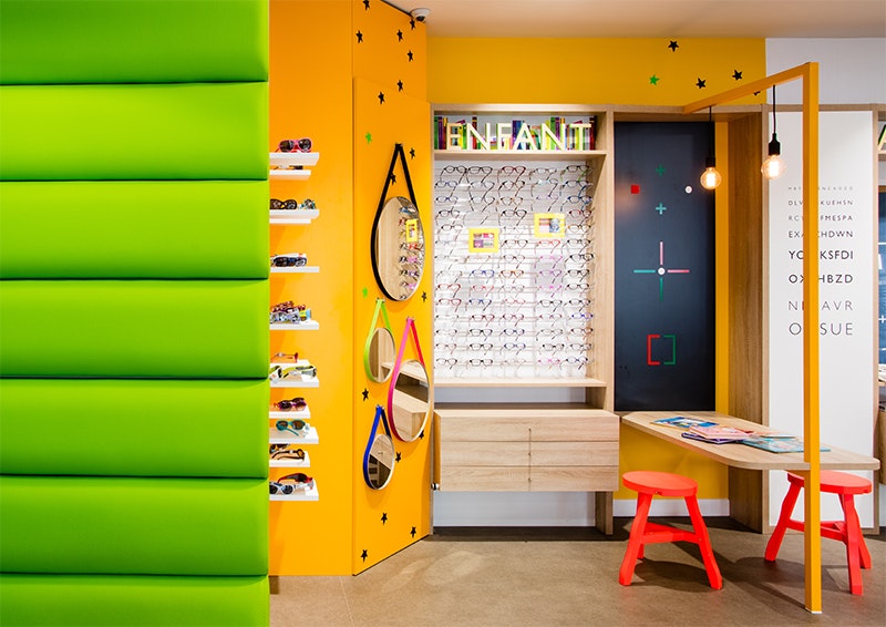
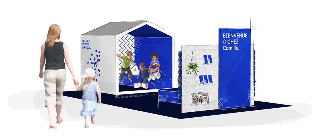
Architectural protect
Stretching out the concept to the brand's more physical attributes, we created a kiddy-shelter to be used in offices were parents meet Camille's staff. These were obviously designed to reflect the brand's identity: protective, safe, yet playfully lively.

Camille is another proof of the power of Design Thinking. Rather than drawing a logo that probably wouldn't have changed much, we were able to come up with a concept that changes a relationship.