Night & Day
Bringing a Little Light to the Night.
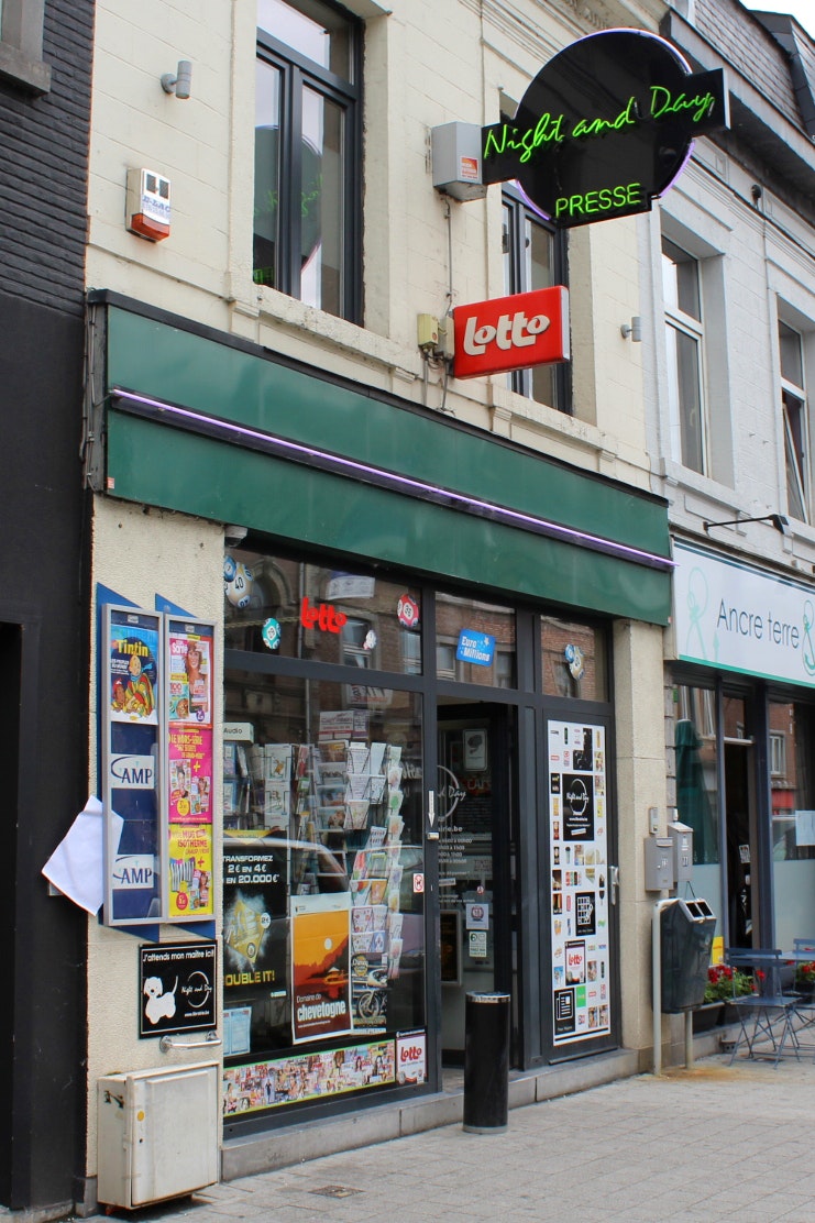
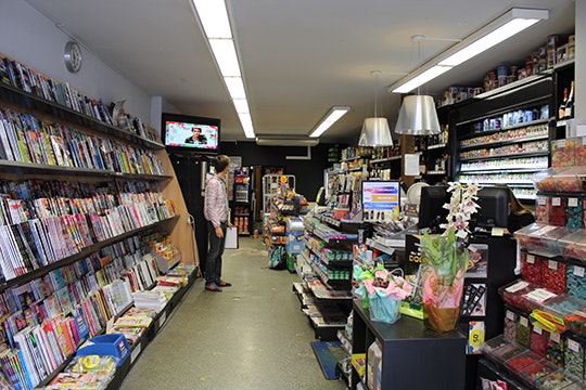
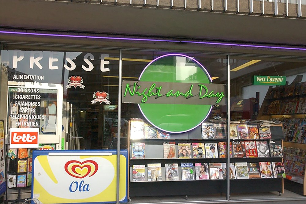
Originally created in 1993 as a simple newsagent, Night&Day has grown, over the years and added to its range of products, services and extended opening hours. The identity itself though is very much what it was like back in 1993. A little dated.
Industries
- Specialised Retail.
Skills
- Strategy,
- Brand Design,
- Retail Design.


Challenge
In the meantime, the market itself has become more competitive, more fragmented, with an increasing number of players offering more or less the same services and products. Consumers have become elusive. Rules & regulations tighter. Time for a change, or maybe not. Maybe it was time to revisit, to return to Night&Day's fundamentals.
Solution
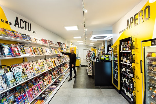
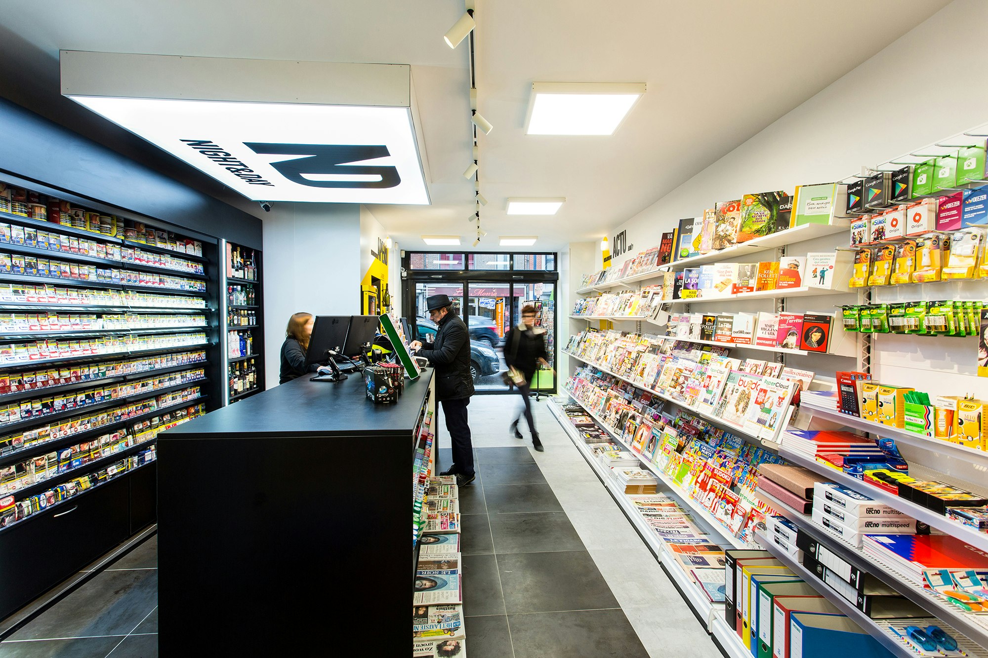
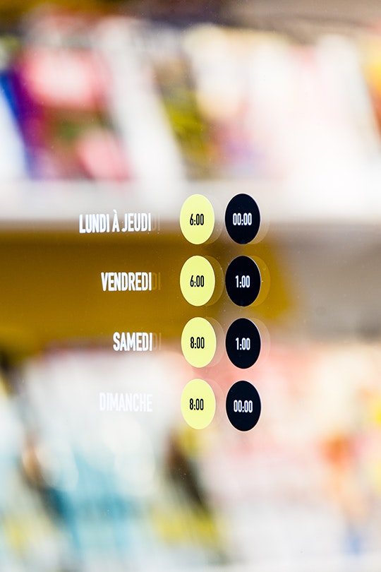
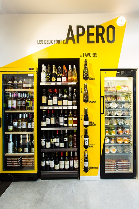
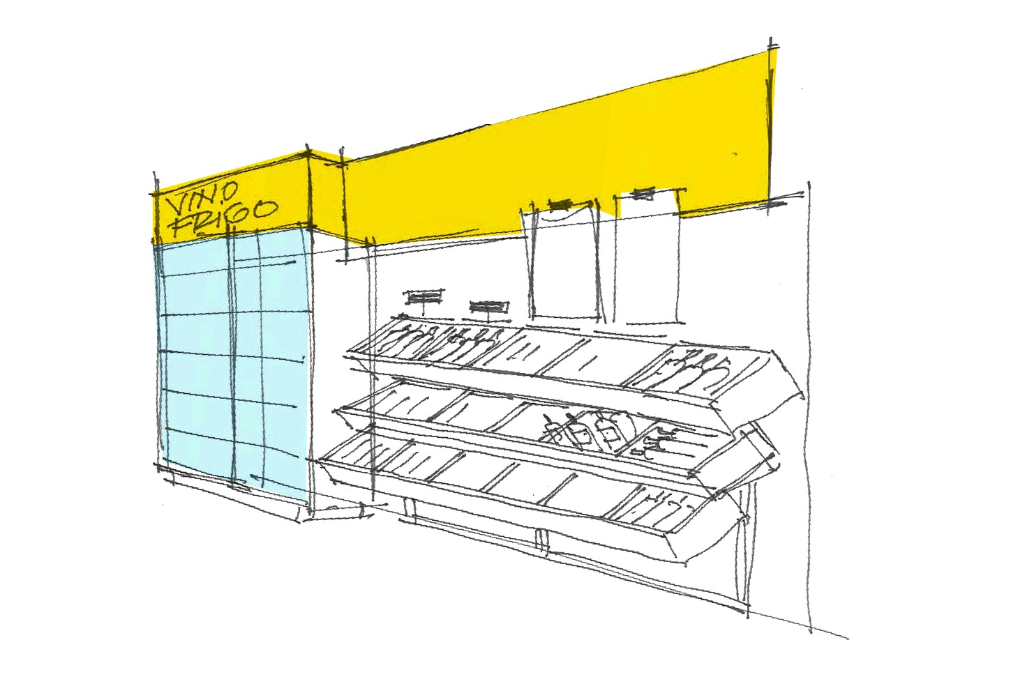
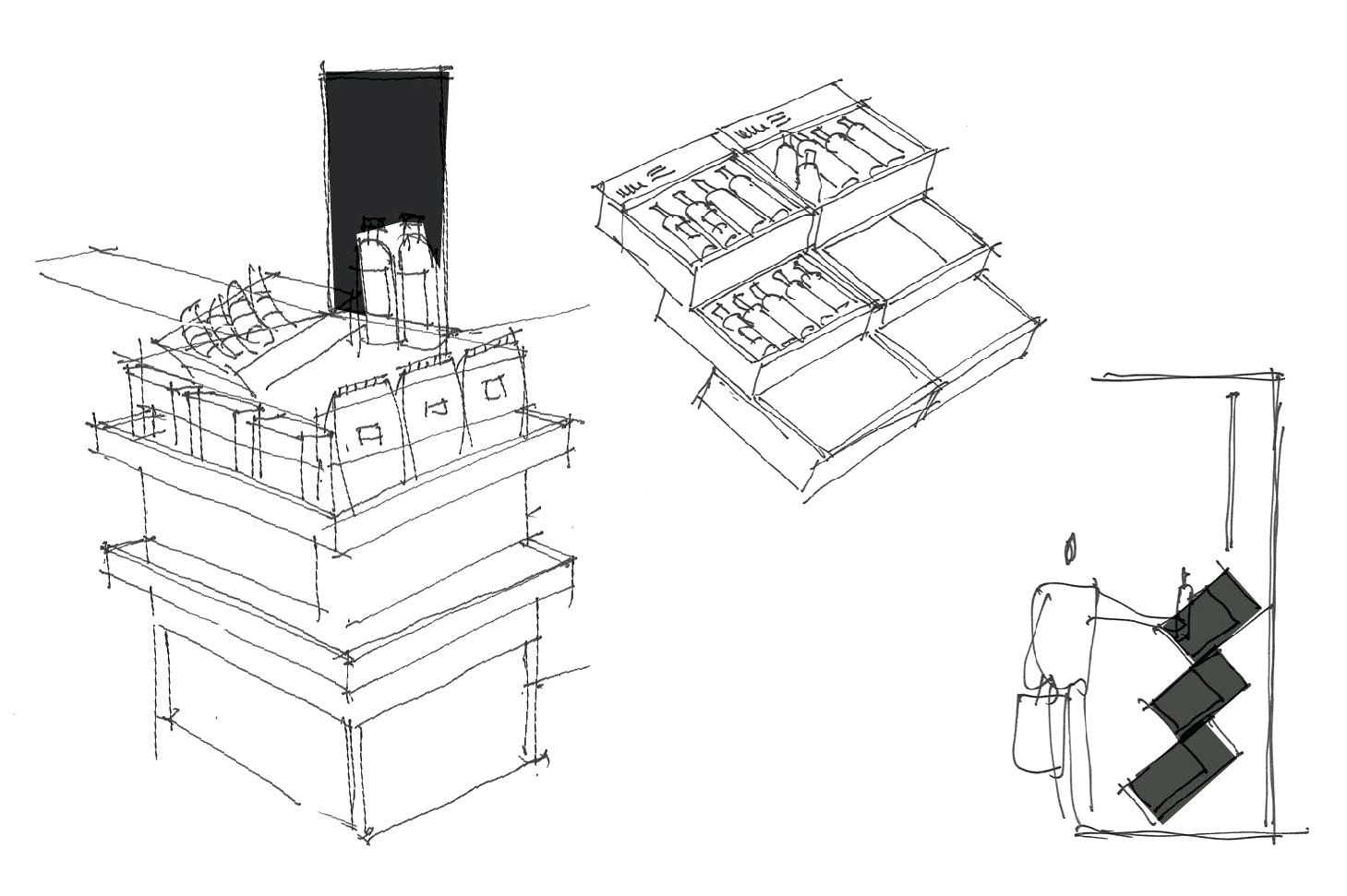
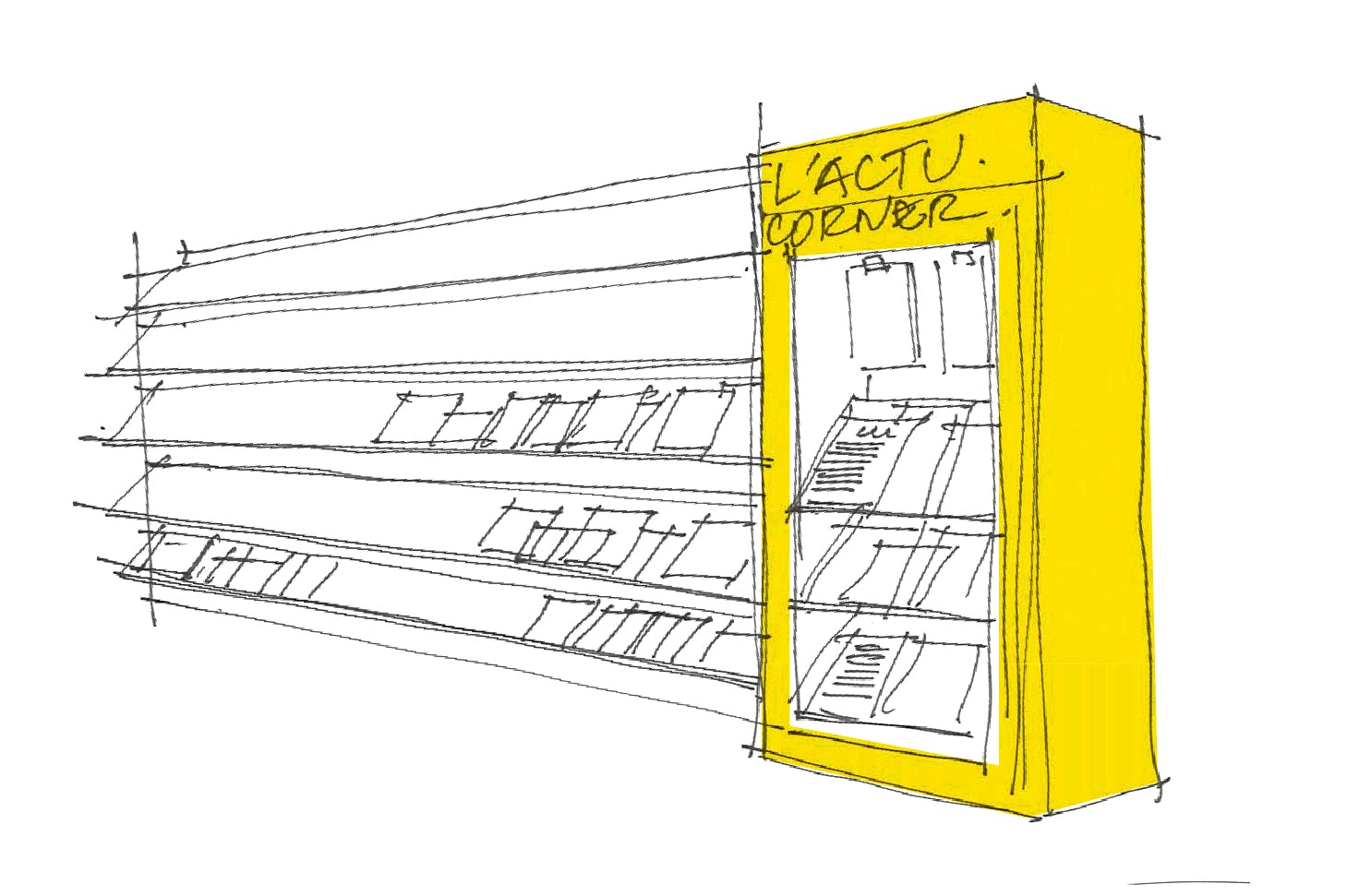
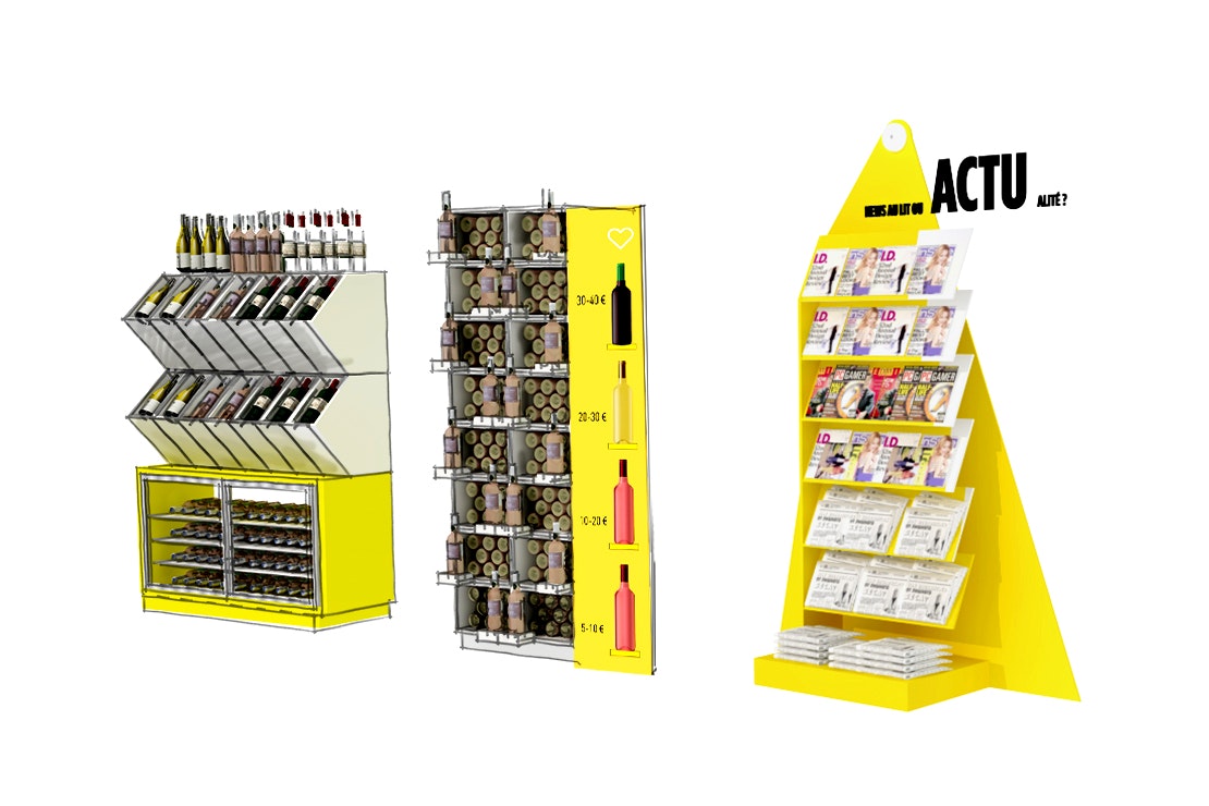
Where others might have seen an essentially graphical or architectural project, our Design Thinking methodology meant we returned to "customer experience". The shop itself needed to be more legible. We reduced the fresh product offering, turned frozen products into essentials and launched an on-the-go snacking range, all simply to better stick to the brand's essence. The results speak for themselves: trafic frequency and average basket have increased in every re-branded store.


Where it begins
As with many, most... all of our projects, the change this meant was as much an *apparent* change, as it was a *change management programme* itself, to focus internal resources on reinstiling interest and energy into the brand, giving it a much stronger and more human dimension.


Lighting tools
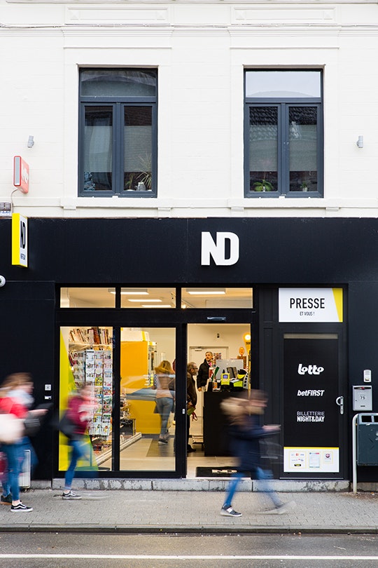
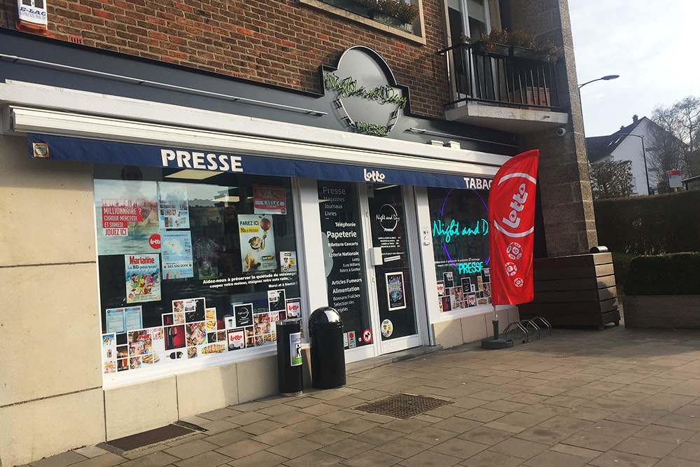
We first developed a strong brand promise: "Toujours le jour" is about being a light, visible all day, destination. We combined a quirky tone of voice to an extremely clear client experience to ensure clearly defined corners answered specific needs. This was achieved by using a two-tone, yellow and black ("Night & Day"), approach. The new logo demonstrates how "Night & Day" are linked together, part of one same client experience. Night & Day now truly means round the clock 'convenience'.


Focusing
Through numerous interviews, client workshops and our focused methodology, we developed together with the client a true brand backbone. We revisited the business model itself, and its associated customer experiences for morning guests, ordinary passers-by and the immediate-needs shoppers.


The result is a truly effective concept, that is both reassuring, inviting and humourous, built on simple codes that turn Night&Day's convenience stores into unique, highly understandable, experiential destinations.
Daniel Tamigniau, Night & Day General Director