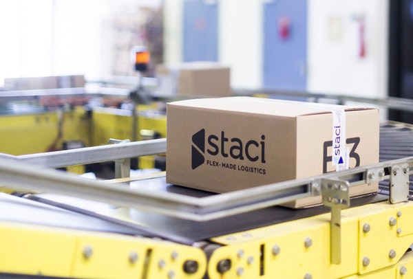
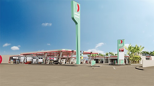
Oryx
The panafrican petrol station brand.
Oryx Energies is an independent provider of oil, lubricants and gas with a presence across more than 20 countries in Sub-Saharan Africa, and is now looking to regain its challenger position on the BtoC market. With extensive international experience in oil and gas services, we are taking the ambitious step of creating a service station brand and concept that combines international standards with a strong local identity.
Industries
- Energy.
Skills
- Strategy,
- Brand Design,
- Retail Design.


Challenge
The goal was to fundamentally transform the image of the service stations, to galvanise employees from all countries in pursuit of an ambitious project, and to strongly support the group bold and strategical long-term vision.
Solution
By reviewing its brand platform and visual identity, Oryx has been transformed into a recognisable brand that is both contemporary and in touch with its local culture. At its petrol stations, the concepts of service and comfort have been put right back at the heart of the user experience.
A new brand platform
Contributing to tomorrow’s Africa means supporting and strengthening local brands, products & services. It stands for a modern African way of life and high quality standards.
Its priorities are: generosity, modernity, service, quality.
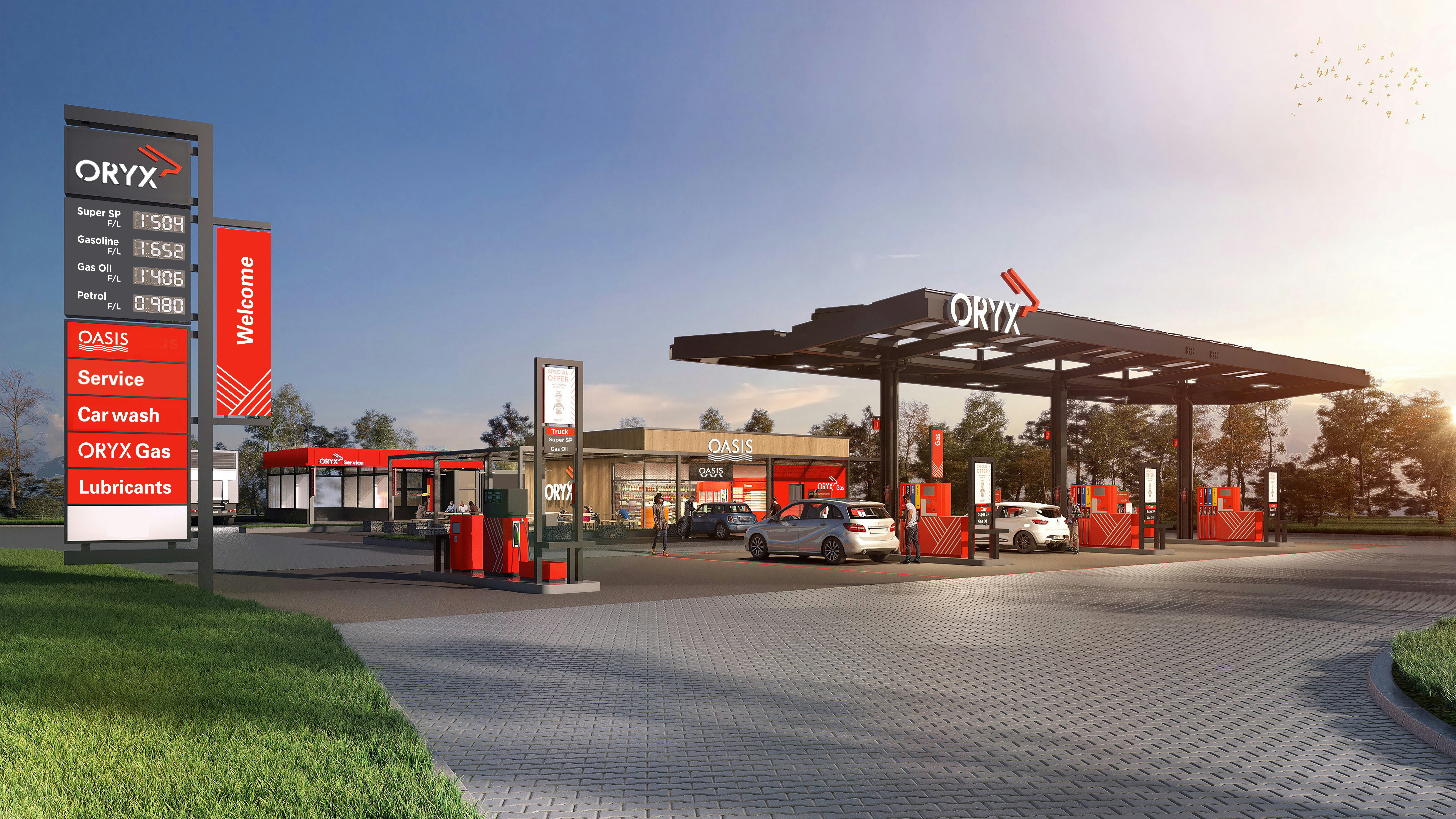
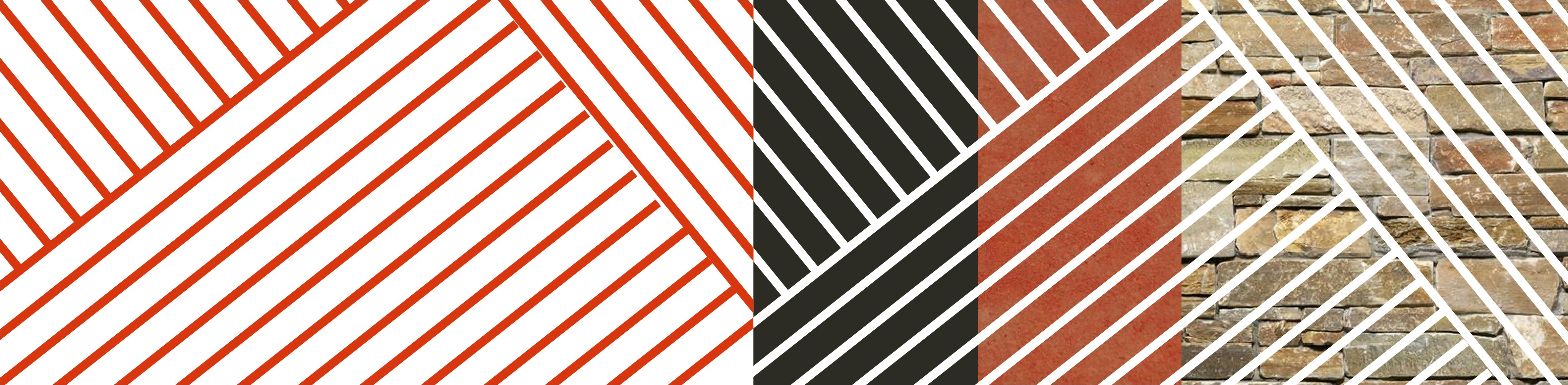
An African-inspired visual identity
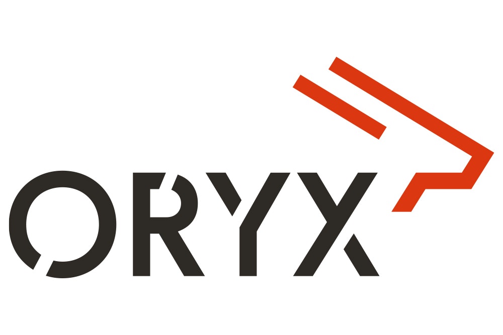
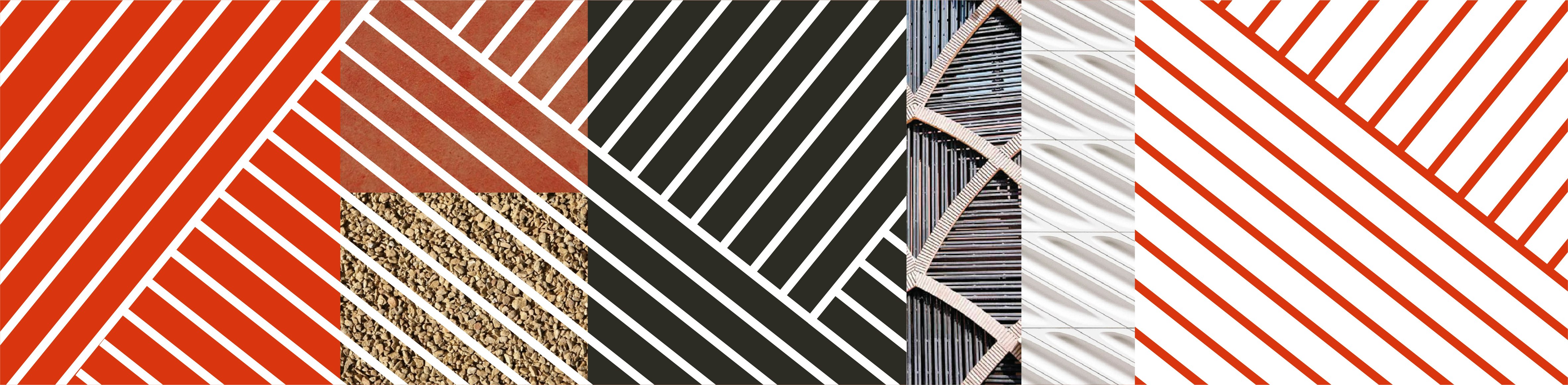
Oryx Energies has decided to build its services stations visual identity on graphic principles that are directly influenced by African culture and tradition Its striped patterns and logo are directly inspired by the iconic animal whose name it bears. A new orange-red and the addition of an anthracite grey brings Oryx all the impact, visibility and distinction it needs in this competitive market. The two straight lines depict Africa's iconic animal, the oryx, in a dynamic, contemporary and timeless design.


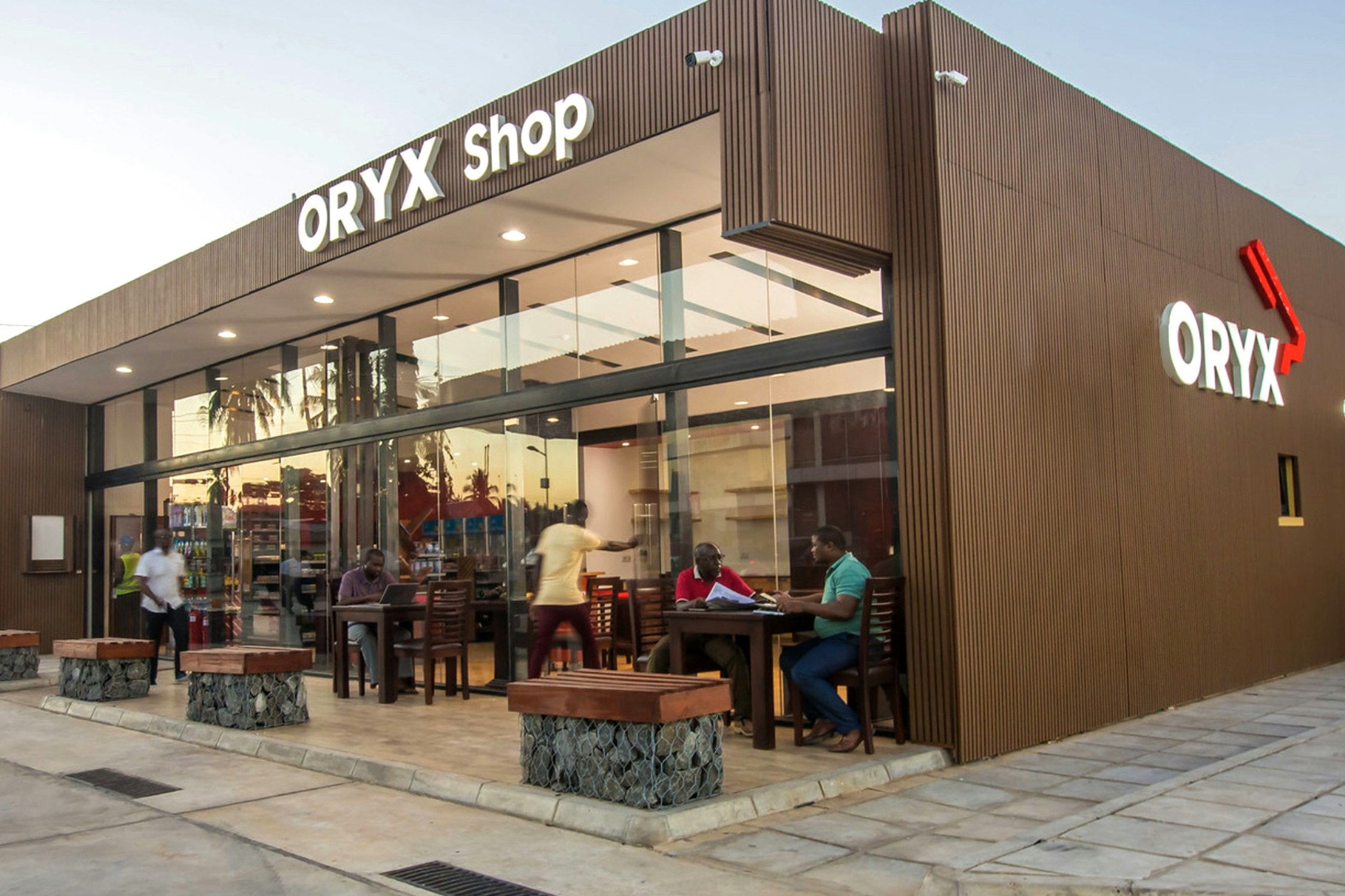
A more logical and service-oriented customer experience
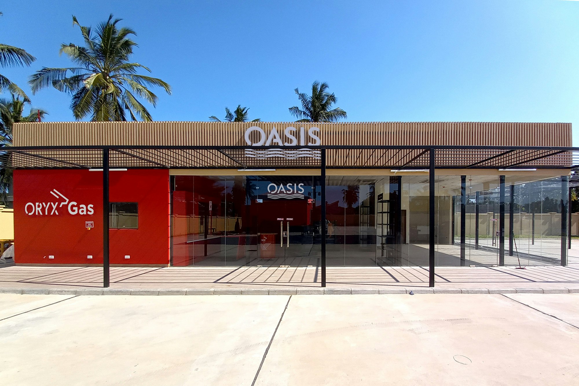
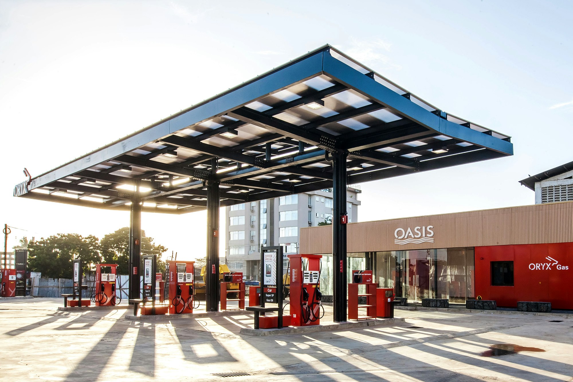
One of the first priorities was to improve traffic flow by separating lorries from the cars for a smoother customer experience. The second job was to make the signage, shop and Oryx gas more visible. We then decided that the colour red should be used to identify all the different aspects of the service.
The focus then turned to the shop, which we gave a clearer sense of purpose, renaming it Oasis and streamlining its organisation. We reintroduced the purchase of gas in store, positioned essential products at the entrance, and added groceries & HBA in the back.
Last but not least, we made the premises even more service-oriented by allowing food and drink to be consumed on site, with terrace areas protected by natural elements, such as grasses and gabion walls.
Oryx service stations are no longer somewhere to quickly stop by; they have been transformed into places to enjoy and relax.


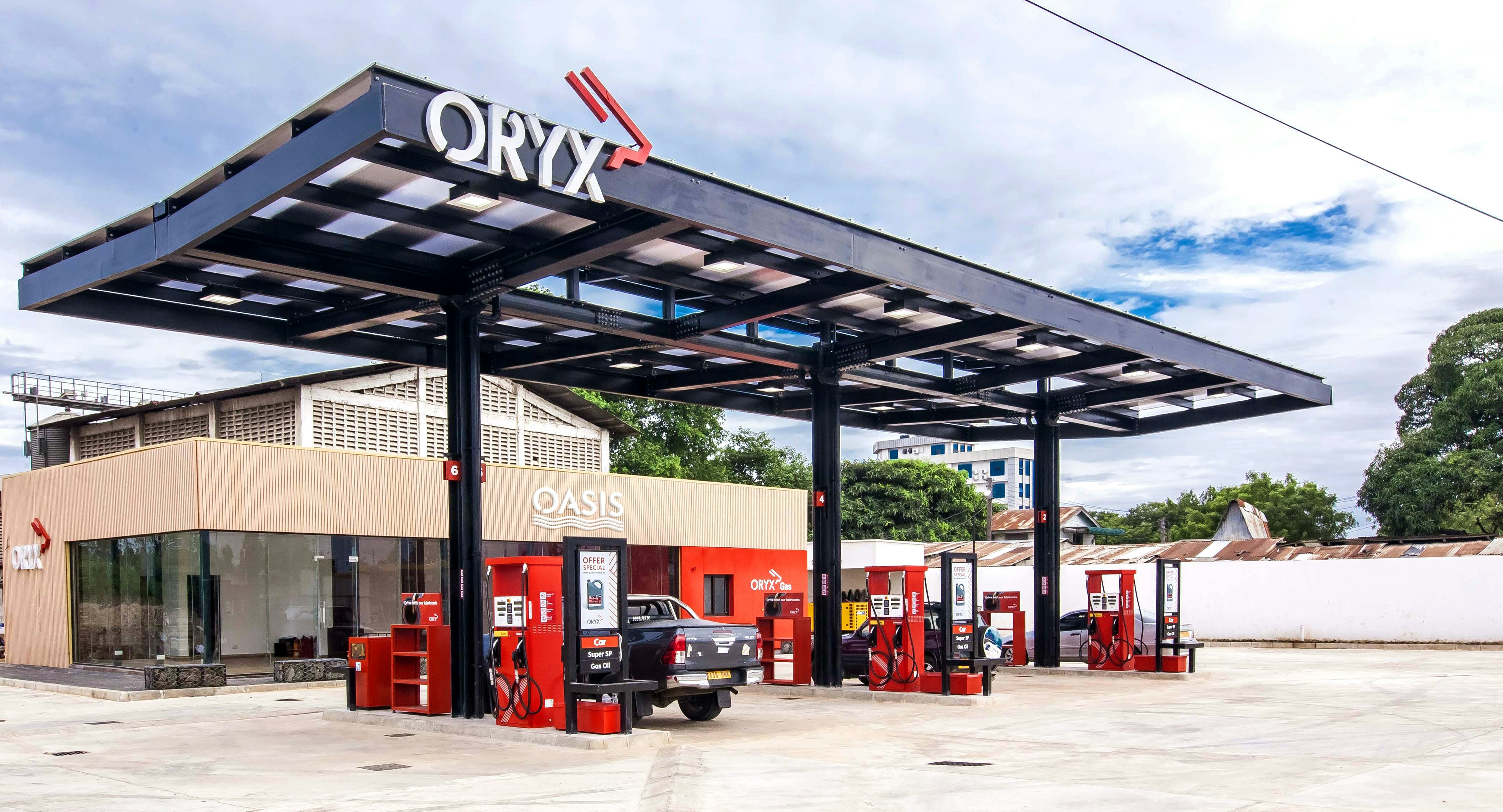

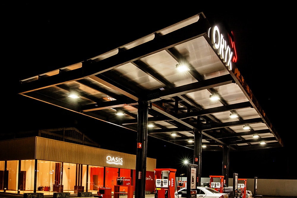
A distinctive and efficient canopy
A lot of thought was given to the canopy, with two main objectives in mind: responding to climate constraints and contributing to the visual identity.
The polycarbonate material offers resistance to heat, and the venturi-shaped design creates a natural ventilation effect, providing fresh, cool air for users. The alternating black and transparent sections on the canopy create shade as well as cleverly echoing the stripes of the identity.


Rapid and large-scale deployment
The network switch to the new concept has already started in several countries including, three emblematic stations in Tanzania, and there is a powerful plan to rebrand completely by end of 2022.

"We have thought long and hard about this change and today we are all convinced that it will make the difference and anchor our new ambitions. More visibility, a better experience for our customers, an offer even better adapted to the new needs of consumers, more trained agents in the stations, more modern premises and a new logo that brings us together."