Sabena
Using the past to engineer the future.
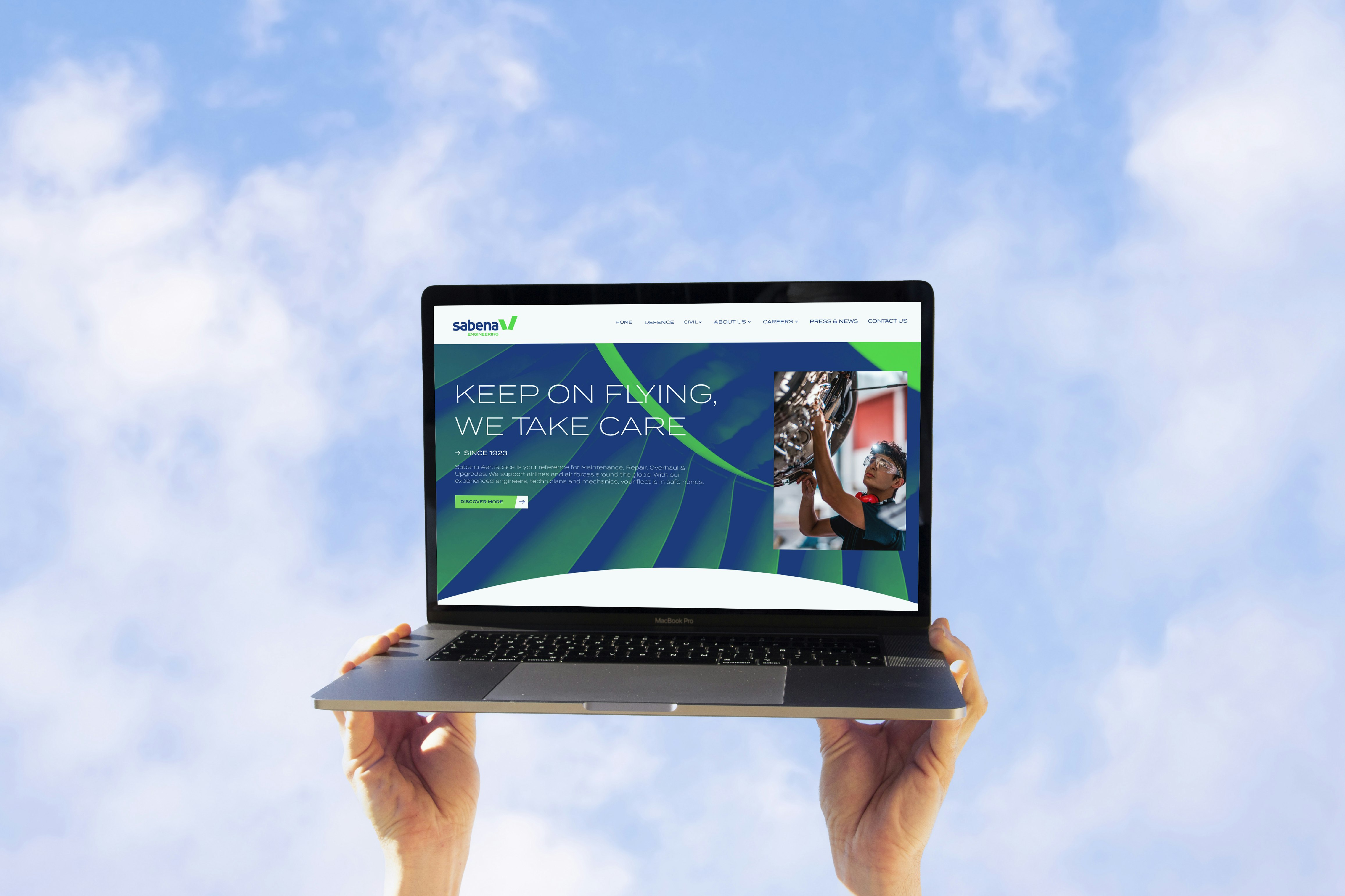
Belgian aeronautical maintenance company Sabena Aerospace becomes Sabena Engineering, adopting a brand new visual identity. This exciting new direction provides clearer insight into the company's activities, and demonstrates its desire to support the Belgian and international aerospace industry in its transformation and growth.
Industries
- Industry,
- Transport.
Skills
- Strategy,
- Brand Design,
- Digital.


Challenge
Our first focus was the name, Sabena Aerospace, seen as too limited when it comes to reflecting the reality of the company's business. The second priority was its graphic identity and style, too similar to that of an airline. All while respecting the brand's heritage and past. The main challenge was therefore to strike the right balance between the company's history and its vision for the future, between its business and its values... which is where strategic design comes into play.
Solution
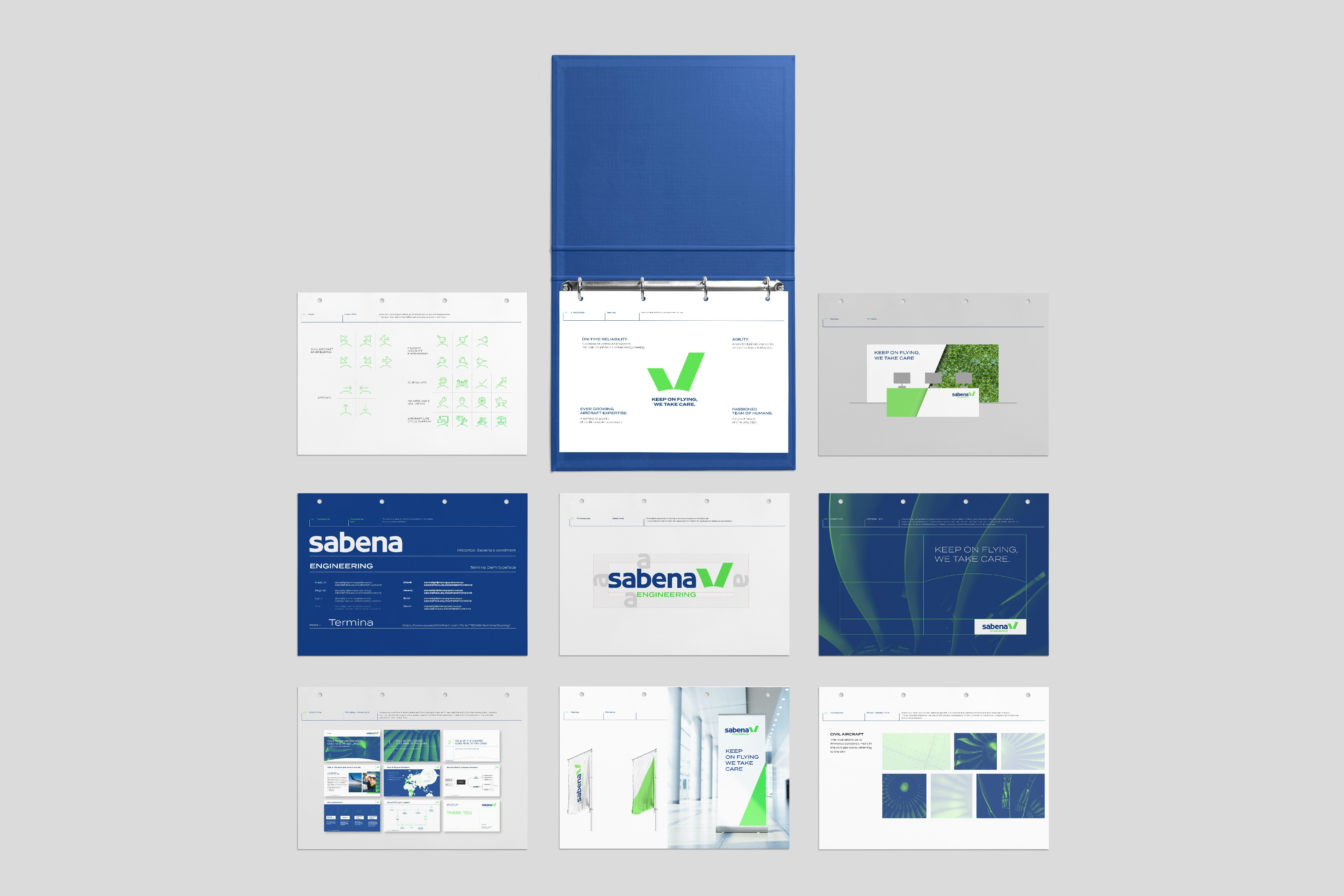
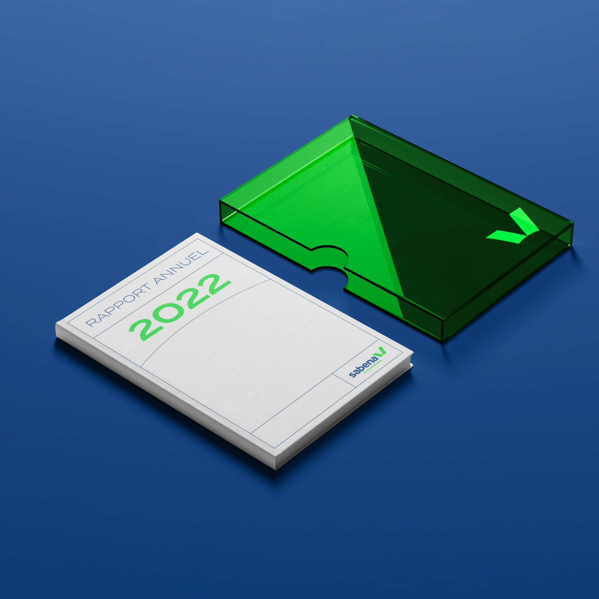
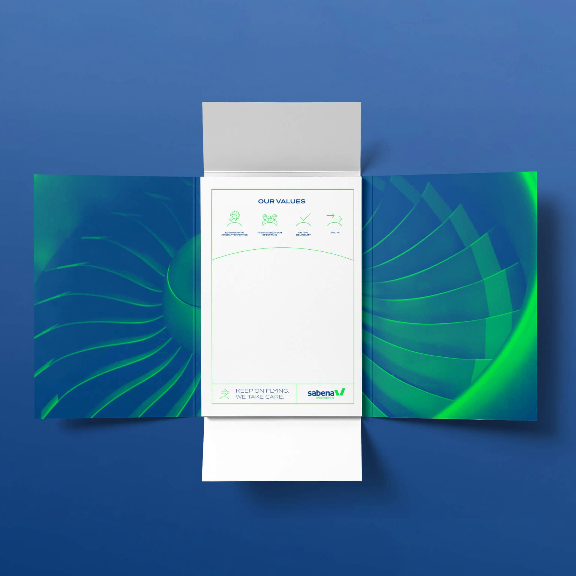
Given the company's unique and inimitable brand equity, we decided that the new visual identity should be based on the historic SABENA brand. We stuck to the same proportions, typography and colours, while enhancing them with additional details that reflect SABENA ENGINEERING's vision of the future. The name change lays the first foundations for a new, more insightful visual identity, in alignment with the classic industry norms. It's a visual identity based on a strong and unifying symbol that perfectly represents their brand.


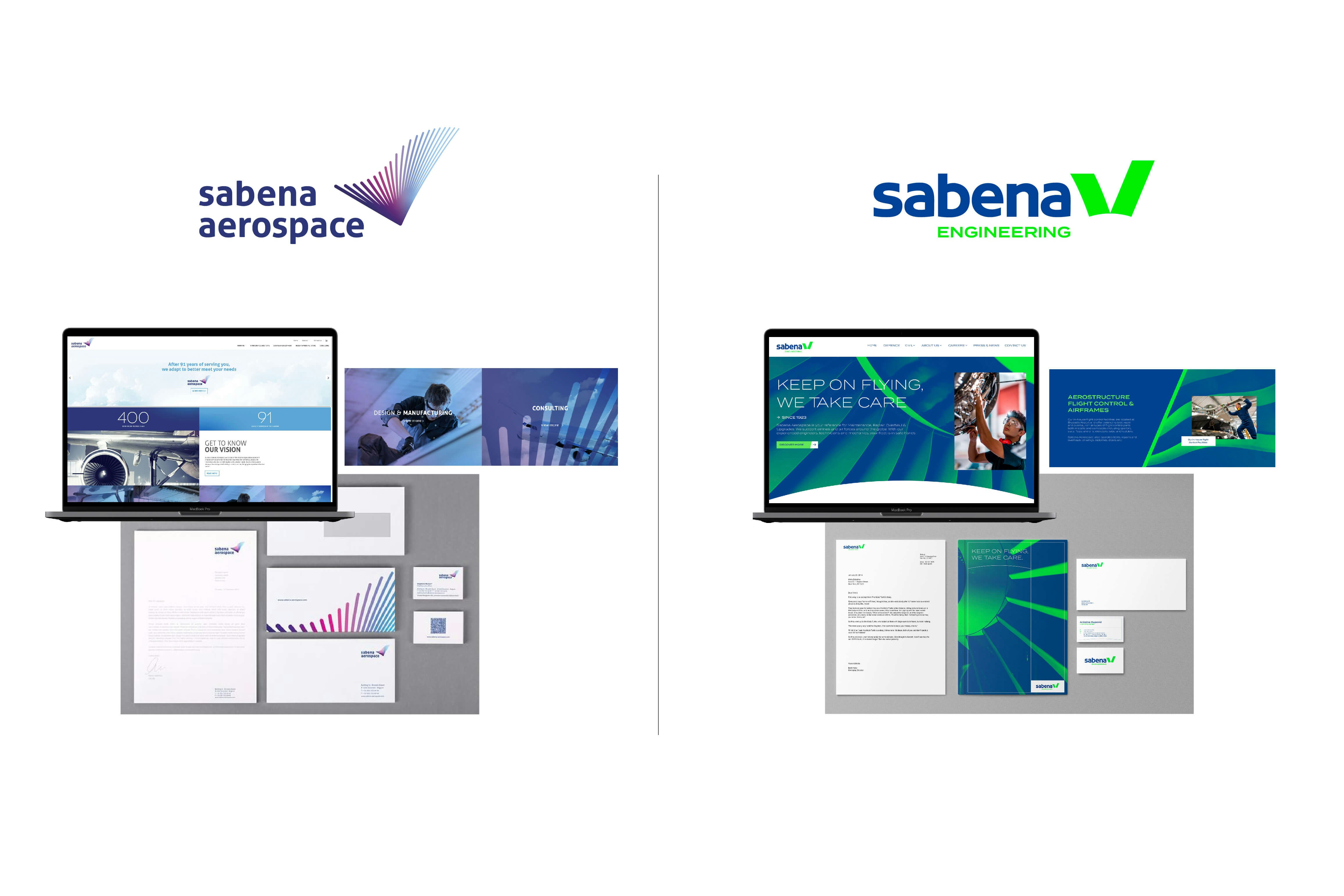
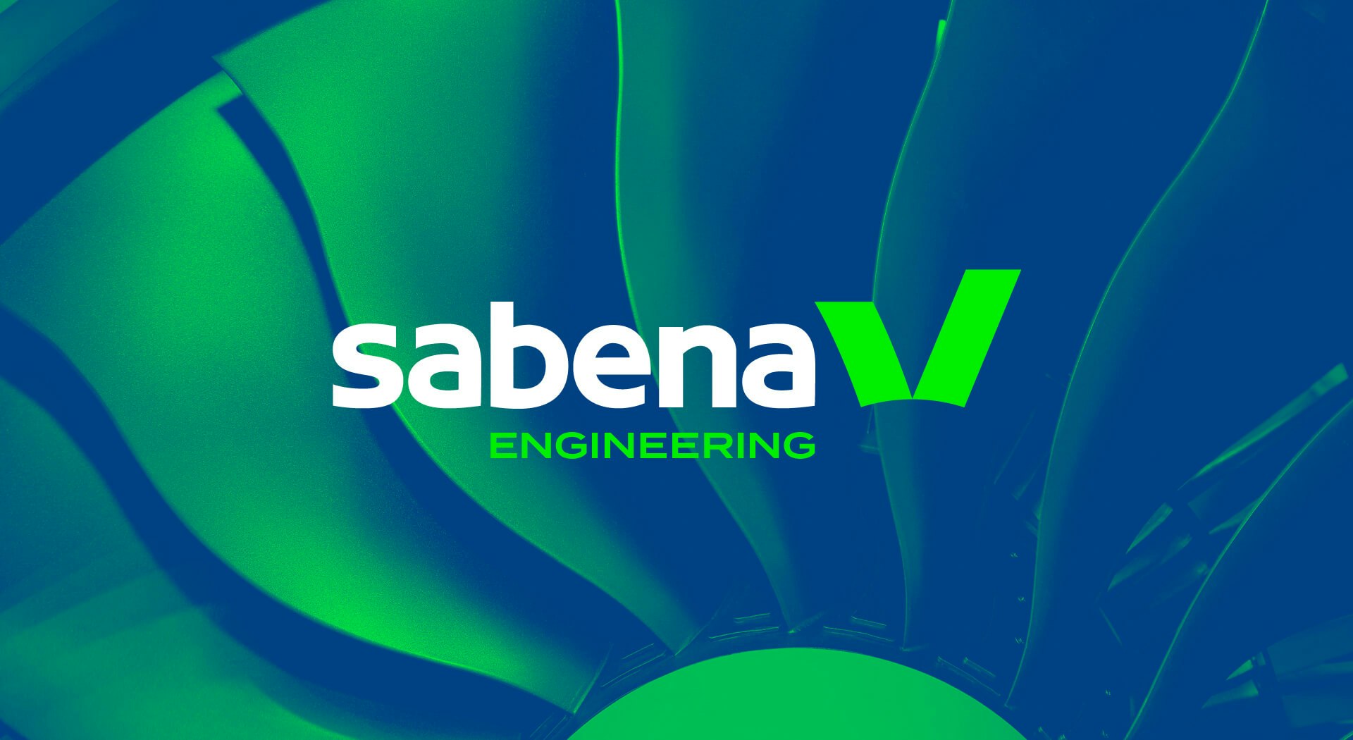
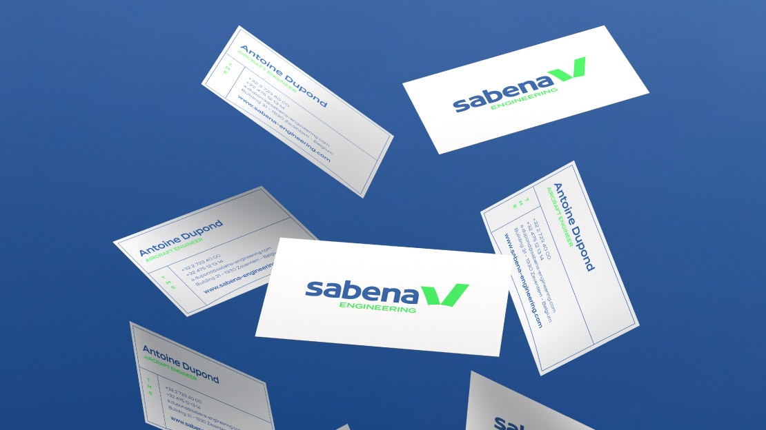
Sabena aerospace becomes Sabena Engineering
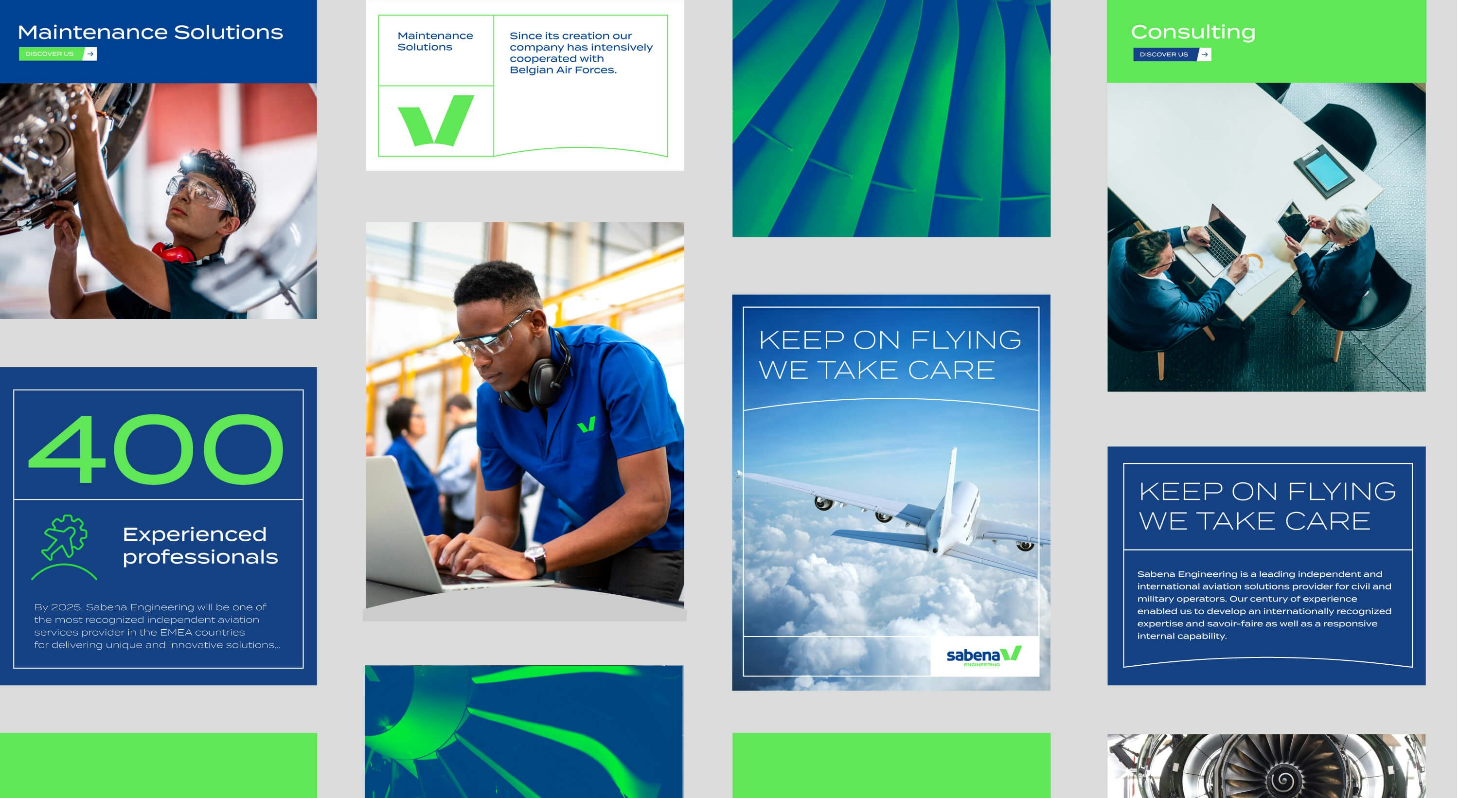
First and foremost, for Sabena Aerospace, we needed to work on the name and the way in which it reflects the brand's expertise in the aeronautical MRO (maintenance, repair & operations) sector. So "Aerospace" becomes "Engineering", a term that is more indicative of the company's skills. Combined with a strong and engaging positioning (Keep on flying, we take care), it lays the foundations for Sabena Engineering's identity as a brand.


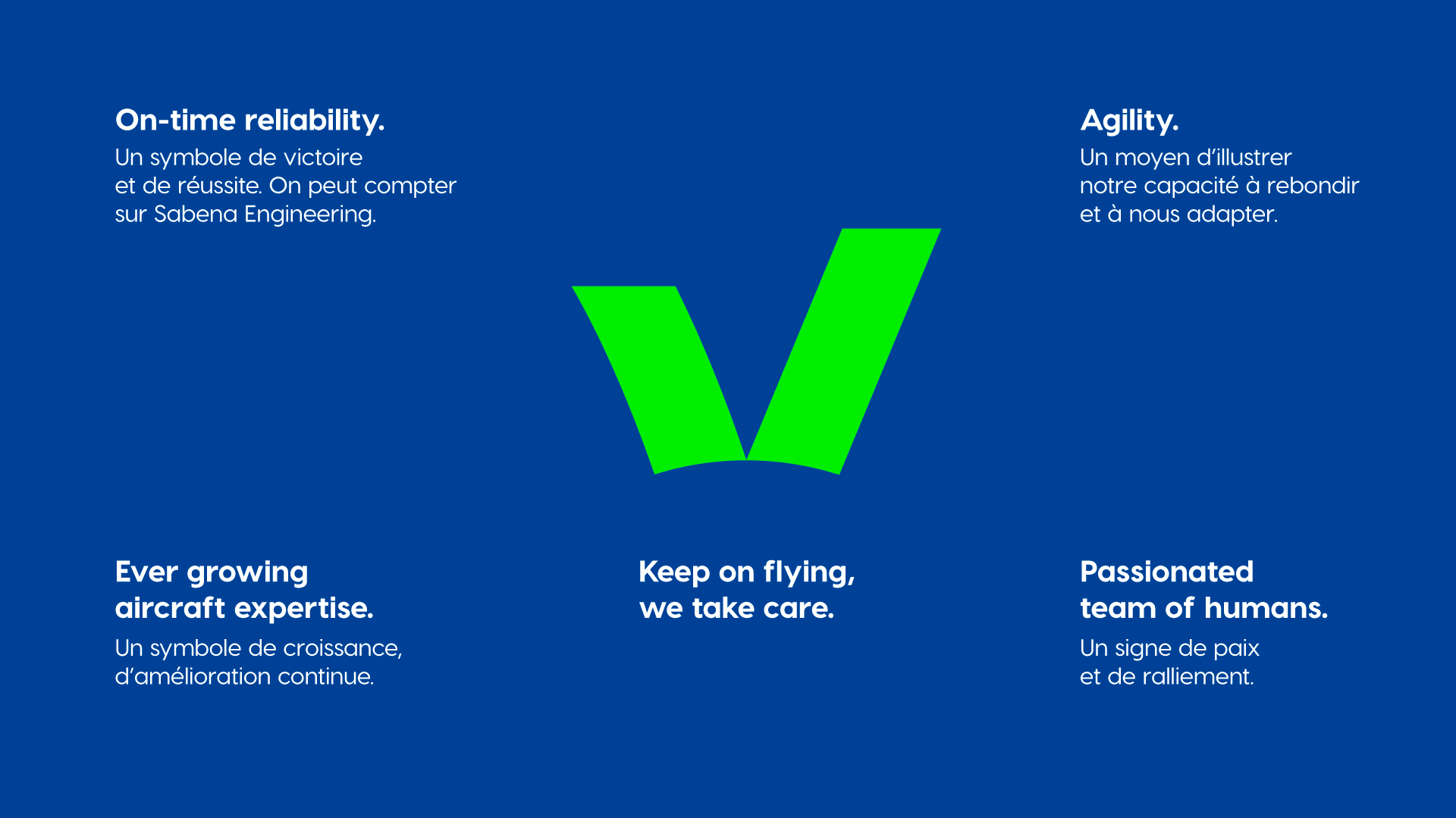
V for...
The new logo is built on the historic Sabena typography and a strong symbol of the brand: the V. A universal symbol of victory and quality, but also a sign of unity, for a community of people passionate about their work.


An ambitious visual identity
Sabena Engineering comes with new visual codes that reflect its technical expertise. The colour palette has also been enhanced with two new important colours: blue, in reference to Sabena Engineering's roots, but also to the aviation sector; and green, which expresses a new vision, a desire to reinvent itself, to reduce the industry's ecological footprint.