SFPI-FPIM
Federate to build the future of Belgium.
The SFPI-FPIM is embarking on a brand new era. With its ambitious strategy, new logo and bold graphic identity, the Belgian Federal Holding and Investment Company is armed and ready for the years to come. The organisation may be somewhat discreet, but it plays a pivotal role in the Belgian economic landscape and is finally ready to come to the fore, through clever strategic design!
Industries
- Public Services,
- Finance.
Skills
- Strategy,
- Brand Design,
- Brand Architecture,
- Digital.


Challenge
Though the project was limited by certain design constraints (the name, the colours of the Belgian flag and the institutional aspect), we nevertheless began with an almost-blank slate. For many years, the SFPI-FPIM's communication and branding has been understated, discreet. It was high time for the brand to step into the spotlight, and be given the image it deserves. So, how could we show the status and heritage of this Belgian federal fund while highlighting its impressive agility and forward-looking vision?
Solution
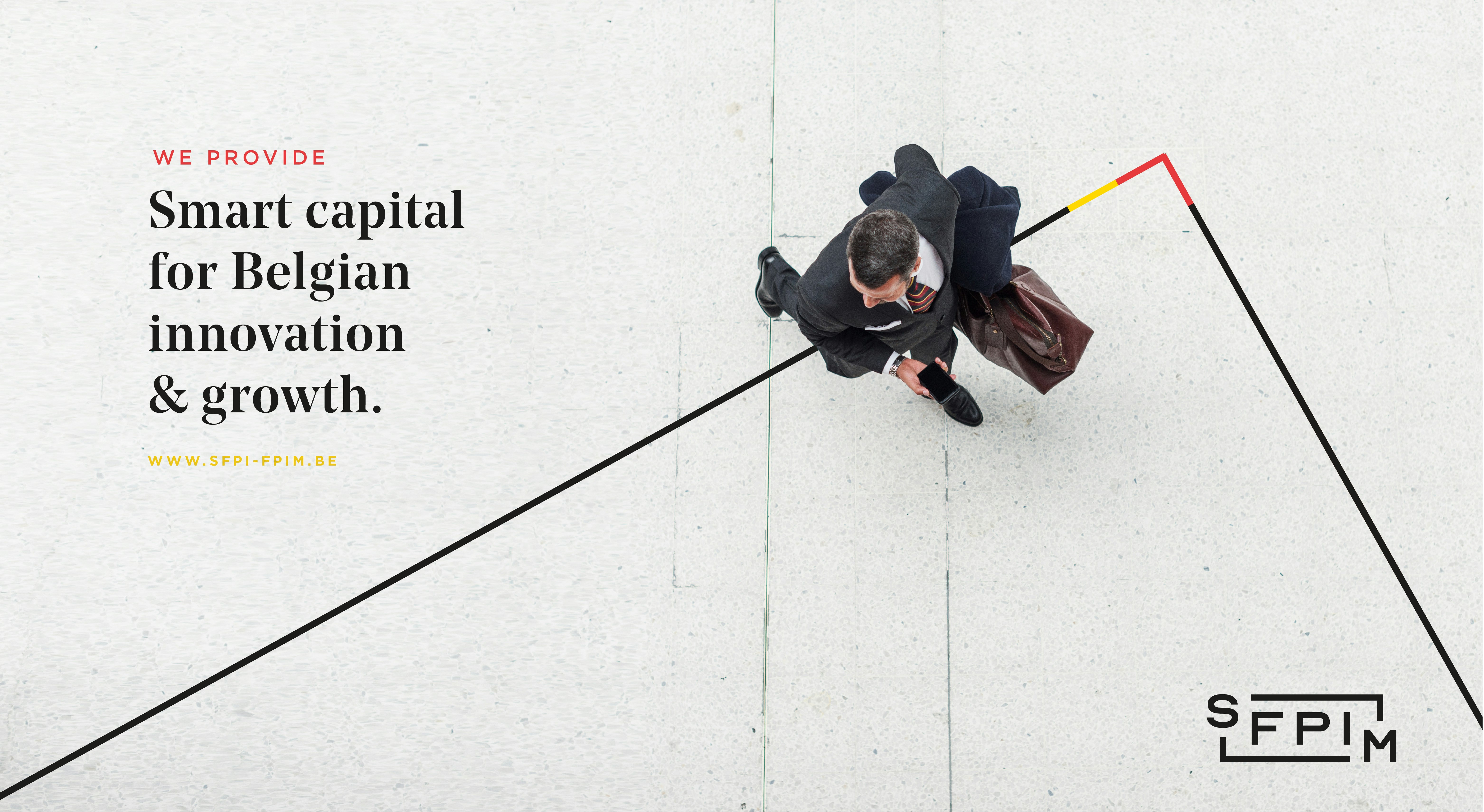
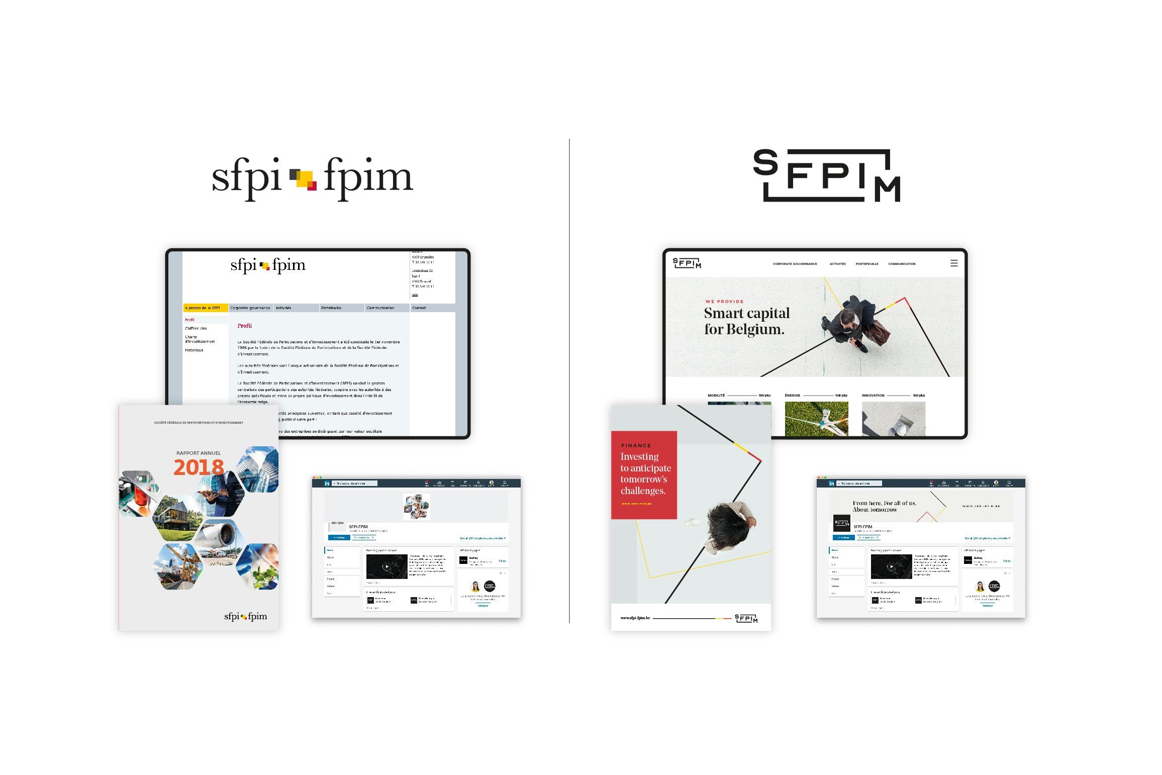
We began by defining the positioning of the SFPI-FPIM, inspired by its federal roots and its unifying role. Then we created a new inclusive and dynamic logo. A logo that opens doors and adapts to new possibilities... The typography brings an institutional angle and affirms the status of the SFPIM. All of which is reinforced by an elegant graphic identity, composed of "top view" iconography and a repertoire of subtle yet dynamic shapes.


From a federal to federating approach
Operating in a complex and fragmented political environment, the SFPIM has a singular status; its unique role goes beyond borders, individual interests and community spats... It is so more than a federal financial tool; it is a unifying entity. And it is based on this powerful and engaging positioning that the graphic identity of the SFPIM brand was able to be built.
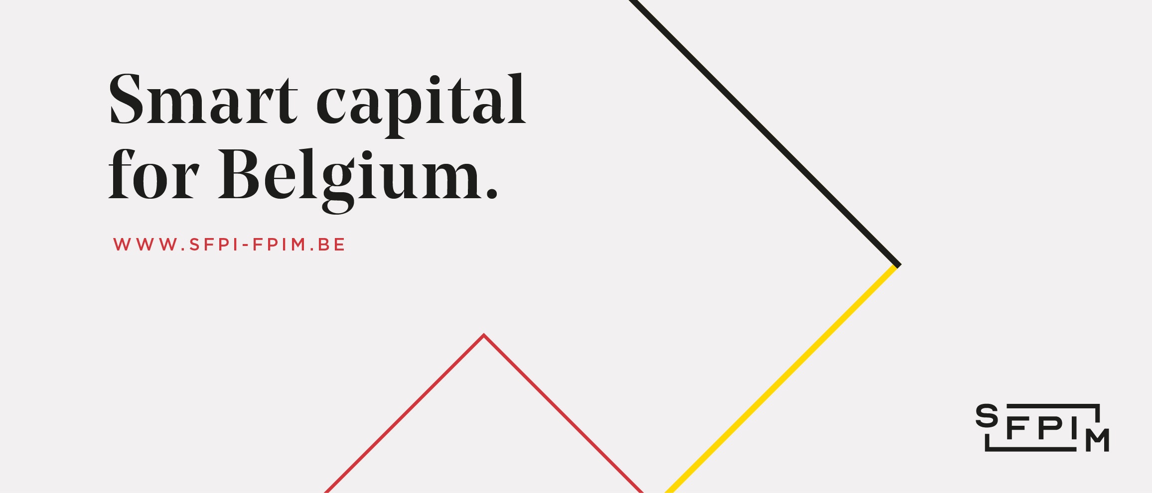
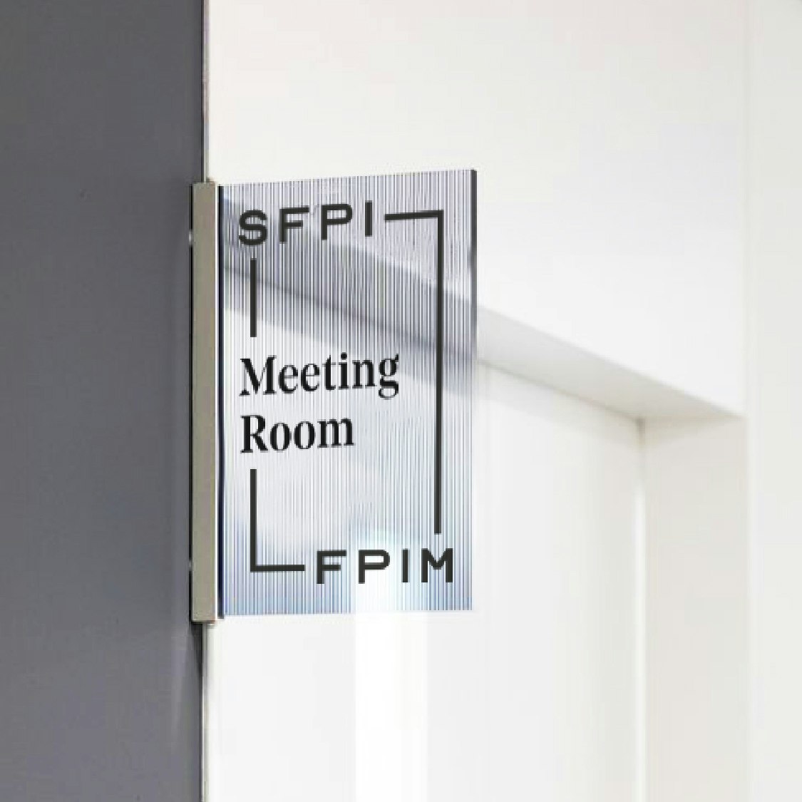
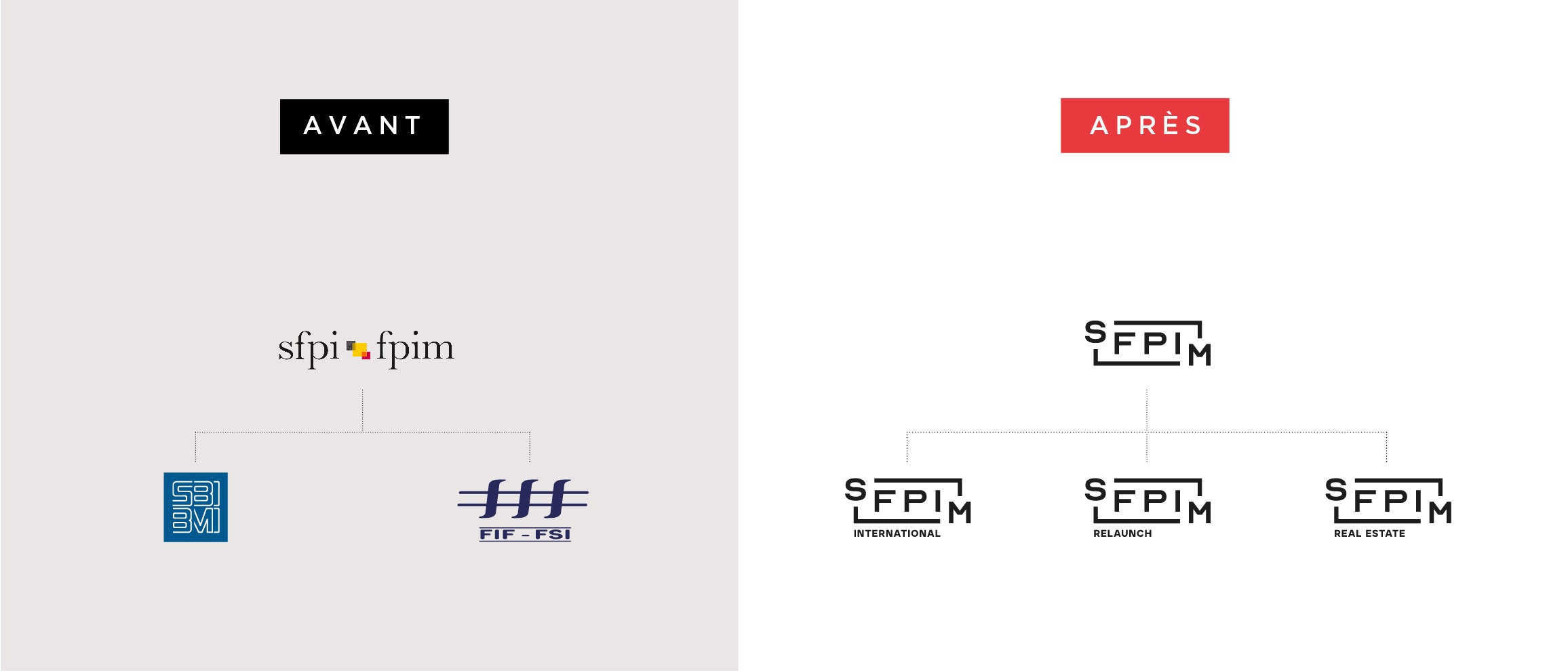
A unifying logo
Nothing could be less unifying than a logo in two different languages. We therefore developed a single version, making the link between French and Dutch to symbolise the unifying role of the SFPIM. It's an open and dynamic logo that demonstrates the SFPIM's stability, as well as its considerable flexibility.


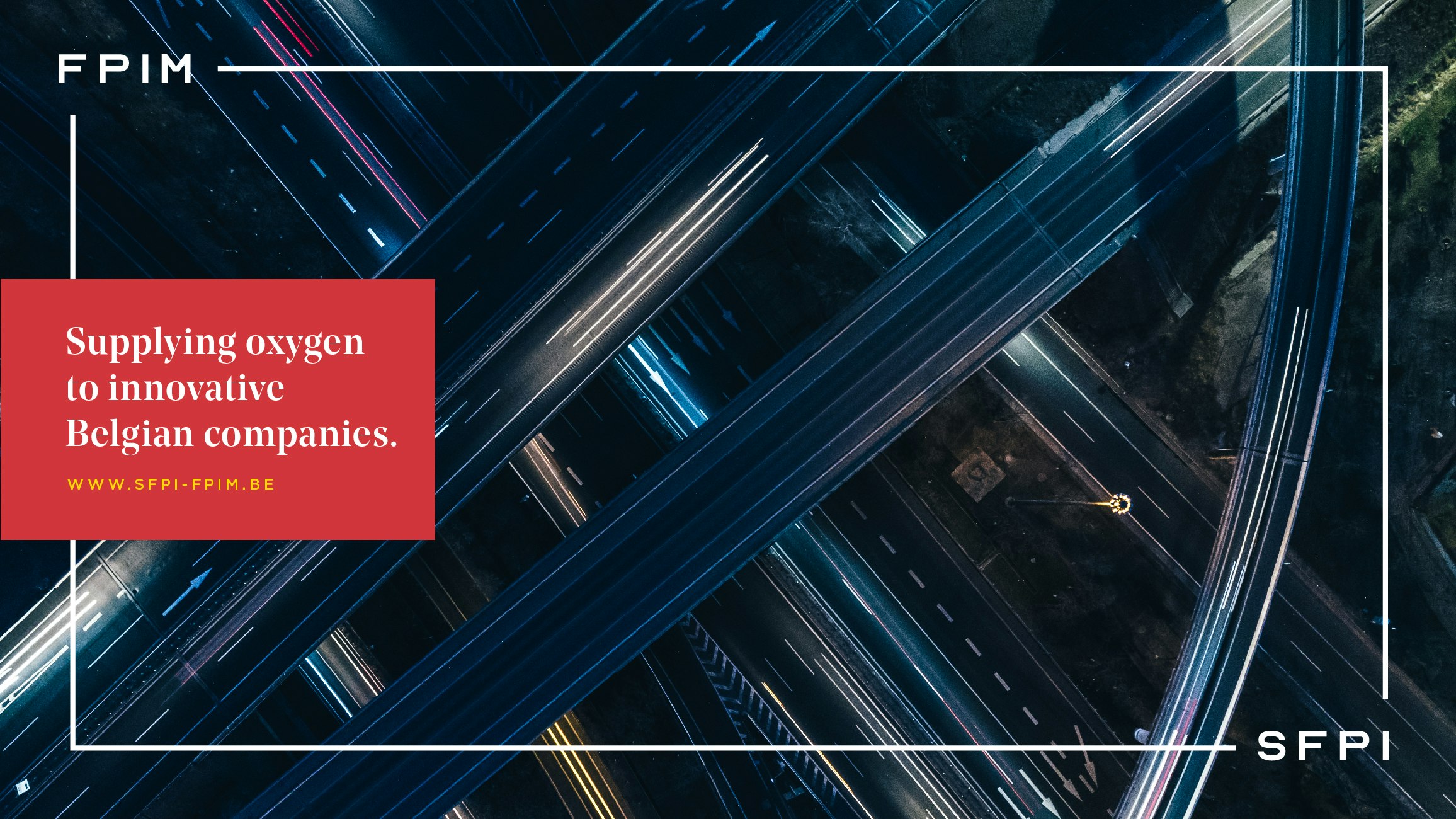


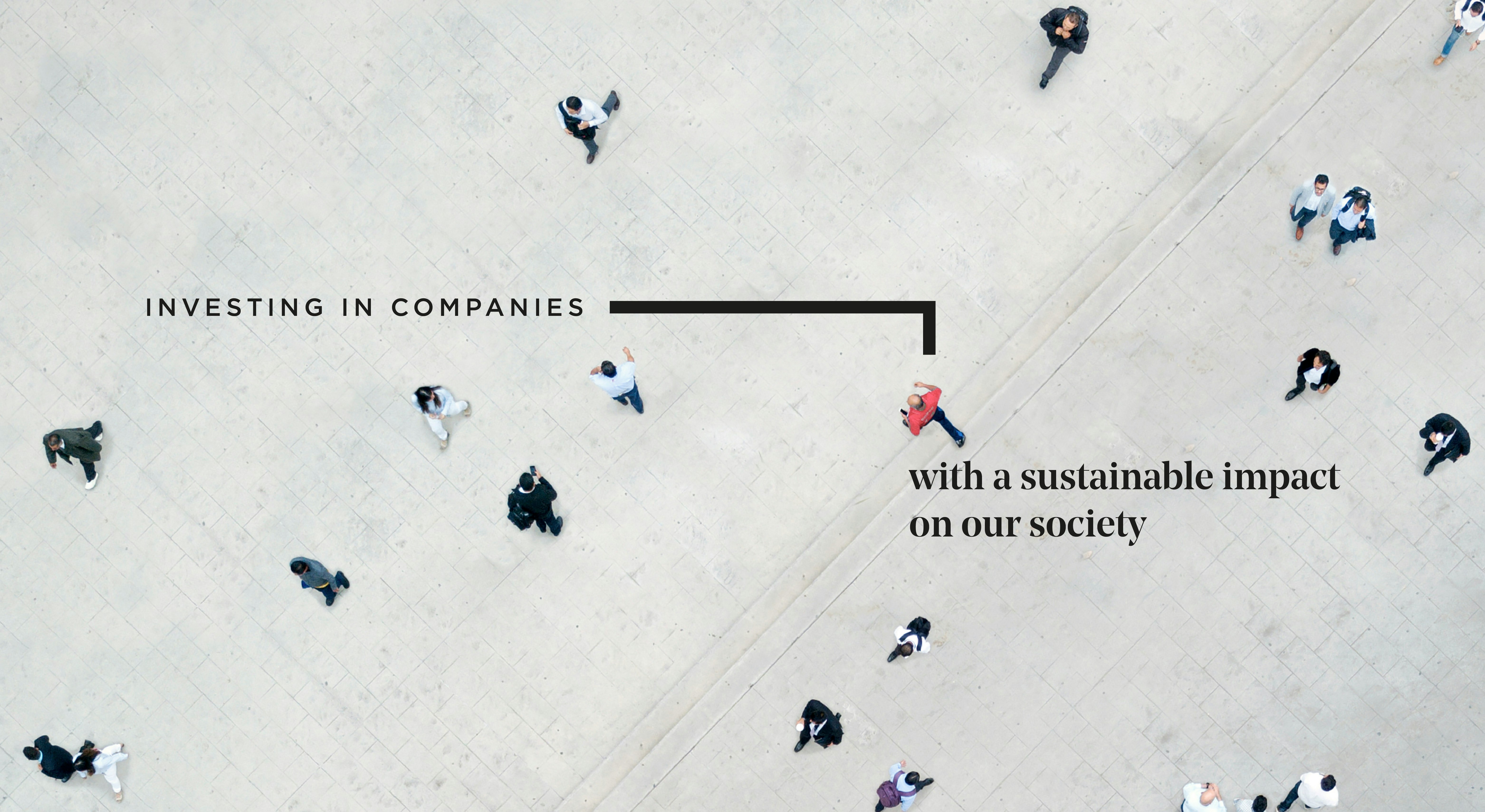
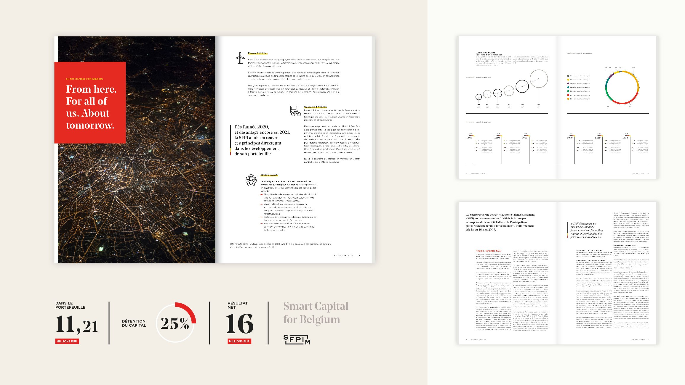
An overarching visual identity
The iconographic style, made up mainly of "top view" photos, illustrates the comprehensive overview that the SFPIM has of the Belgian economic landscape. The typography and colours were also chosen to give a federal and institutional status to the brand. Added to this is a repertoire of rectangular and wireframe shapes that bring life to this identity in a subtle way.