Australian Ice Cream
From "Ice to have" to "burning desire".
"An ice cream a day keeps the doctor away". Why not transform this motto to a well-designed client benefit? Coming from a descriptive brand to an expressive brand, that was our ice challenge with Australian.
Industries
- Food & Drink.
Skills
- Strategy,
- Brand Design,
- Retail Design,
- Packaging.


Challenge
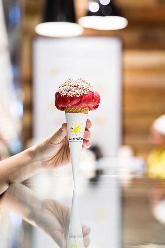
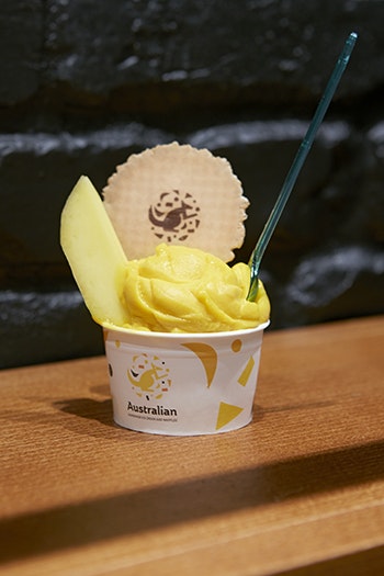
The product speaks for itself. Translating the passion for ice cream into an unforgettable customer experience: ice cream made on-premises using natural ingredients. Designing a global brand that tells the story, enhances the customer base through the shop design and targeted communications.
Solution
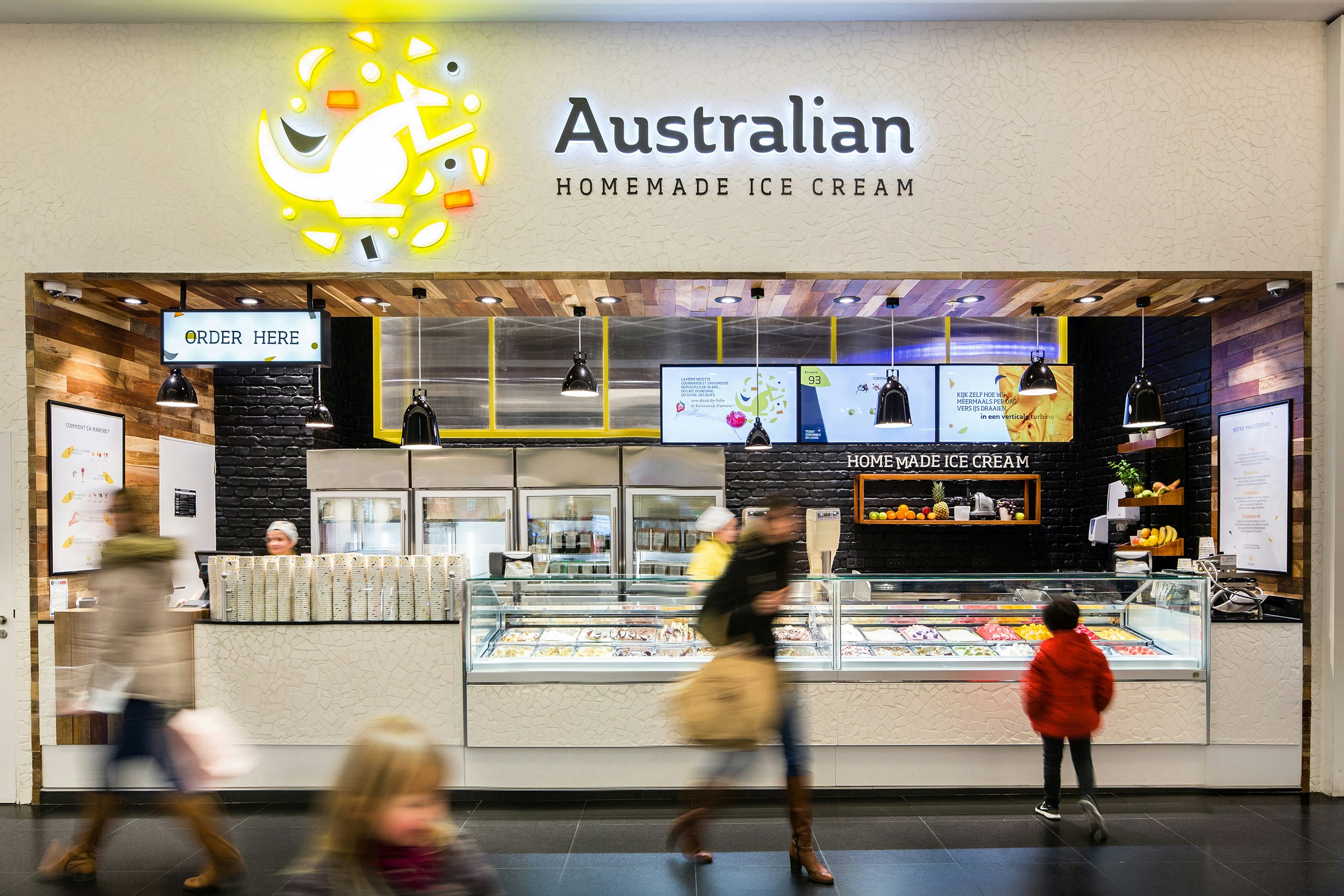
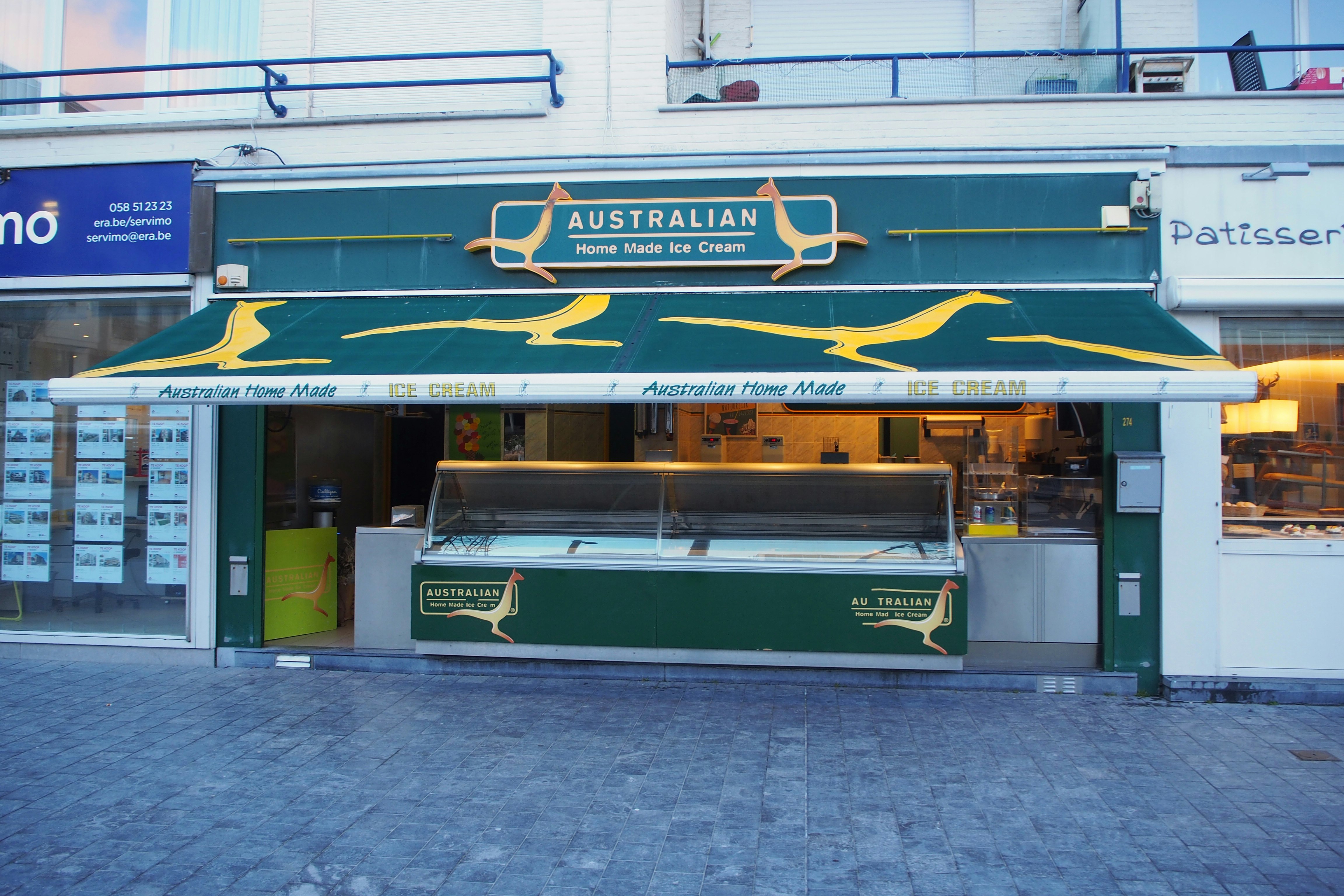
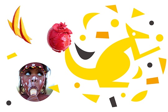
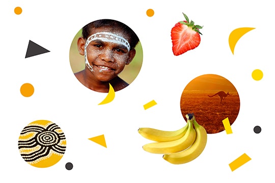
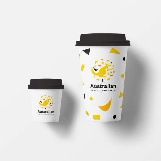
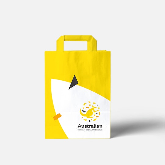
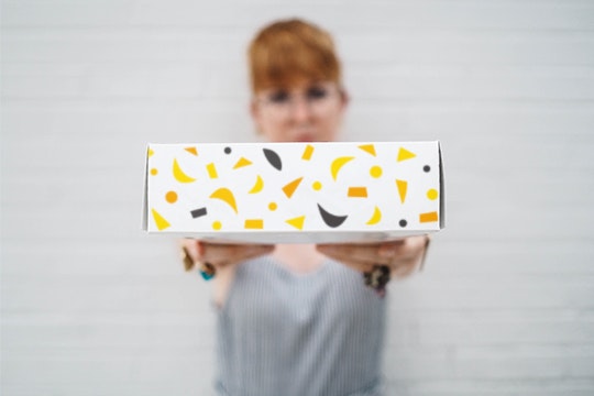
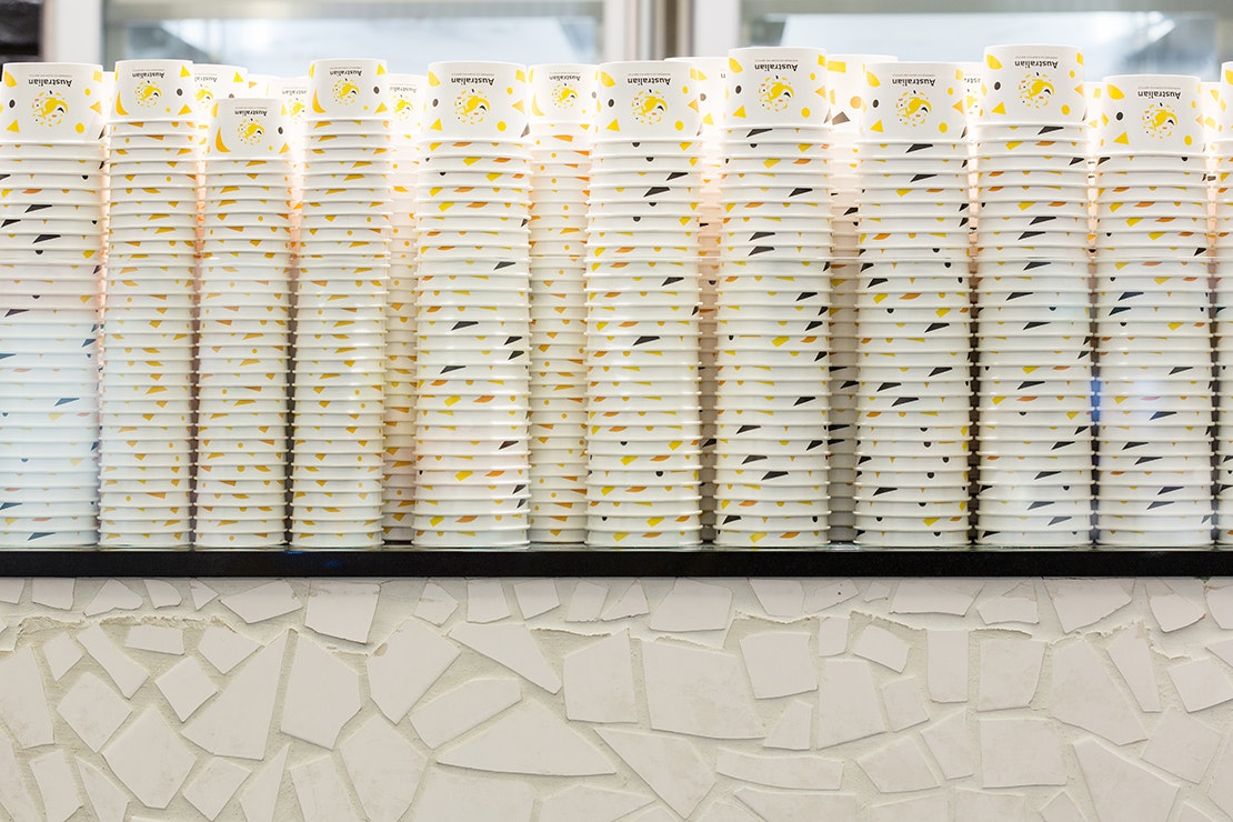
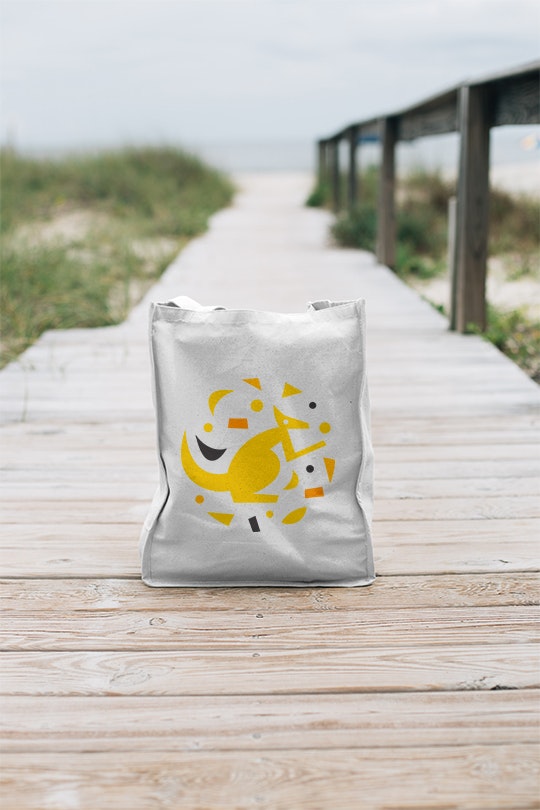
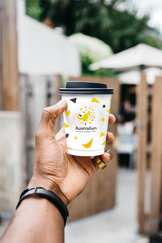
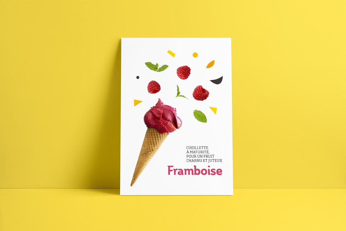
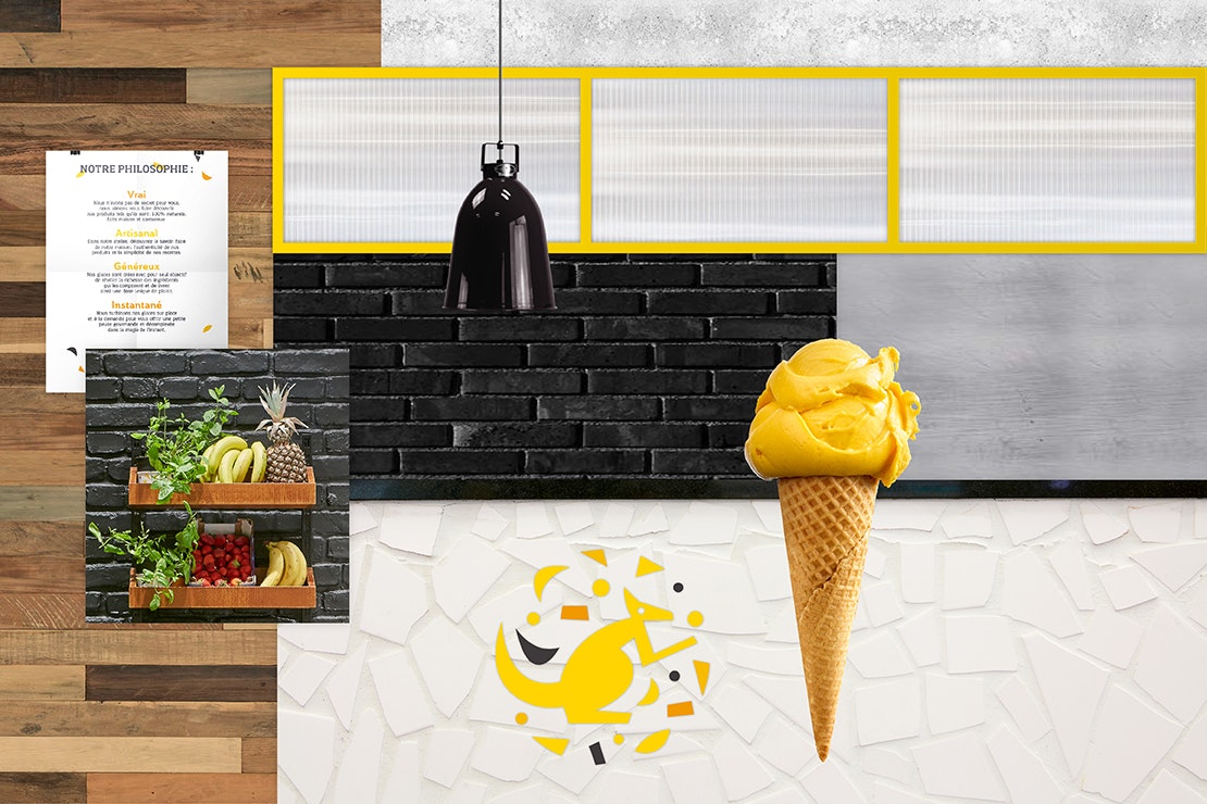
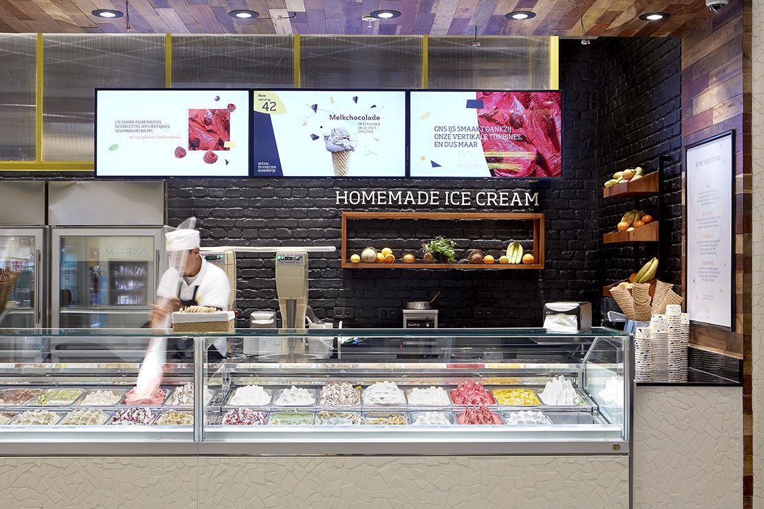
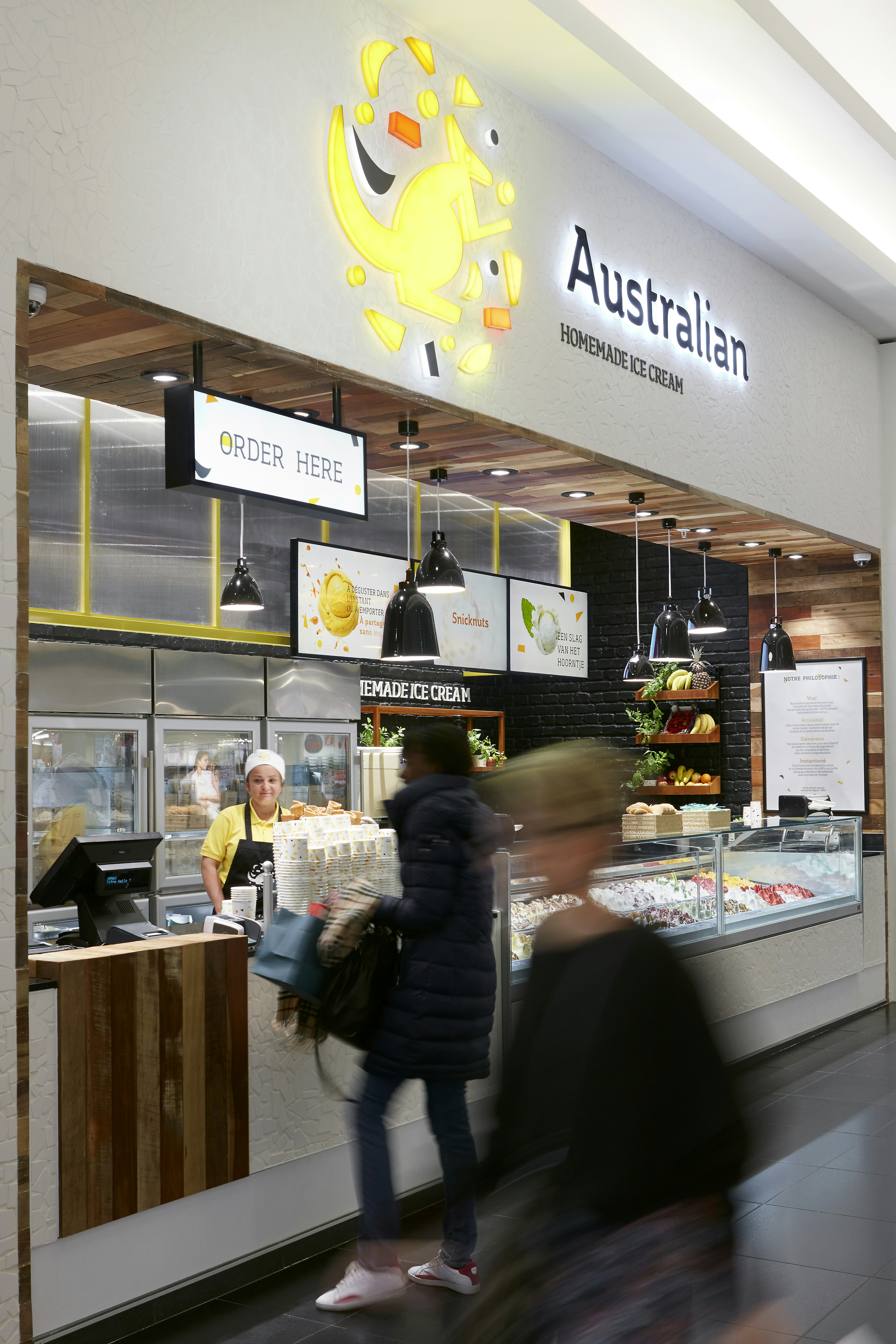
Deliberately choosing to retain the name, representing life’s simple pleasures. Just like the ice cream products, this business is homemade. On the one hand we have the workshop dimension where the ice cream machines are visible to customers, allowing them to see how our ice cream is made. On the other hand, a friendly and welcoming staff team. Yellow is the defining colour of the brand. For the brand logo, we have a unique design: a yellow kangaroo glimmering in the centre of ice shards.


Opening the eyes
After talking, thinking and interviewing our collaborative team between Minale Design Strategy and the client, we opened the eyes on what was the distortion. There was a simple disconnection between natural & fresh products made by Australian and industrial look & field from the corners.
Brand & Retail point
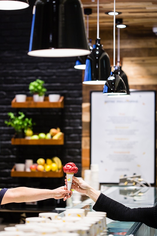
We decided to work on deux aspects : Retail point and the brand. Retail point was made to make sure the first contact is related to a unique customer experience. A kind of atelier where the client can feel the home-made dimension of the ice cream.
All the values are made to last : generous moment, handmade production, the client feels like tasting the ice cream in the chef's atelier. The iconic kangoroo is redesigned, with fresh new colours. Visual identity answers to customer experience.


Ice pleasure
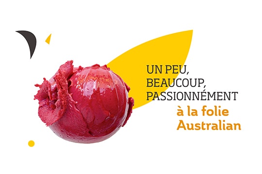
Because nowadays, people don't buy the what, they buy the why. The Australian new concept is true to his DNA. It makes sure the ice moment of pleasure is linked to a memorable experience.


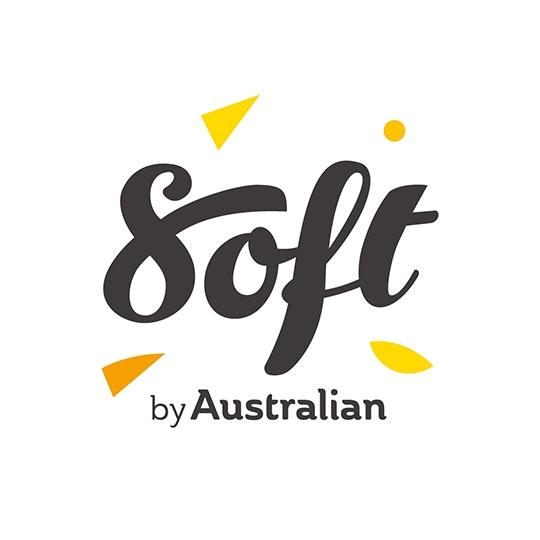
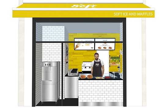
Soft by Australian
A second format uses the codes of the concept with a sub-brand. For a soft ice on the go in an urban dynamic. A small corner just as colorful for a refresh moment.