Hockey Belgium
Let's grow, together!
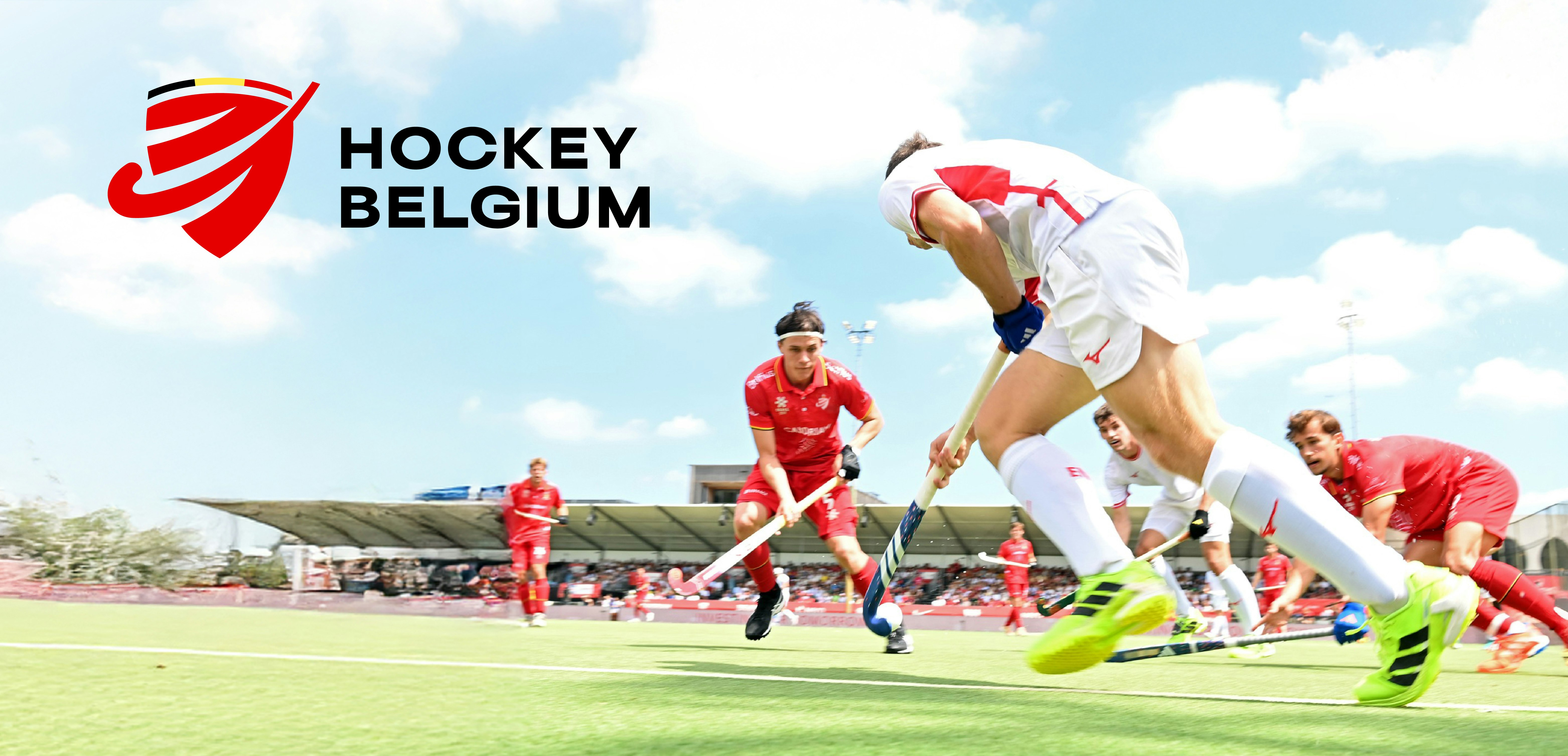
In Belgium, hockey has experienced impressive growth, boosted by the results of the national teams. These achievements are no coincidence but the result of professionalization driven by the federations. On the eve of the 2026 World Cup, it was high time to embody this ambition through a new brand and an identity project. Today, Hockey Belgium unites an entire sport that is organized and forward-looking.
Industries
- Entertainment.
Skills
- Strategy,
- Naming,
- Brand Design,
- Brand Architecture,
- Brand management,
- Digital.
Challenge
Belgian hockey has been booming in recent years: over 60,750 members, 111 clubs, and remarkable sporting successes. Yet this development was hindered by a fragmented image. Three entities (ARBH, VHL, and LFH) communicated separately, creating a lack of coherence and visibility for the general public, players, partners, and media. The challenge was therefore clear: unify the identity to reflect the dynamism of hockey and prepare for the future, in particular the 2026 World Cup hosted in Belgium.
Solution
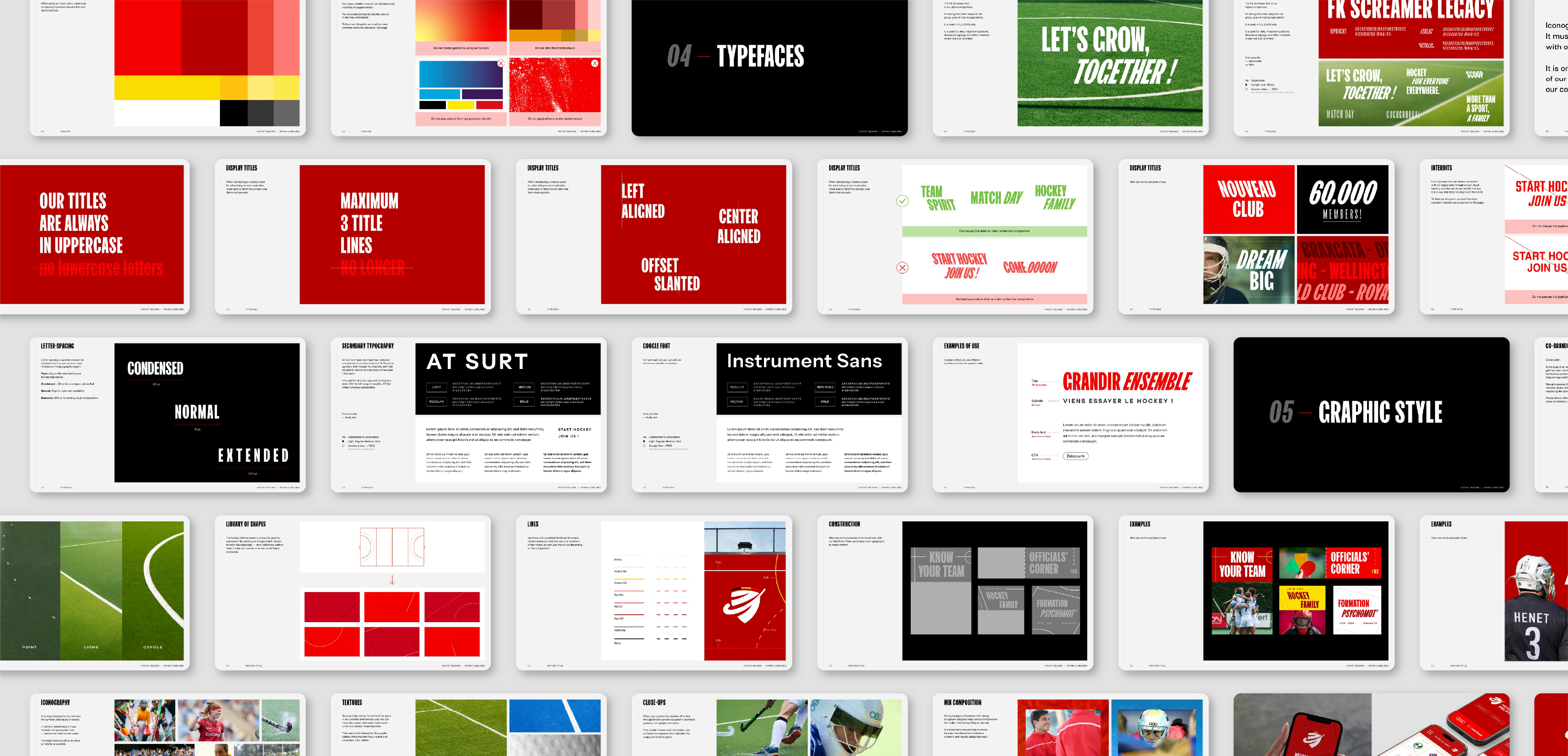
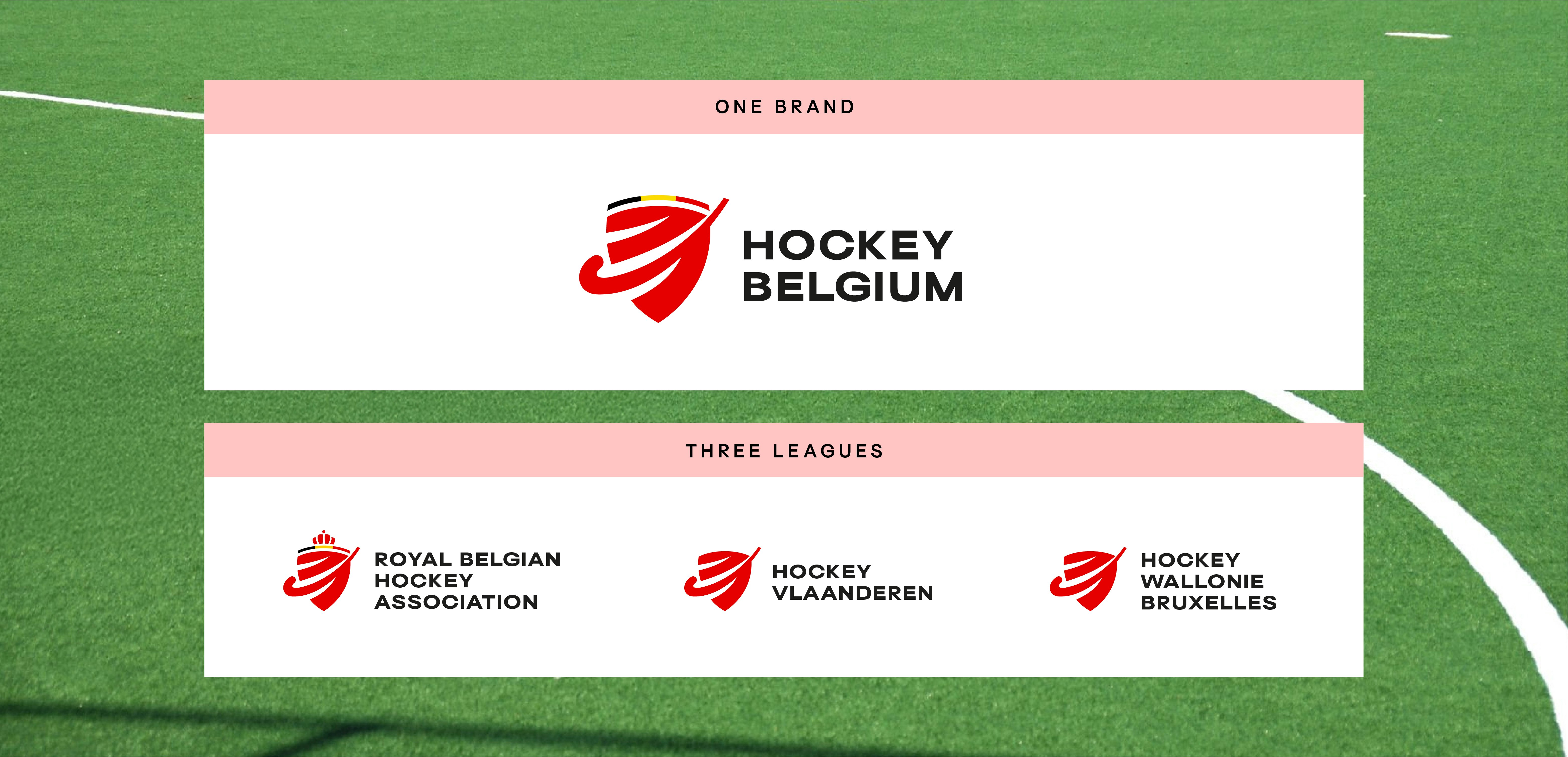
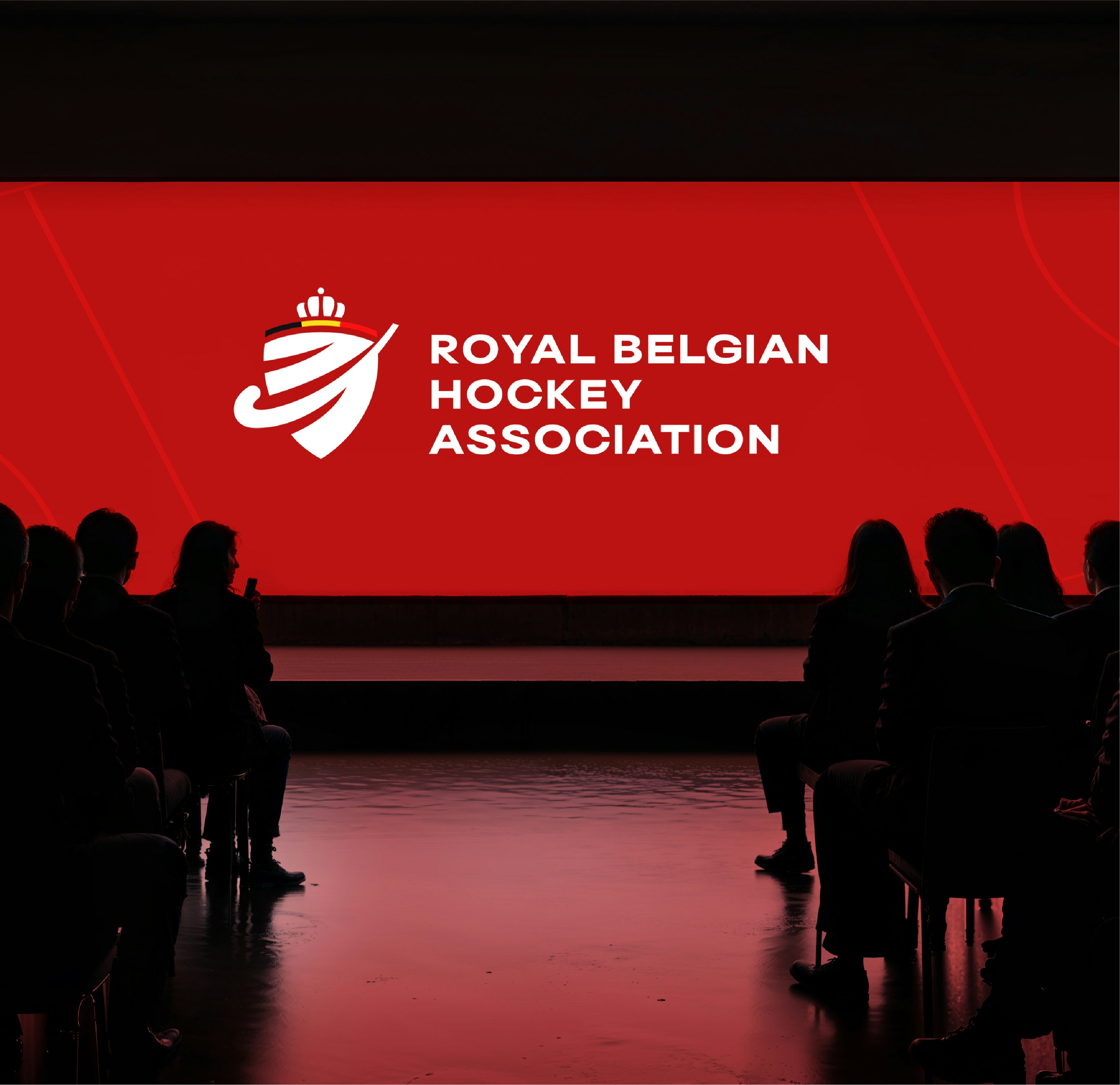
This is how Hockey Belgium was born: a unique, strong, and unifying brand, conceived as a national rallying point. It brings together the three leagues, now renamed Royal Belgian Hockey Association, Hockey Vlaanderen, and Hockey Wallonie Bruxelles. This new structure is supported by a modernized visual identity, a clear brand architecture, and a complete design system, all carried by a unifying slogan: Let’s Grow Together, expressing the spirit of Belgian hockey and its philosophy of inclusion, progress and shared performance.
A unifying crest
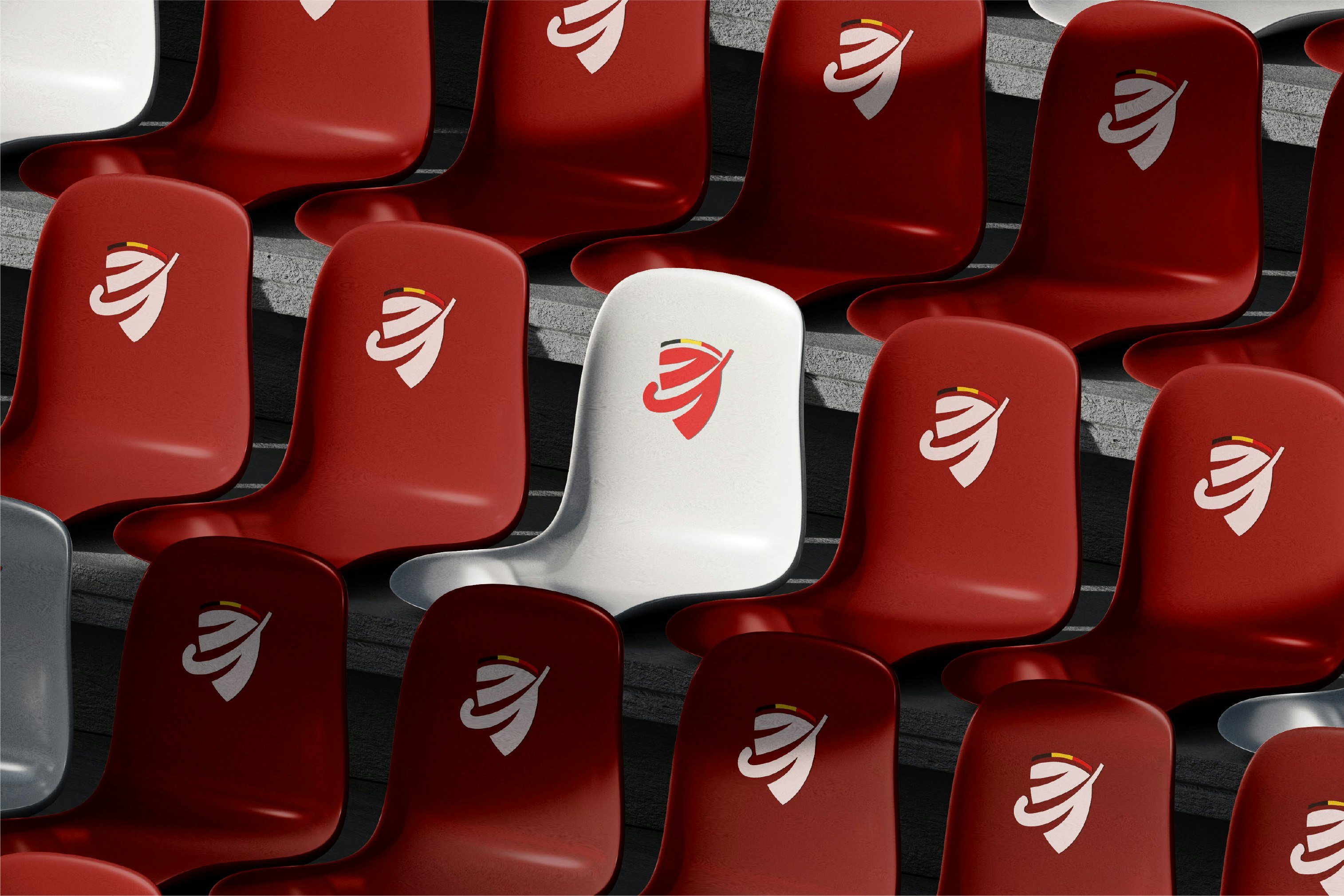
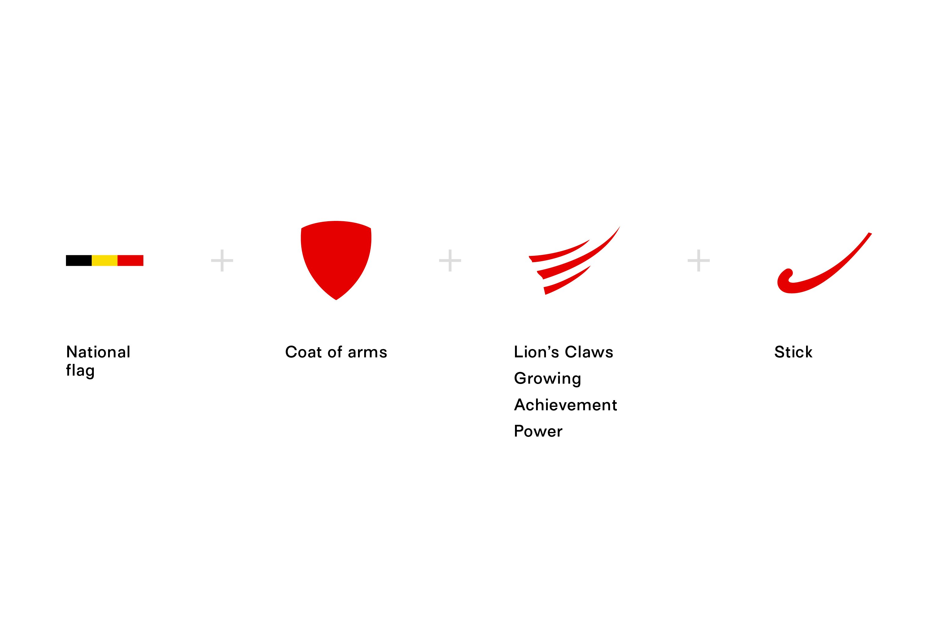
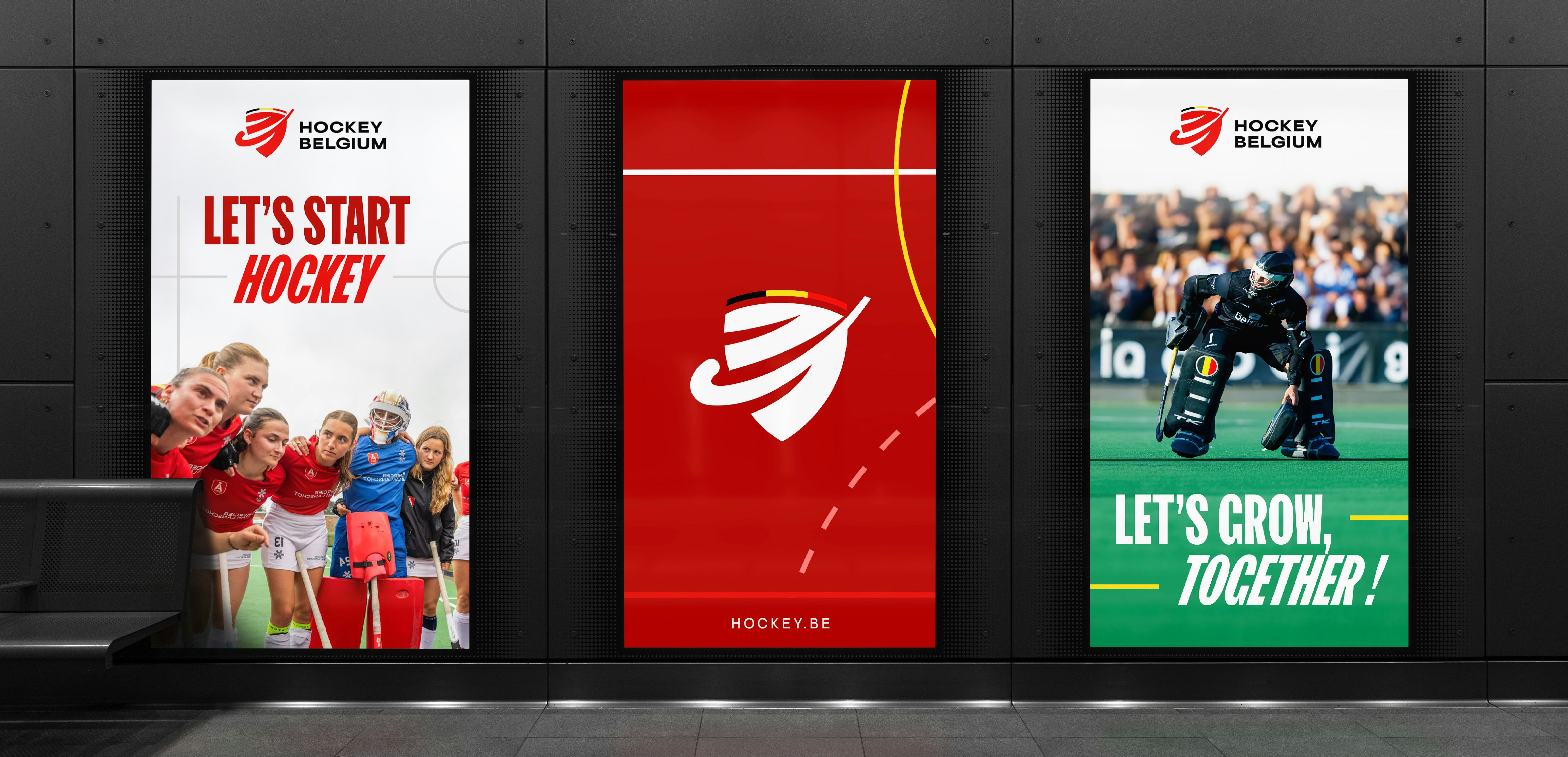
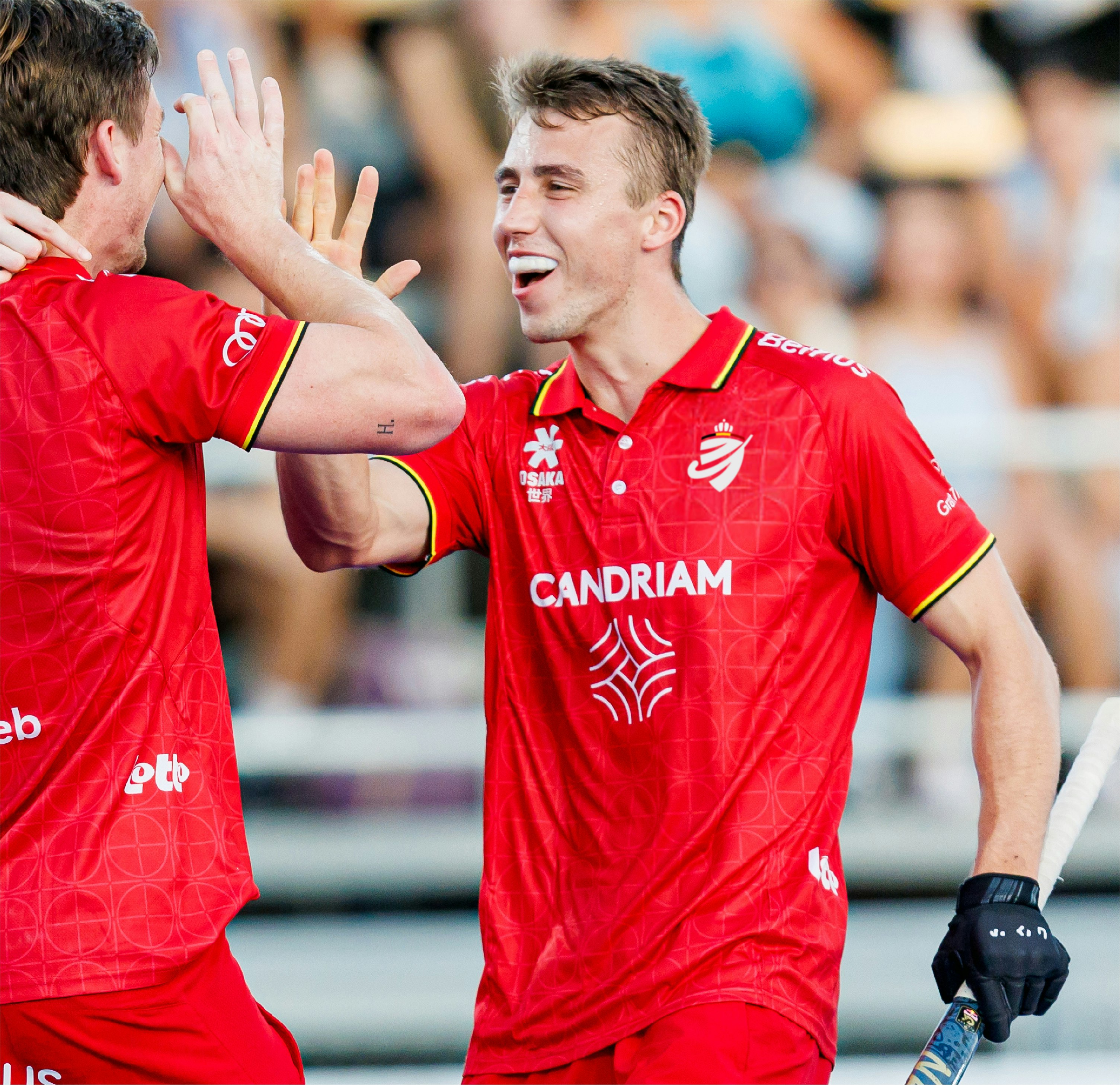
The visual identity of Hockey Belgium is built around a modern crest, inspired by heraldry yet forward-looking. Red, the central color, embodies the energy and passion of the sport, reinforced by the national colors. The stick’s shape and upward claw marks symbolize progress and the collective momentum that drives players, clubs, and supporters. This crest becomes the visual marker of a sport that is asserting itself as one of the country’s leading disciplines.
Three entities, one voice
Until now, the three Belgian leagues operated under distinct identities and communicated separately. They are now united under the banner of Hockey Belgium, with rethought names. This clear architecture strengthens visibility and affirms the unity of the entire Belgian hockey community.



An identity inspired by the pitch
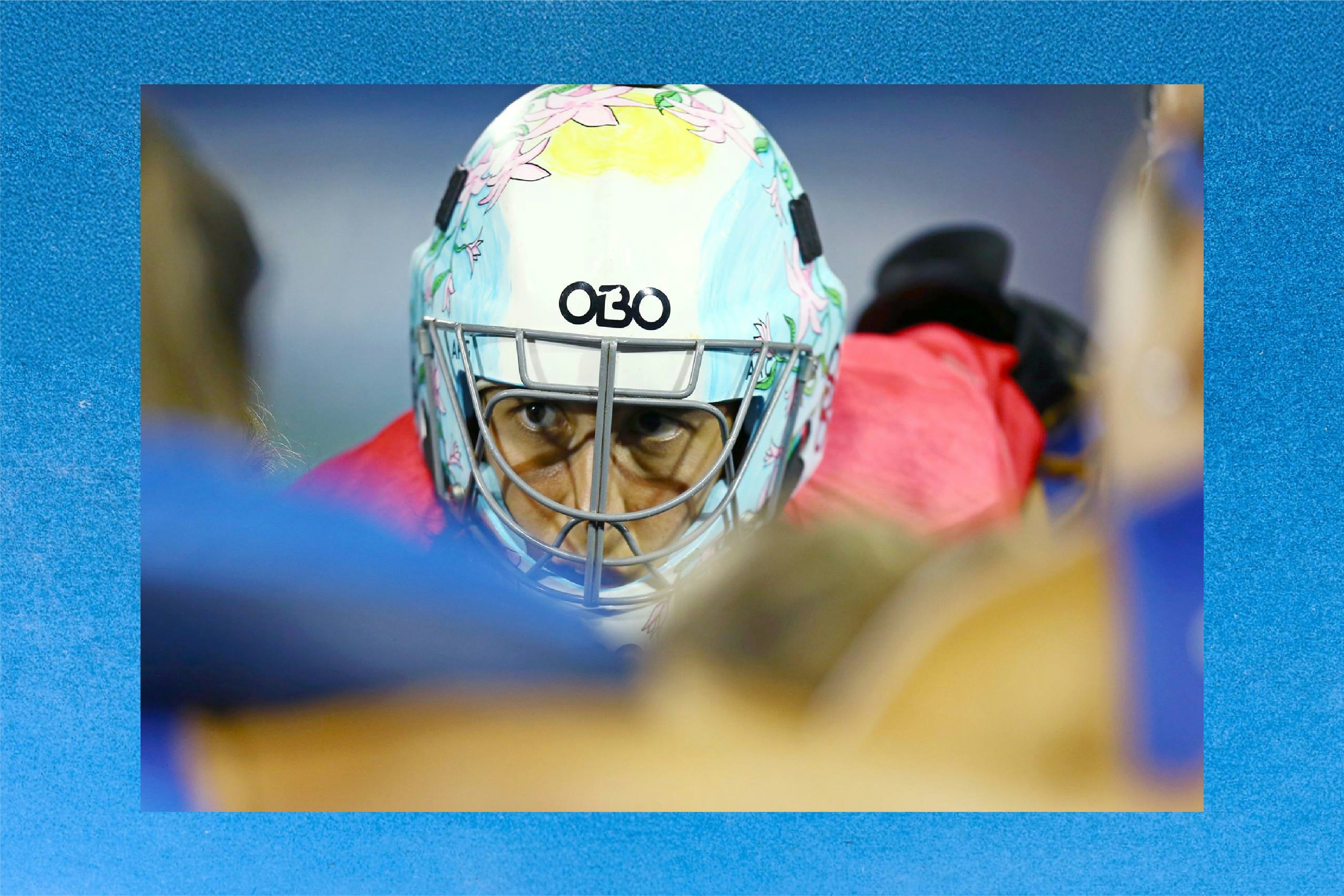
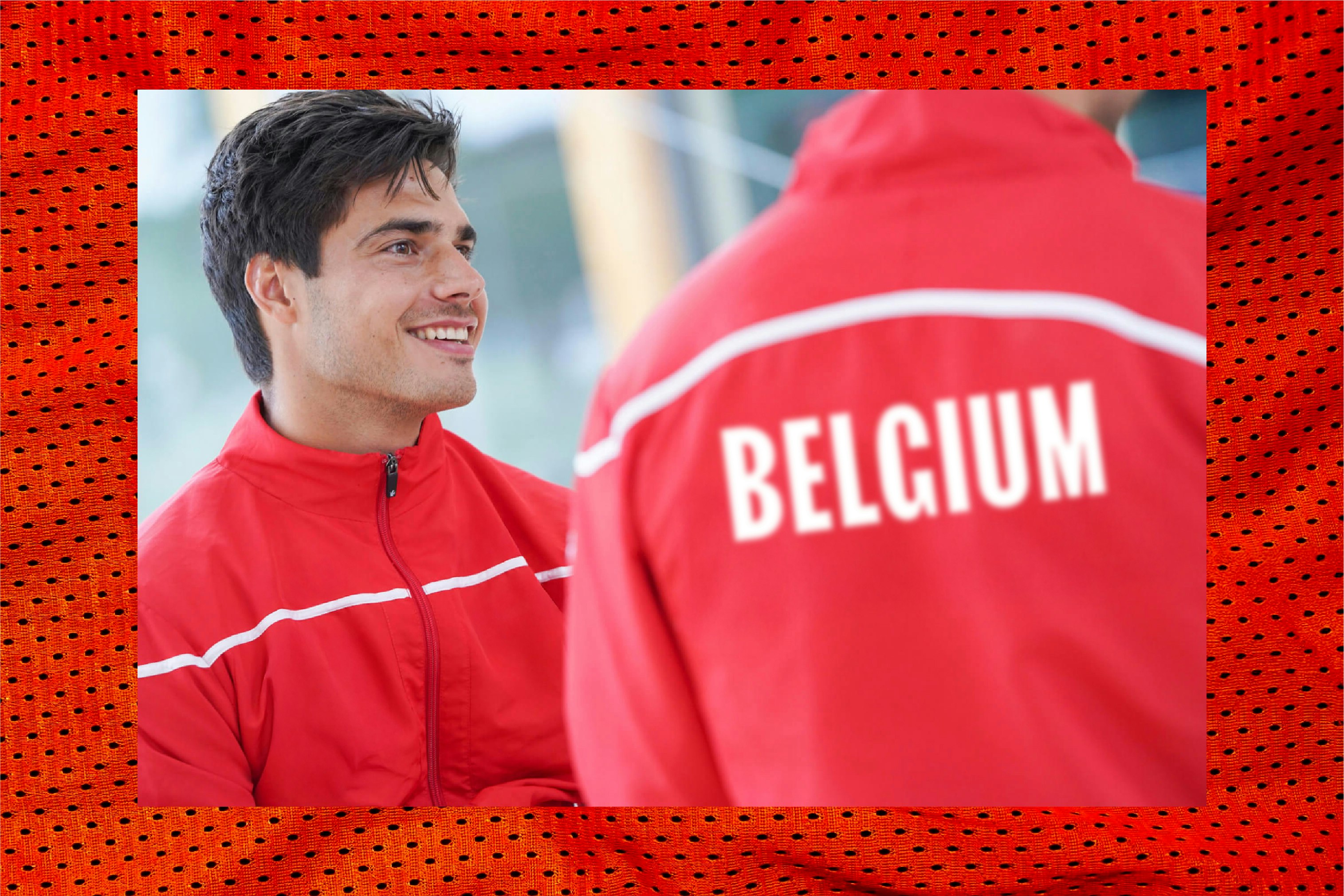
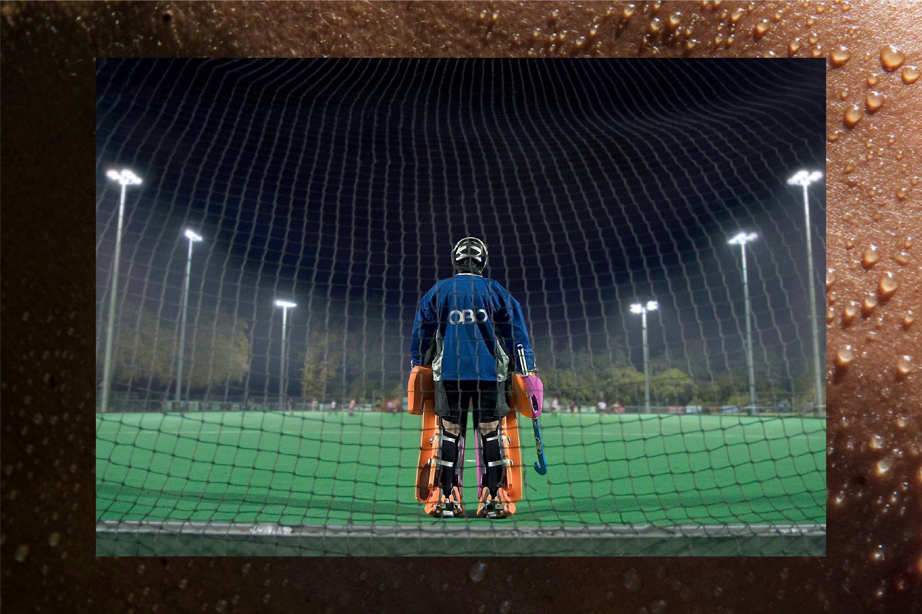
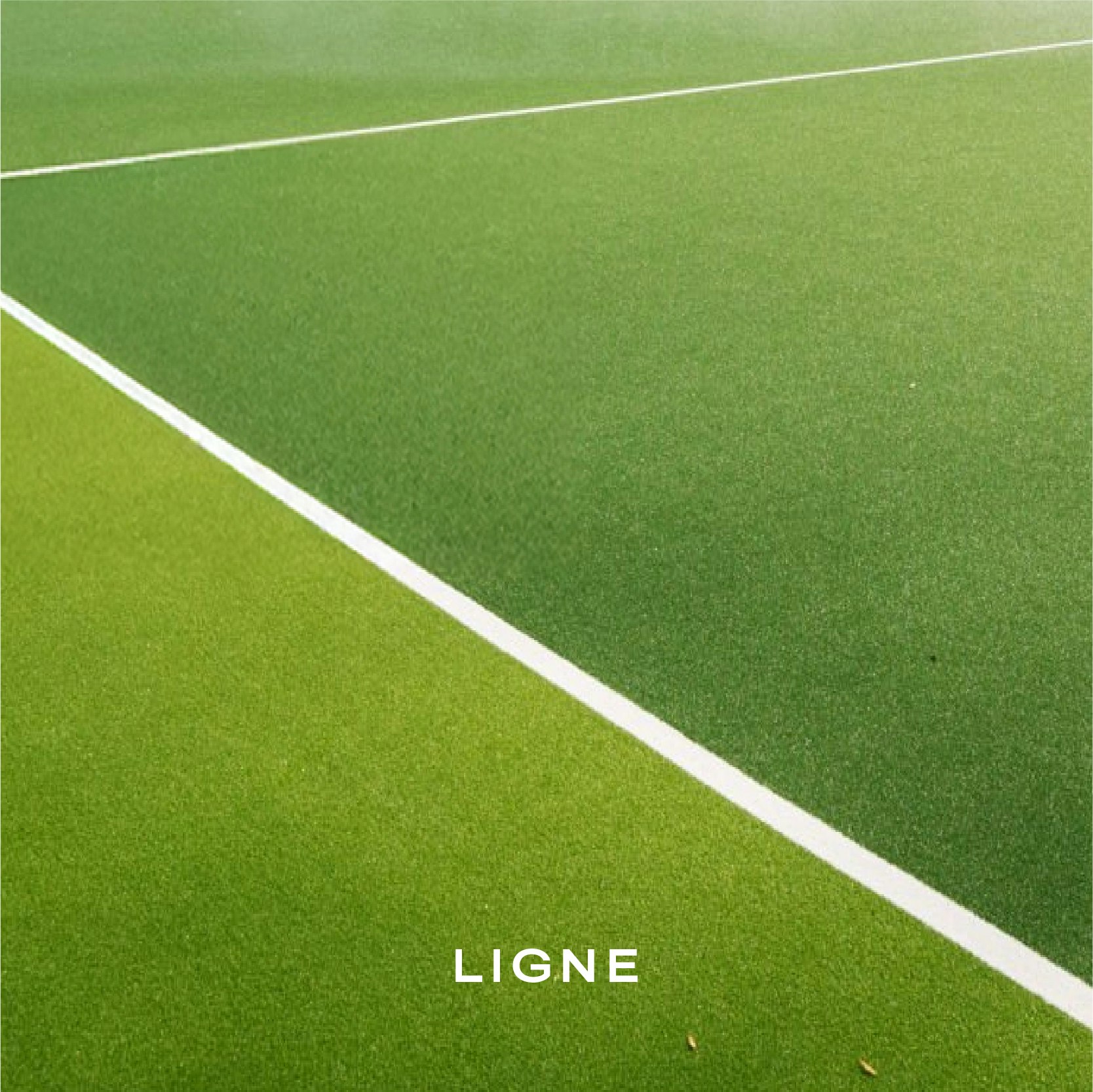
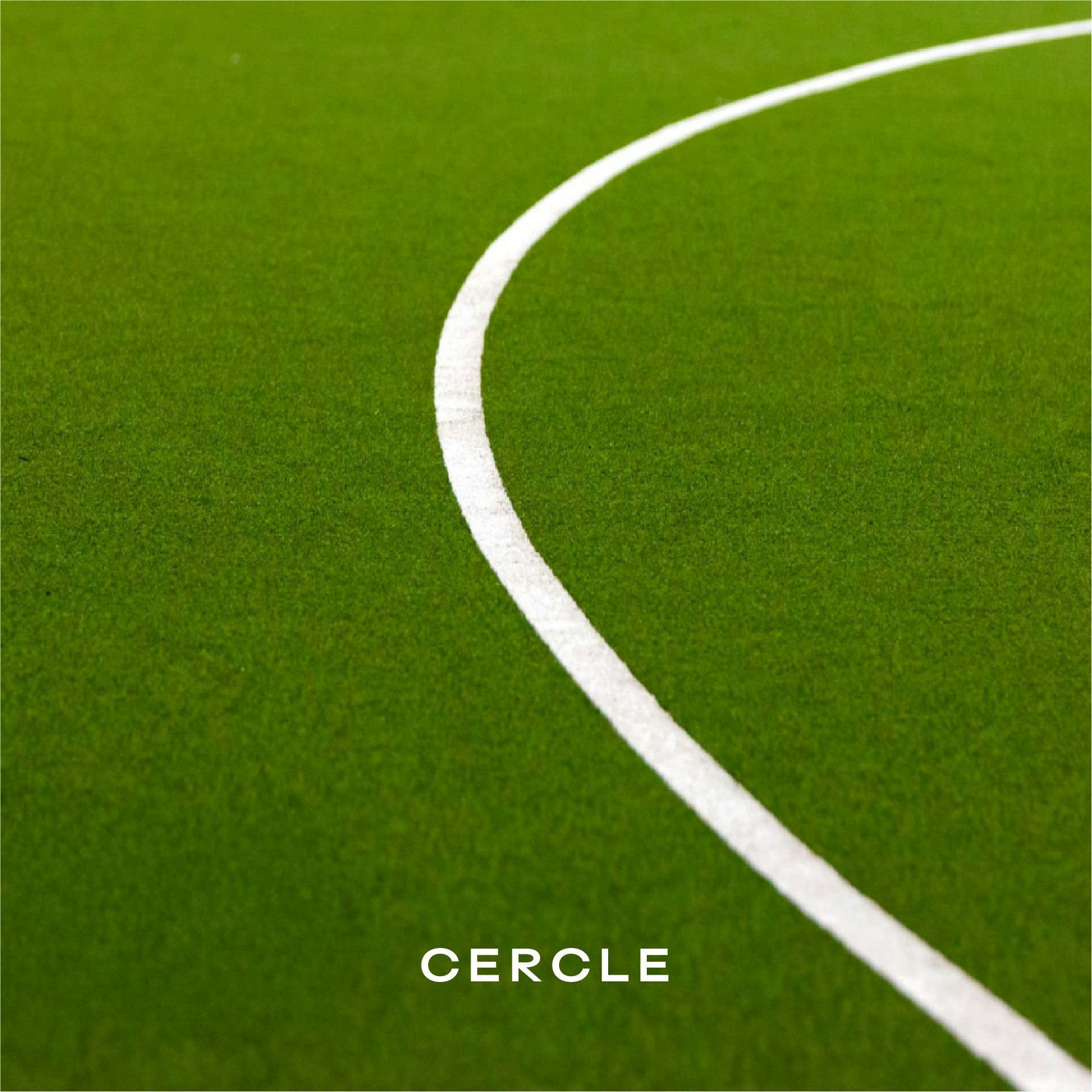
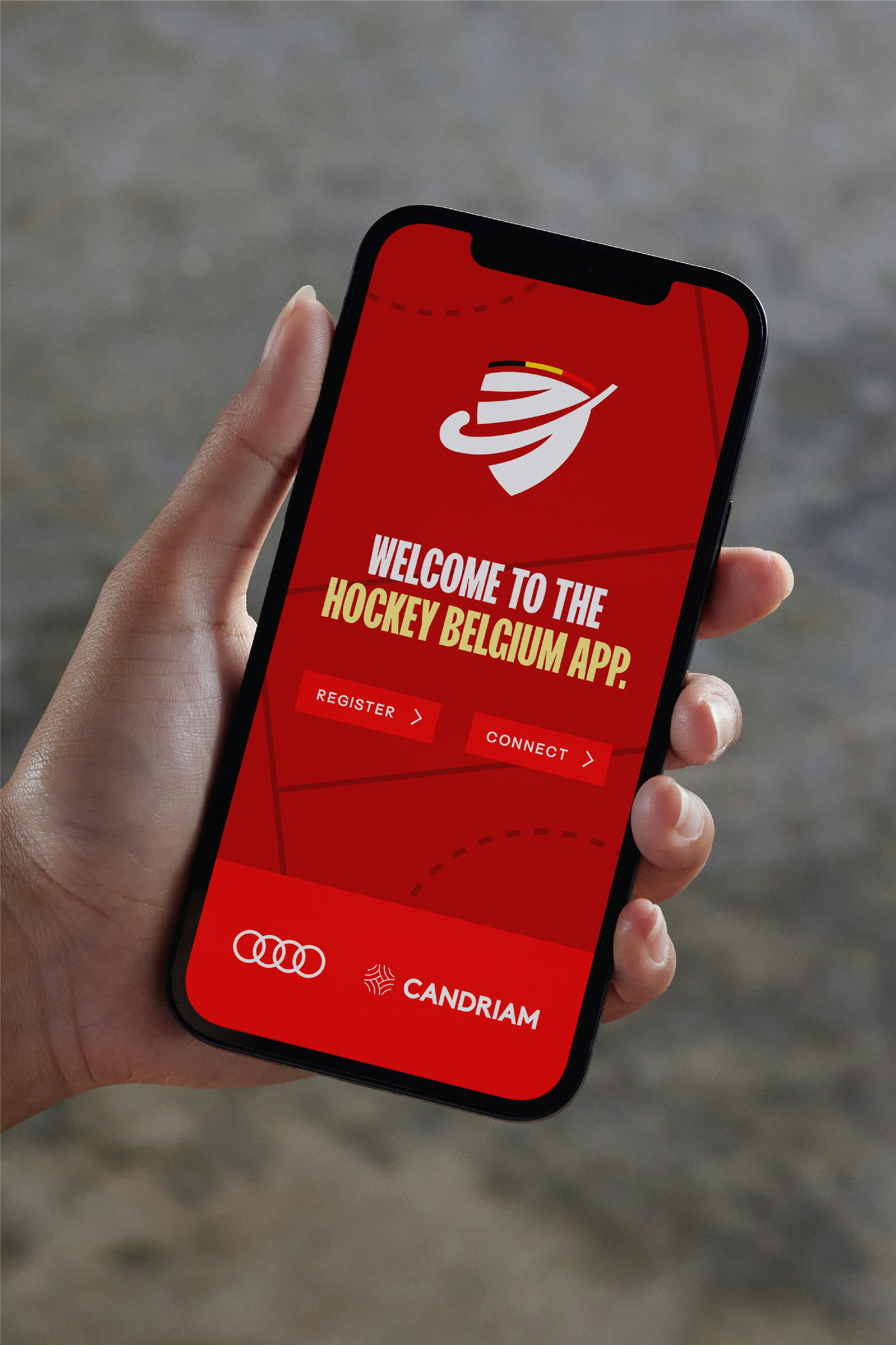
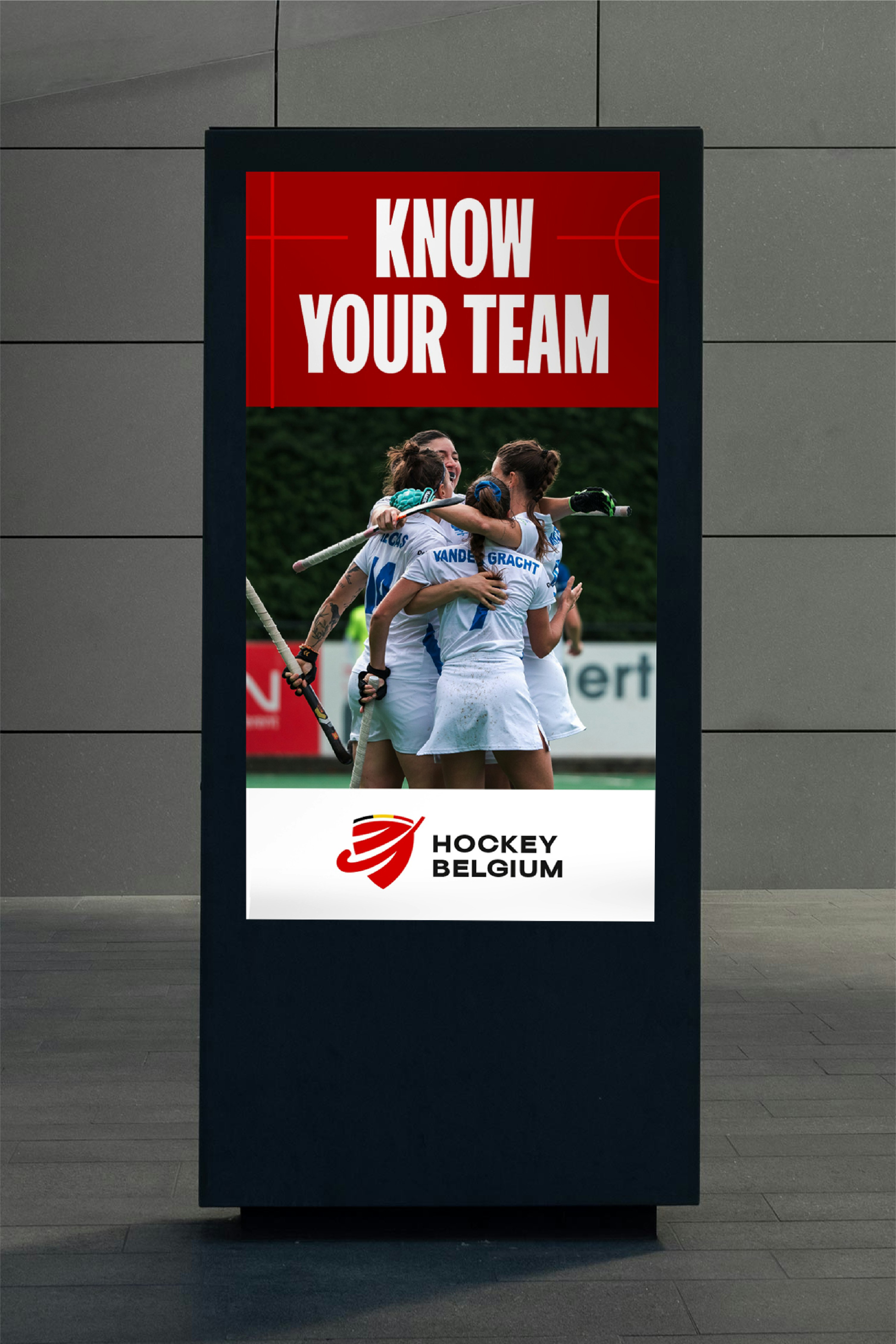
The brand is accompanied by a complete design system, created to ensure consistency and impact across all communications. The graphic codes draw inspiration from distinctive elements of the hockey field (lines, markings, angles), anchoring the brand in its own universe. The result is a strong, immediately recognizable identity that adapts seamlessly across all formats.

Beyond the sport
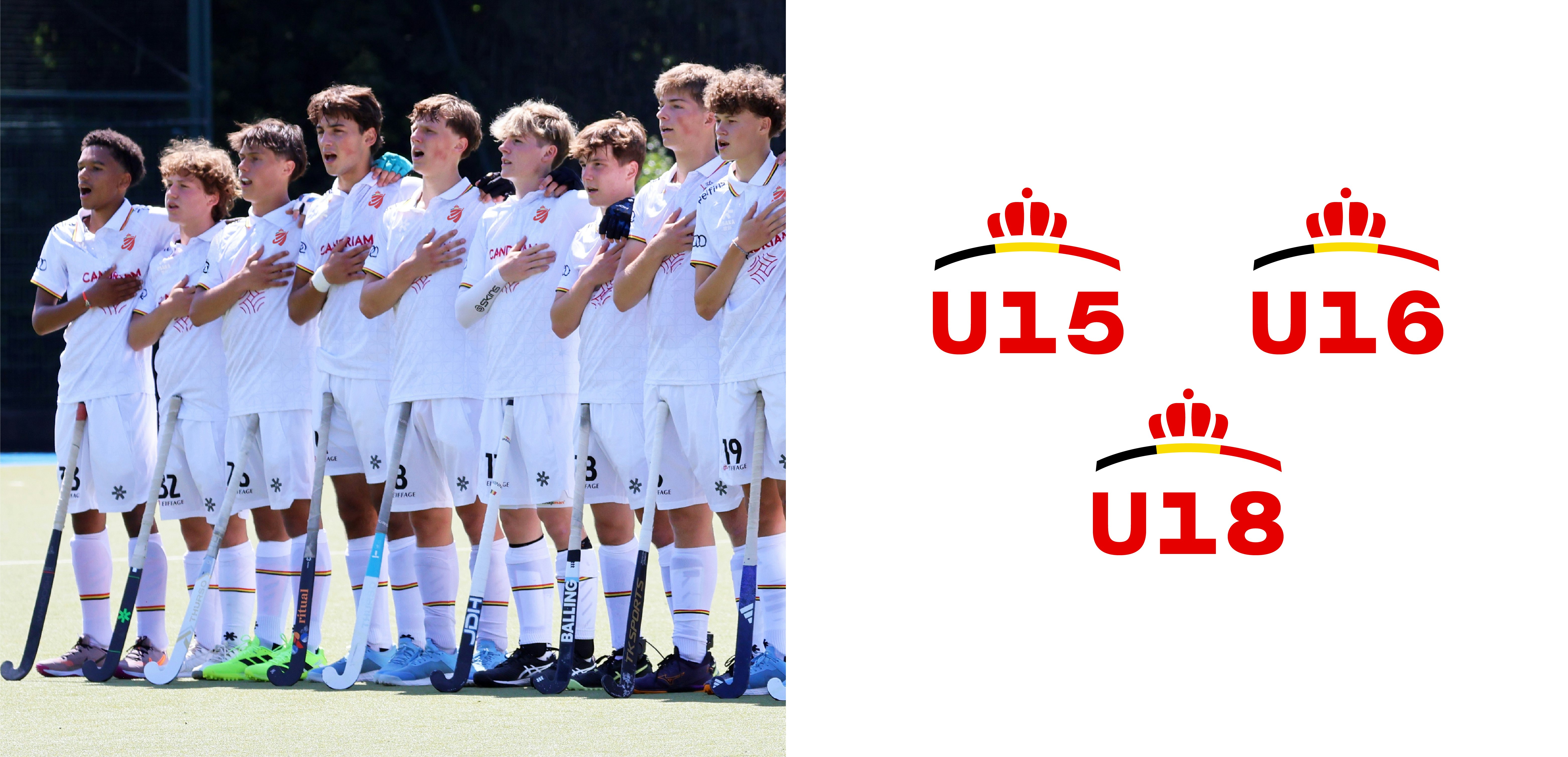
In parallel with the leagues, the brand universe extends to satellite brands that structure training, inclusion, and development programs such as Coach Academy, Umpire Academy, Club Academy, Hockey 2 School, Officials, and High Performance. Together, these sub-brands compose a coherent and unifying system designed to support the growth of Belgian hockey at every level.
