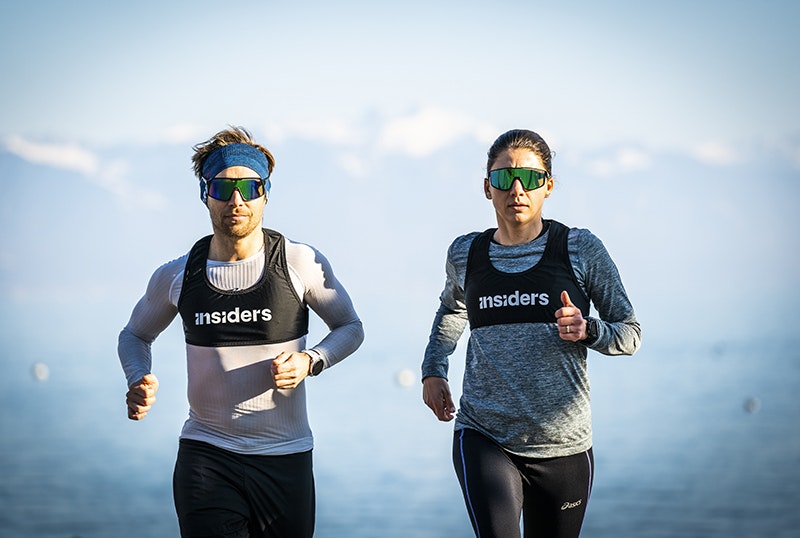
Insiders
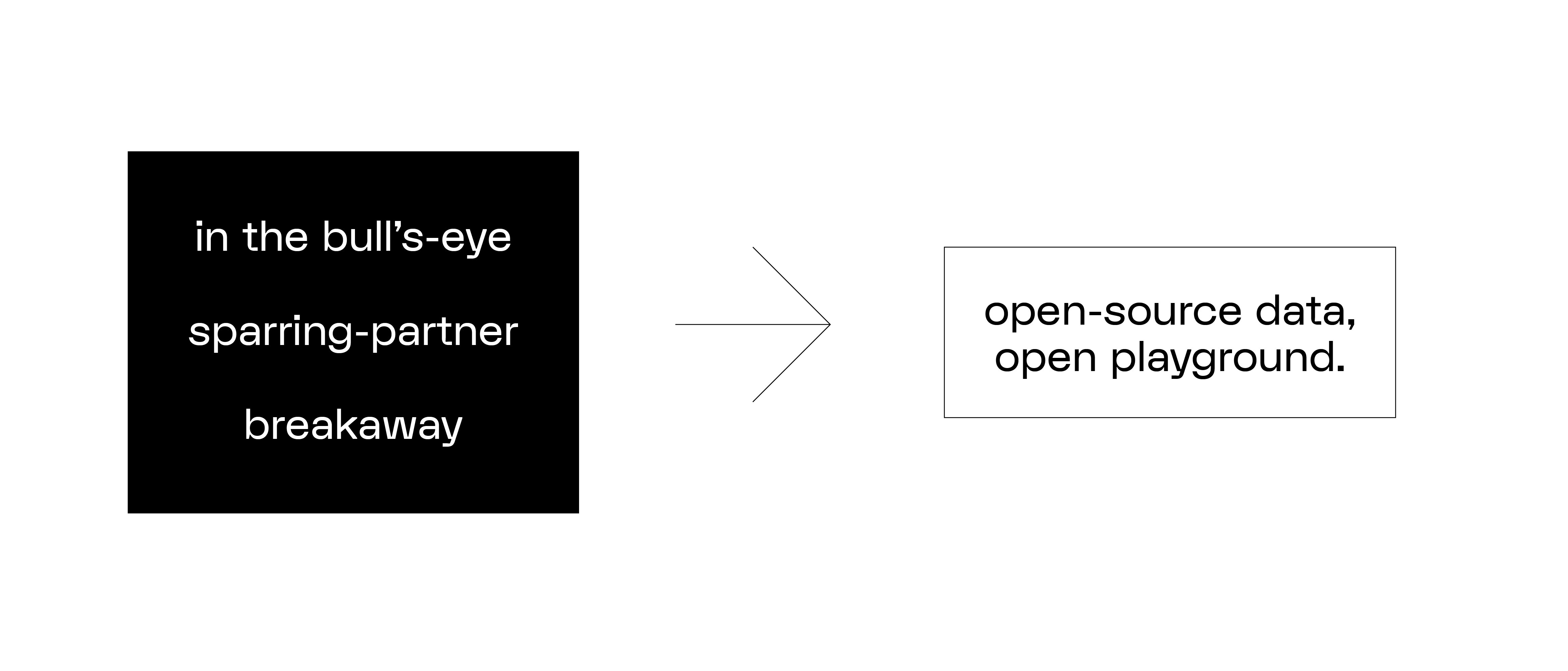
Open data, open playground.
In just ten years, young Swiss company ASI (Advanced Sport Instruments) has made a name for itself in the sports tracker market, thanks to its technological approach and precision-engineered sensors. After years spent focusing purely on the technical side, ASI is taking its business to the next level, giving its branding and brand message a complete overhaul. It's official, ASI is out of the race: make way for Insiders!
Industries
- Entertainment.
Skills
- Strategy,
- Brand Architecture,
- Naming,
- Digital.


Challenge
Our mission was to inject a healthy dose of ambition and inspiration into ASI's branding, while maintaining a strong technological identity. Capturing the essence of this young company and bringing it to life across all its communication channels. In short, creating a brand as precise as the trackers it sells.
Solution
After defining the company's brand platform (brand identity & values), one thing became clear: the name ASI is too functional, and meaningless to most. This finding led us to choose a new name that better reflects the company's DNA: Insiders. Based on this fundamental branding, we proceeded with a complete overhaul: logo, visual identity, tone of voice, from the website to product design. The result is an exciting new brand that is both inspirational and technical, working hard for athletes and its partners. A brand that is ready to fulfil its ambitions: using "open data" to revolutionise the sports tracker market.


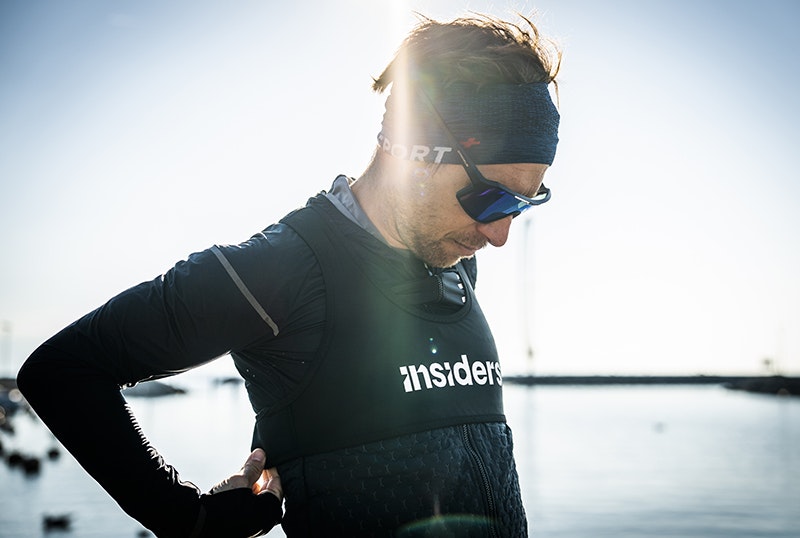
Insiders is a team of experts with in-depth knowledge of athletes and teams. As discreet as they are precise, Insiders do the work from the inside. They're not here to take centre stage, on the contrary. They're here to make others shine.


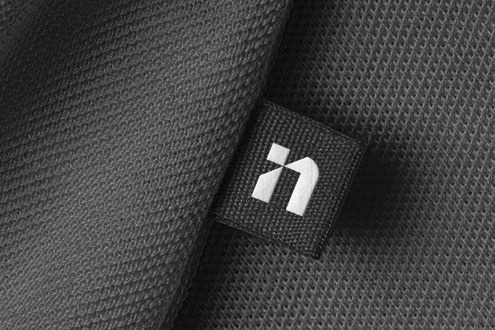


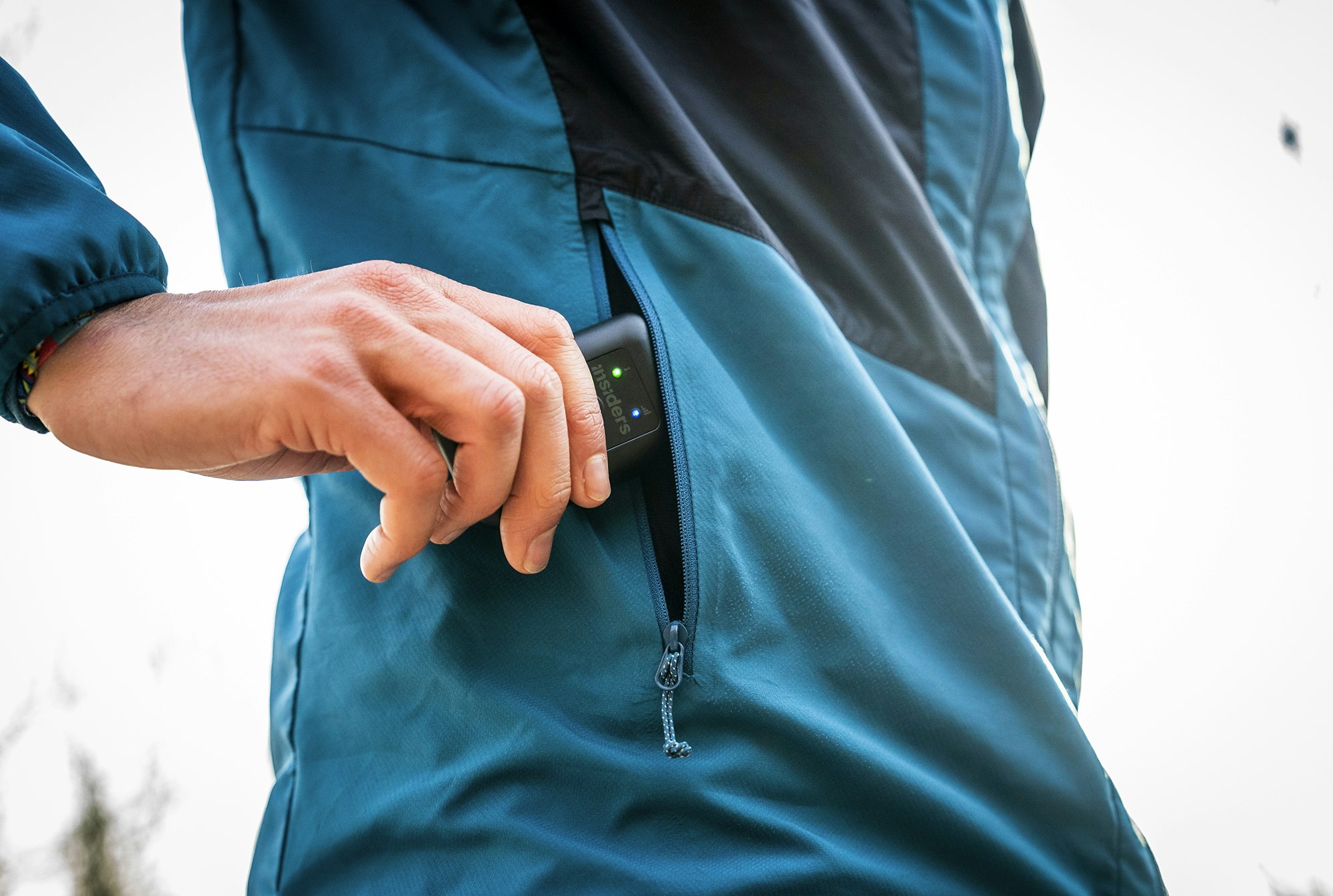
A new typographic logo that plays on the notion of "inside" with its "cut" letters. The Insiders icon brings together the i and n from the logo to create a graphic symbol that can be featured on the brand's trackers and other products.

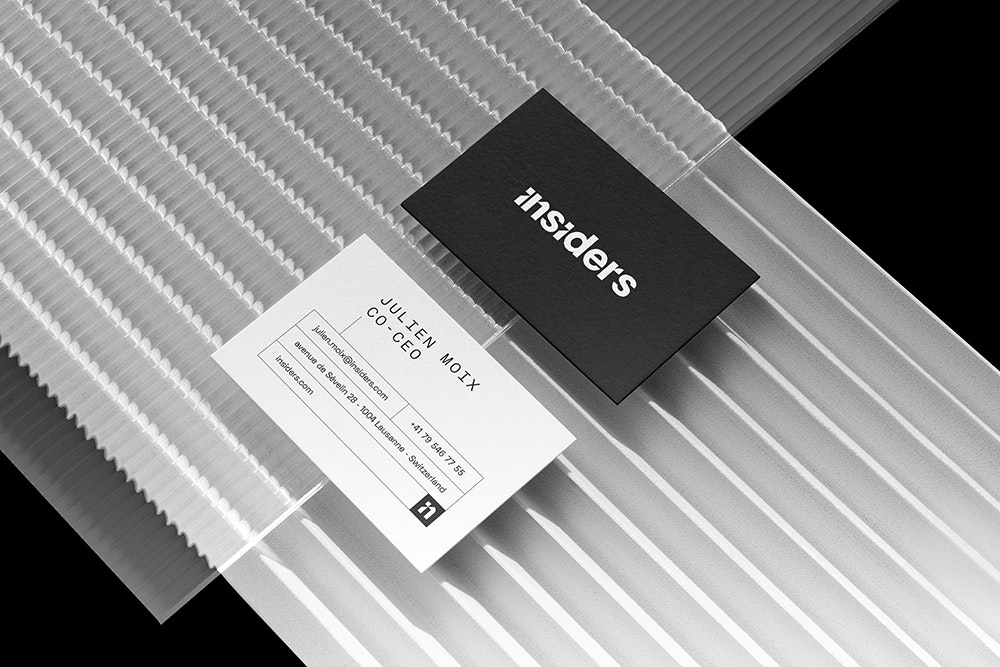

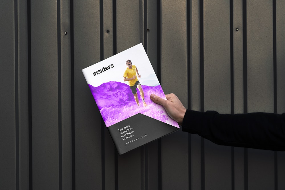

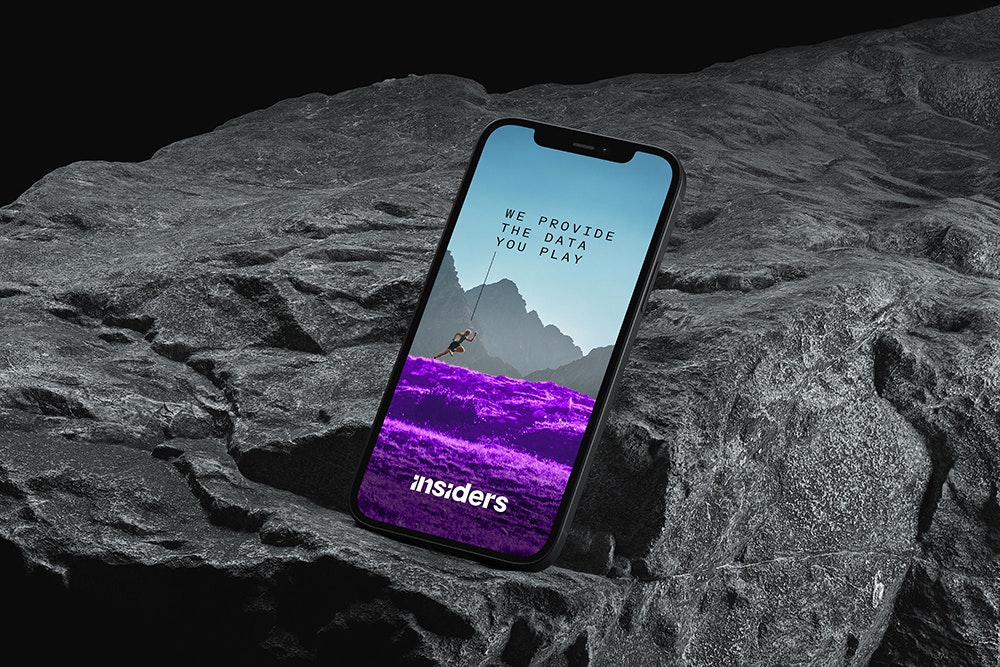

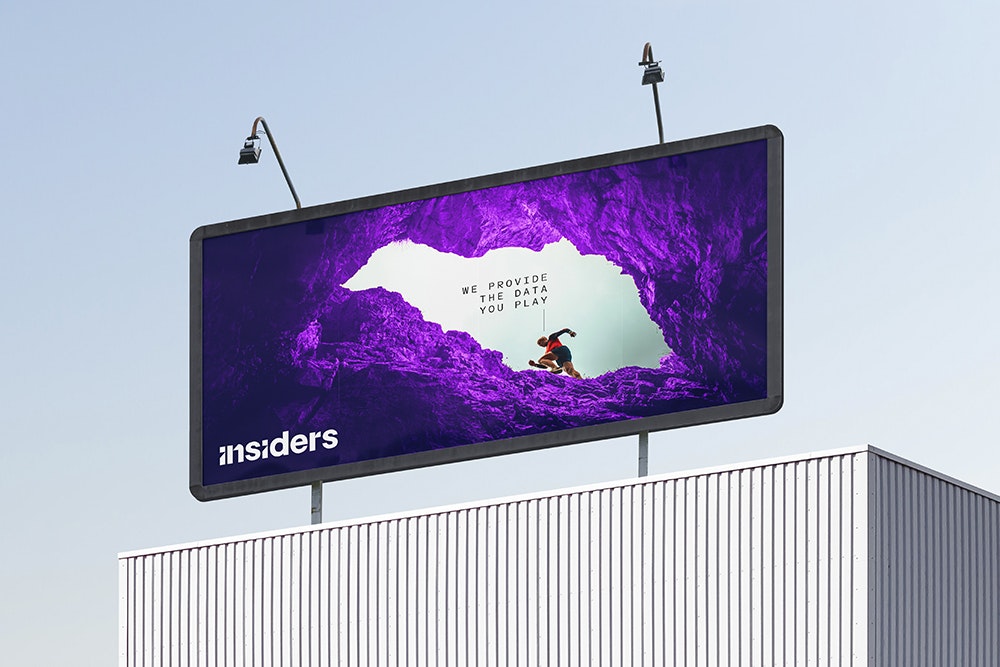


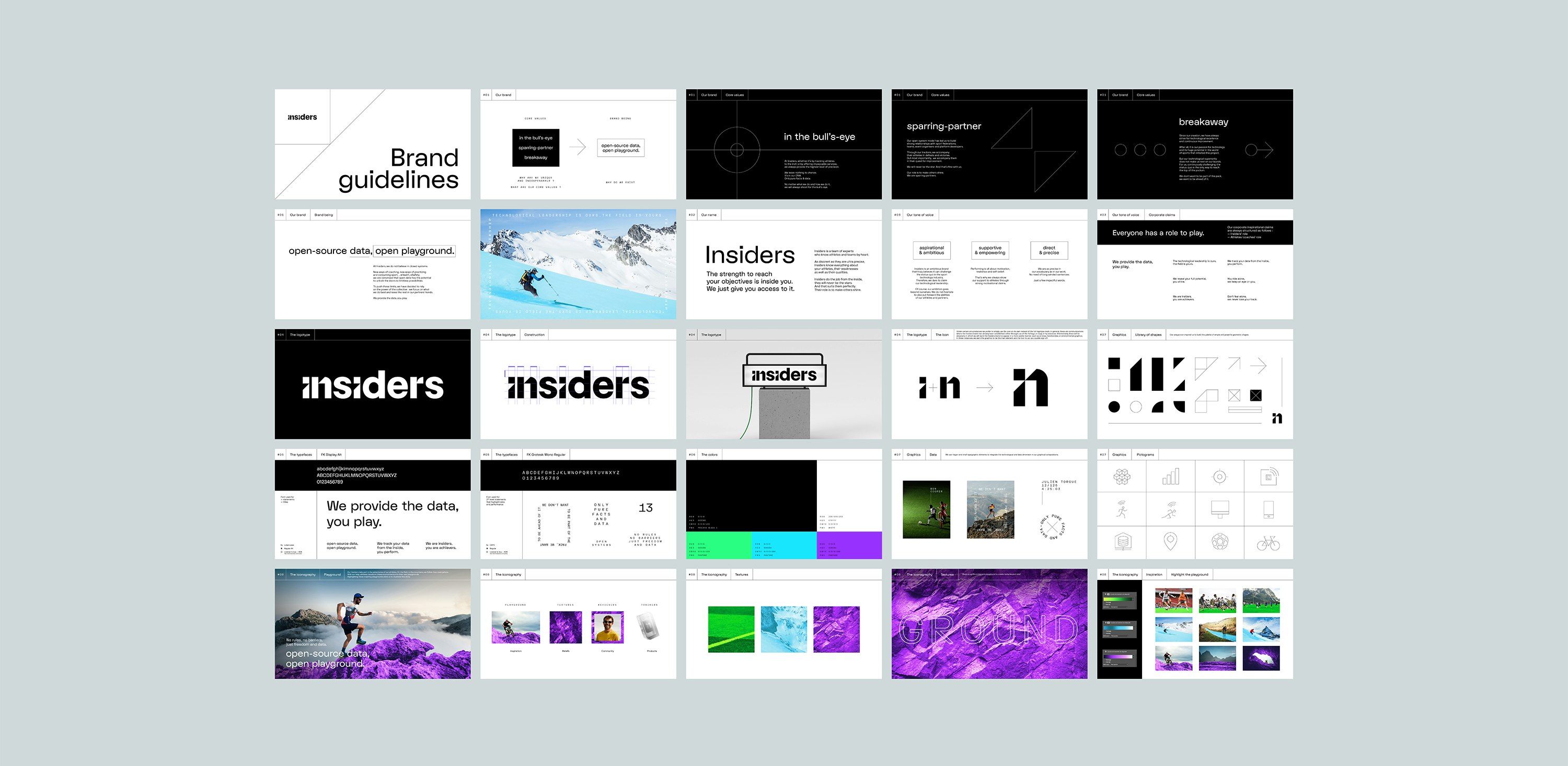


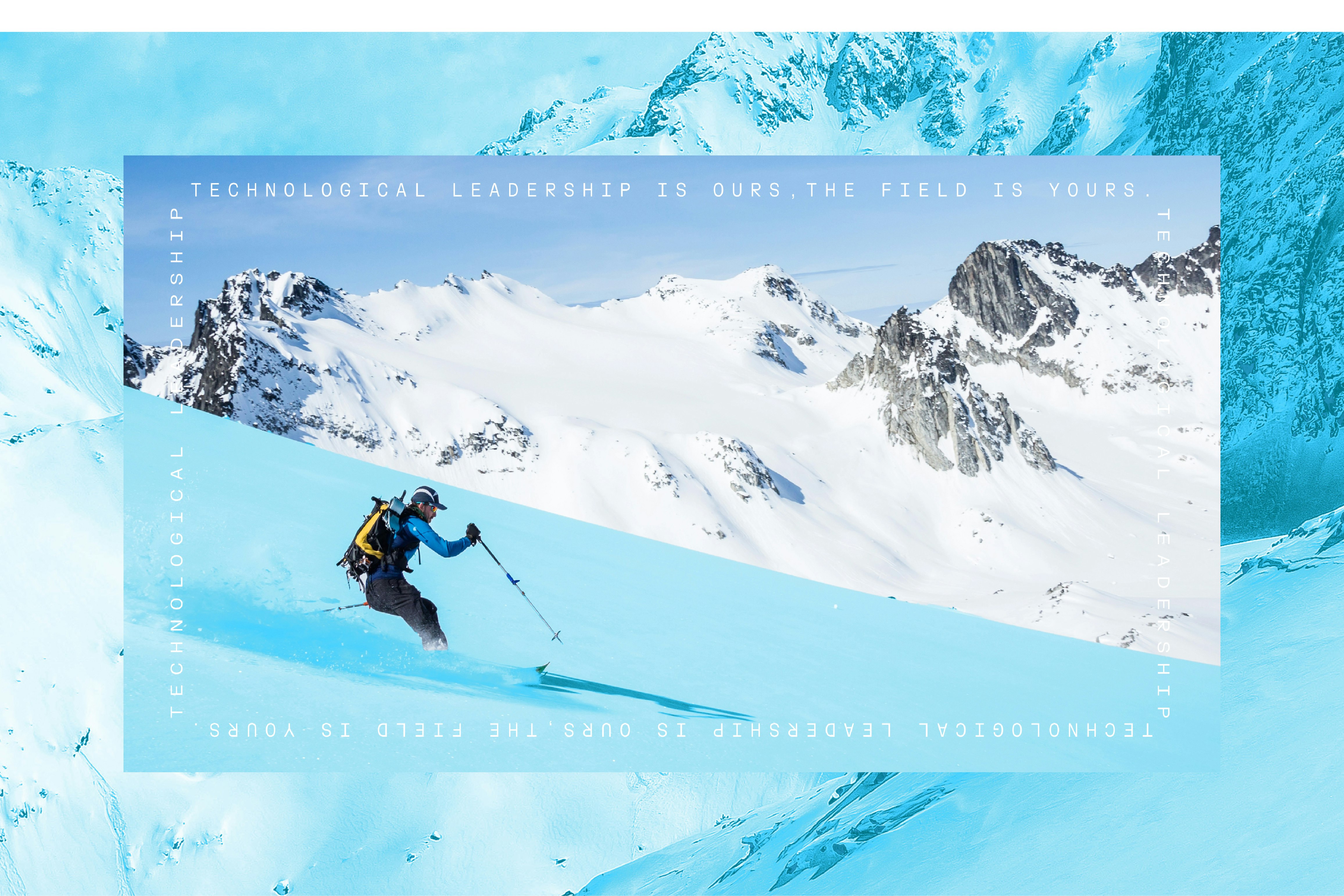
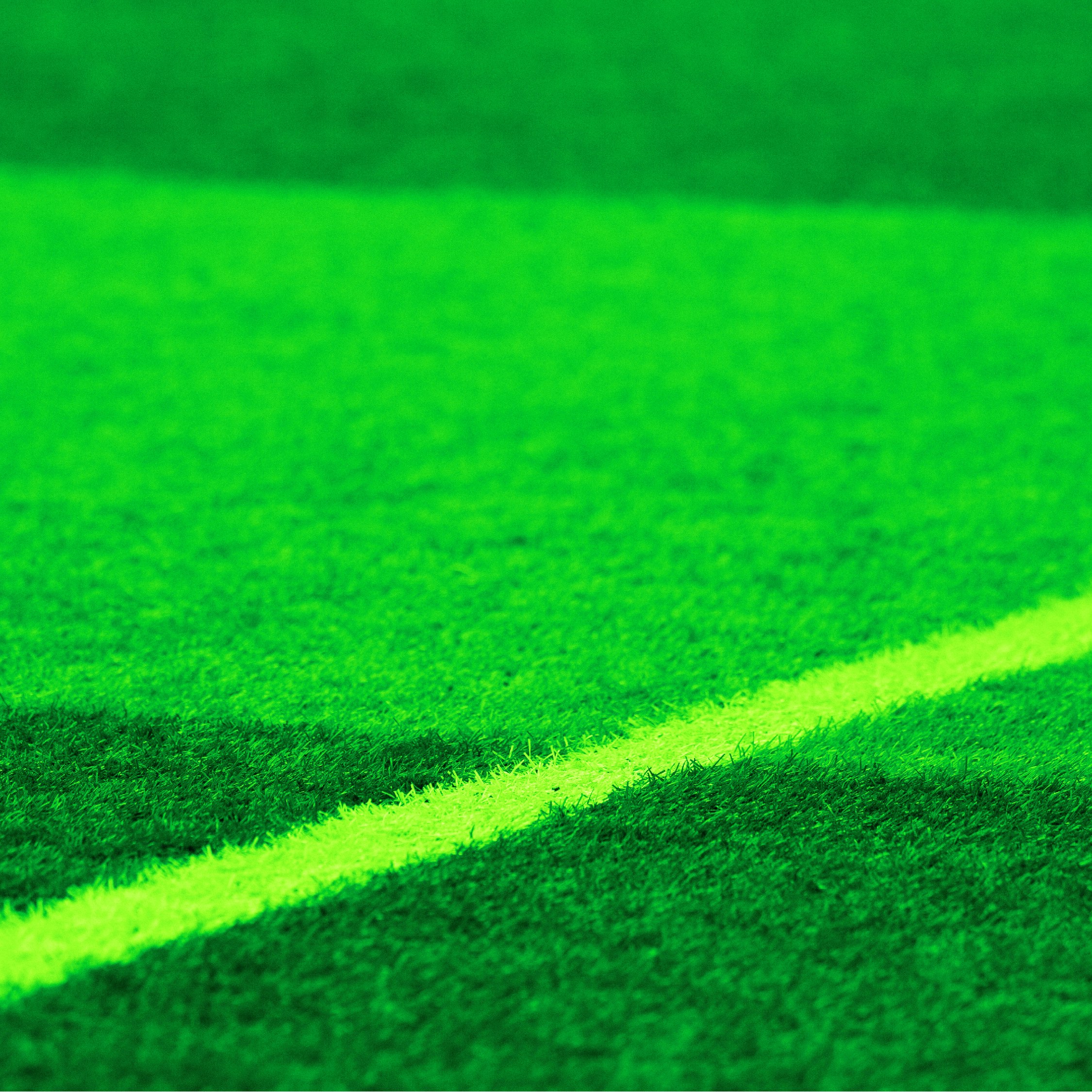
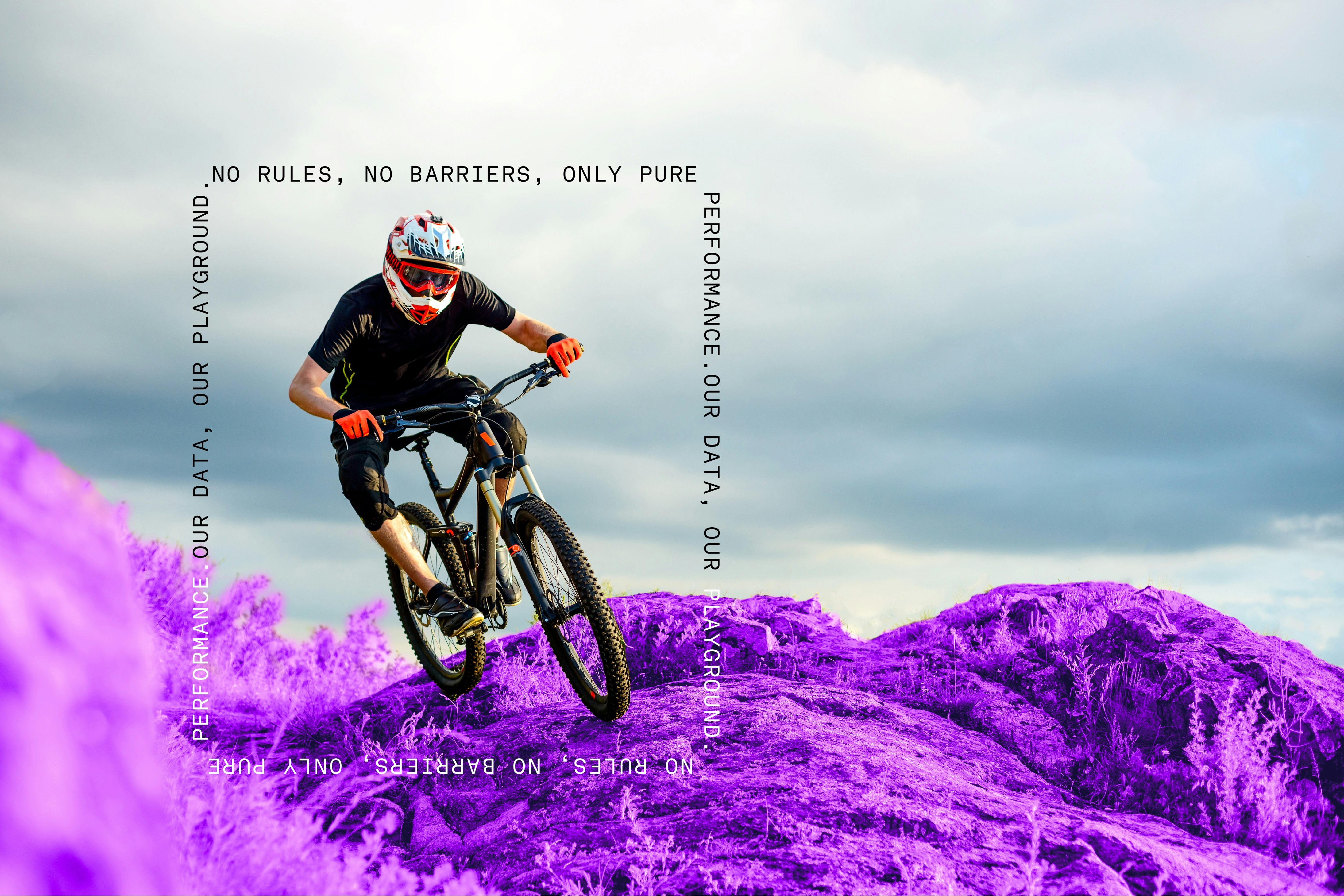
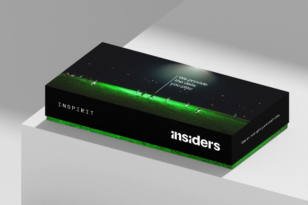
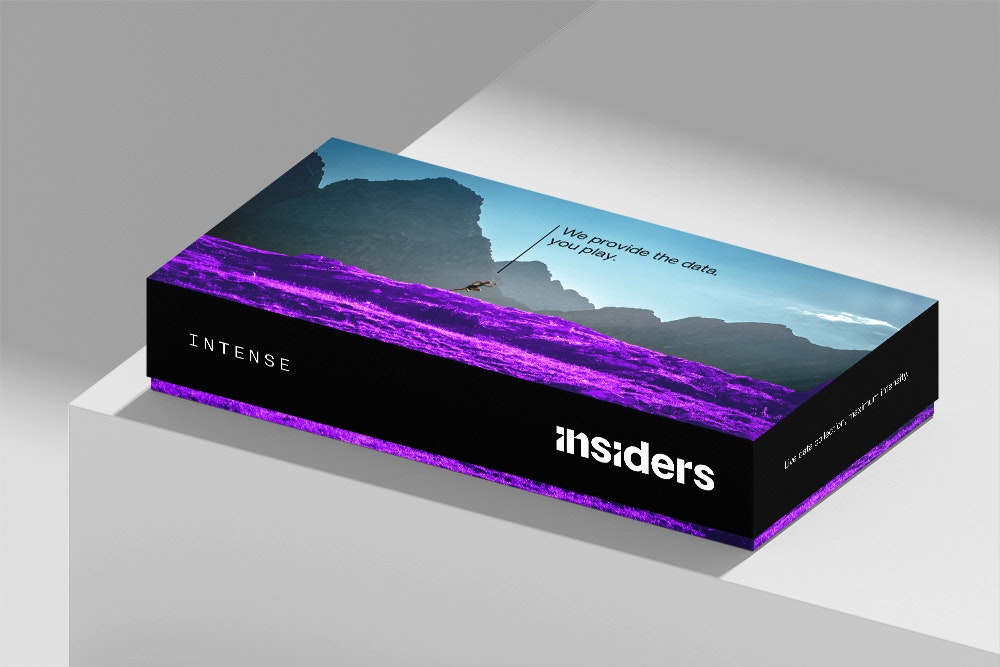
The brand’s visual identity is understated, elegant, sporty and tech-inspired. It is made up of several typographies, along with a graphic charter inspired by the logo, and a colour palette featuring black and three secondary colours. The images are a key component of this identity, using textural close-ups and saturated hues to convey the idea of the outdoors as a playground.


Naturally, a complete rebranding means a new website design. Both in terms of UX and UI, the site has been redesigned to meet the needs of developers and partners.