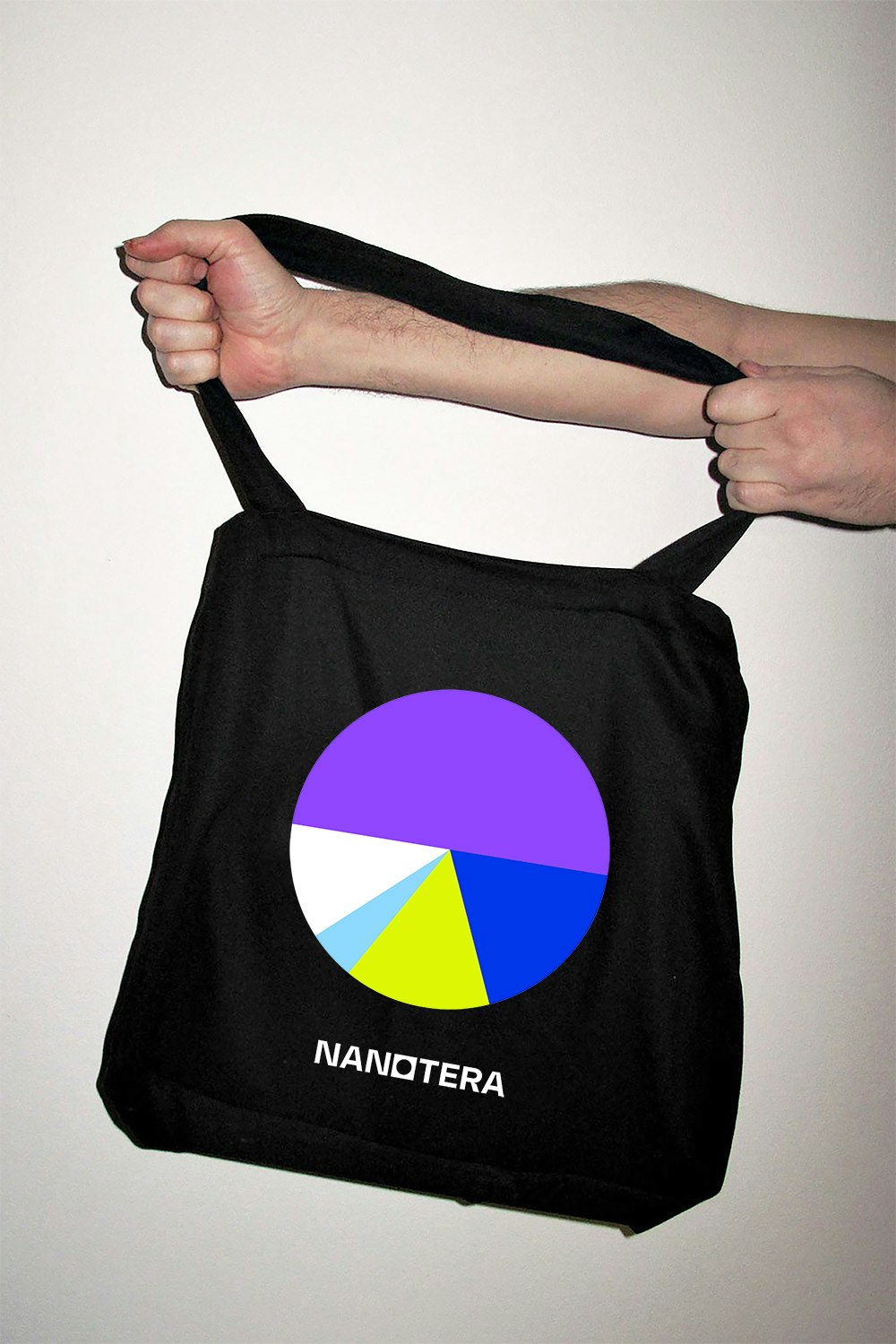
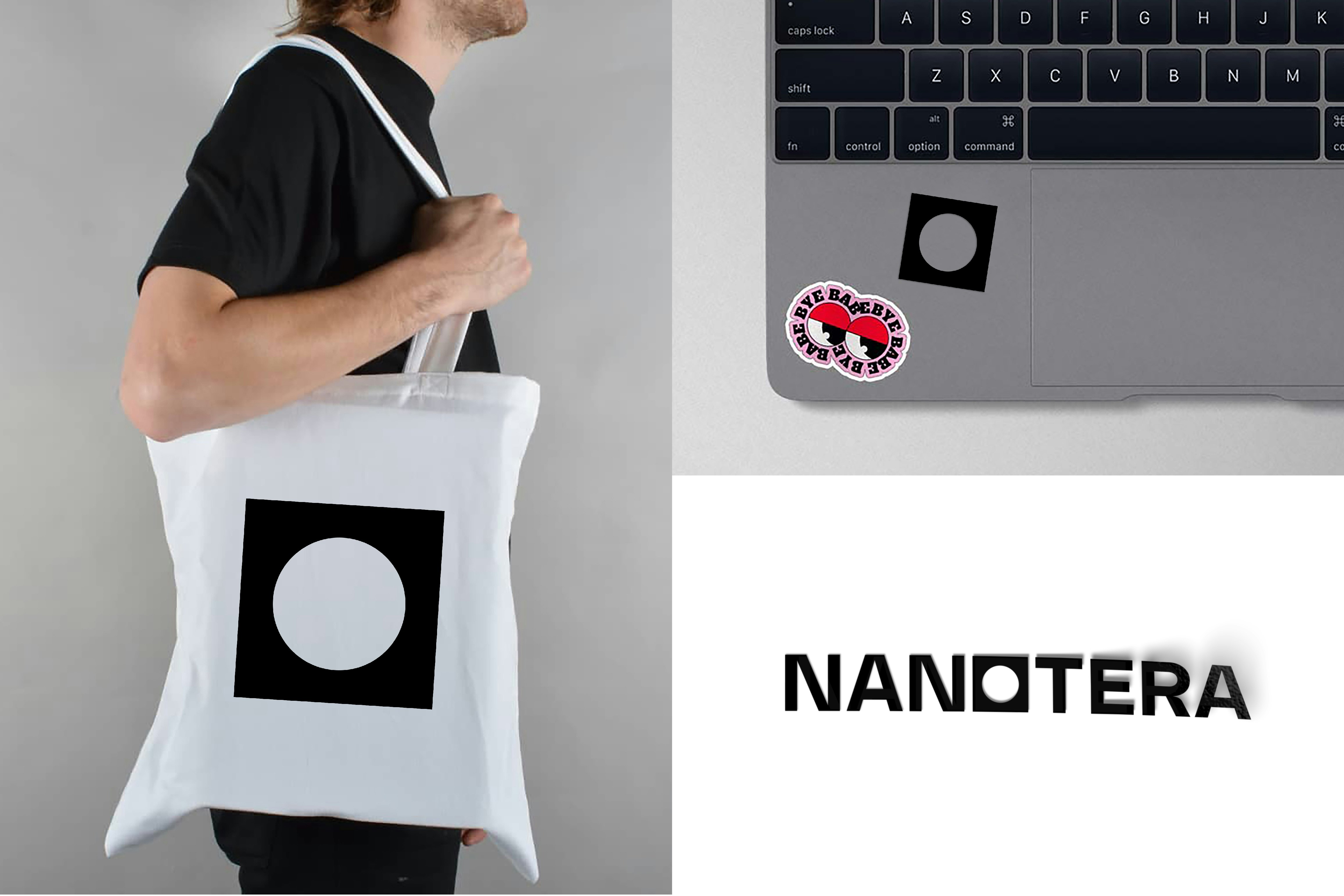
Nanotera
Solution-focused!
Elpev, a specialist in commercial action plans, and Périmédias, a major player in point-of-sale advertising, have joined forces to become Nanotera. The result is an exciting new brand that unites people and teams, stands out from the competition, and is vocal about its ambitions!
Industries
- Services.
Skills
- Strategy,
- Brand Architecture,
- Naming,
- Brand Design,
- Digital.


Challenge
The challenge was to bring together two different companies, previously competitors, with two very separate identities, and establish a common positioning. Building, then promoting, a new corporate culture. Creating a new brand and visual identity that are identifiable on the market and stand out from the crowd, while clearly showing the commercial strengths and points of differentiation. The aim is then to harness this change as an opportunity for communication.
Solution
We began by working with both companies upstream to develop a new vision. The goal was to break away from the past while building on existing foundations, to come together around a clear brand platform with lots of promise for the future. The next step was to promote this positioning by creating a name - and subsequently a brand - using a logo and graphic identity that reflect the personality of the company. This identity was then promoted inside and outside the company as a beacon for change.


An ambitious brand platform
Getting people on board, creating connections and generating support for this new business proved to be a considerable challenge, but pivotal to its success. Participatory workshops were therefore held to develop the brand platform and message, ensuring all employees are fully on board with this exciting new venture.


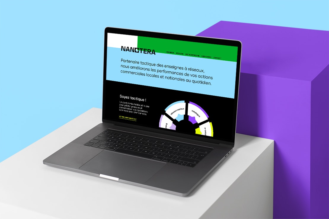
A revealing name
Nanotera is very much a 21st century noun, from the Greek Nano, meaning small and Tera, immense. For a company that handles hyper-personalised communication targets at the level of the sales outlet (commercial actions, marketing campaigns, etc.) to meet the mass market challenges of domestic and international brands.


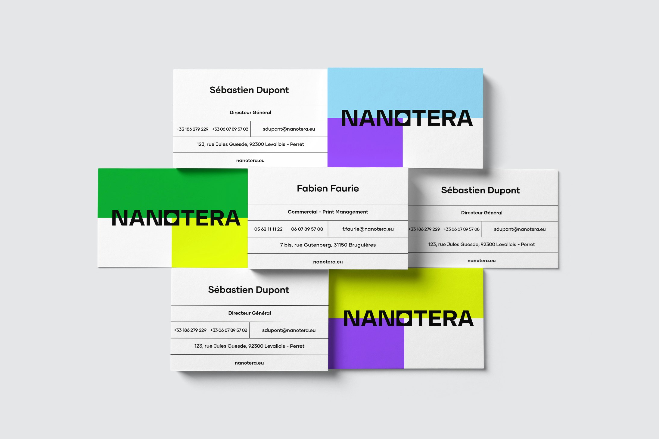


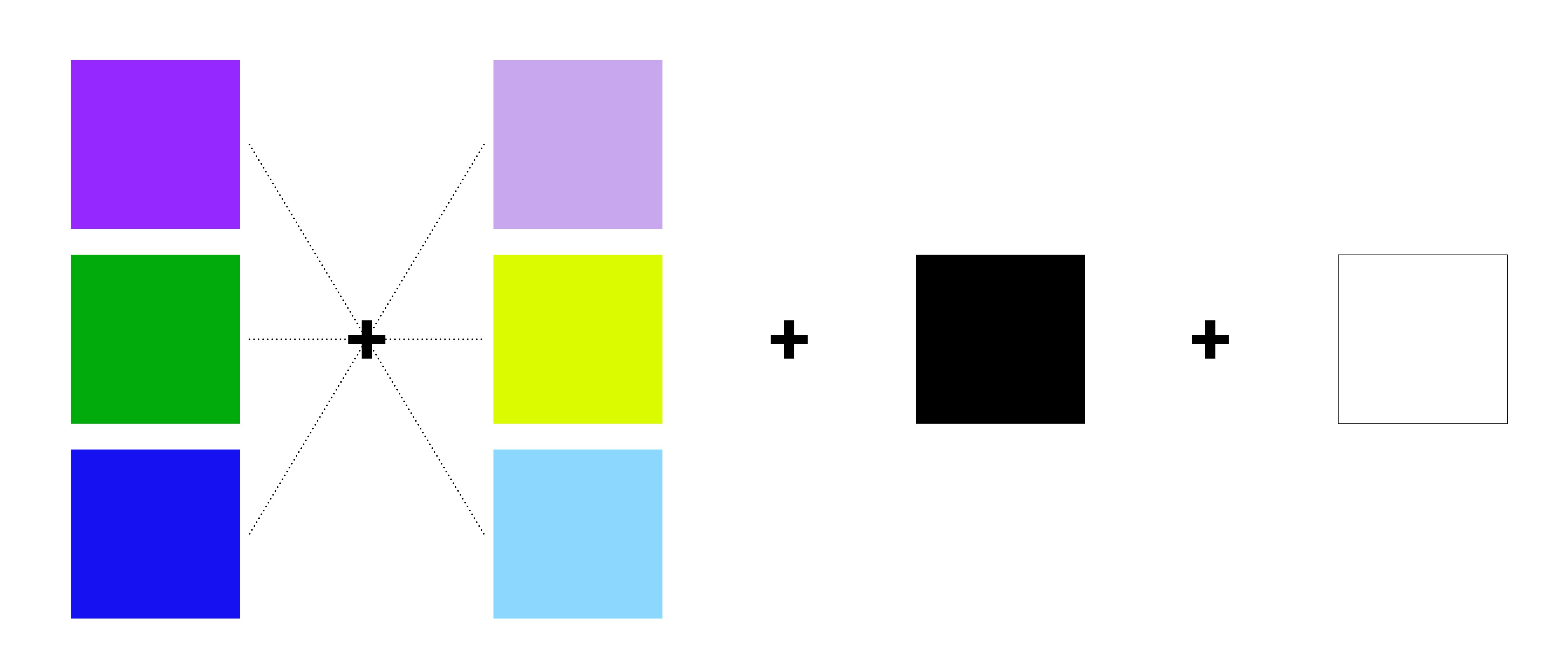
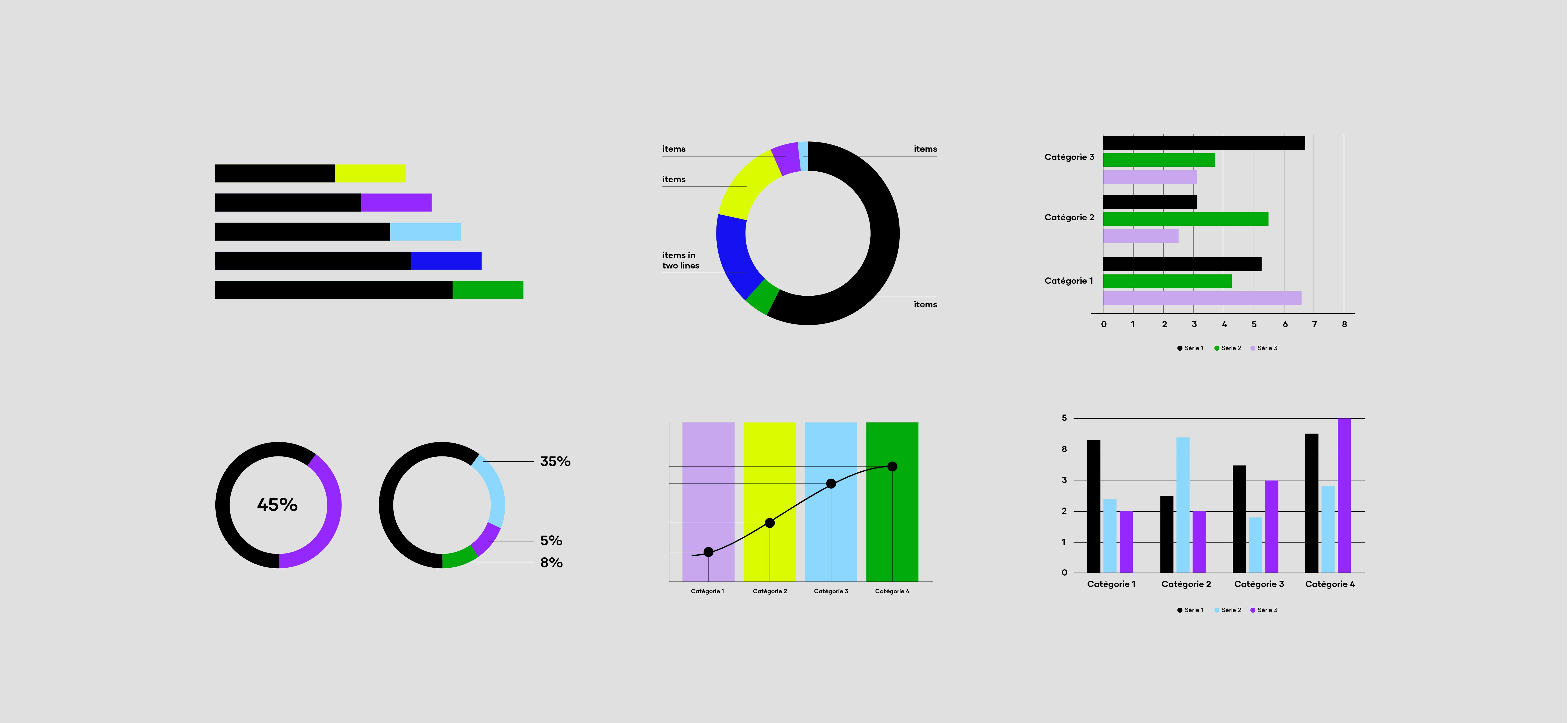
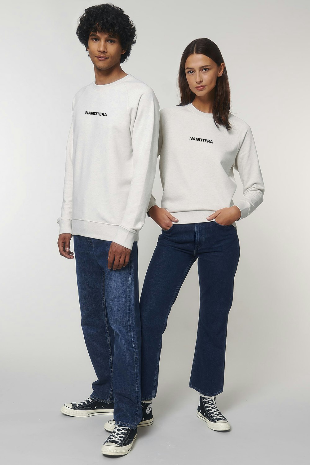
Right on target!
A strong identity and a dynamic, rich and lively visual approach to support the various facets of the business. The graphic effect on the "o" reflects the company's strengths: tactical and "to the point". An identity rolled out across a broad range of applications.