UCM
Small businesses are big business.
An image overhaul, with a clear identity, and no change of name? Yes, please!
Industries
- Services.
Skills
- Strategy,
- Brand Design,
- Brand Architecture.


Challenge
To give UCM a complete visual makeover and translate its new identity... without changing the name.
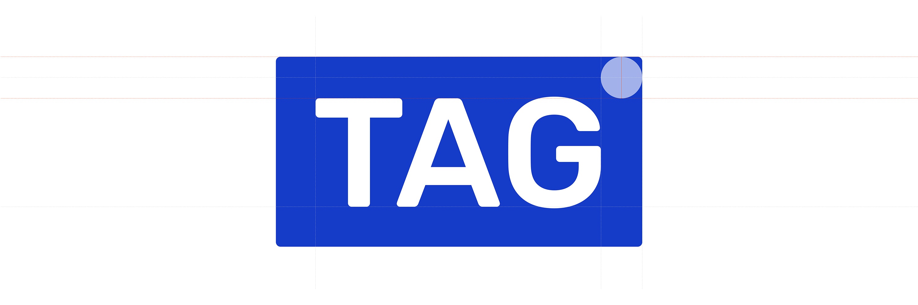
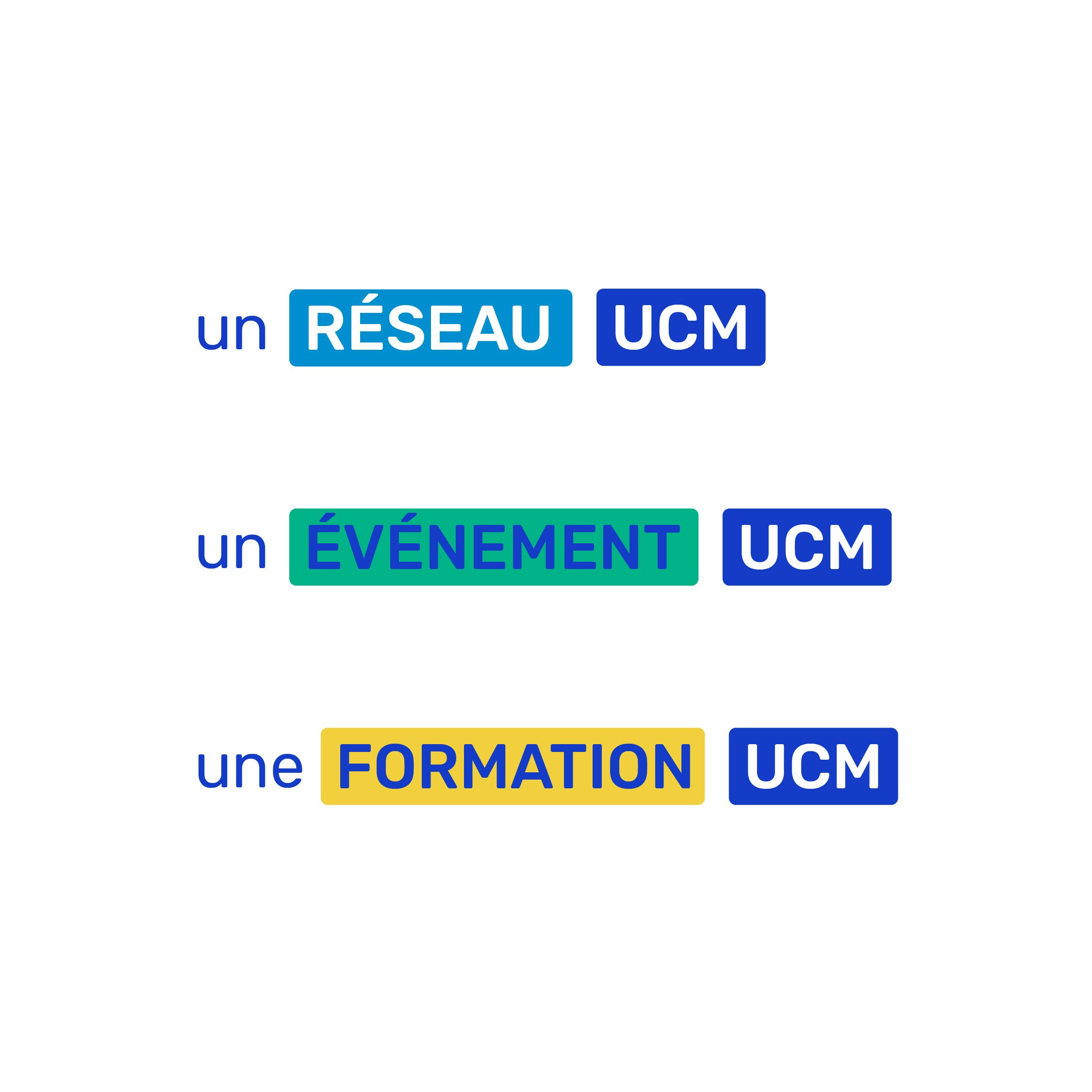
Solution
A clear visual landscape built on the renowned and recognisable classic UCM logotype, the cartouche text box, which we are calling the "tag", and collaboration and coaching of the internal production team.

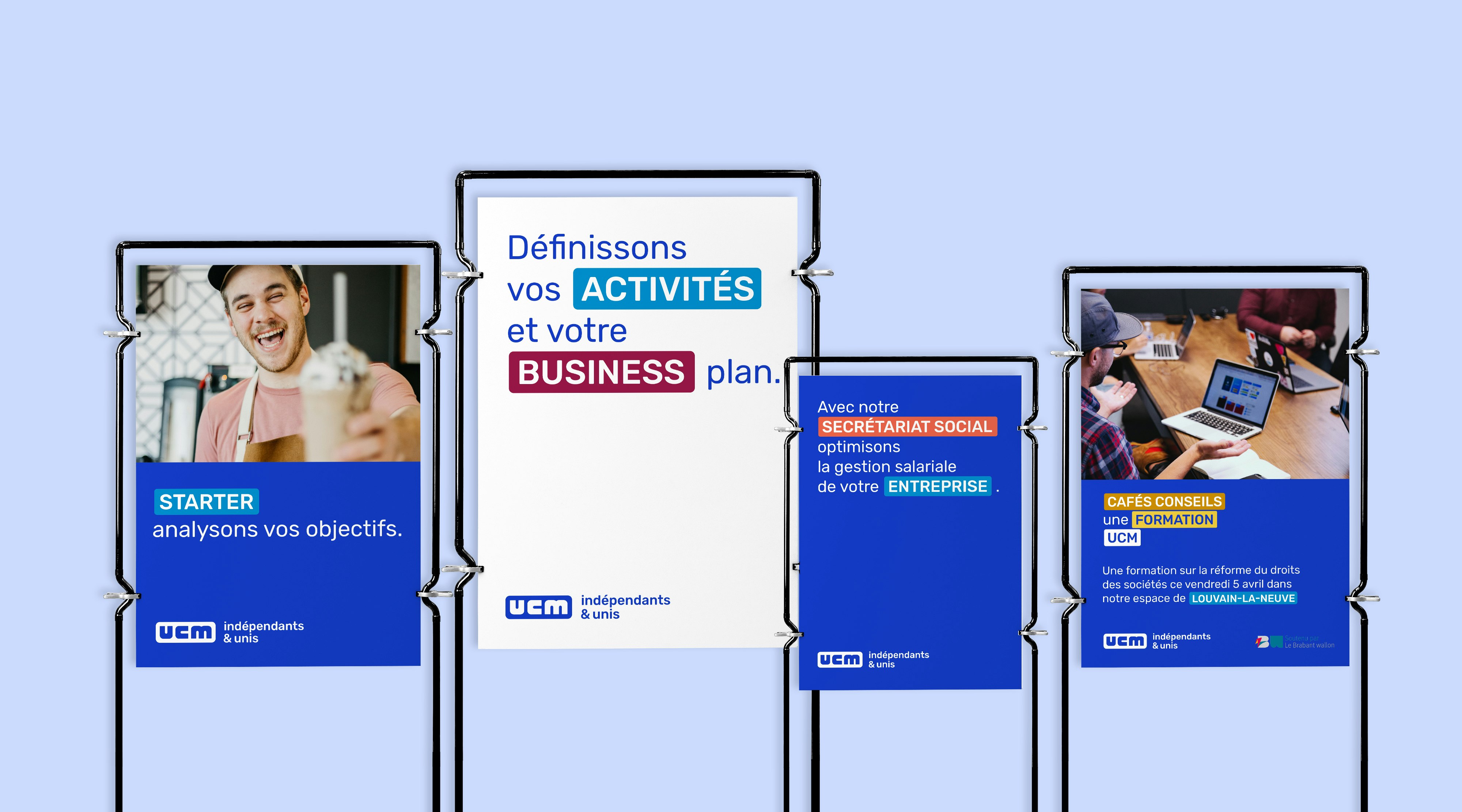
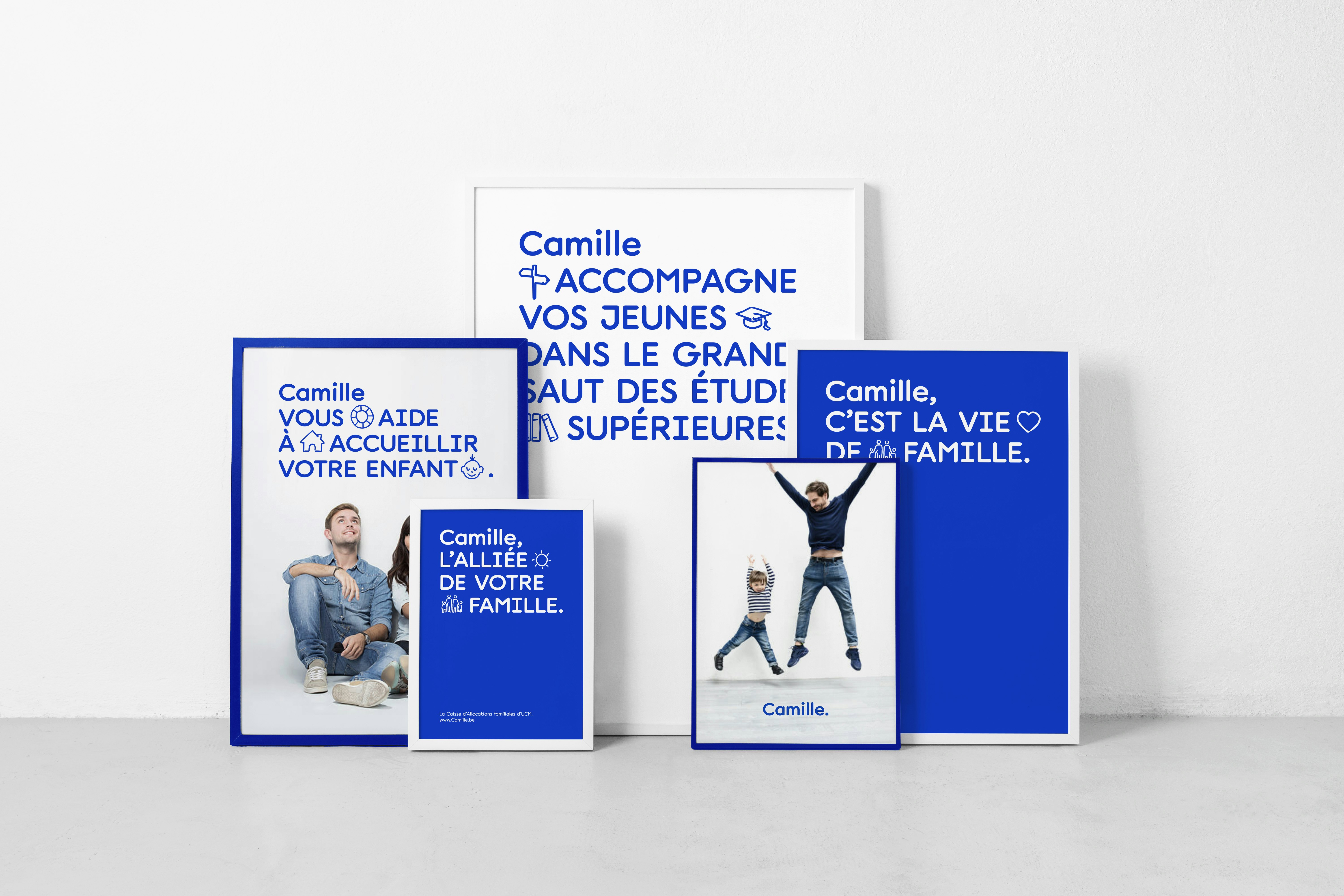
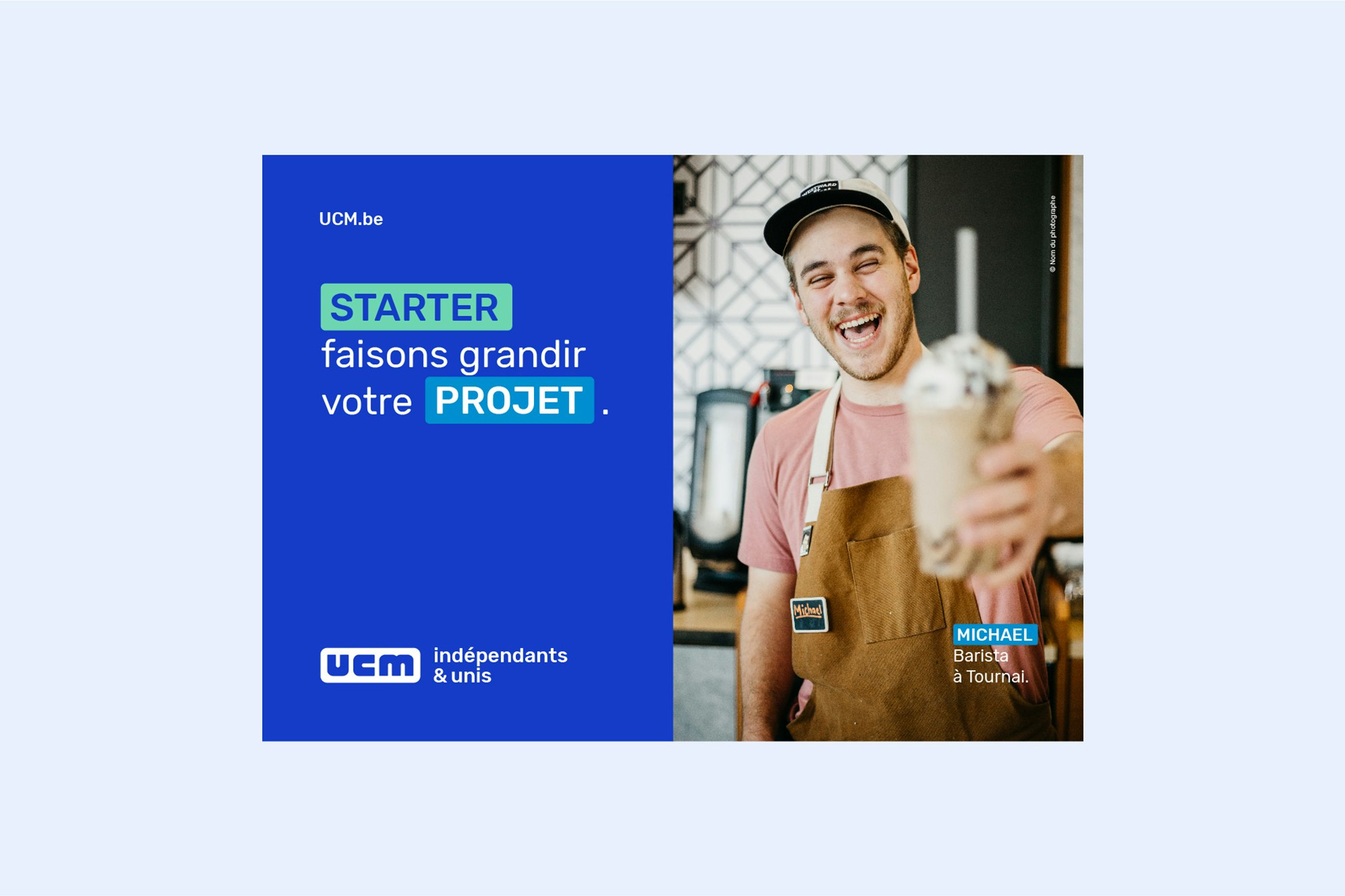
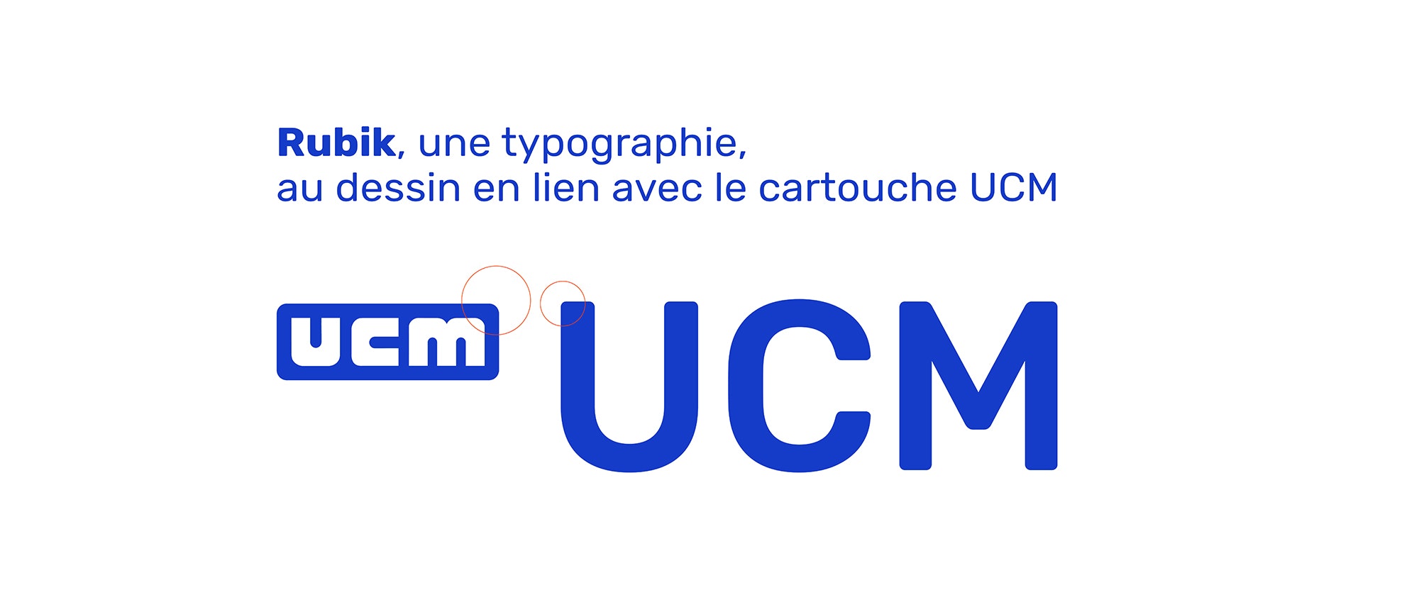
A logo from the past, inspiring the future
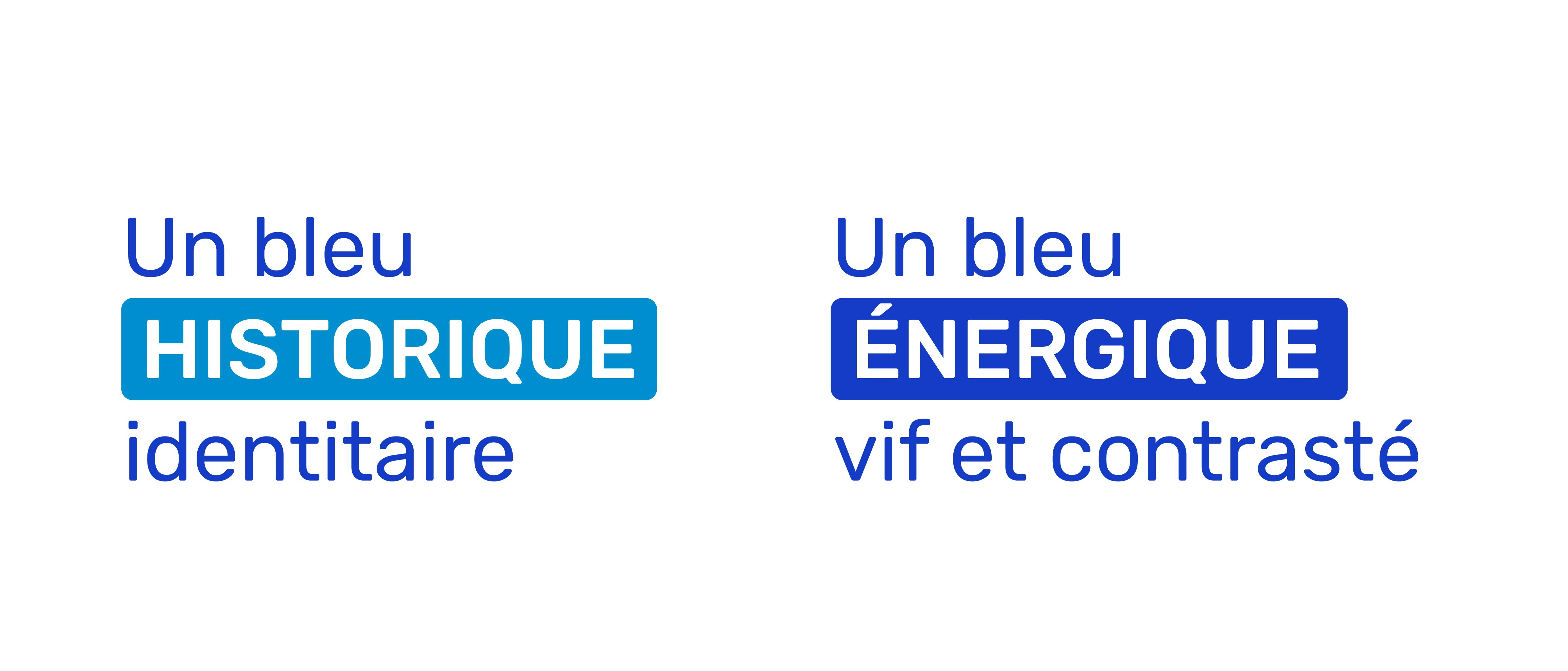
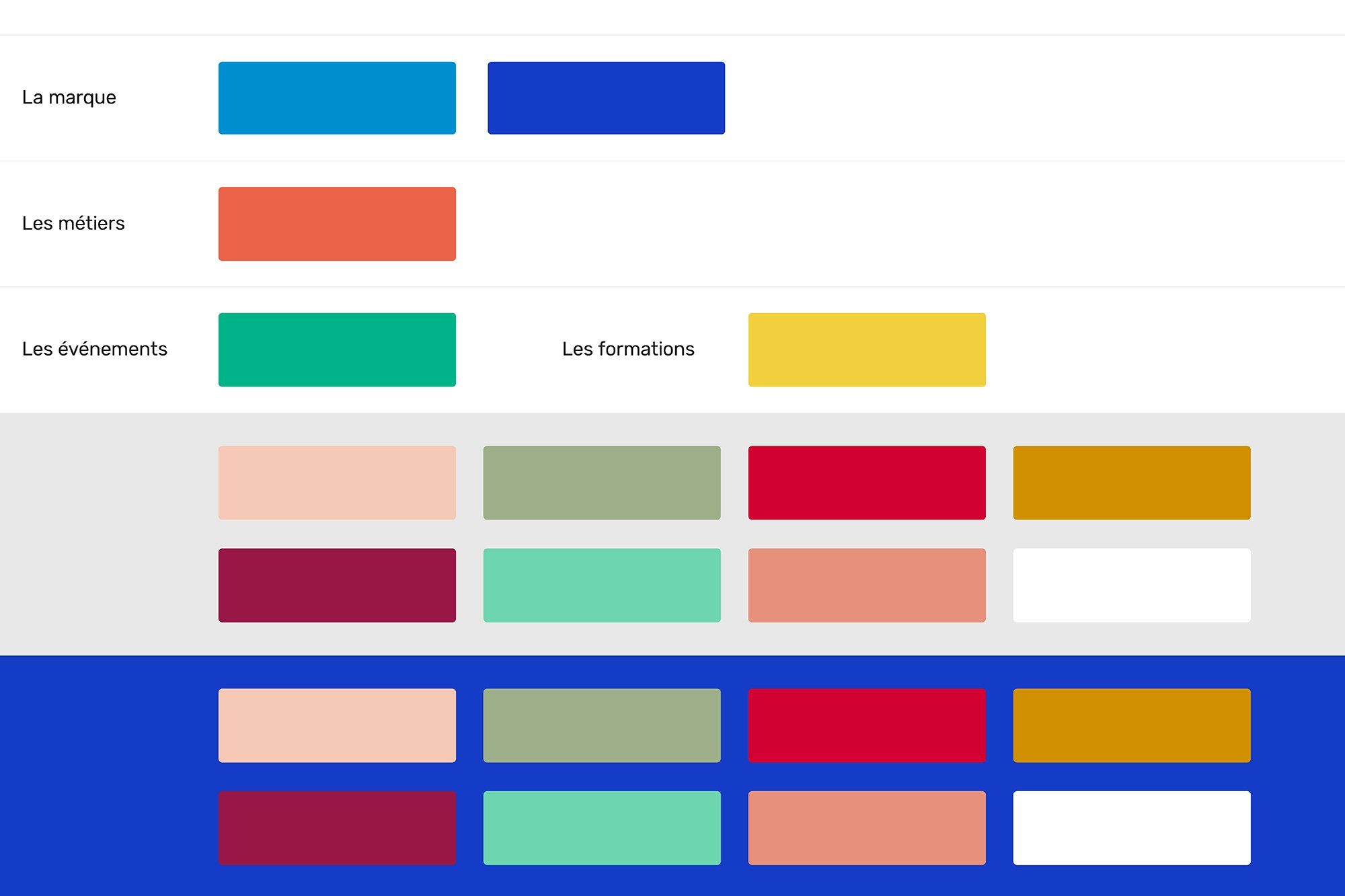
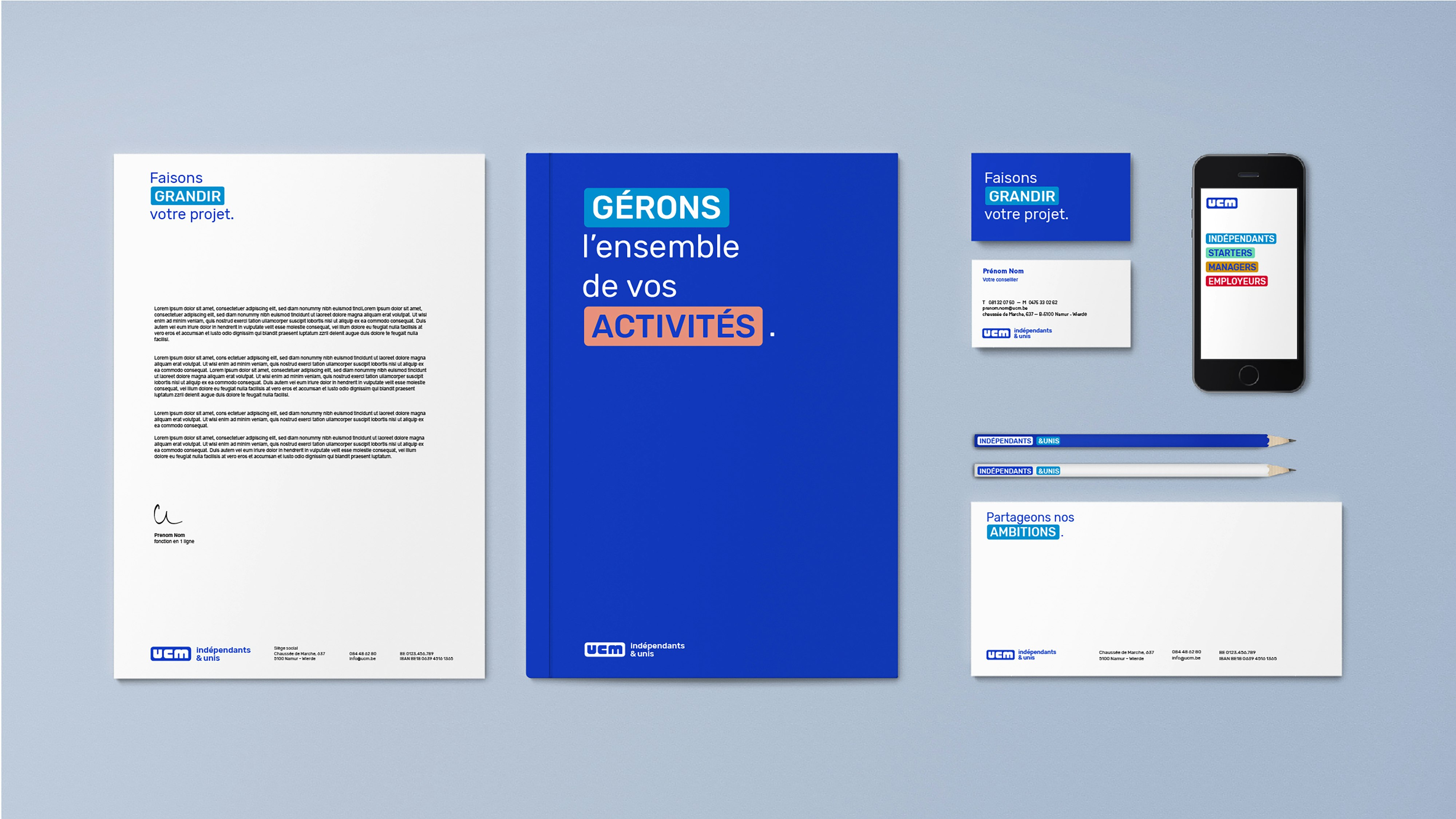
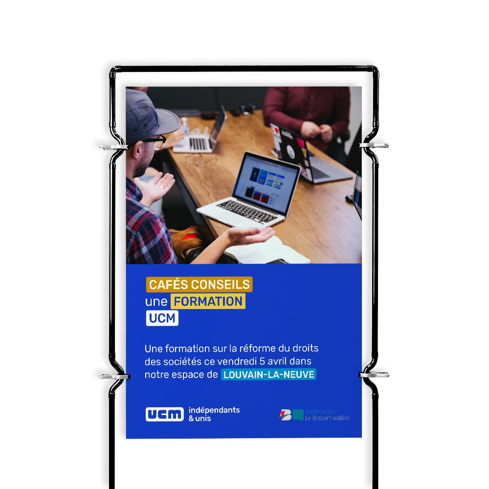
We have developed a brand new visual identity based on the original UCM logotype. Its cartouche text box with its rounded corners serves as the basis for a varied yet standardised application of the new set of "tags"". The use of these tags creates a coherent visual language that still manages to offer a wide variety of possible types of use. The bland and slightly outdated original shade of blue has gradually given way to a more dynamic, more contemporary blue that is more in line with tomorrow's vision of UCM.


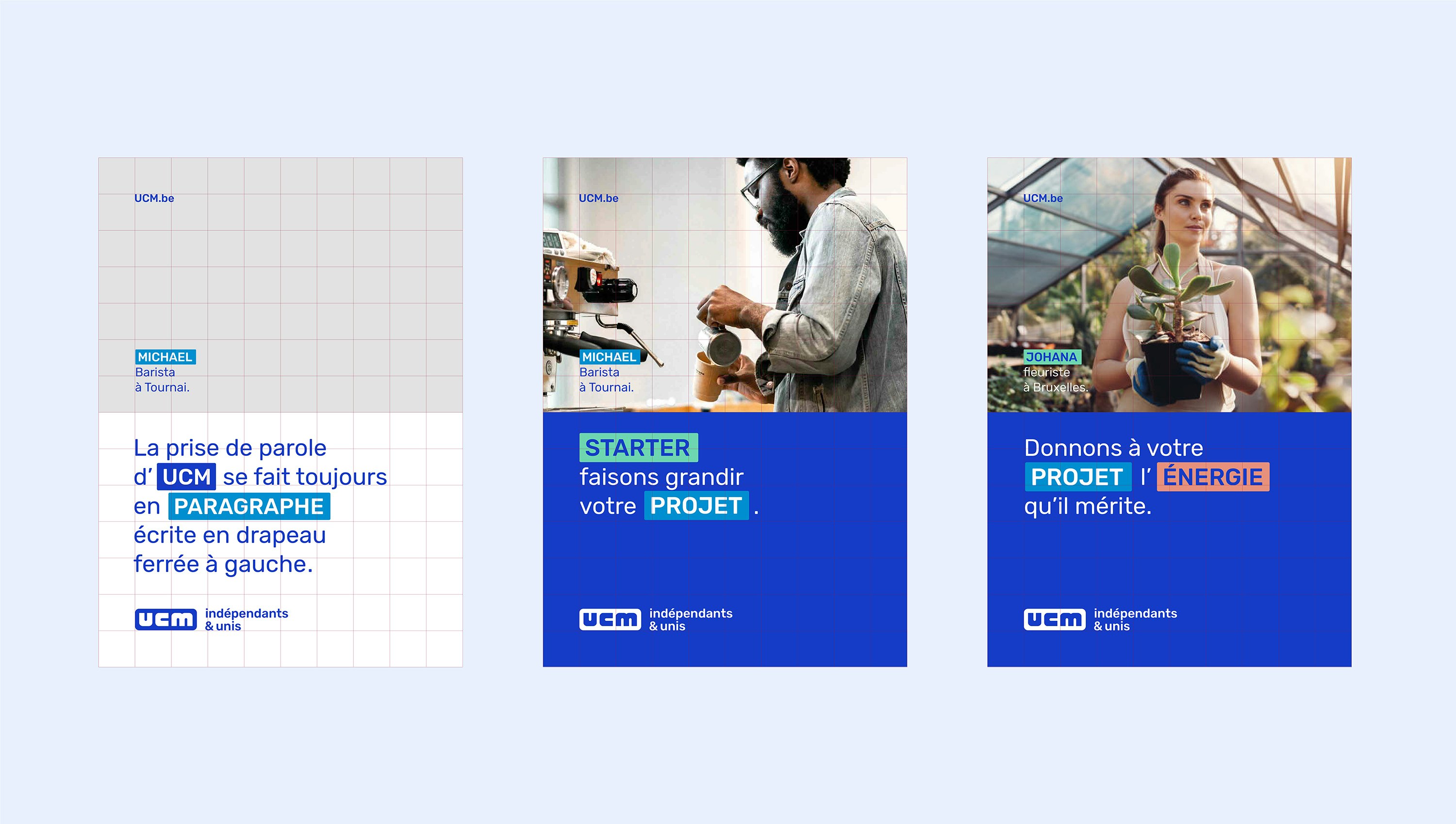
A framework focused on freedom
This freedom and versatility of use is a result of the initial collaboration and coaching of UCM's content producers, allowing them to take ownership of the language and codes of this exciting new identity, and fly the flag for all things UCM.


A Tone of Voice that everyone can get behind
The coaching and support also helps to establish a clear and consistent tone of voice among teams, to further reflect this new, more modern identity and promote a vision of UCM that is more supportive than ever of French-speaking SMEs and entrepreneurs.