Unesco
R(e)generations: UNESCO reveal.
UNESCO has a reputation that spans the entire globe, but many people are still in the dark about the true purpose of this global organisation.
Industries
- Non Profit.
Skills
- Strategy,
- Brand Design,
- Retail Design.


Challenge
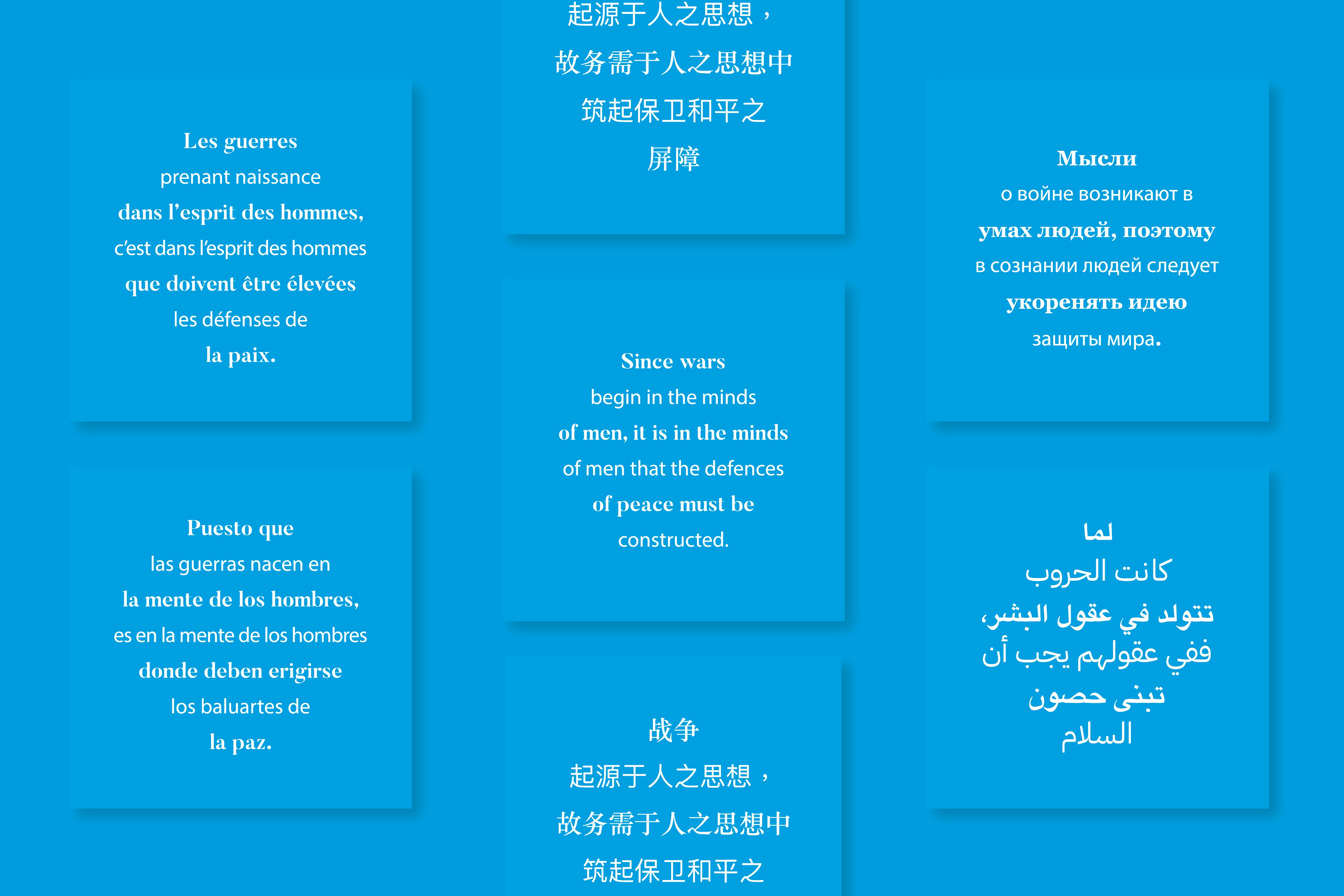
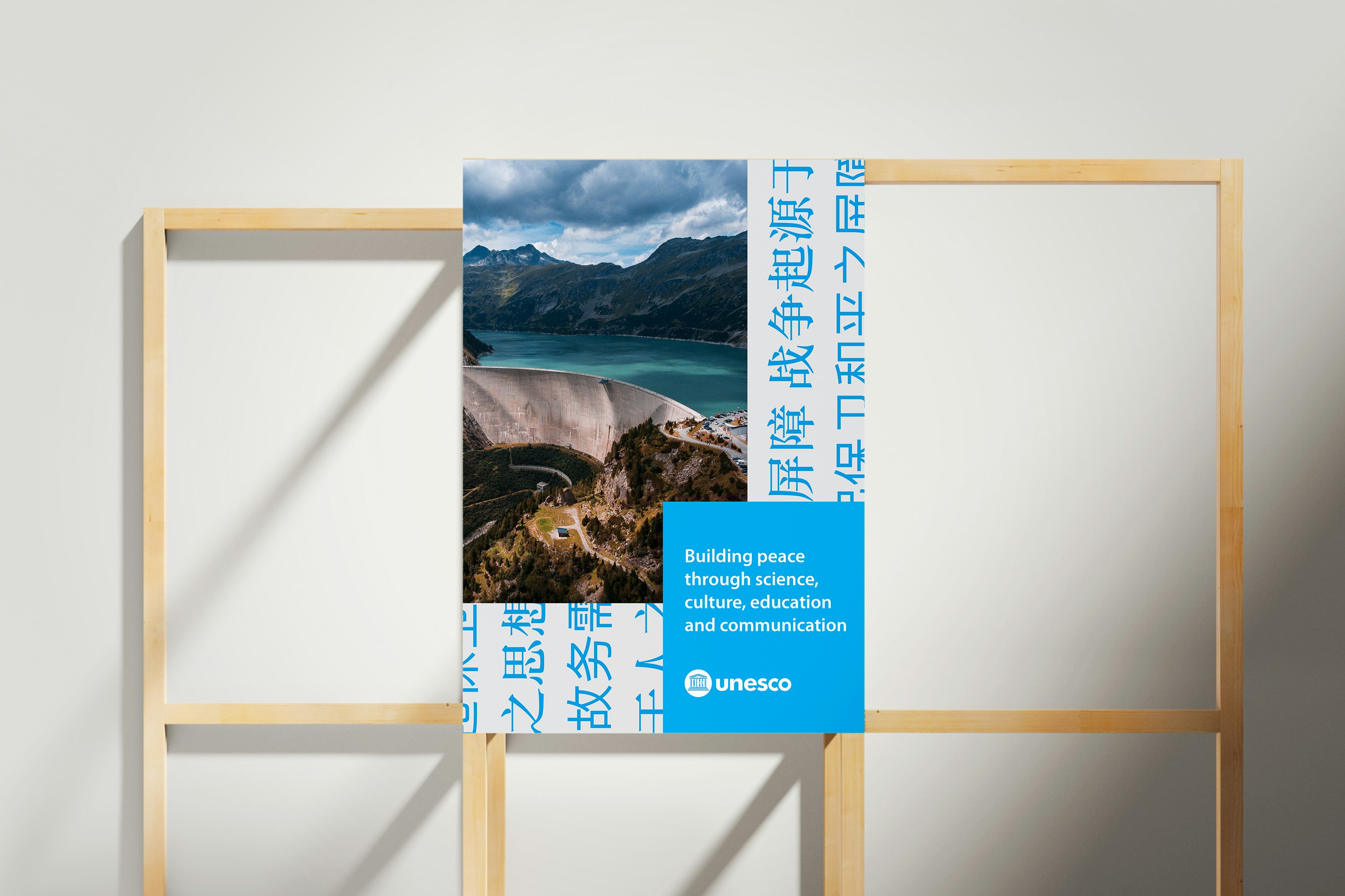
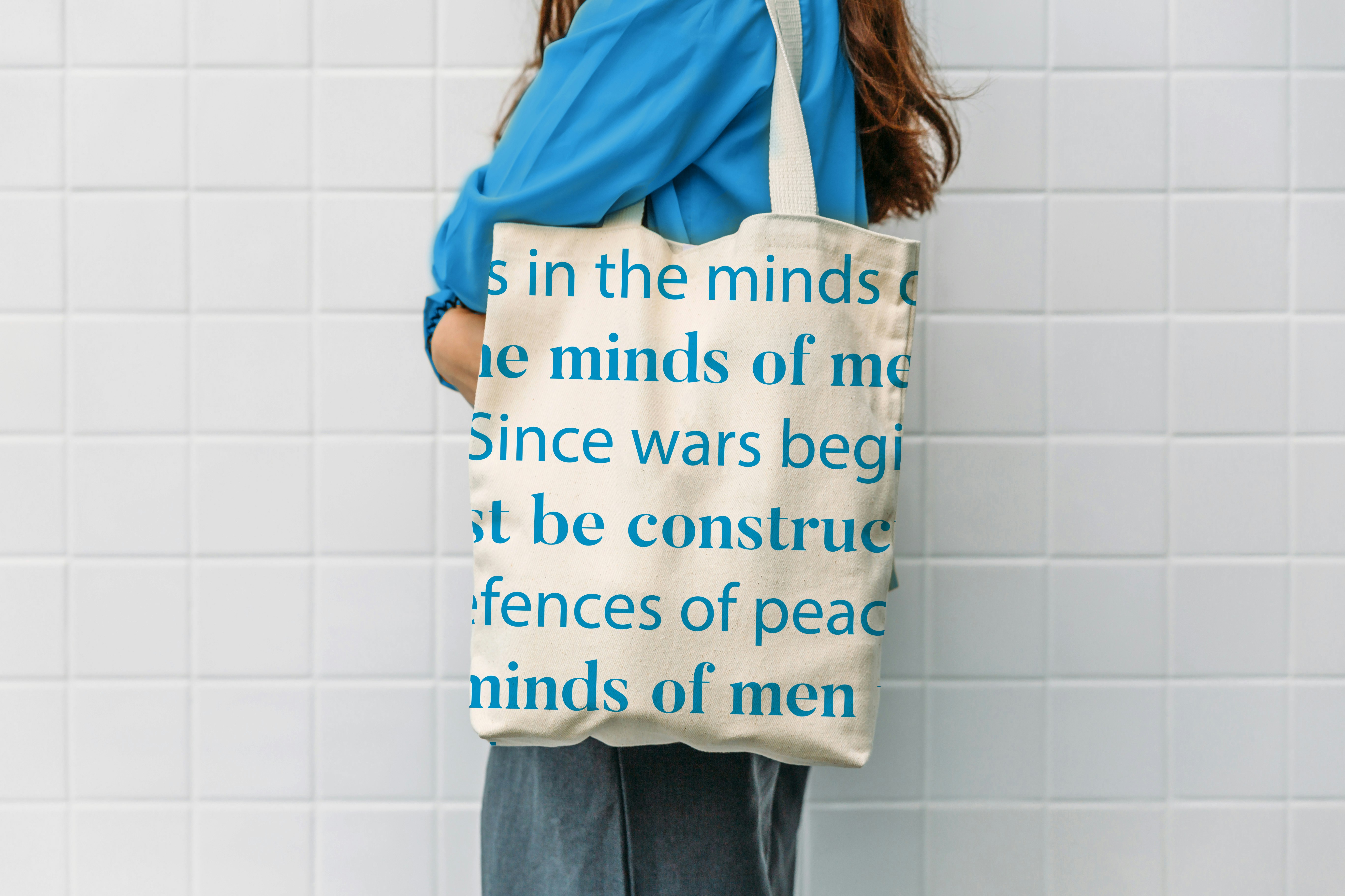
To help the organisation show what it is really all about: instilling peace in the minds of men and women, through education, science and culture.
Solution
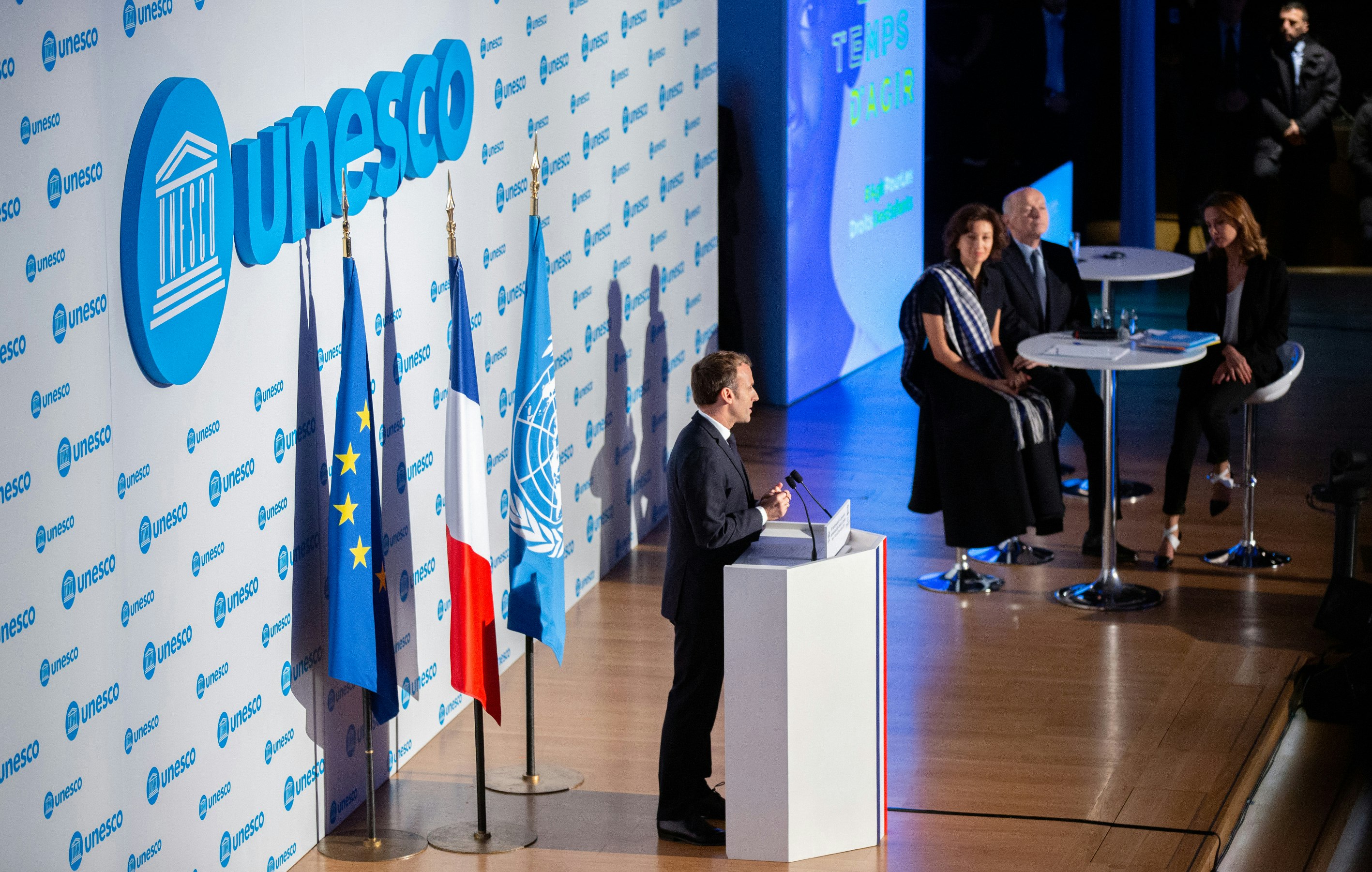
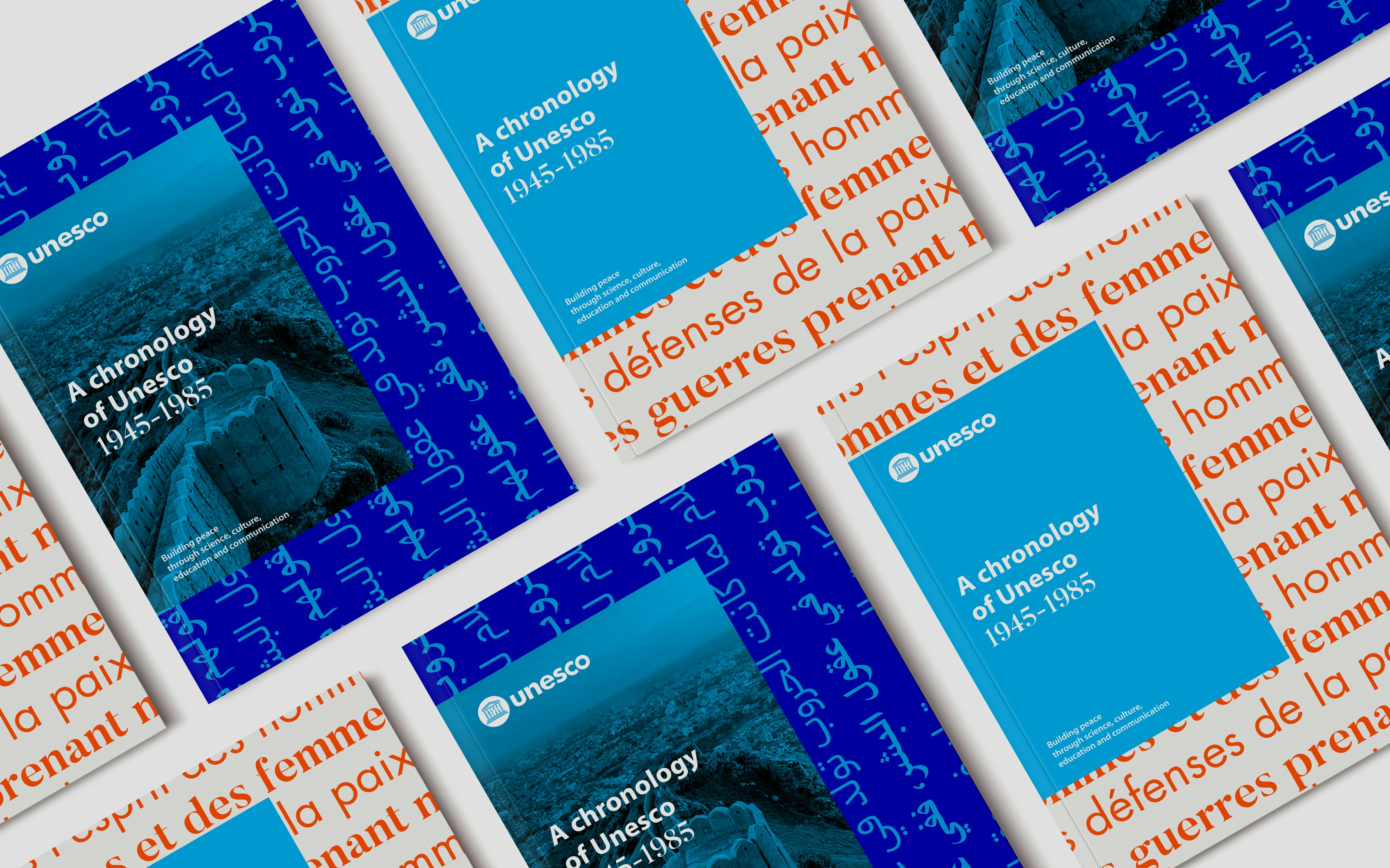
Development of a new visual identity for UNESCO that reinforces its historic link to the United Nations and can be used in a more coherent and systematic way across the world, smoothing over the conflicting signs within the organisation and giving it more of an impact on today's media. The timing couldn't have been better: the new identity, rooted in the institution's traditional colour scheme, was unveiled during the 40th General Conference in Paris, in November 2019. The theme for this exceptional occasion was focused and clear: (Re)generation by Minale Design Strategy, a theme dedicated to reiterating UNESCO's purpose and philosophy through its original guiding principles.


Two key tasks to achieve a common goal
To shed some light on what UNESCO is really about, we decided to focus on two complementary tasks: development of the logo and the staging/design of the 40th General Conference in Paris.


Developing the logo
As well as more modern typography, the historic temple is now positioned in a blue sphere using the colours of the UN, which puts Unesco's work firmly in the context of this universal framework and helps bring its image more in line with its parent organisation.
The visual identity has been improved to offer increased modernity, a stronger impact and better readability, especially in its digital applications.


UN & UNESCO
One of Minale Design Strategy's recommendations for the new visual identity was to opt for a bright shade of blue, symbolic colour of the UN.
Under the aegis of the United Nations, the two entities work hand in hand to solidify peace in the world.


Item 1
Back to basics for a new, more modern touch. Item 1 becomes a calligram in the shape of a planet, inspiring others to build peace.


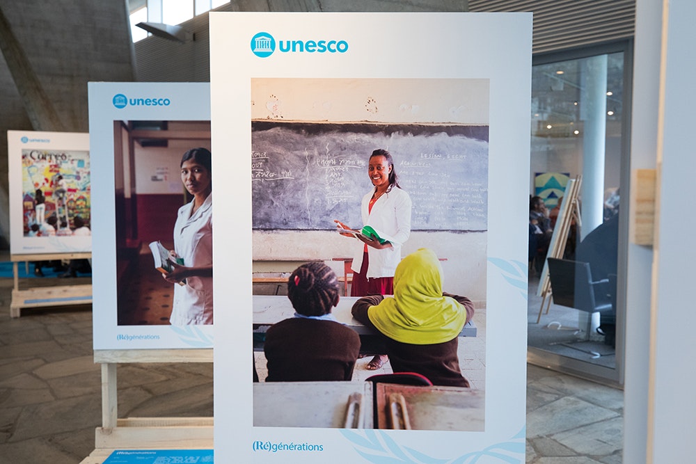
R(e)generations
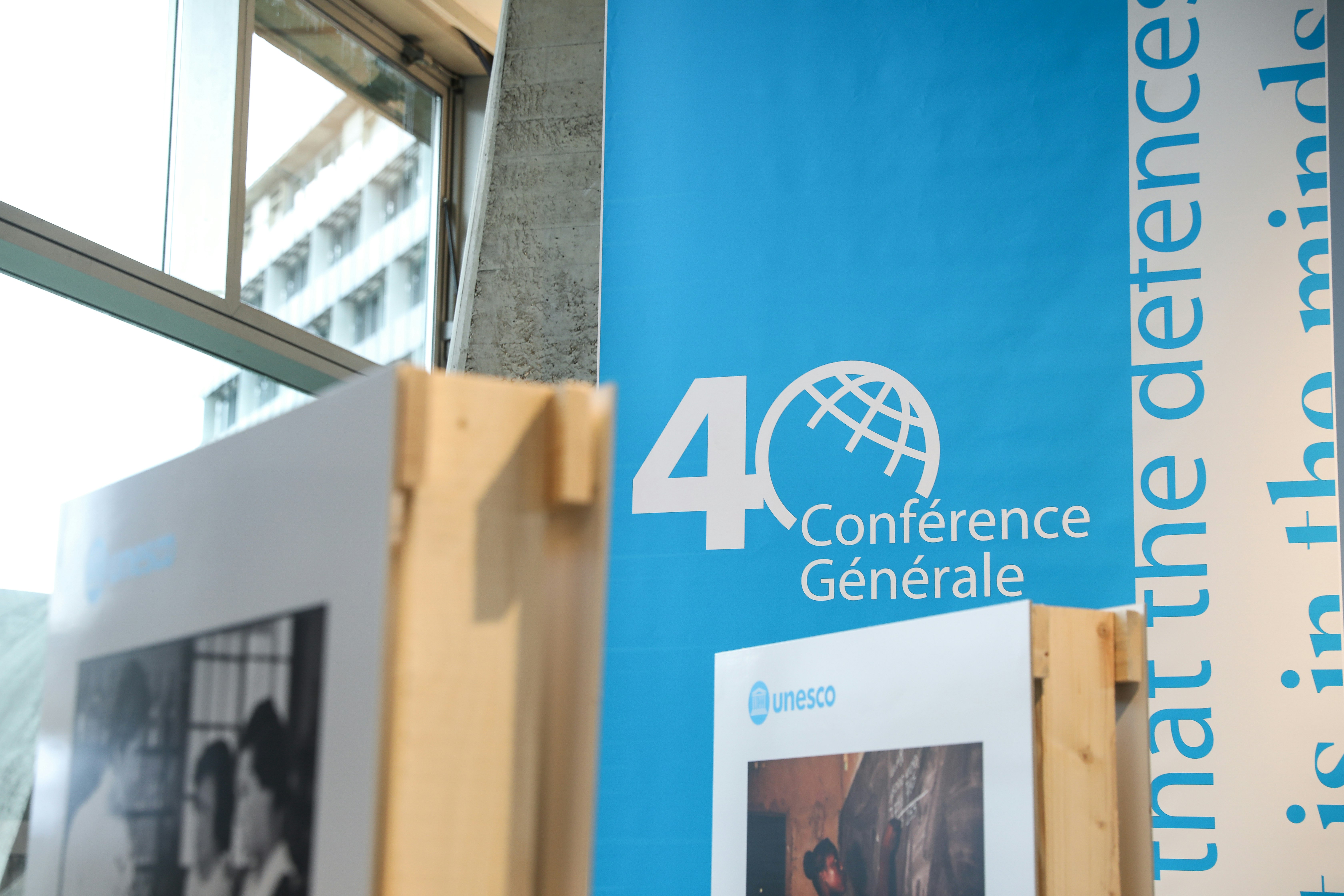
Under the guidance of Minale Design Strategy, (Re)generations was chosen as the central theme of the 40th General Conference.
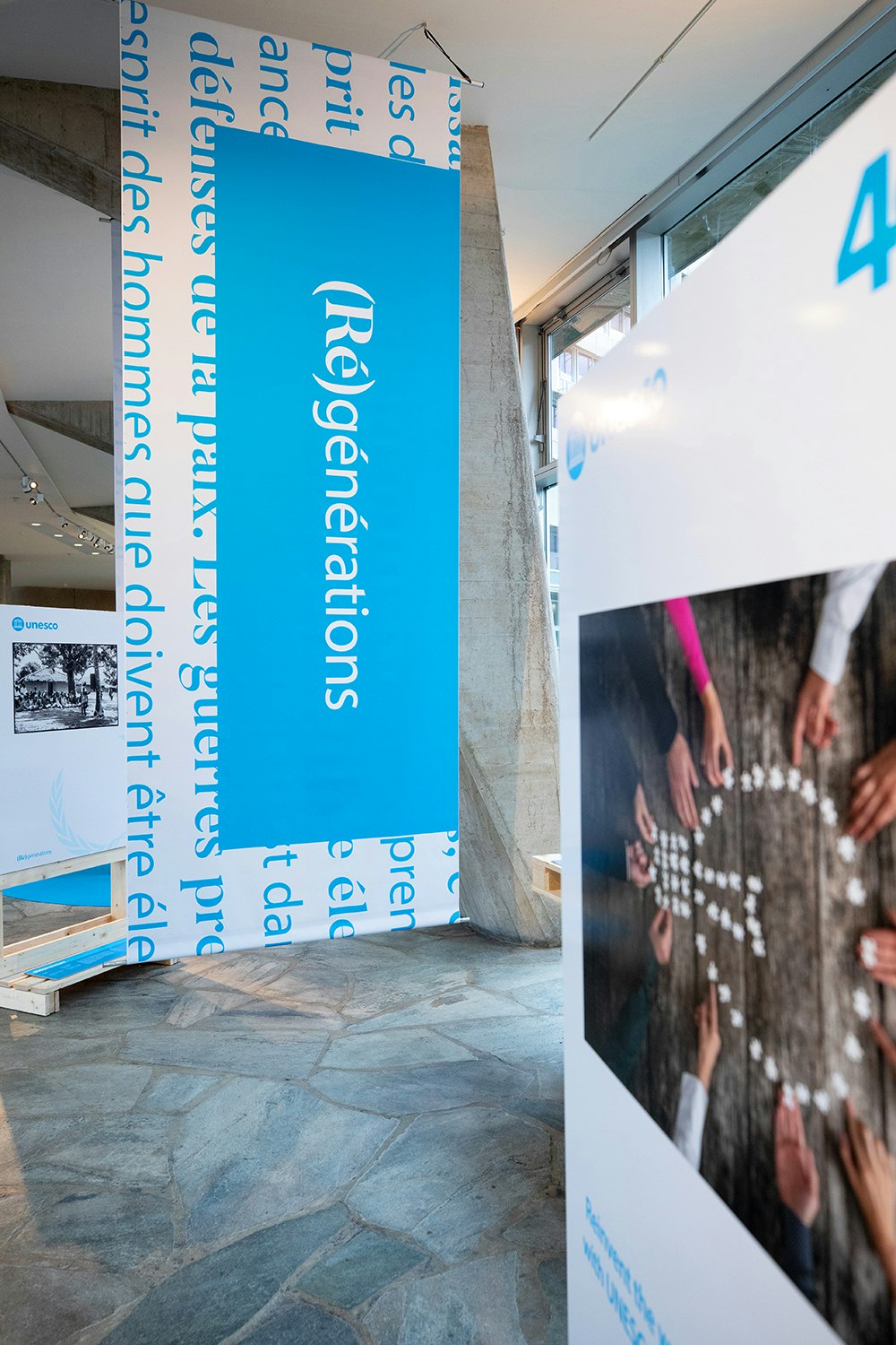
The primary aim was to rethink and revamp Unesco's image by going back to its original guiding principles, but also to evoke the challenges faced by future generations to prepare them for a more peaceful world.


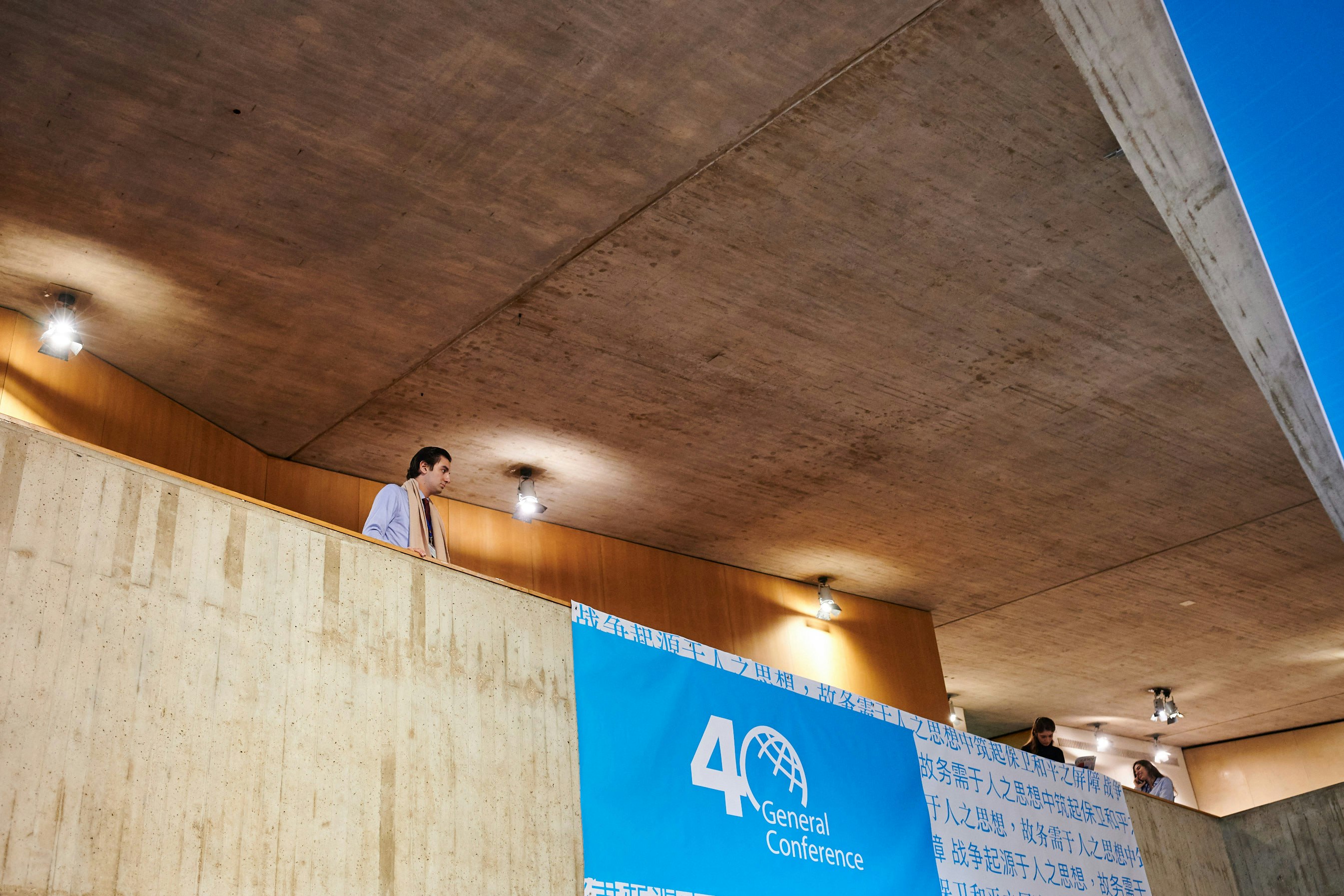
40th General Conference: creating the logo
An understated and effective design for the 40th General Conference.

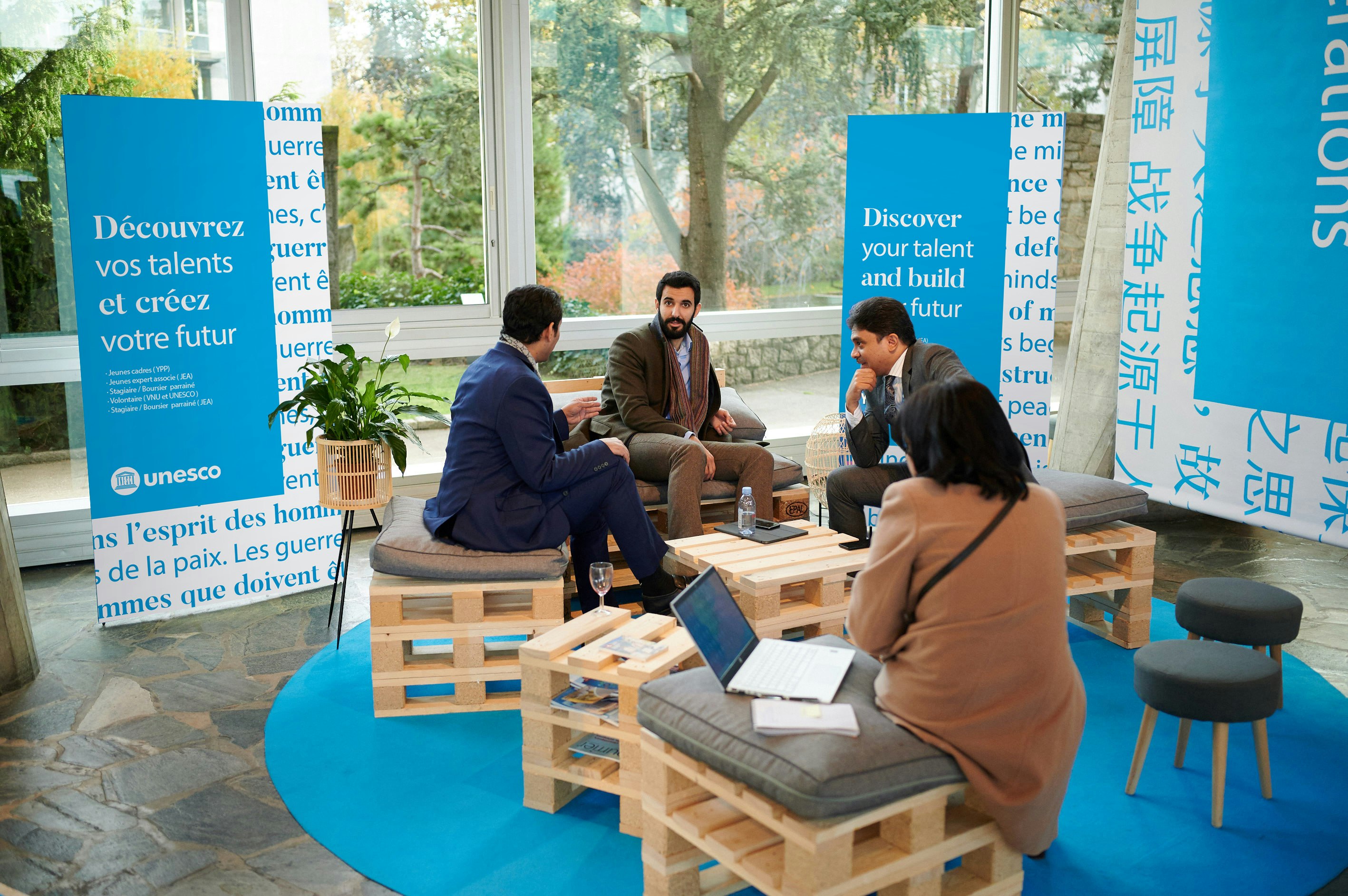


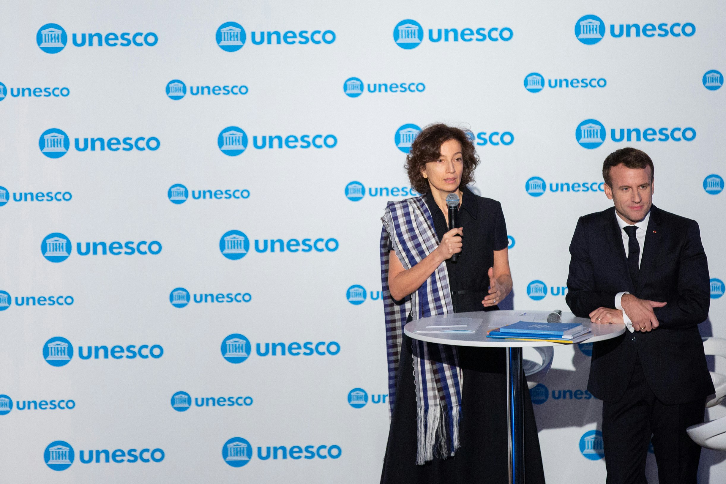
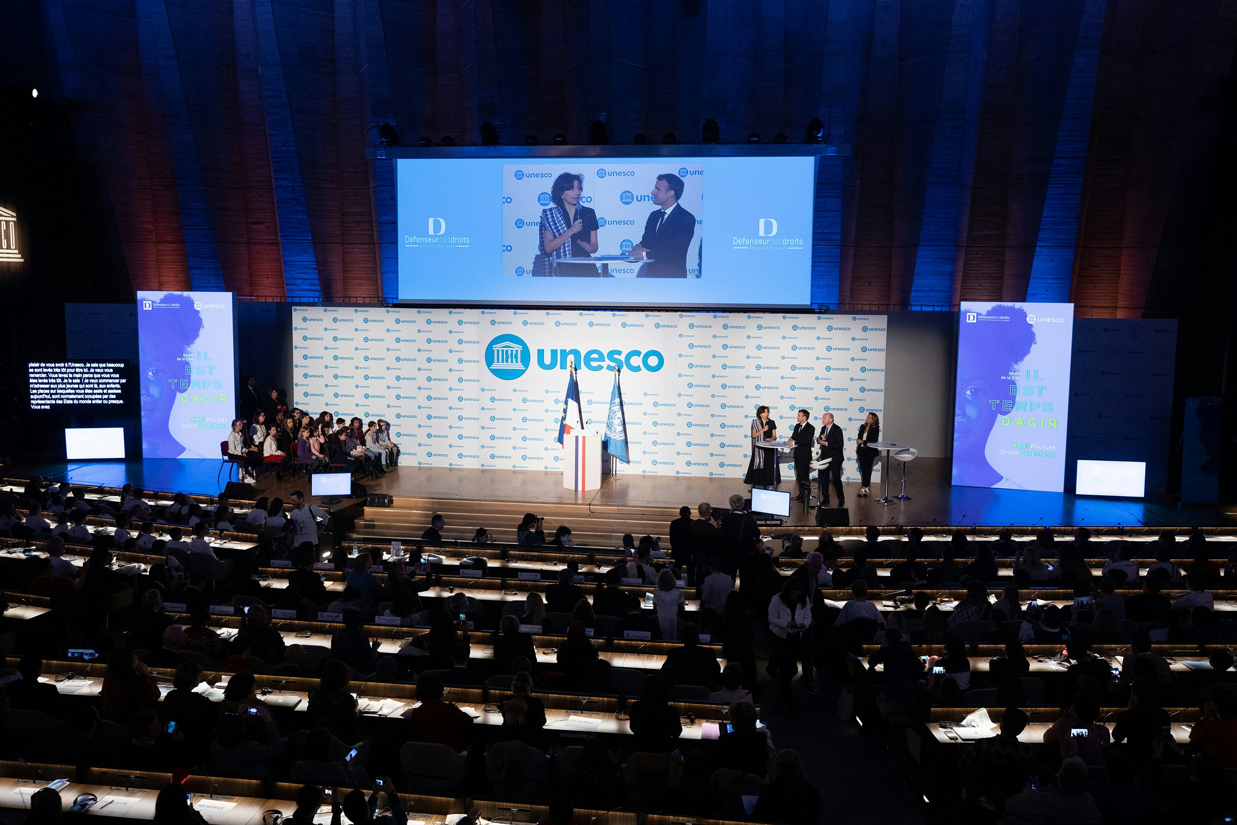
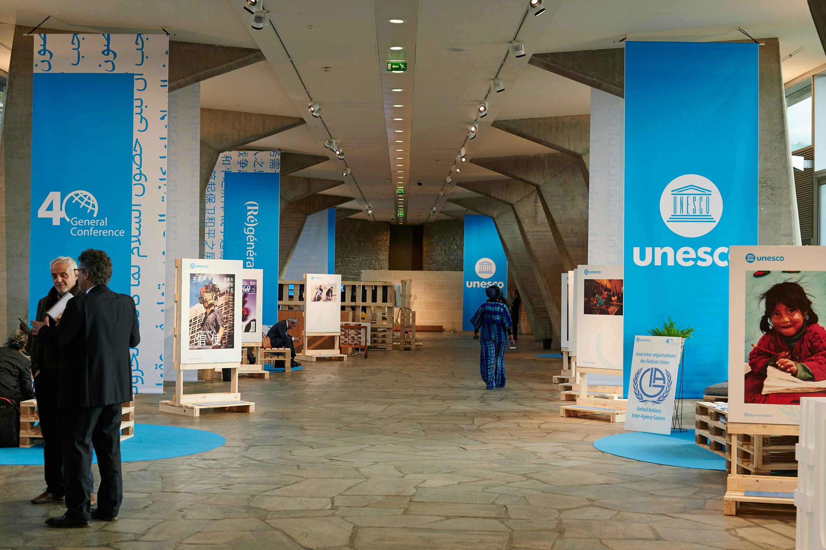
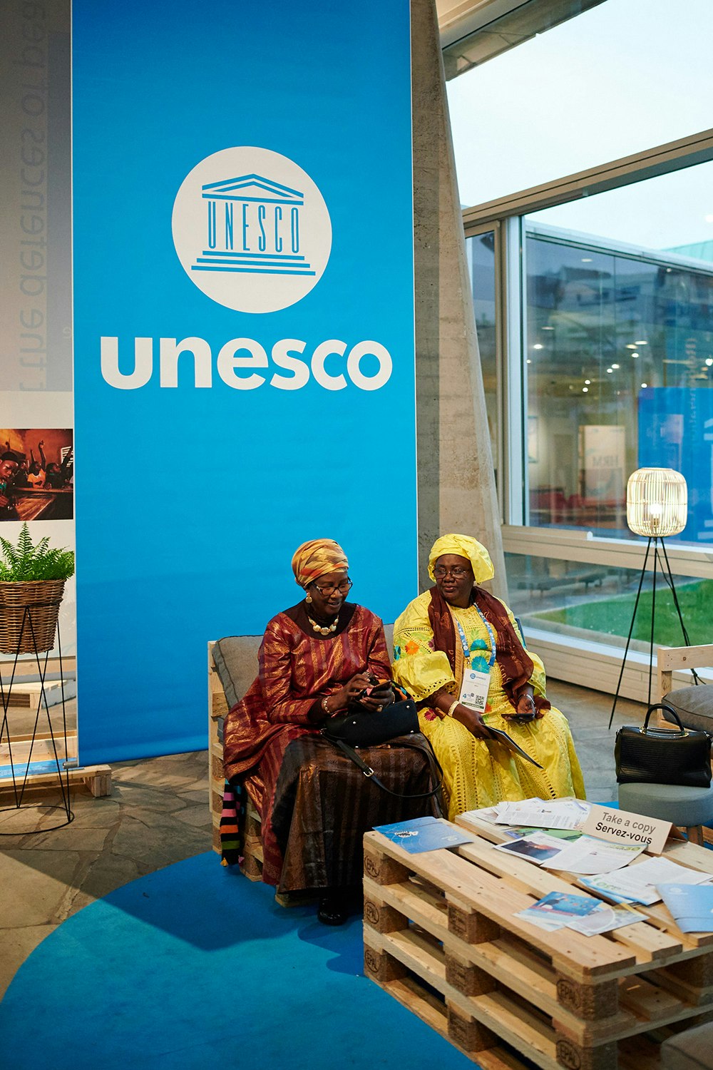
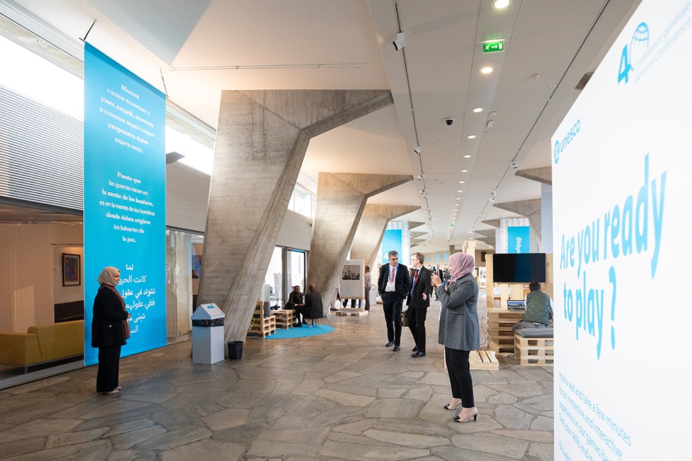
40th General Conference: staging the event
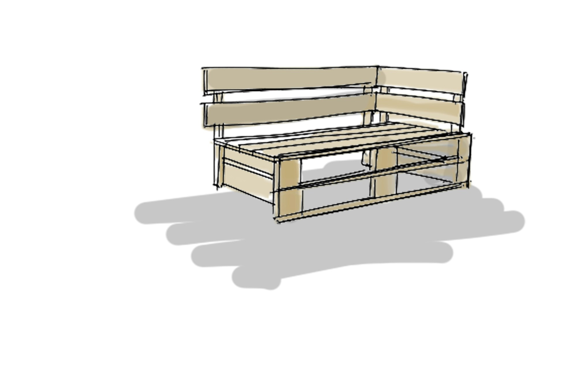
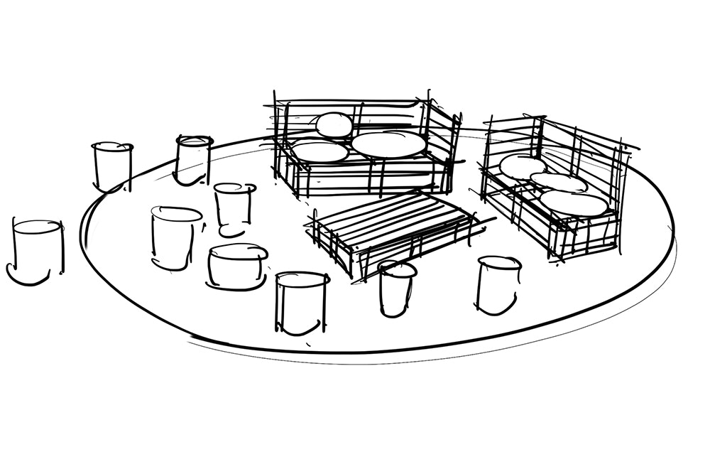
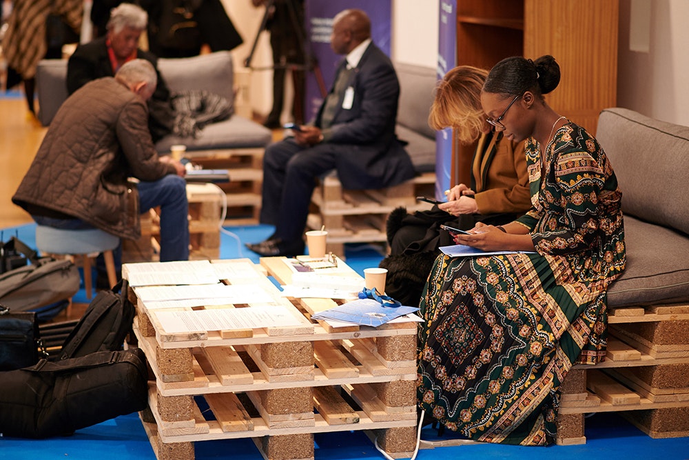
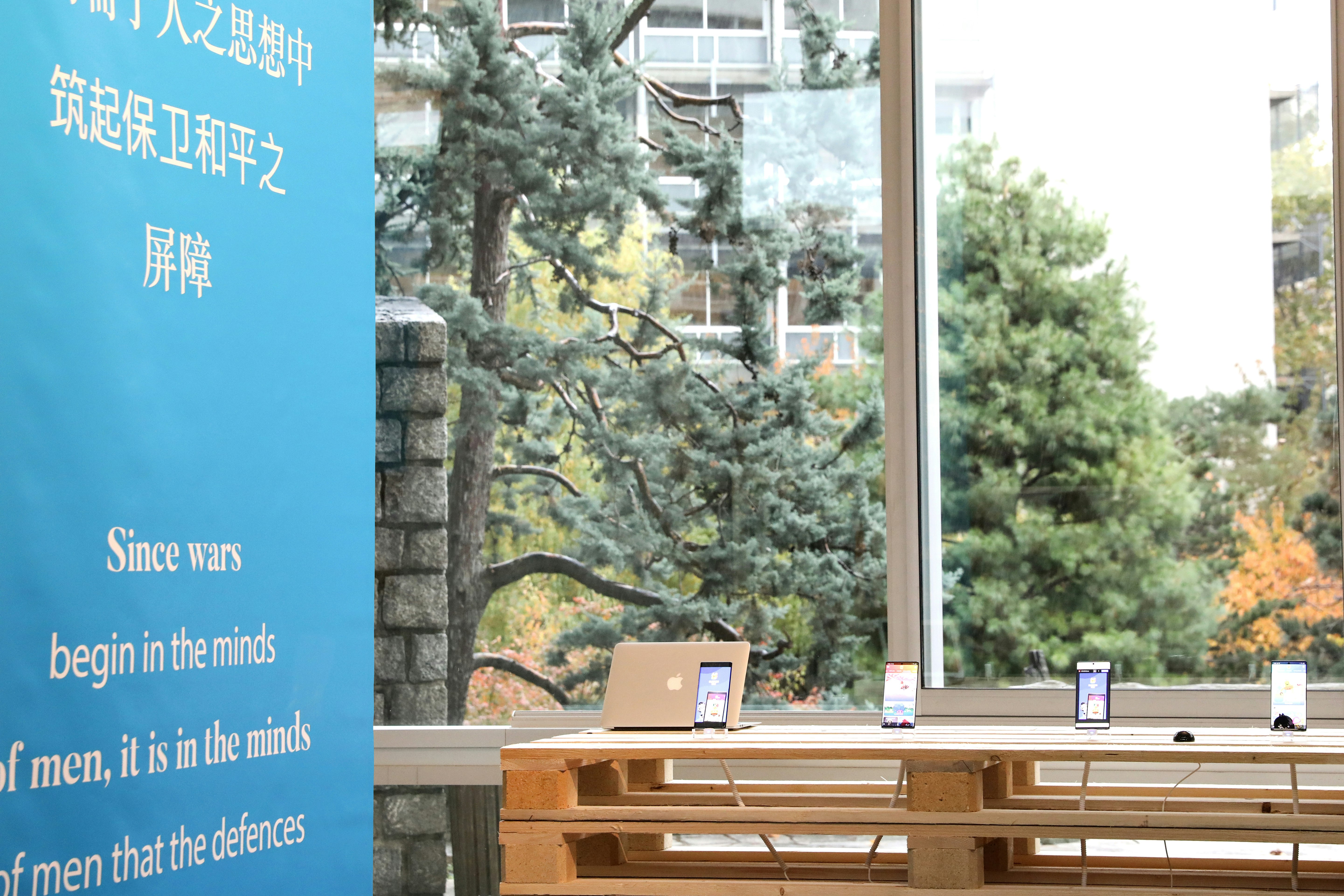
At the heart of UNESCO's iconic headquarters in Paris, Minale Design Strategy designed an event focused on the reuse of materials. Based on the theme of (Re)generations, the visitor experience goes hand in hand with the brutalist-style architecture, including wooden pallets for furniture, enhanced with cushions to create comfort from raw materials. Calligrams in the new graphic charter offer inspiration and decoration across the event spaces, in which the 193 delegations can wander, chat and learn about UNESCO's fascinating work around the world. The conference auditoriums are also decorated in this vibrant blue, and feature the new logo. A photo-call showcases the key players at the conference against a backdrop specially designed for the occasion by Minale Design Strategy.