Ostreya
Changing materials to change the world
Ostreya is the story of a metamorphosis. That of a recycling expert group choosing to reinvent itself to embody a clearer, more ambitious, and more sustainable vision. Born from TGW, the brand now stands as a driving force for positive transformation: an actor that doesn’t merely process waste, but works to regenerate materials and rethink how we produce, consume and create value. Ostreya is built on a simple conviction: every resource deserves a second life.
Industries
- Services.
Skills
- Naming,
- Brand Design,
- Brand Architecture,
- Strategy,
- Digital.
Challenge
The TGW Group had long struggled with structural and identity complexity inherited from its history. Several brands (Tri-O, Greenwishes and Groom) coexisted without a unifying vision, diluting both efforts and visibility. Despite recognised expertise and continuous innovation (data monitoring, reporting, engineering offices, record recycling rates), the brand lacked coherence and reach. The challenge was therefore twofold: to clarify the brand architecture and position the group as a single, strong and recognisable actor, and to find a meaningful name capable of embodying its mission.
Solution
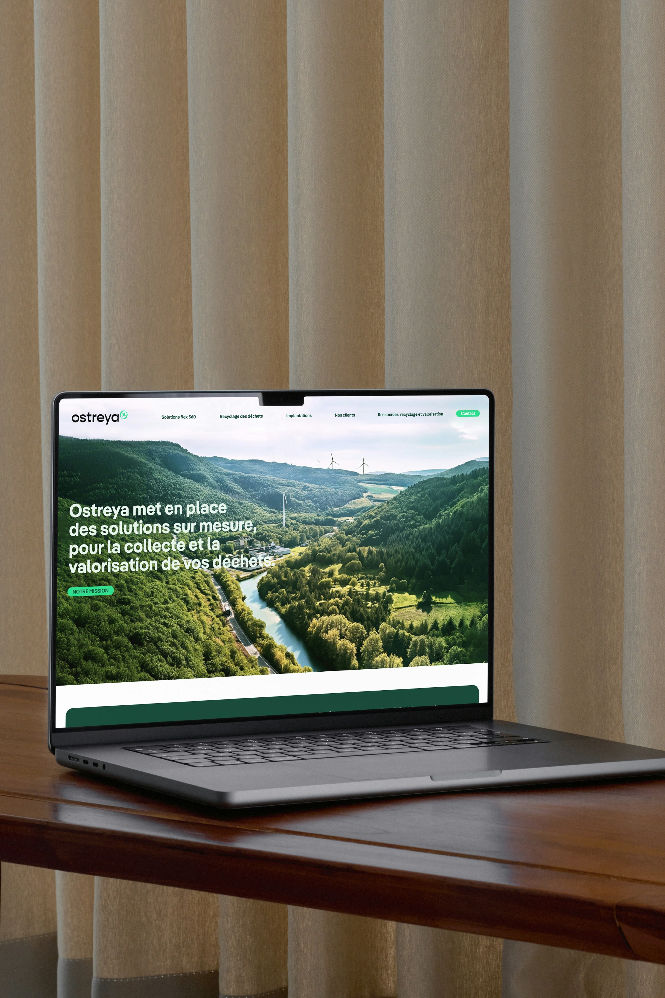
The rebranding process led to the creation of Ostreya, a unified, distinctive and inspiring brand. The name derives from the contraction of “ostreas” (Latin for oyster) and “estrella” (Spanish for star), symbolising a project that purifies its environment and guides the way towards zero waste. This new name reflects a positioning built on three pillars: bespoke solutions, client support, and data reporting. This approach has unified the group’s various entities while structuring its offer into modular solutions tailored to the specific needs of each client.
Objective 100% resources
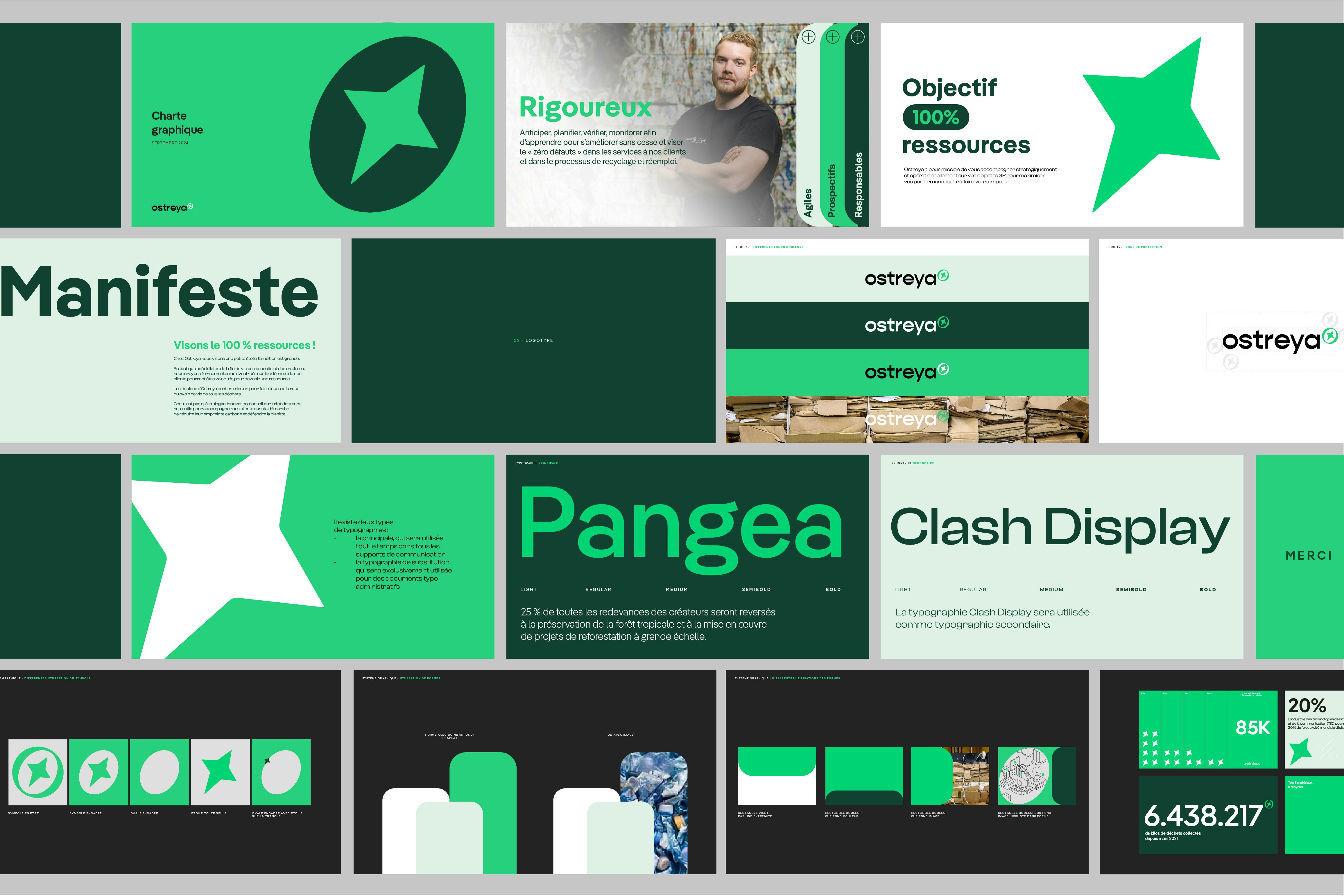
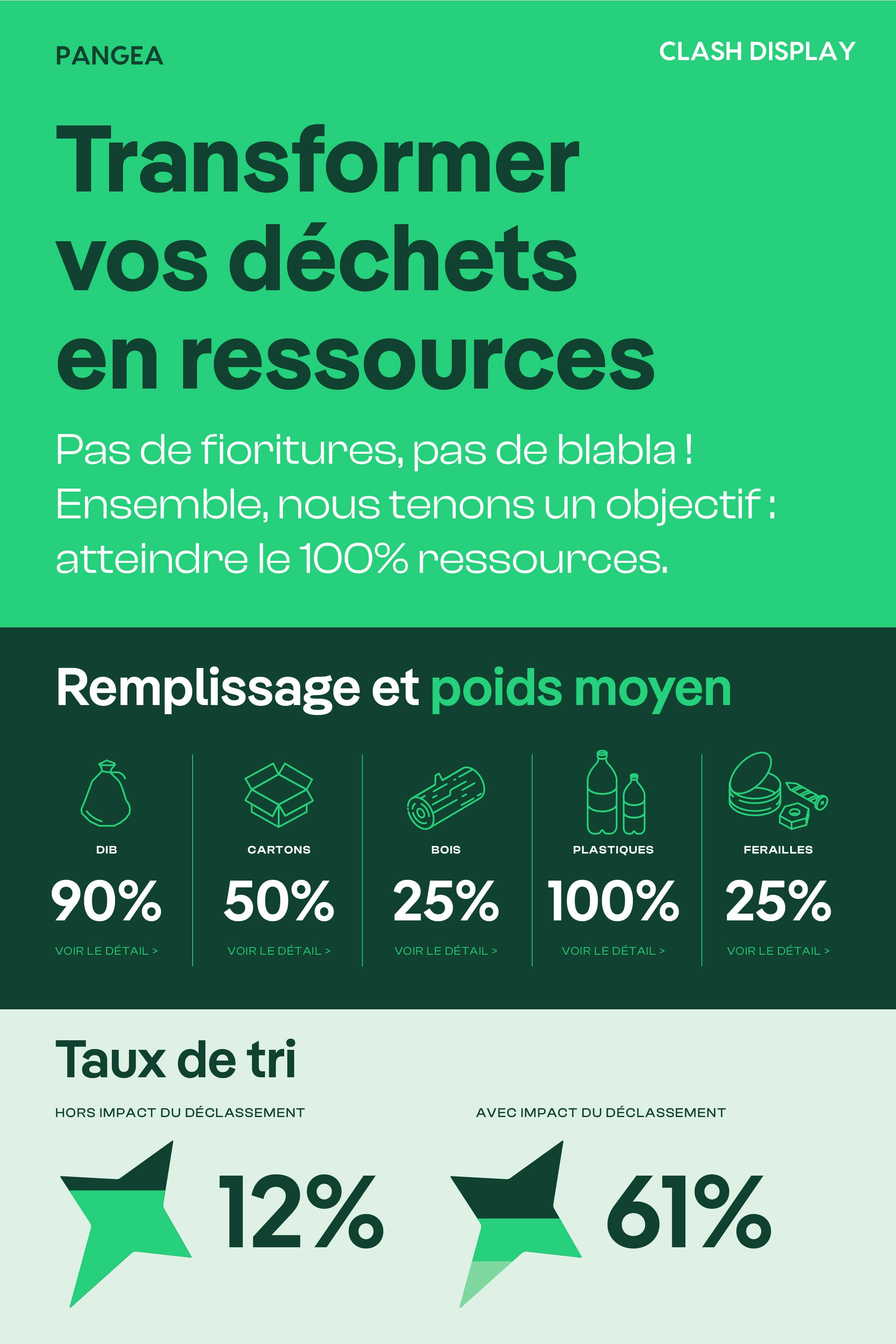
Ostreya carries a clear ambition: to turn waste into resources and make recycling a driver of innovation, performance and pride for businesses. Each project aims to achieve “100% resources”: a model where nothing is lost and everything is transformed. This philosophy translates into daily actions, processes and communications, placing environmental responsibility at the heart of every decision.

An identity that embodies transformation
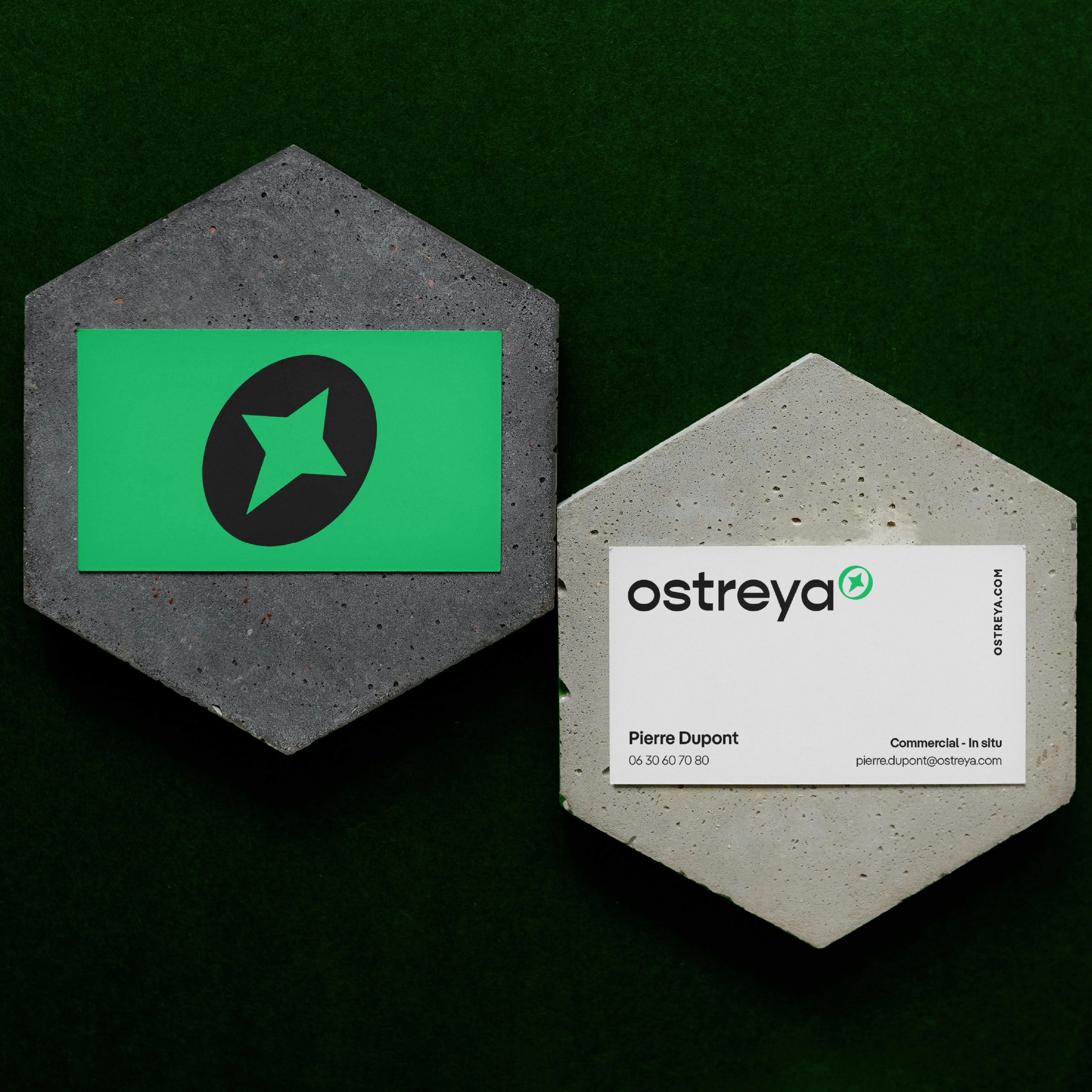
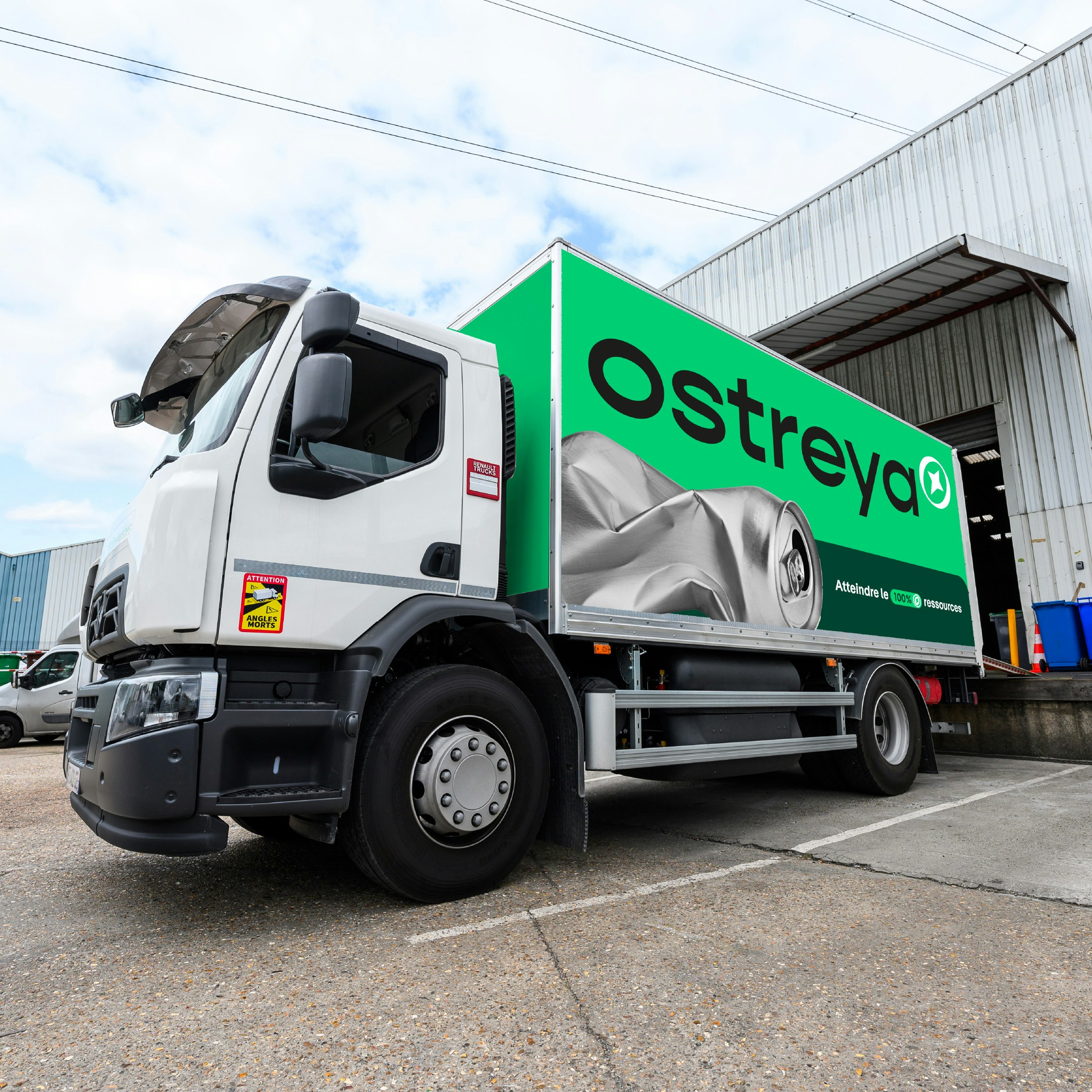
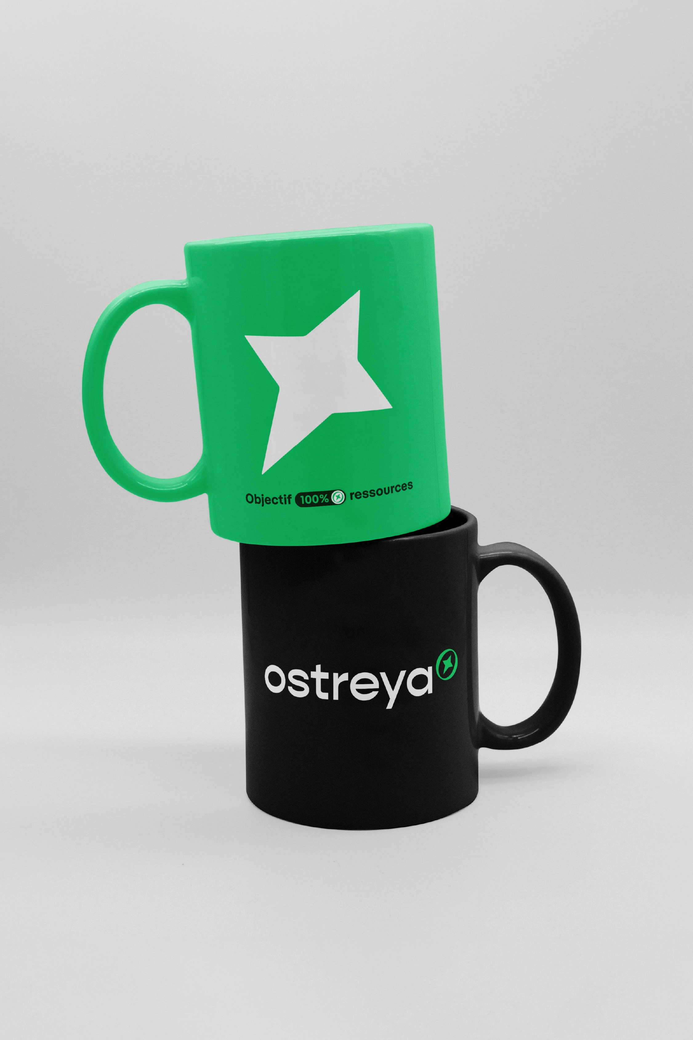
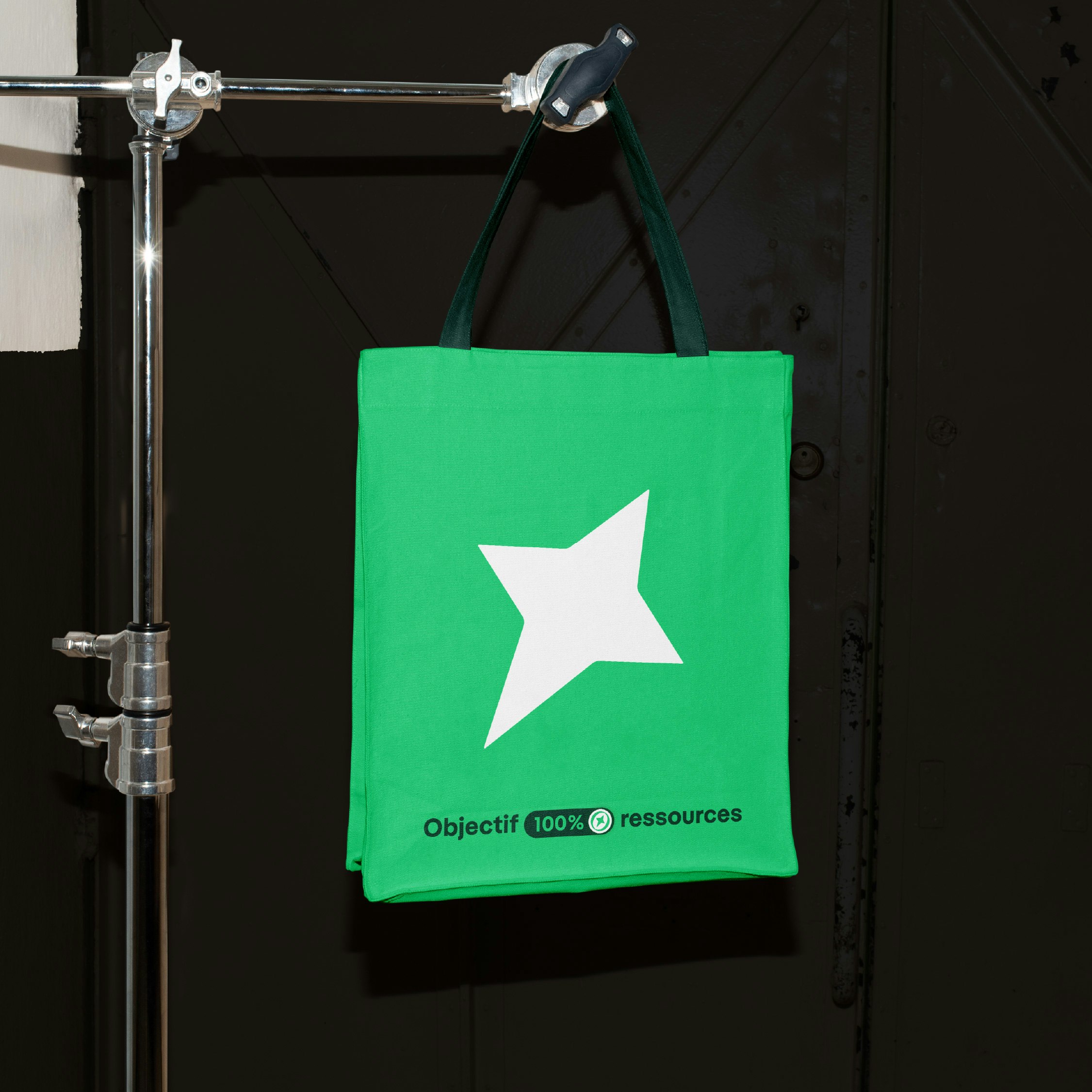
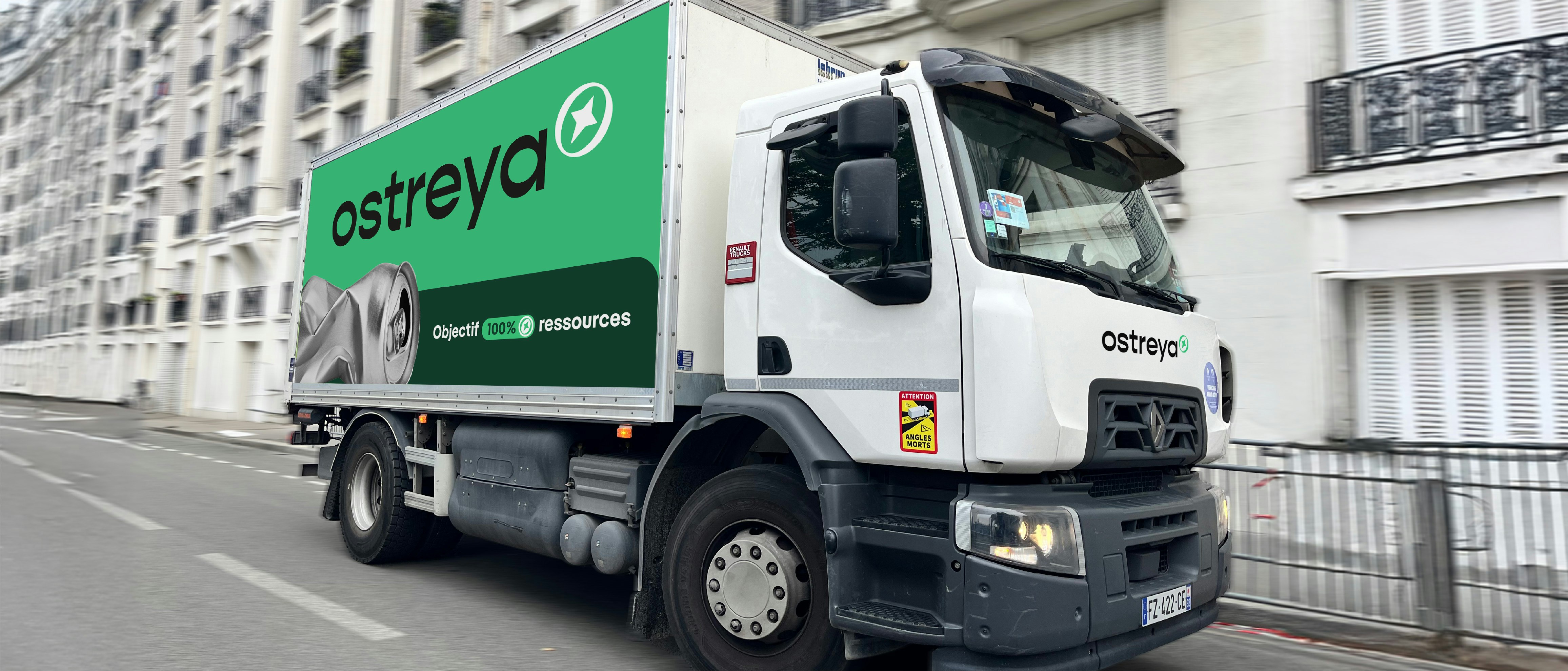
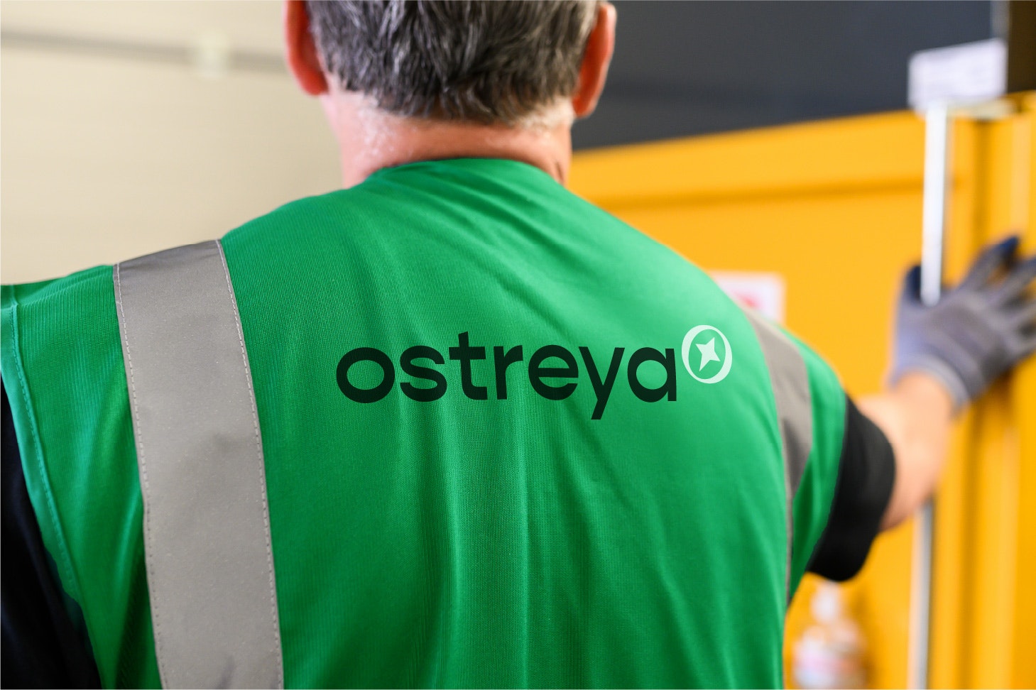
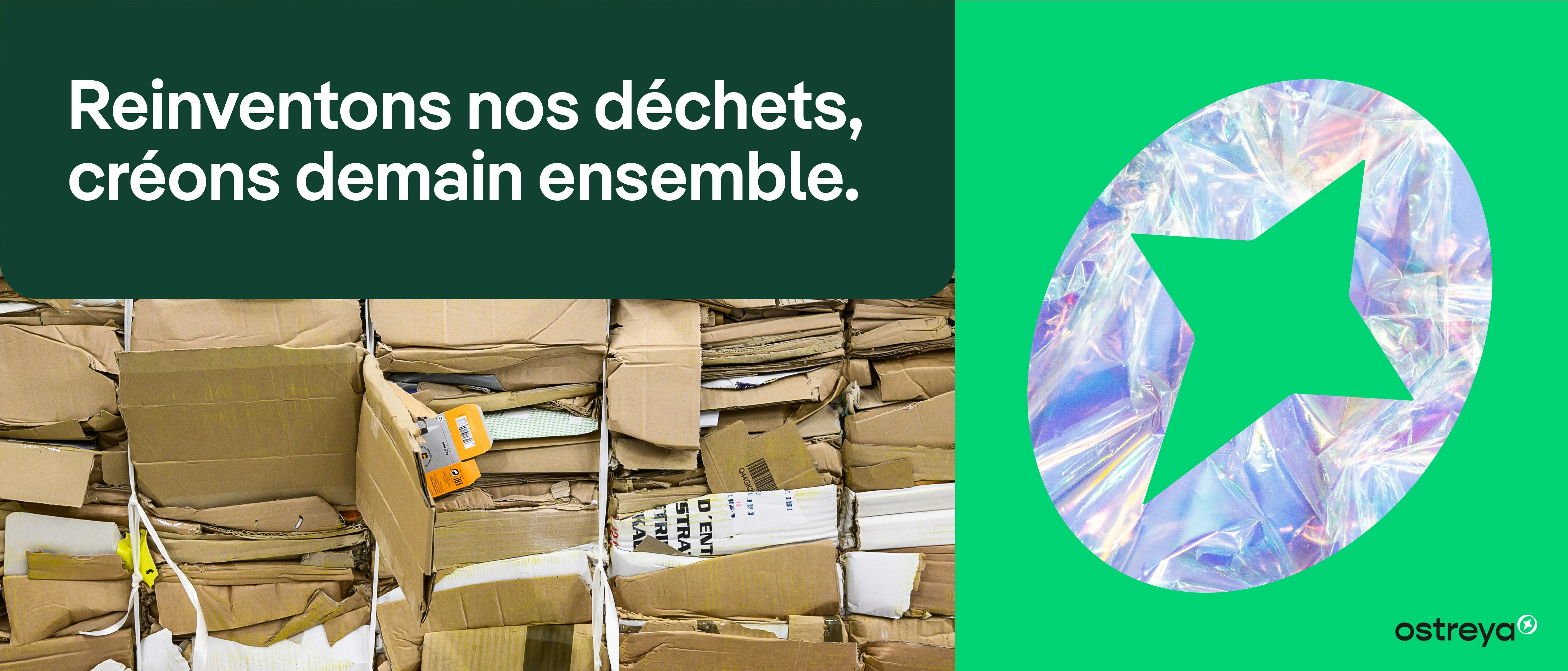
Ostreya’s identity visually expresses its ambition. Its symbol, a star within a circle, evokes purpose, measurement and excellence. It embodies the group’s ability to guide companies through their environmental transition with precision and agility. Deployed in multiple forms, the star becomes a powerful visual marker, a source of energy and optimism, that brings rhythm and coherence to the brand’s communications across all media.
A Unified Architecture, an Amplified Impact
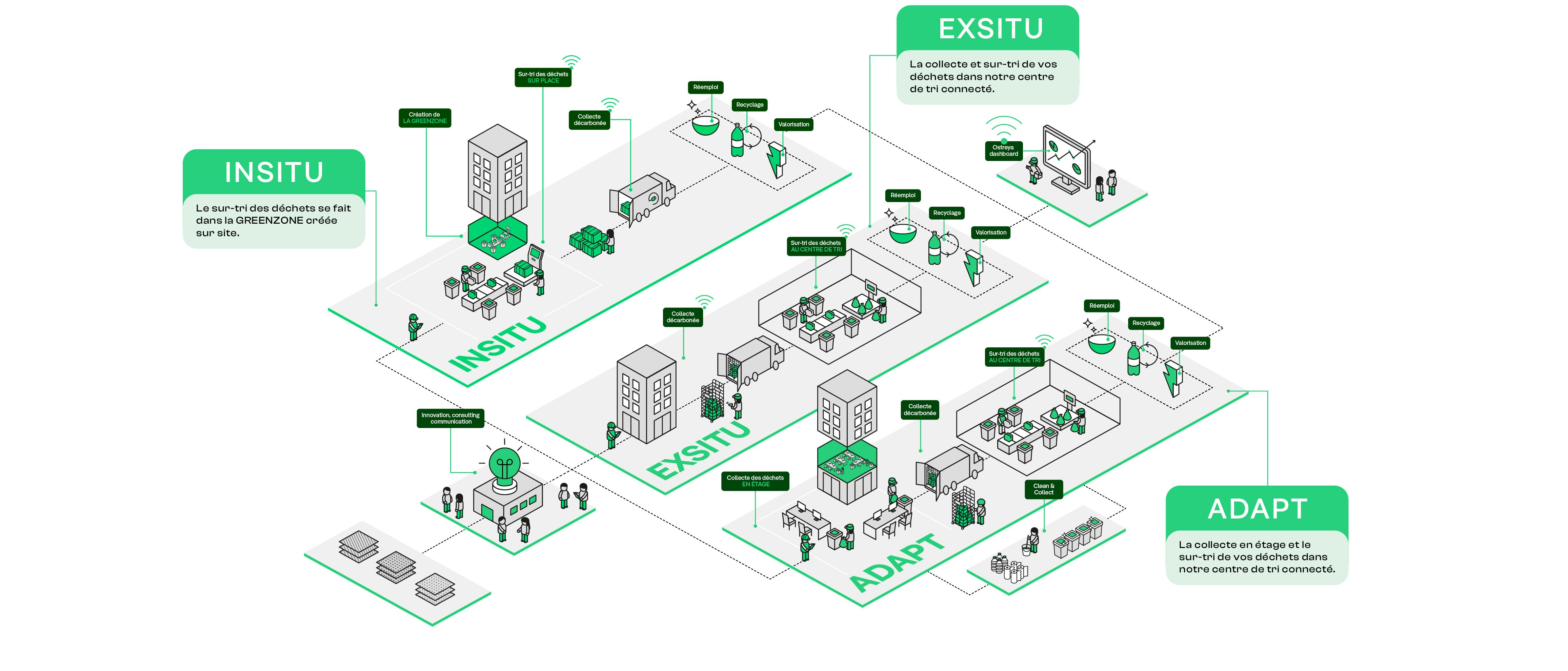
The transition to Ostreya brought all the group’s entities together under a single banner, one vision, one promise. This structural simplification strengthens the group’s visibility, optimises communication investment, and clearly conveys its positioning. The offer now unfolds through a range of complementary solutions (Ex-Situ, In-Situ, Adapt, Ponctuelle, Big Bag and Aquarys) enabling Ostreya to support every client’s specific needs and bring renewed coherence to the group’s overall expertise.
