Wallonie Entreprendre
Creating the future of Wallonia, when OUI becomes WE!
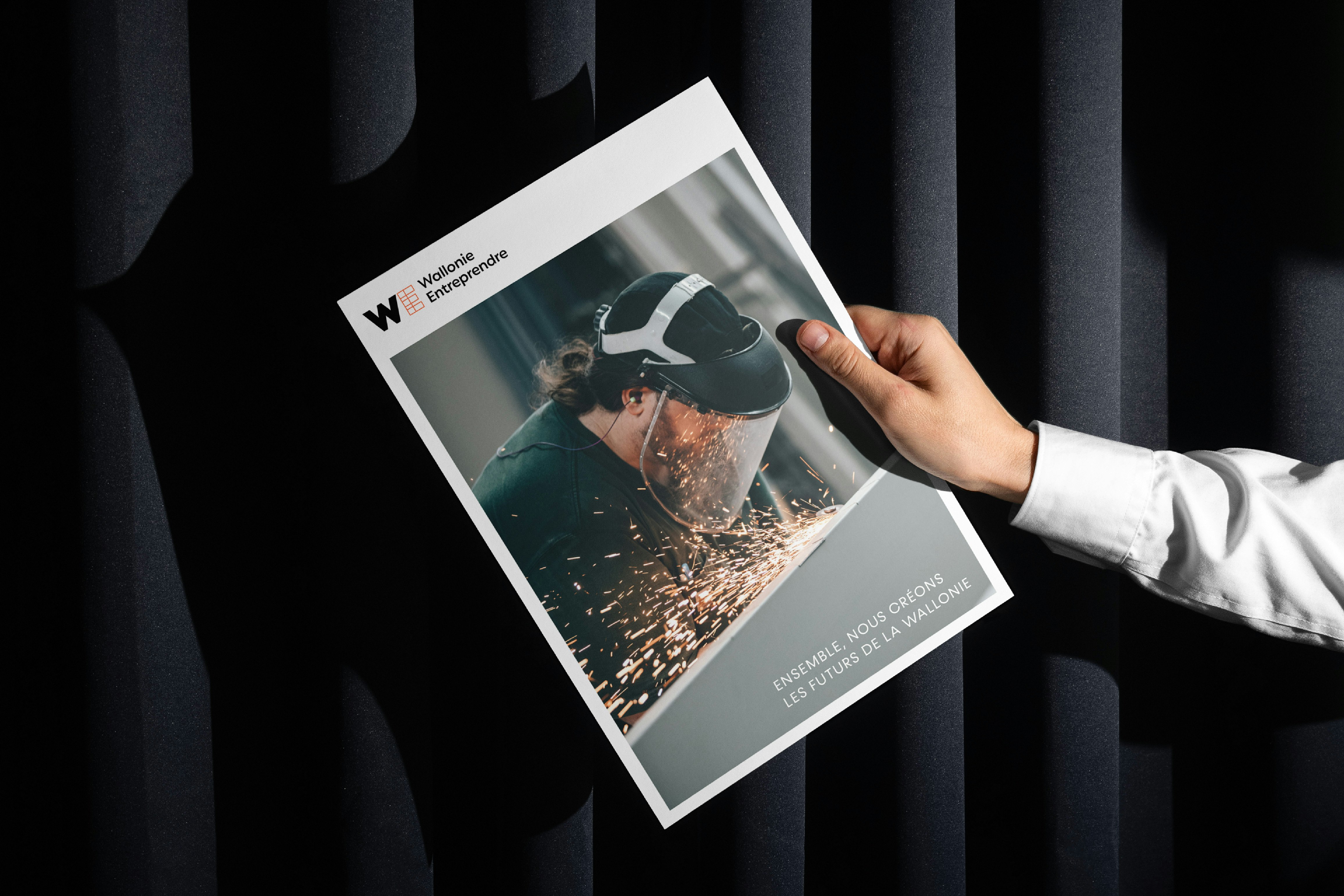
When a Belgian state reform led to a merger of investment funds SOGEPA, SOWALFIN and SRIW, the three entities decided to join forces, using it as an opportunity to boost the impact of their work with companies and the self-employed. A new brand, a new structure... a new start!
Industries
- Public Services.
Skills
- Strategy,
- Brand Architecture,
- Naming,
- Brand Design,
- Digital.
Challenge
Successfully identifying a branding approach that unites the three entities. Uniting teams around this branding and a shared mission. Building a brand that has what it takes to embody this ambitious project, consistent with a forward-looking company, its employees and its customers. Clarifying the solutions and services offered by the entity and increasing the visibility of the brand.
Solution
We wanted to create an inspiring brand for employees, but with added value for customers and partners, too. The first step involved defining a set of values, through a collective and participative approach, with a view to building a brand platform. This then led to the creation of a simple, collaborative and unifying brand. A brand capable of expressing the wide range of expertise present in this new entity; a brand capable of embodying a vision for Wallonia, its entrepreneurs and its businesses.
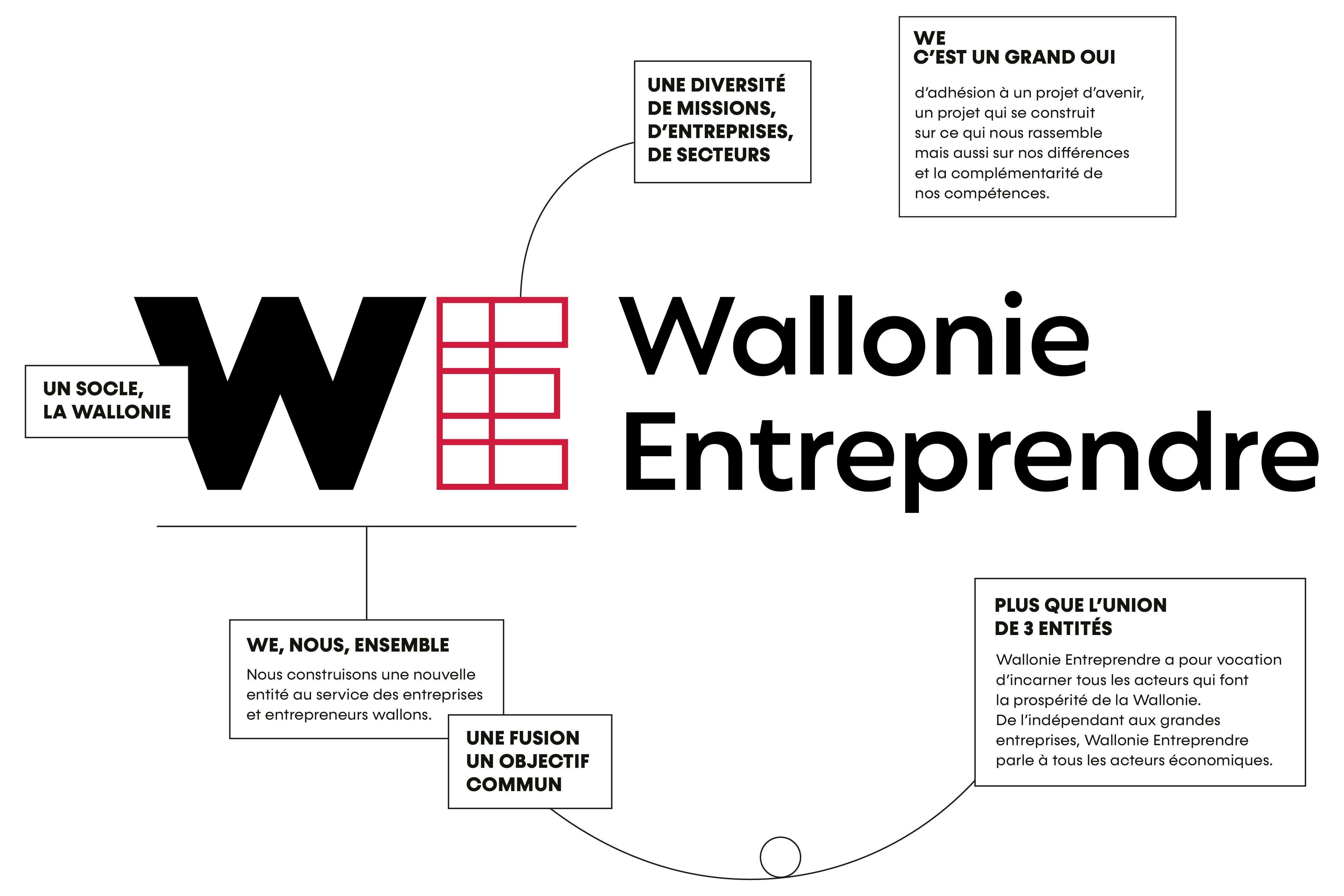
WE - an inclusive, unifying name
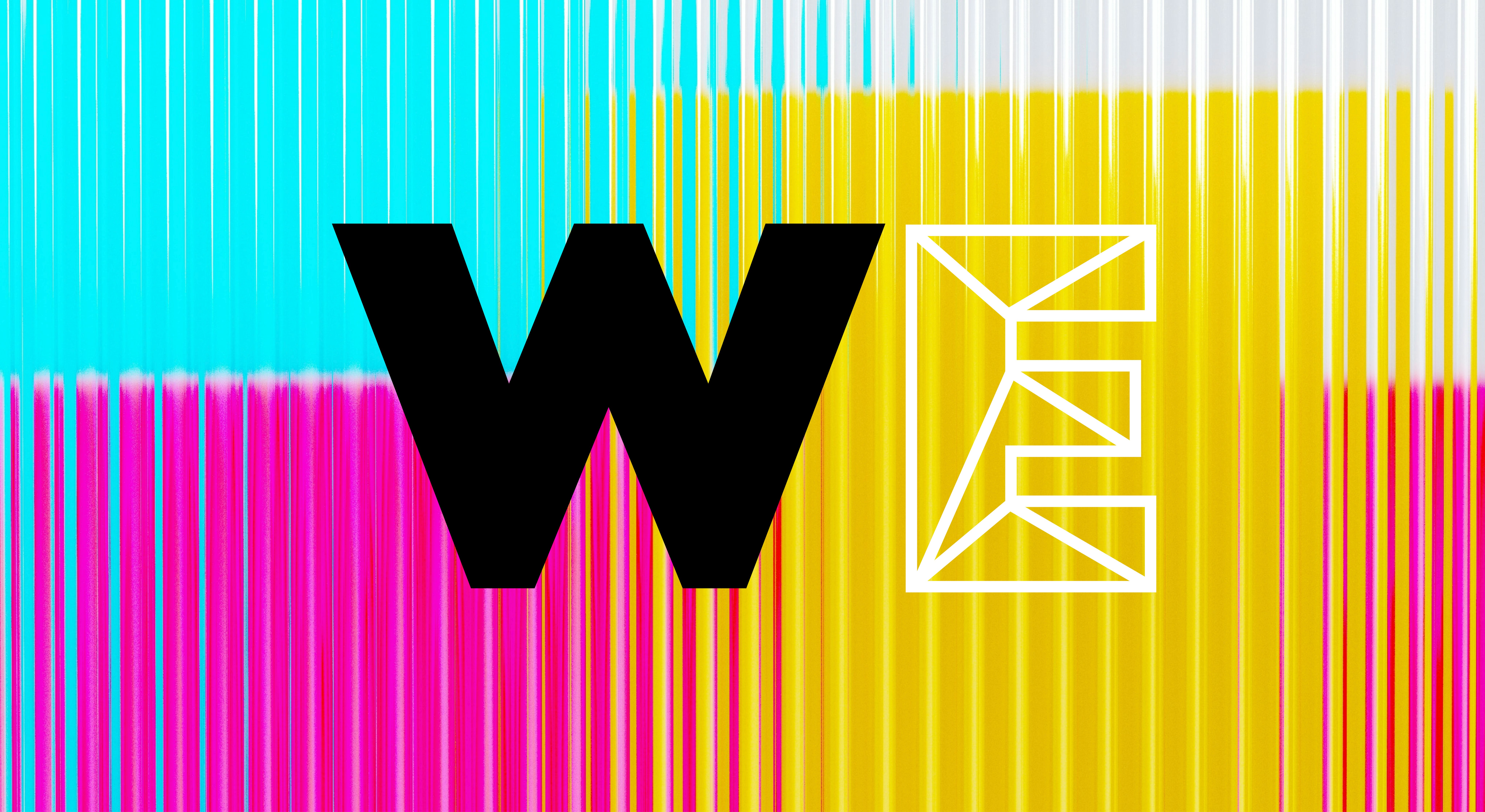
WE is an acronym for Wallonie Entreprendre. It reflects the entities' desire to pool their knowledge and skills to support the companies and entrepreneurs who make Wallonia prosperous. The new name, WE, symbolises unity and cohesion around a shared project, embodied by the teams. WE is the expression of "OUI", a great big "YES" to a project for the future. The name and branding reflects its regional roots, as well as the mark of the shareholder, the ambition to move forward, and an open and dynamic corporate culture.

A dynamic, agile and evolving brand
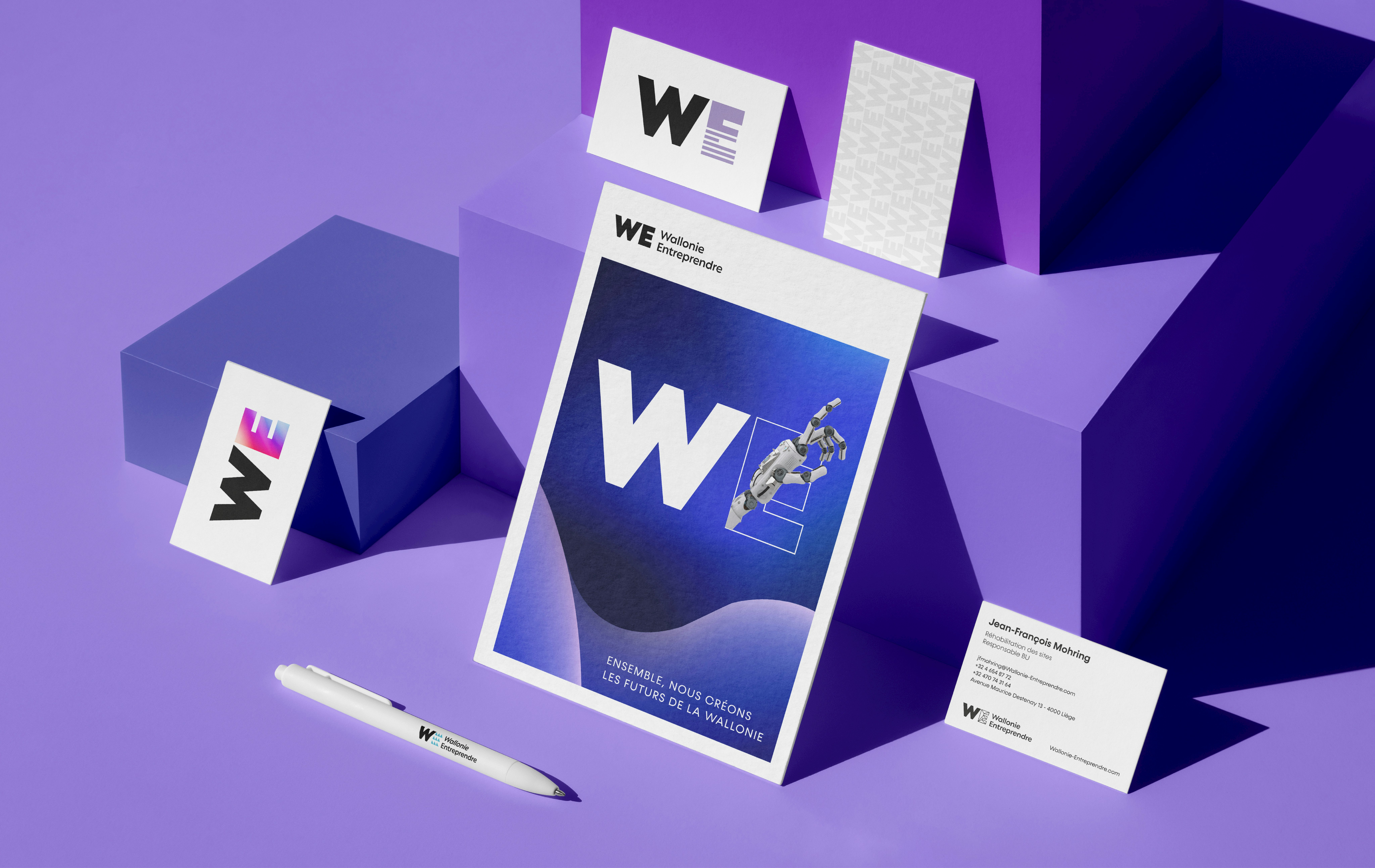
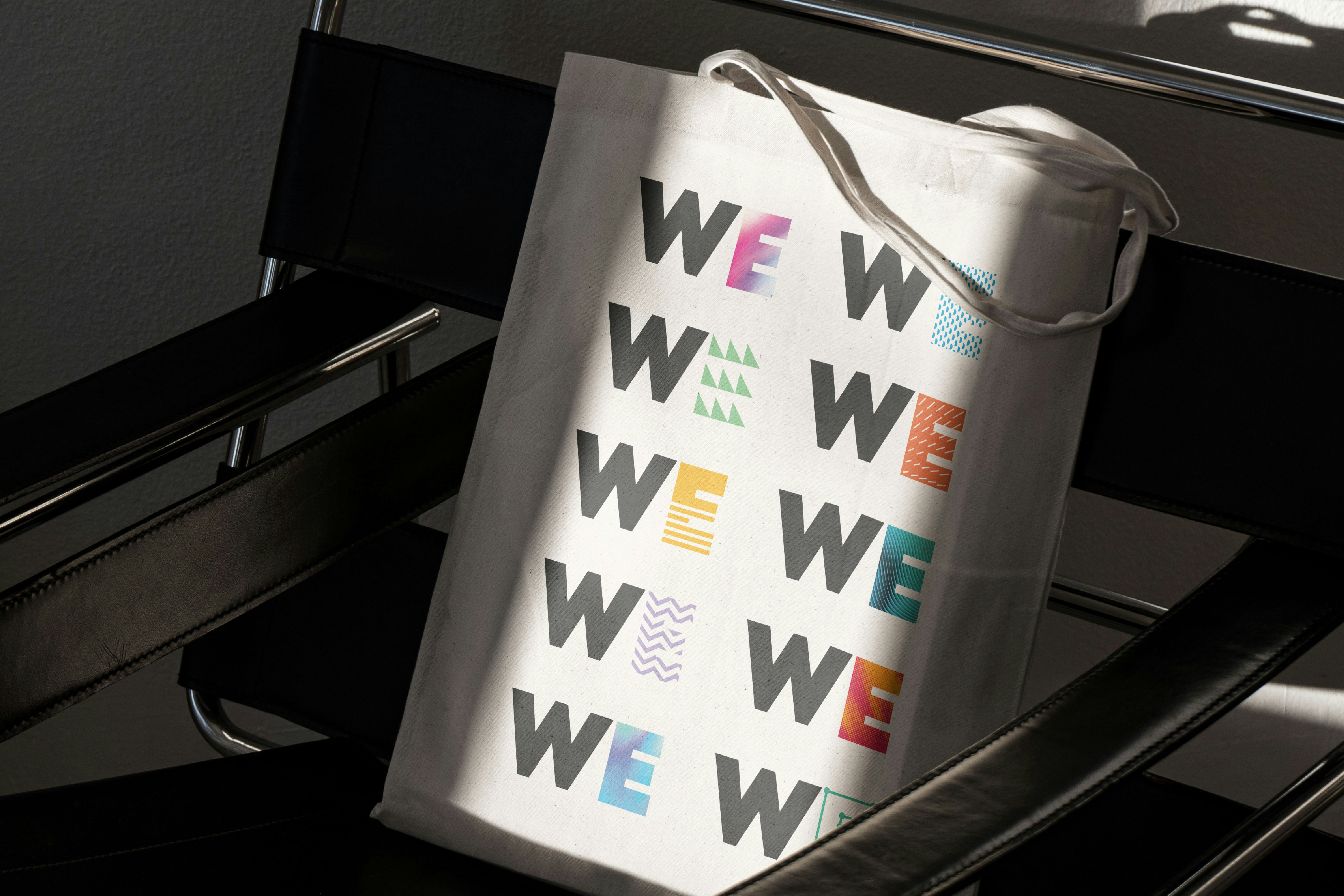
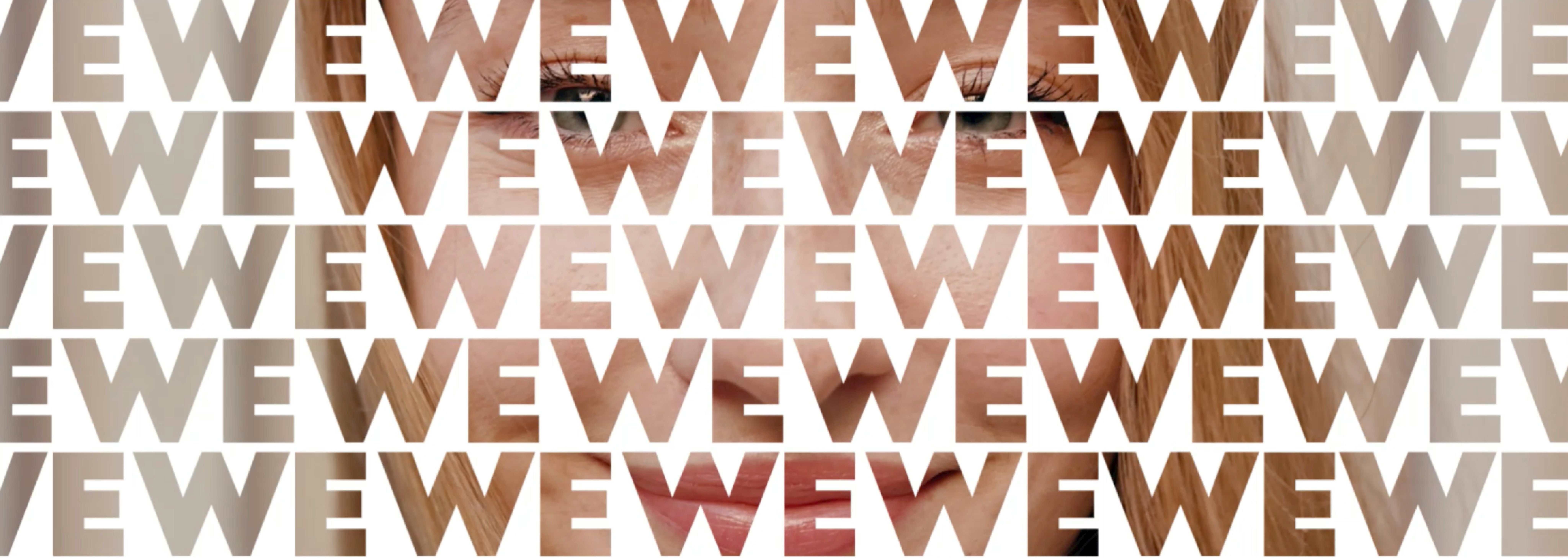
This simple yet powerful logo is based on two letters. The W, a solid base, symbol of the region, and the E, changing, dynamic and evolving, like entrepreneurship itself.




A focus on expertise
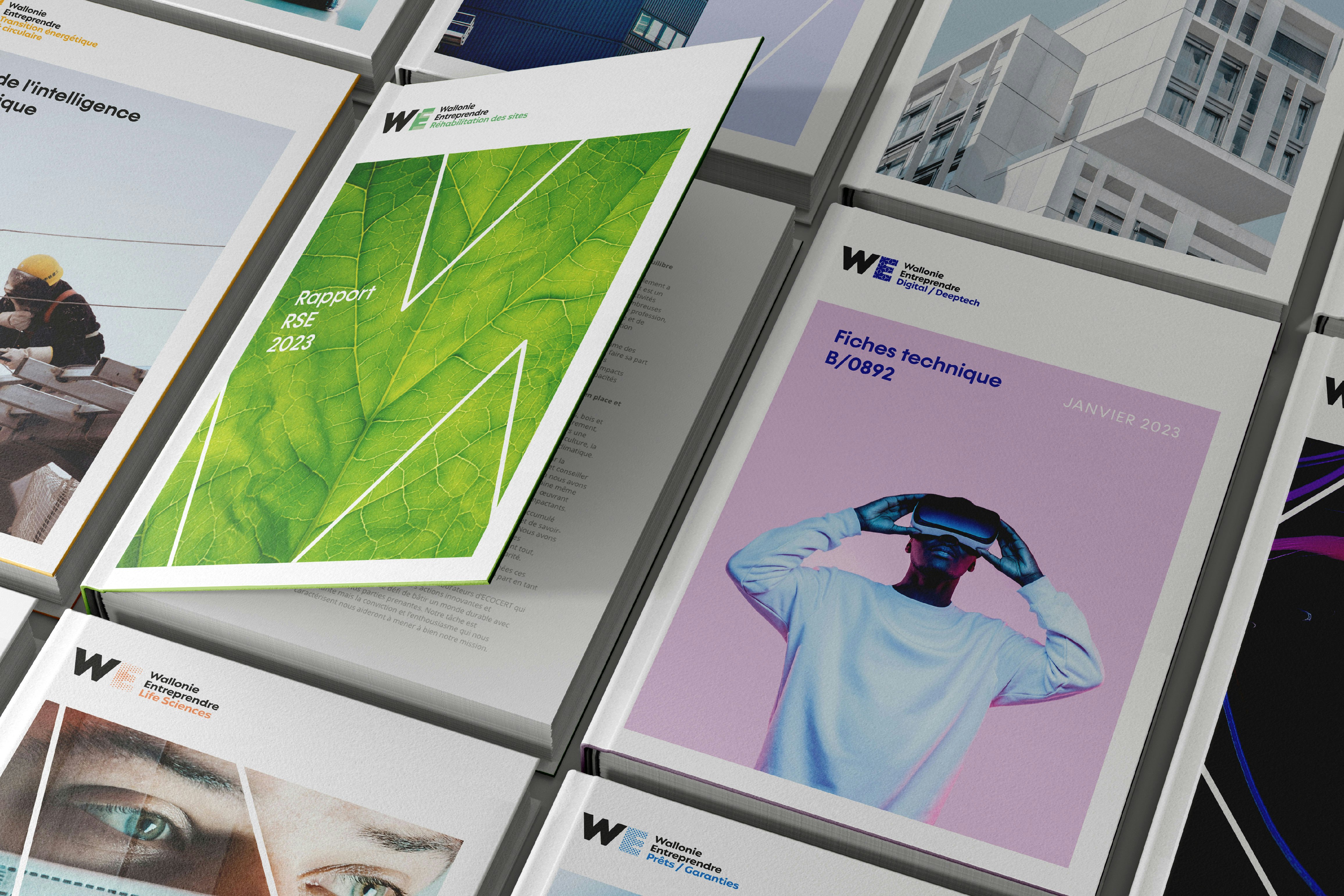
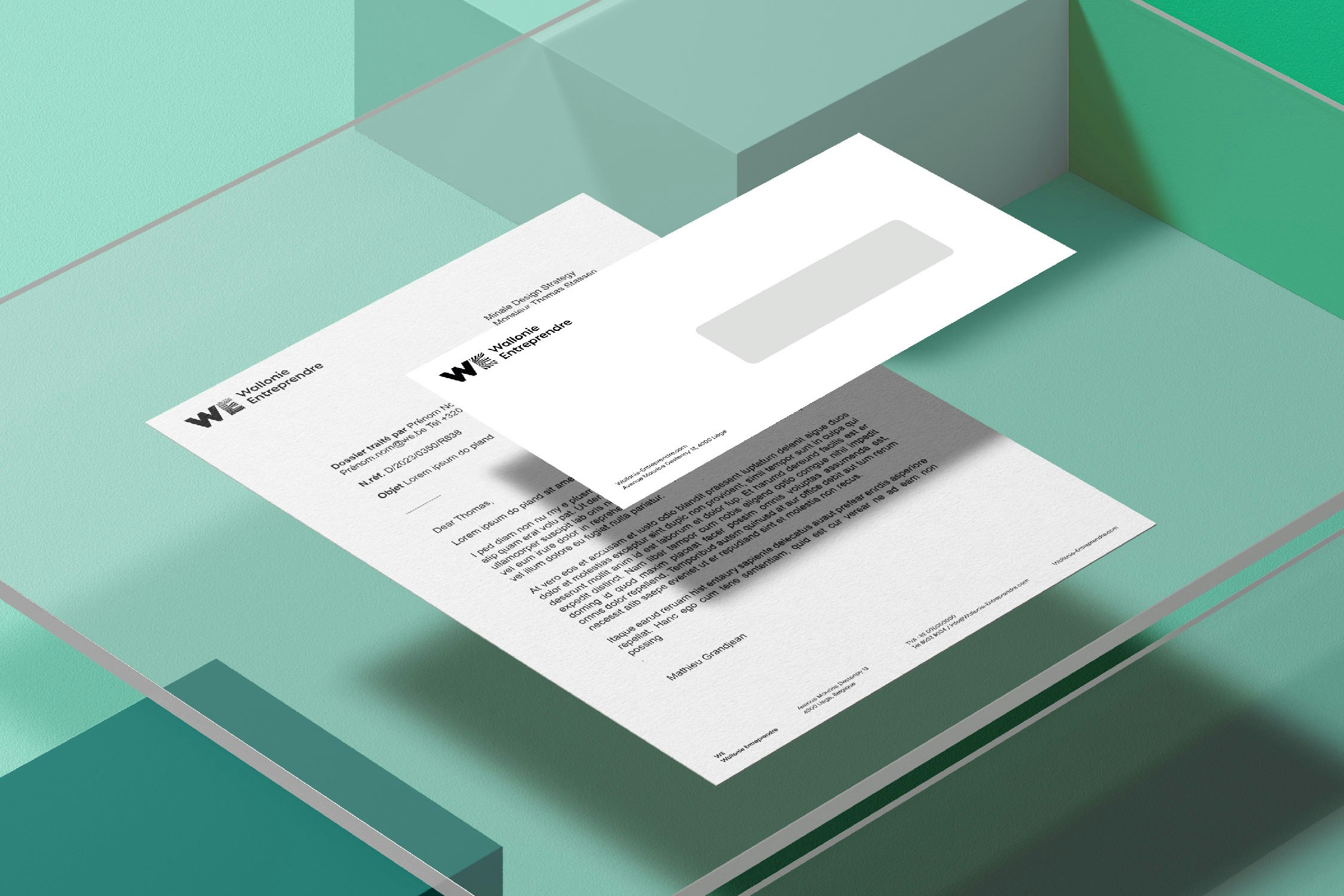
WE's identity is most evident in its reorganised service offering, which highlights the expertise of its employees and their interactions with businesses and entrepreneurs. The result is a versatile and evolving logo, which adapts to various sectors and needs.

